

Chime needed to grow up their brand to reach new, more aspirational segments and compete with big banks—without losing their cultural relevance. We made sure to honor their history and key signature assets, while evolving their visual identity to activate their new mission of “uniting everyday people to unlock their financial progress”.
Chime’s old color palette was limiting; Chime Green + white didn’t meet ADA compliance, which led to channel-specific solves and a lack of consistency. The secondary colors were all the same value as Chime Green, so it was impossible to combine without having colors vibrate.
We expanded Chime Green to a series of tints and shades, while introducing a new secondary palette inspired by the emotions our audience associates with financial progress. This amplifies Chime’s new mission while promoting accessible color combinations and ensuring their green DNA is always present.
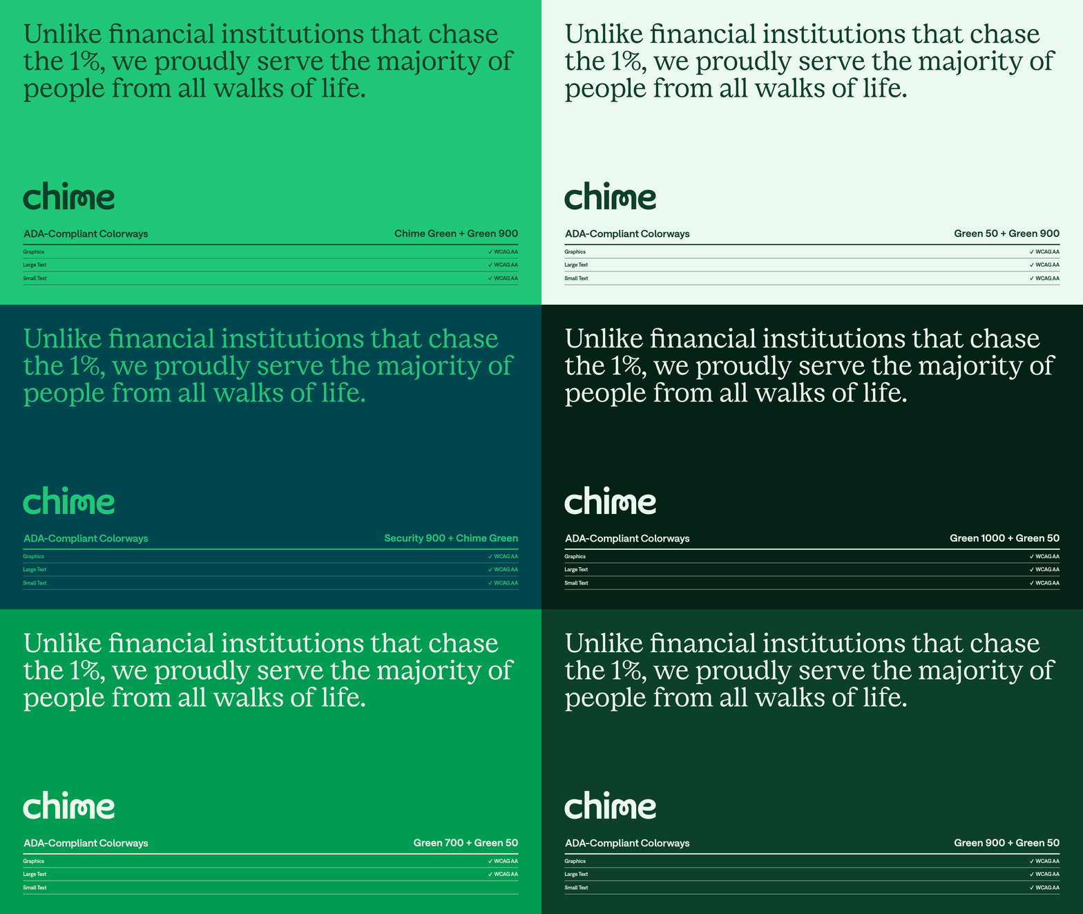
We cue a foundation of stability with a tailored version of Saans by Displaay) that feels smarter and more direct, with increased functionality and accessibility.
It’s complemented with a custom secondary serif (designed in collaboration with our friends atColophon) that adds credibility without sacrificing personality.
For type-led compositions, we amplify the idea of unlocking with a custom set of “unlocked” characters from Colophon. Each character is a seamless transformation of its Chime Saans base; free, expressive and forward-moving.
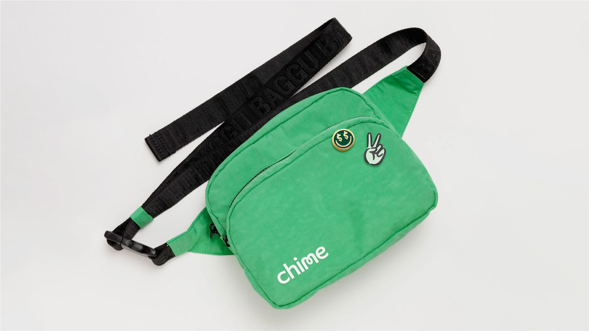
Letters can also be unlocked with a set of Chime-mojis, drawn by Marco Palmieri.
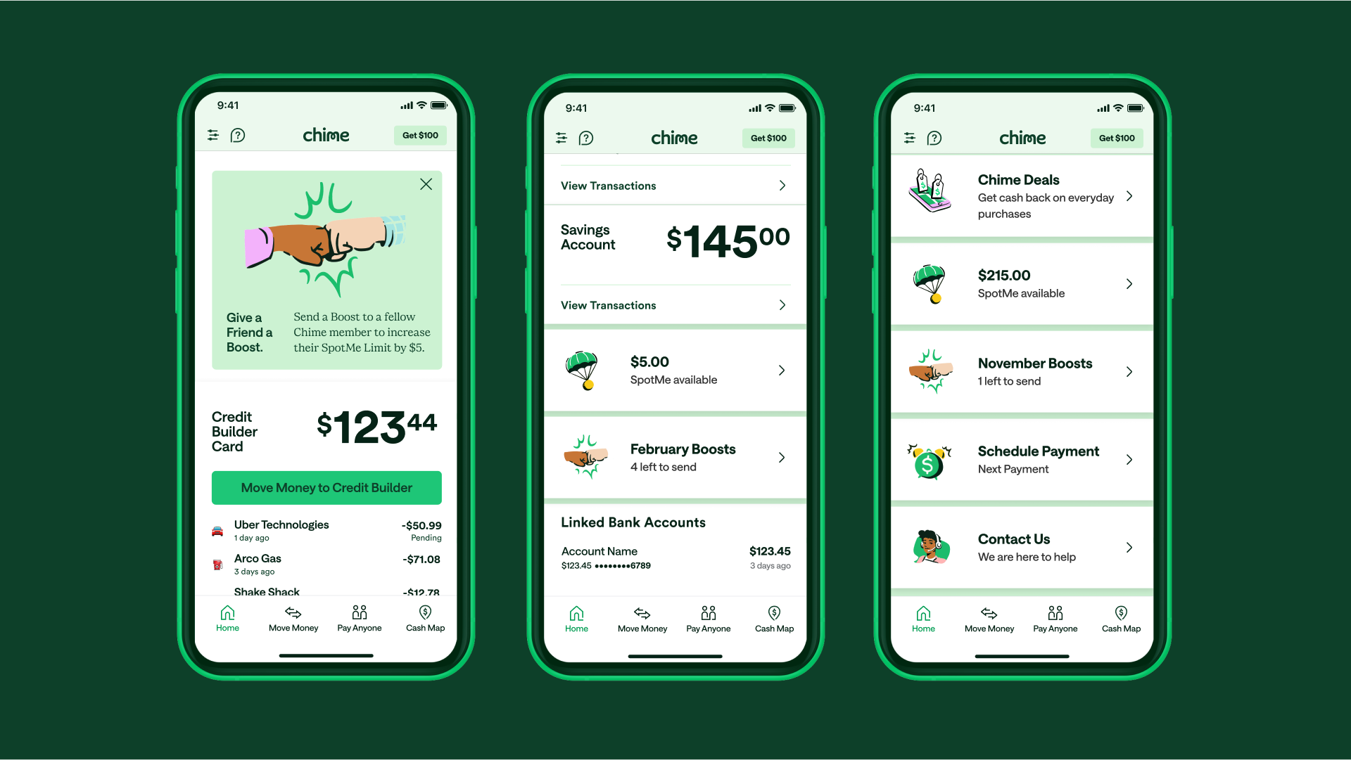
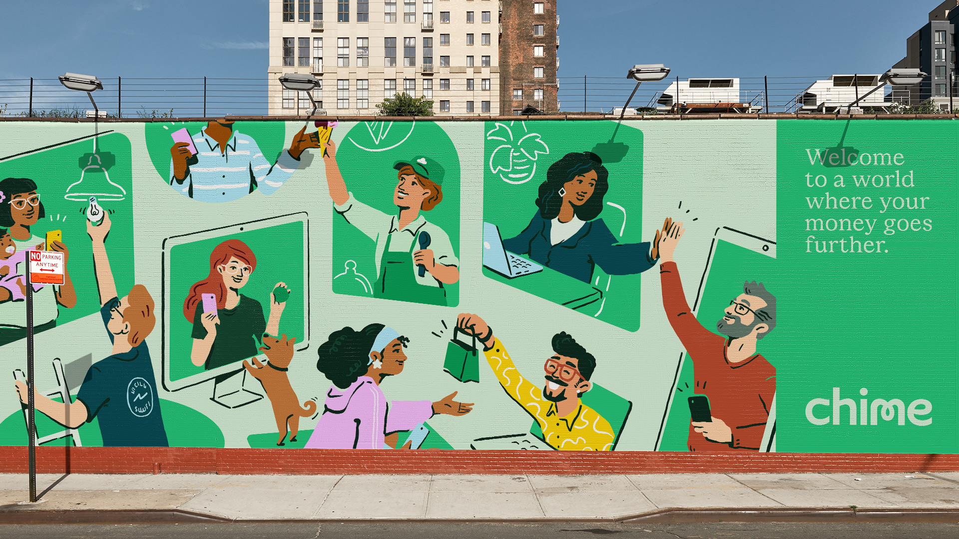
We invite people into Chime’s world of financial progress with a series of illustrations that raise the bar for what representing Chime’s community looks like (also drawn by Marco Palmieri).
Our focus was on representing true diversity, using realistic body proportions/anatomy; natural skin tones from the Von Luschan and Fitzpatrick scales; and making sure that things like hair color, facial features and wardrobe celebrate our community’s range of personalities and cultures.
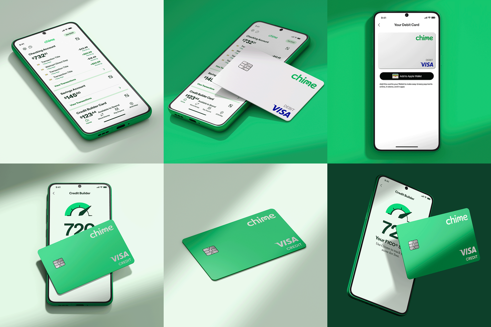
Portals are at the center of how we activate Chime’s brand mission—either with actual products that transform into worlds of financial progress, or more open-ended, metaphorical representations of progress.

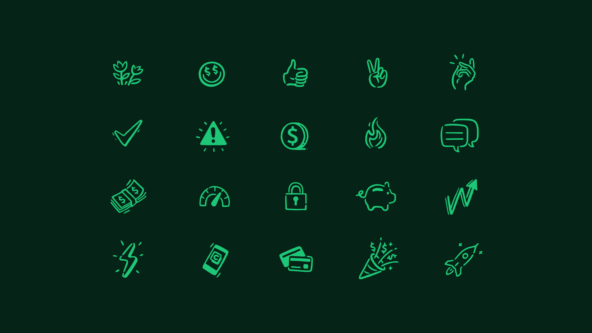
Chime’s illustration style extends to every touchpoint, including a responsive set of feature icons that accommodate all product and marketing design use cases.
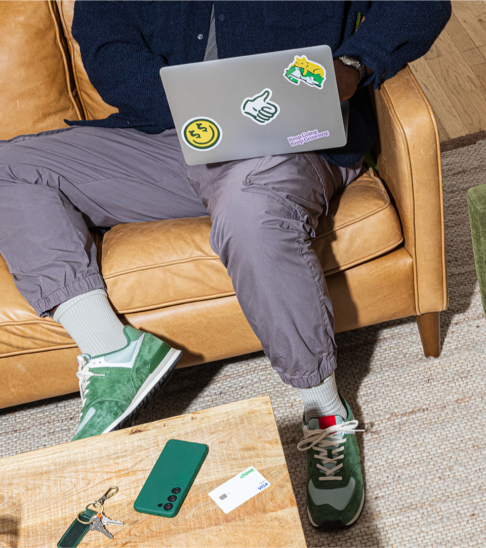
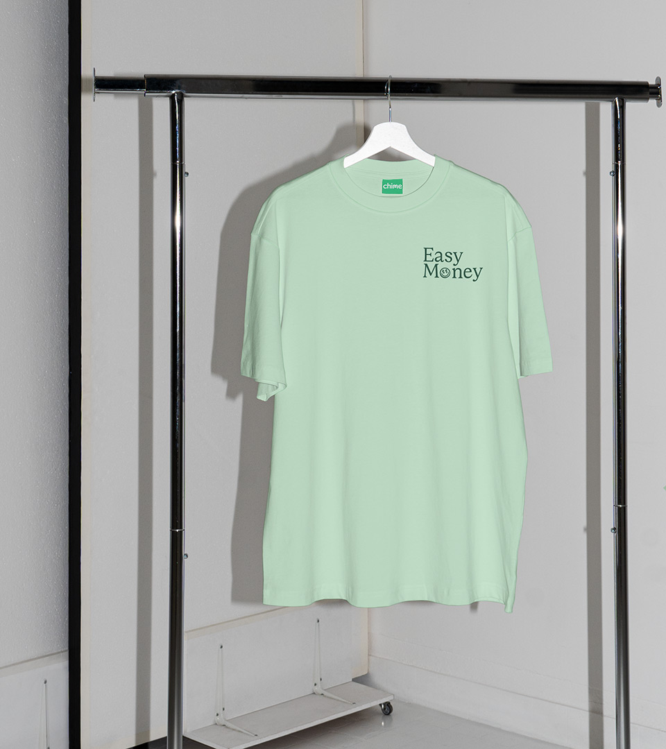
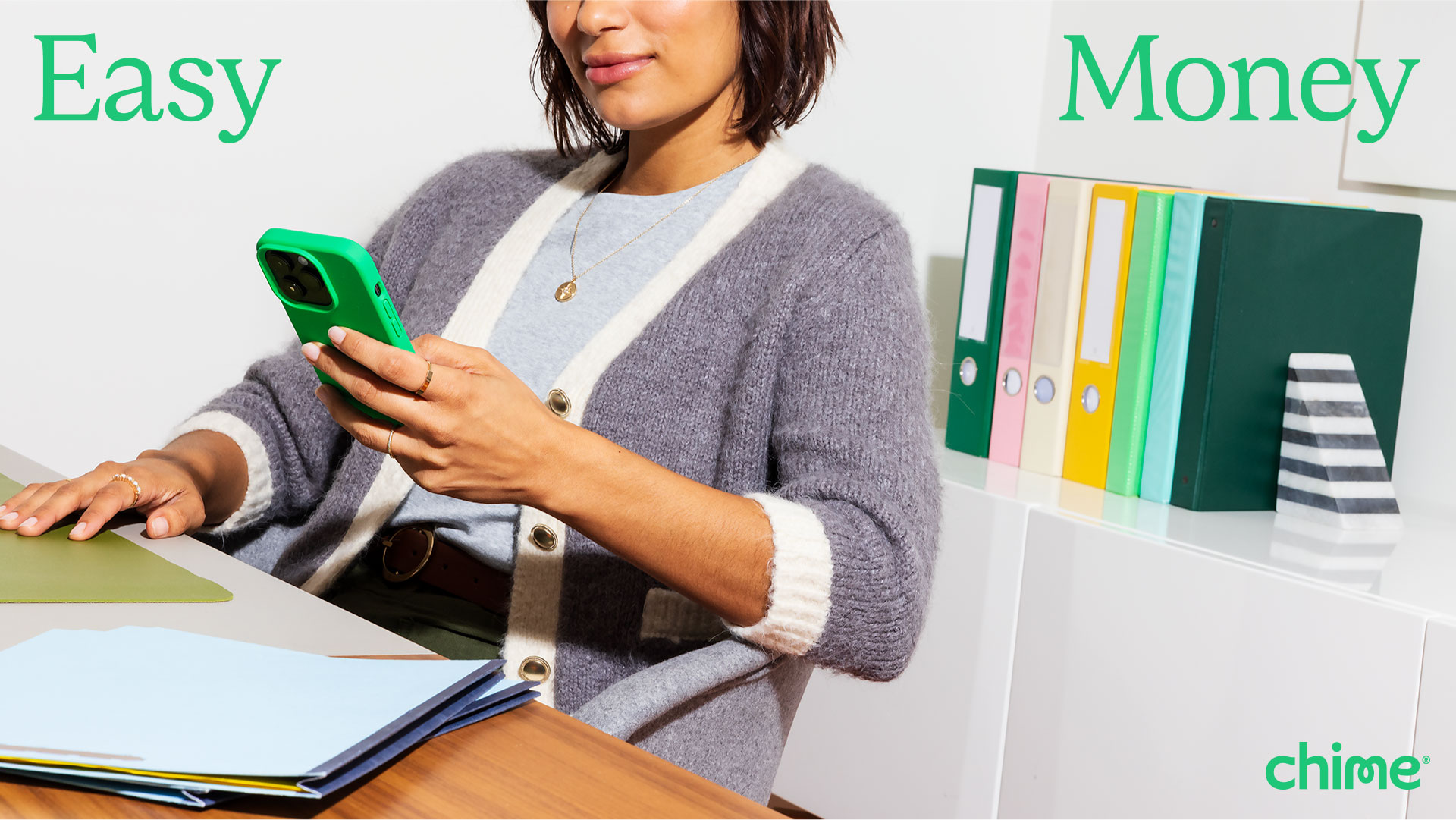
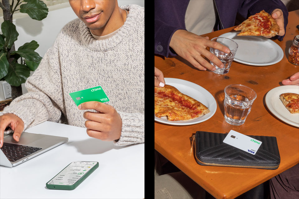
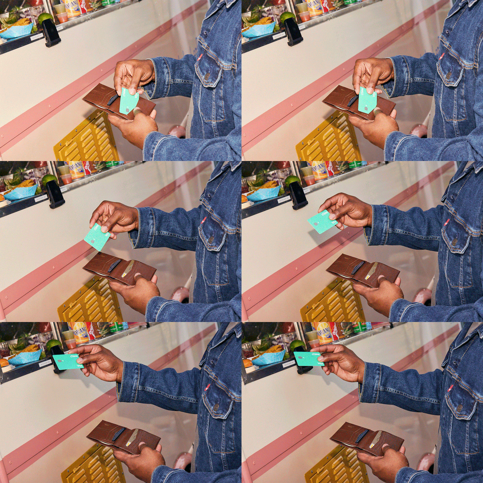
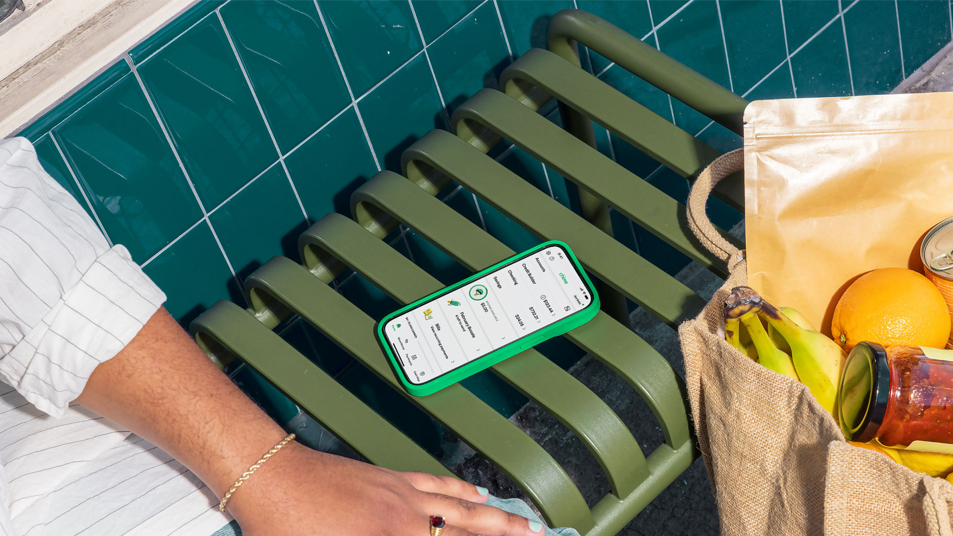
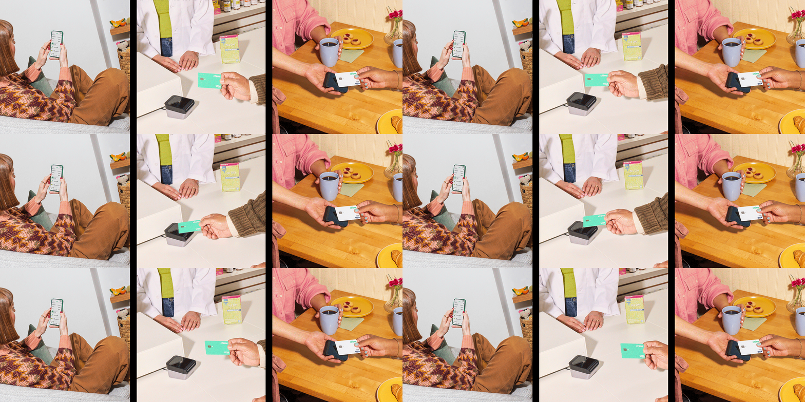
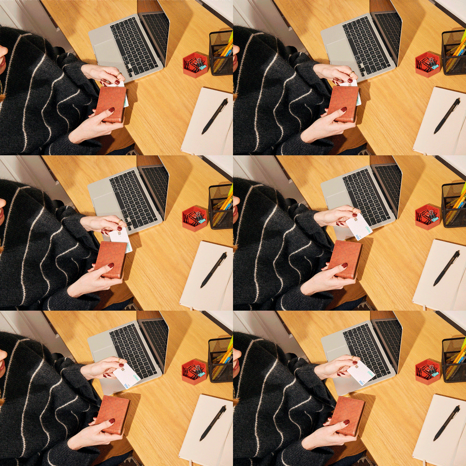
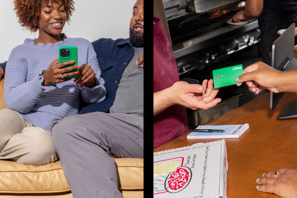
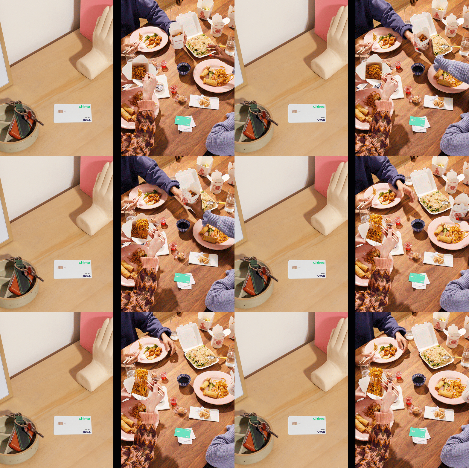
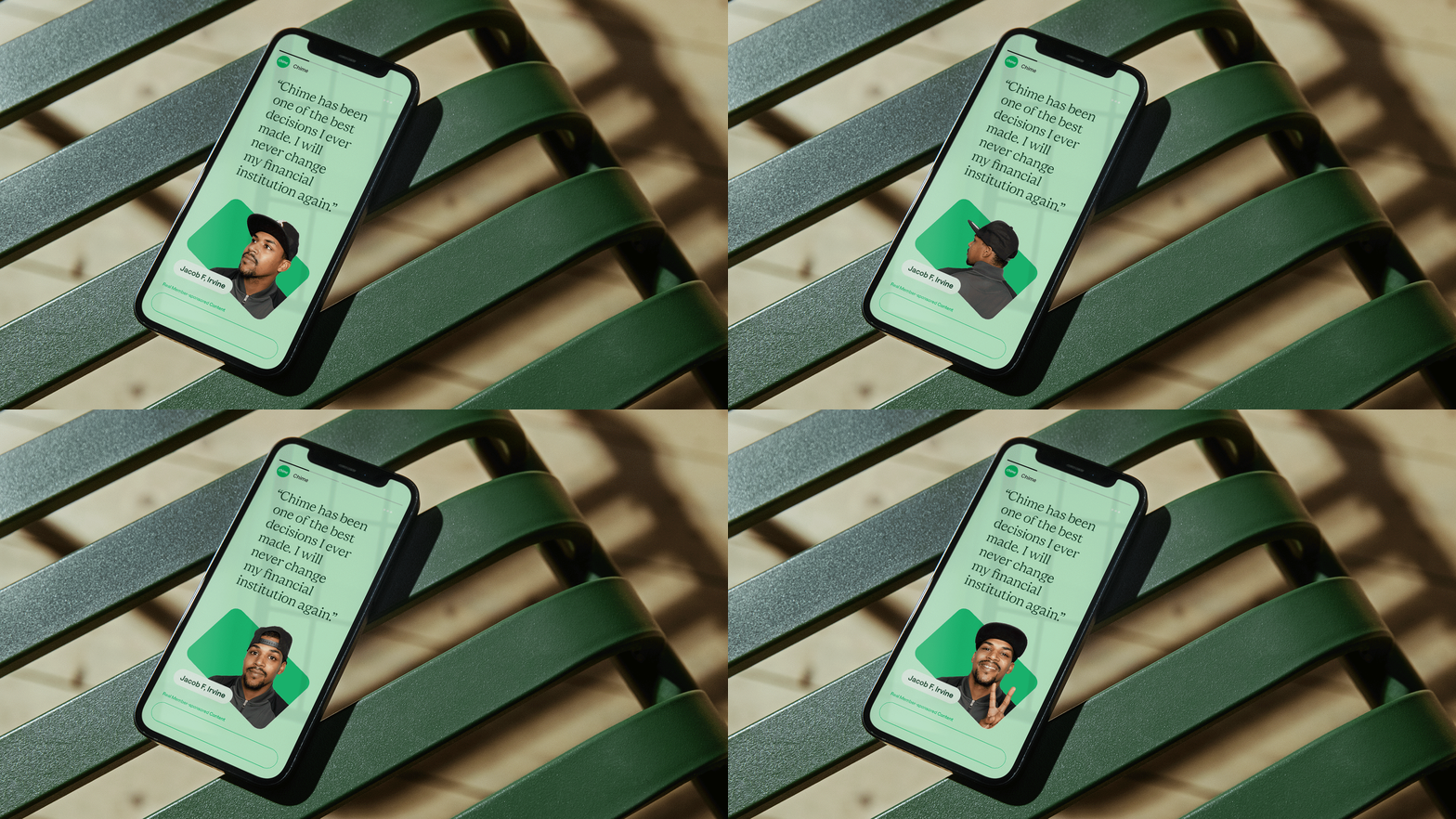
Chime’s first-ever brand photo library is a collection of elevated expressions of everyday moments, featuring real Chime members as talent.


PROJECT LINKS
CAPABILITIES
Branding
Creative Direction
Type Design
Motion Design
HTML/CSS