

For over 20 years, Sound Physicians has delivered transformative patient care (and bottom-line results) as one of the leading multi-specialty medical groups in the US. Yet their brand sold their story short by blending into the rest of the generic, corporate-feeling groups in the category.
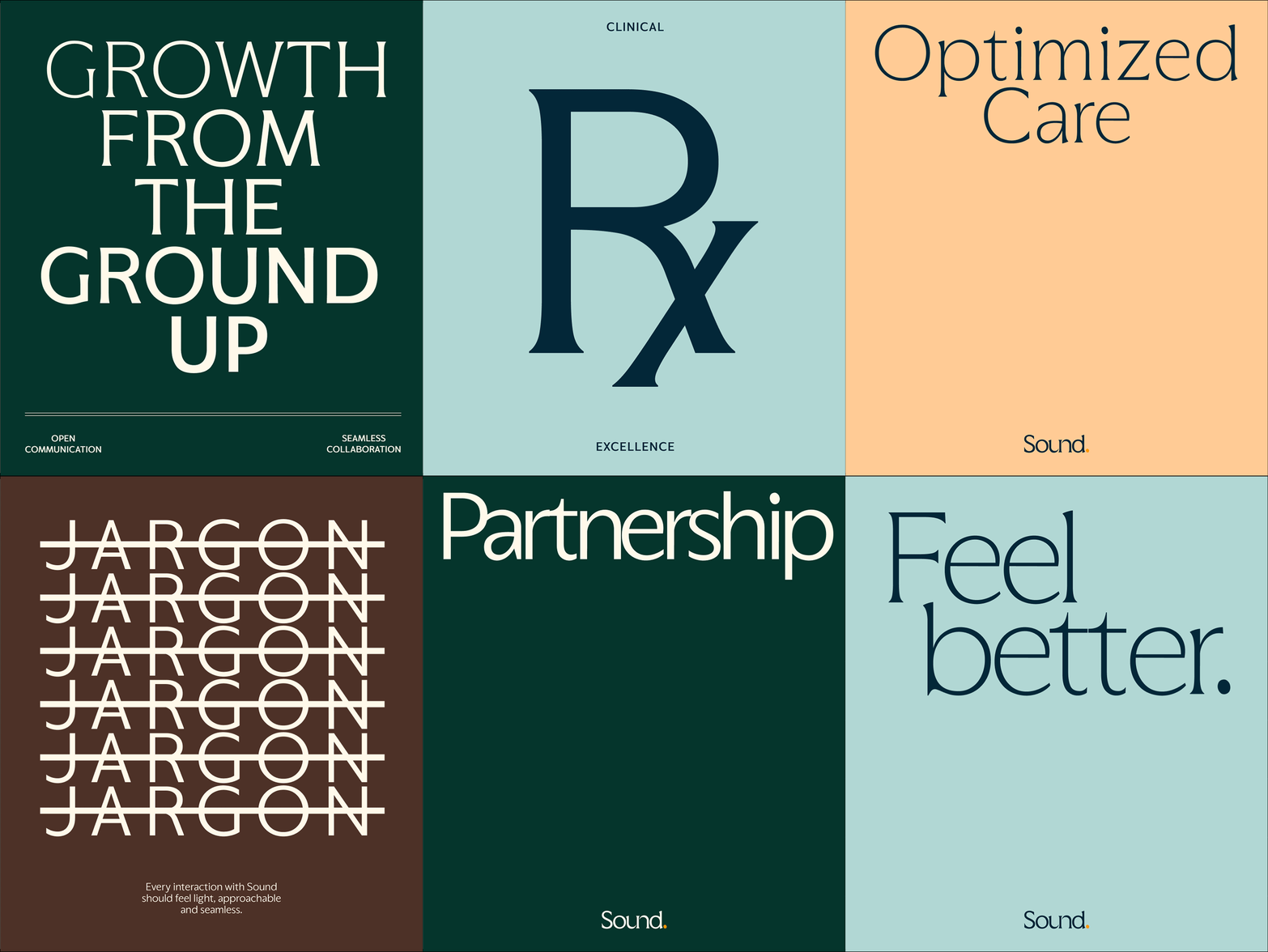
We transformed Sound’s brand around the concept of a care catalyst: a concentrated kick that can immediately accelerate business acumen and empathetic, dignified treatment–lightening the burden of care for patients, clinicians and healthcare systems everywhere.

The new logo, monogram and brand positioning is built around the care catalyst idea–starting with a “catalyst” symbol (taken from the counter of the “o”) as our core building block. The logo style and architecture represents Sound as the network of empathetic experts that it is, emphasizing SOUND while allowing the now-smaller PHYSICIANS tag to be swapped out for other service lines as needed, or in some contexts removed entirely.



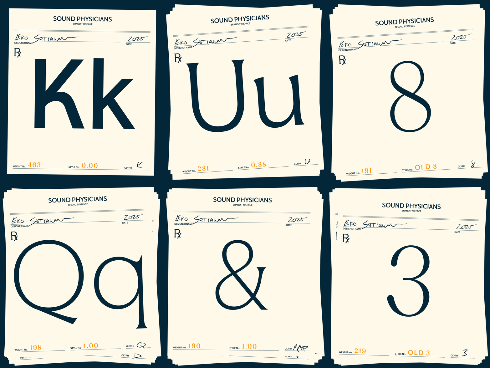
Sound’s wordmark extends to a variable typeface (both designed by Eko Setiawan) that seamlessly transitions from care-inspired serifs to business-inspired sans, in a range of weights. It also includes a set of decorative numerals, inspired by the stamps used on prescription cards from the days when you had a more personal relationship with your physician.
We commissioned Lee Kyutae to create a set of illustrated scenes showing the range of Sound’s service lines in action, in a medium inspired by classic Gray’s Anatomy medical illustrations.
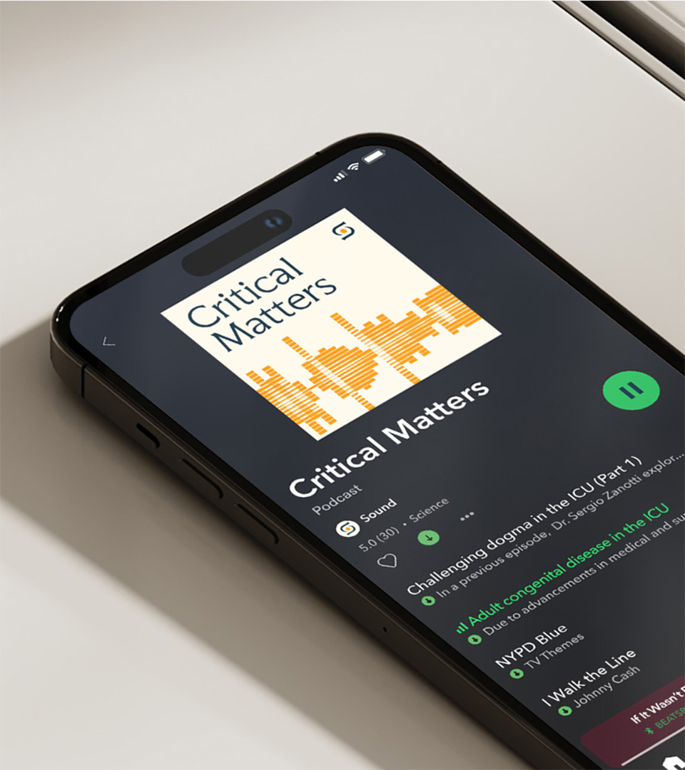
Sound’s imagery library is accompanied by ambient motion graphics that reference the iterative, progressive visuals found in medical testing, results mapping and real-time health monitoring.
The care catalyst appears throughout the design system as a framework for layouts, a persistent UI motif, and a foundational accent in type and information design.







PROJECT LINKS
CAPABILITIES
Branding
Creative Direction
Type Design
Motion Design