
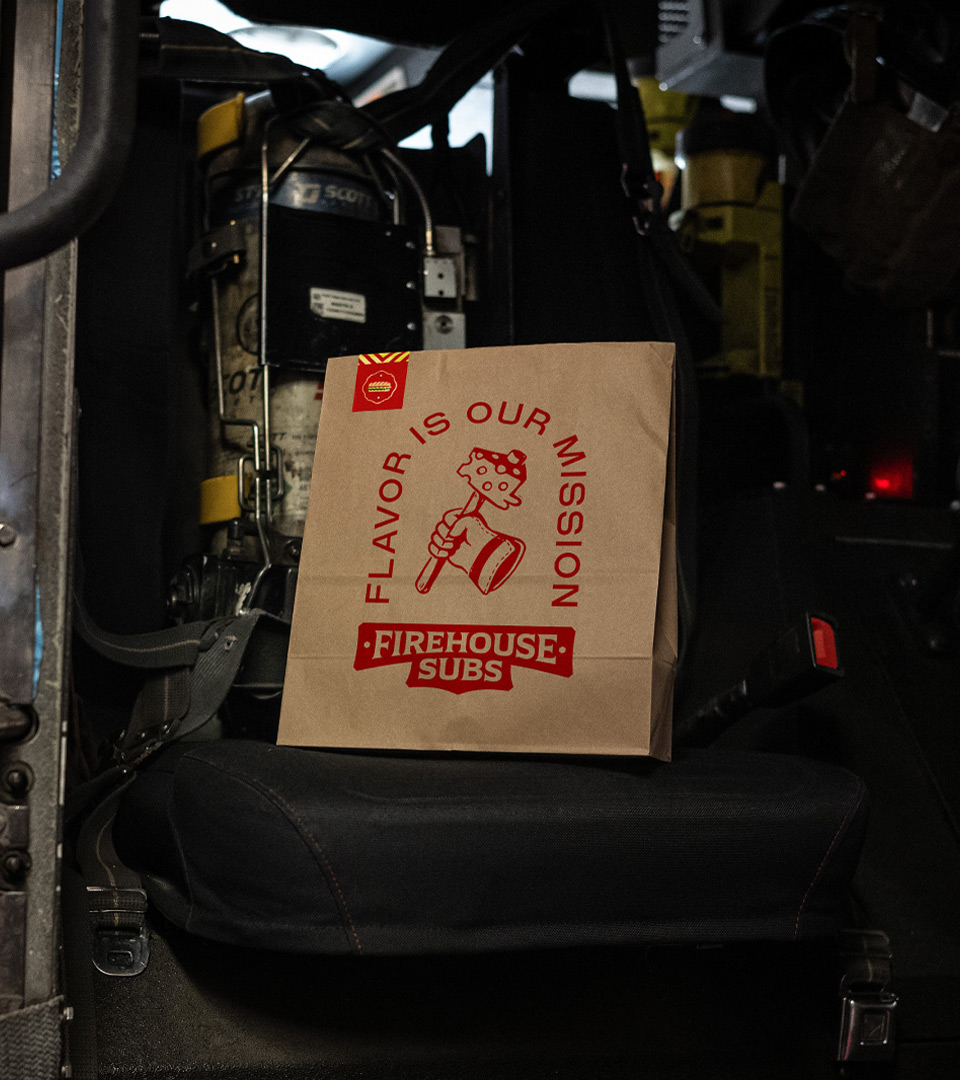
As Firehouse Subs expands globally, they needed to retain their mission and origin story, while better emphasizing taste to resonate with international markets. We developed a new Purpose, Positioning and comprehensive Brand Identity that is warmly crafted, deliciously bold, inspiring and energetic. It amplifies the culture of the firehouse, while celebrating “community captains” all over the world that embody the firehouse spirit.
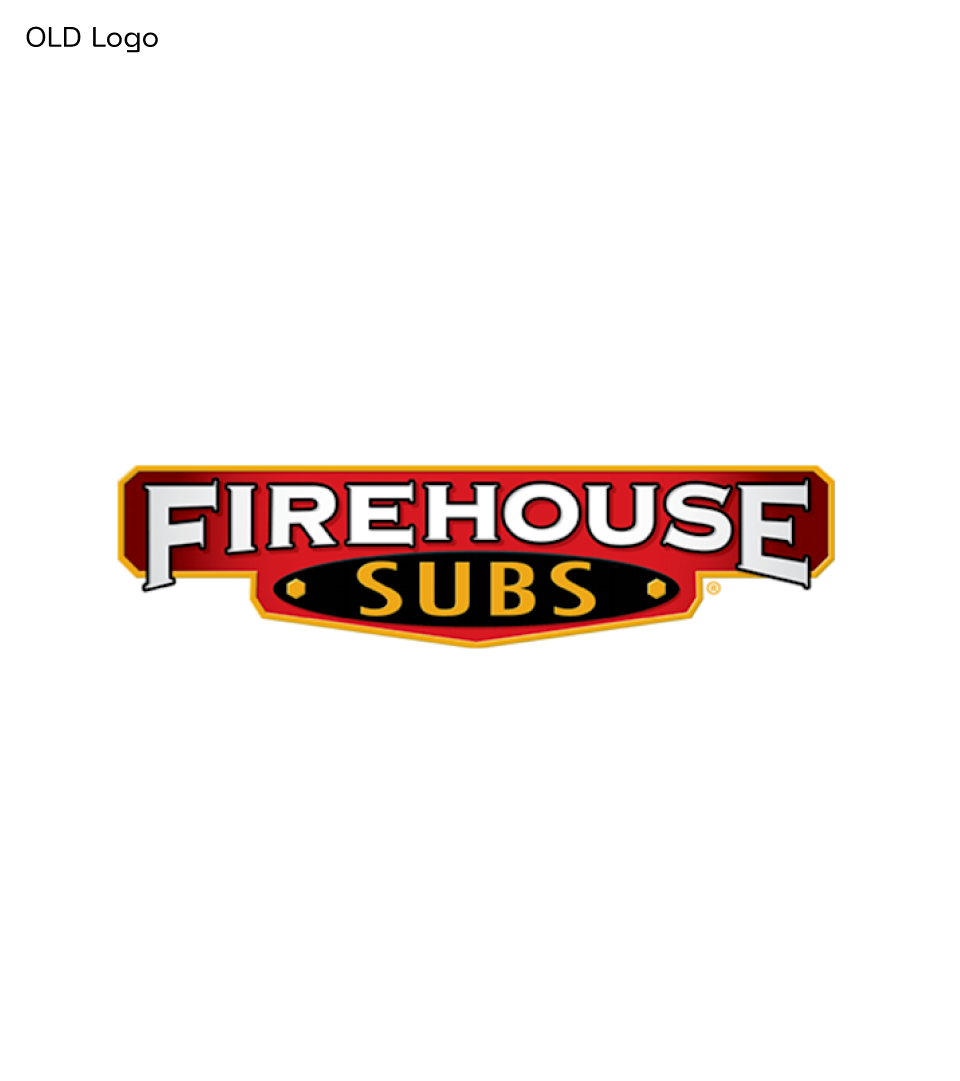
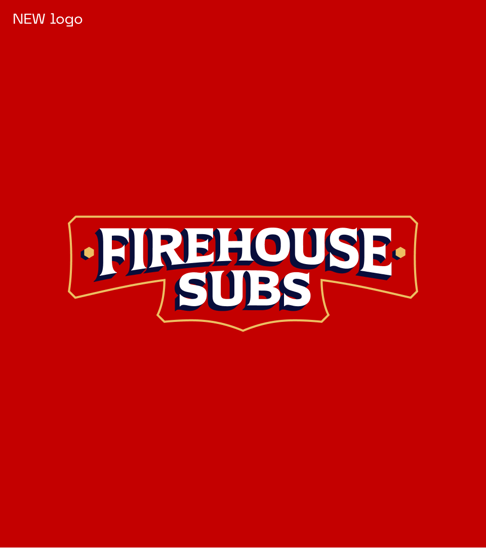
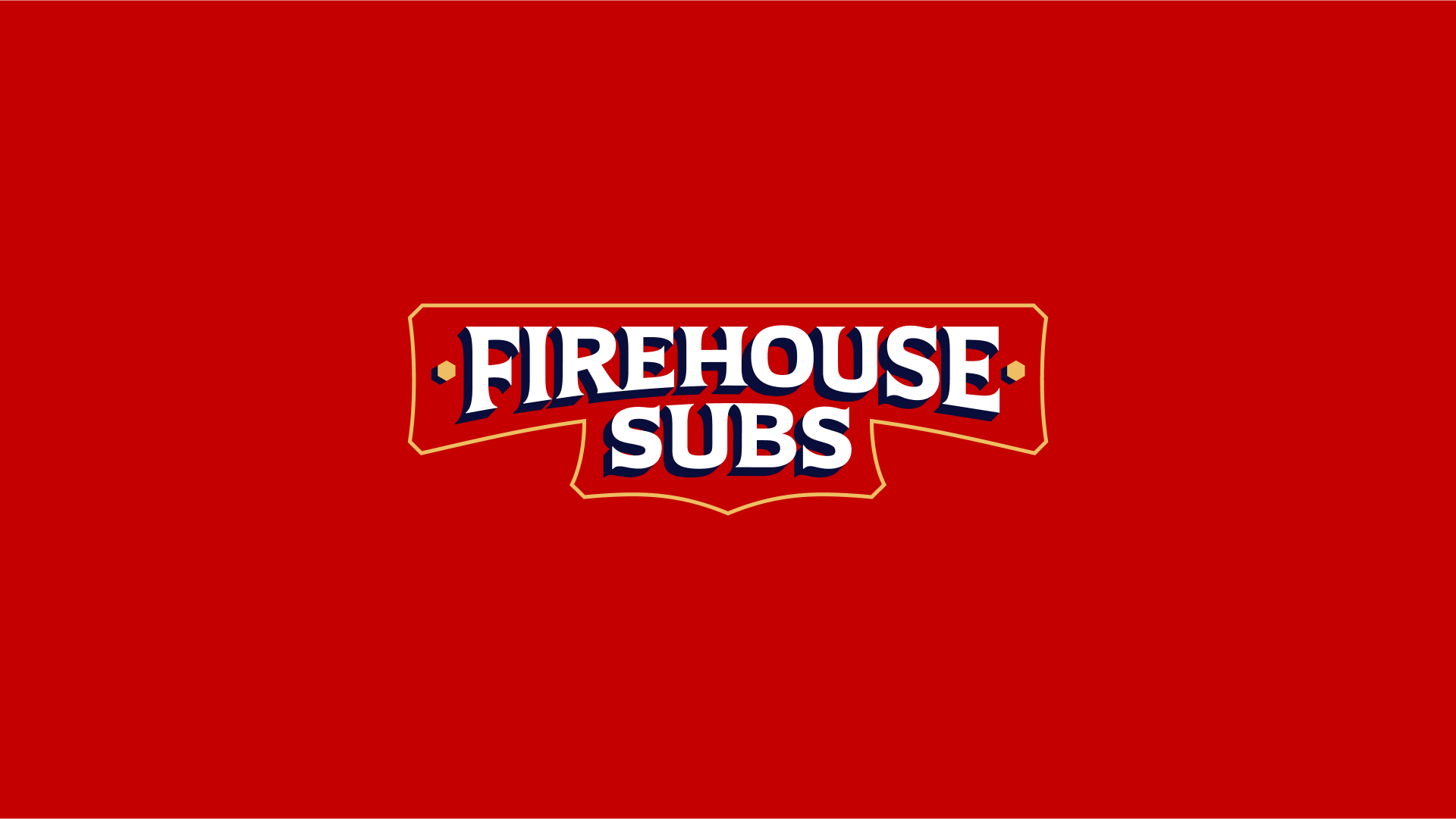
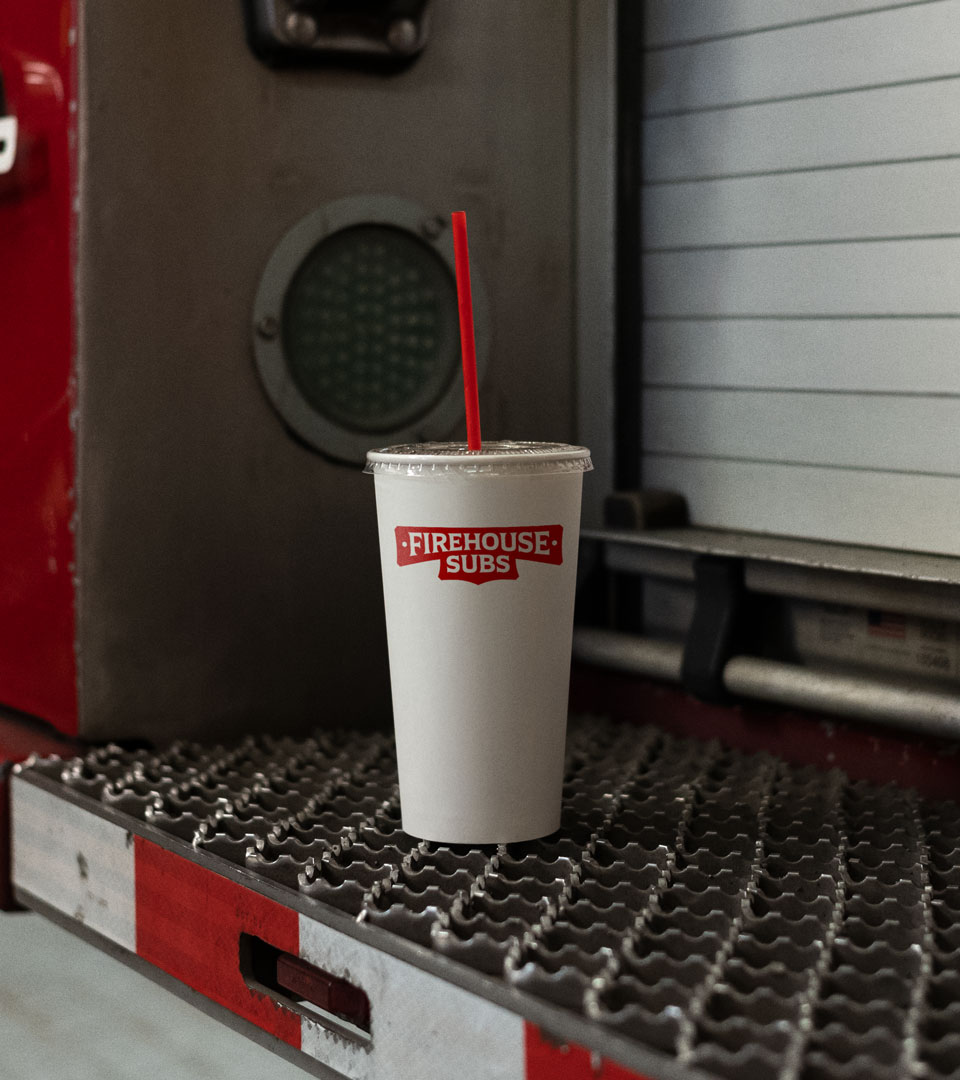
We partnered with the lovely folks at Colophon to create an evolved Firehouse Subs wordmark that takes the most distinctive elements from the original logo—the helmet-badge-inspired holding shape & bolts, flared type, and contrasting strokes—and simplifies them, creating a more taste-led, digital-friendly logo that can transform into a monogram at small sizes.
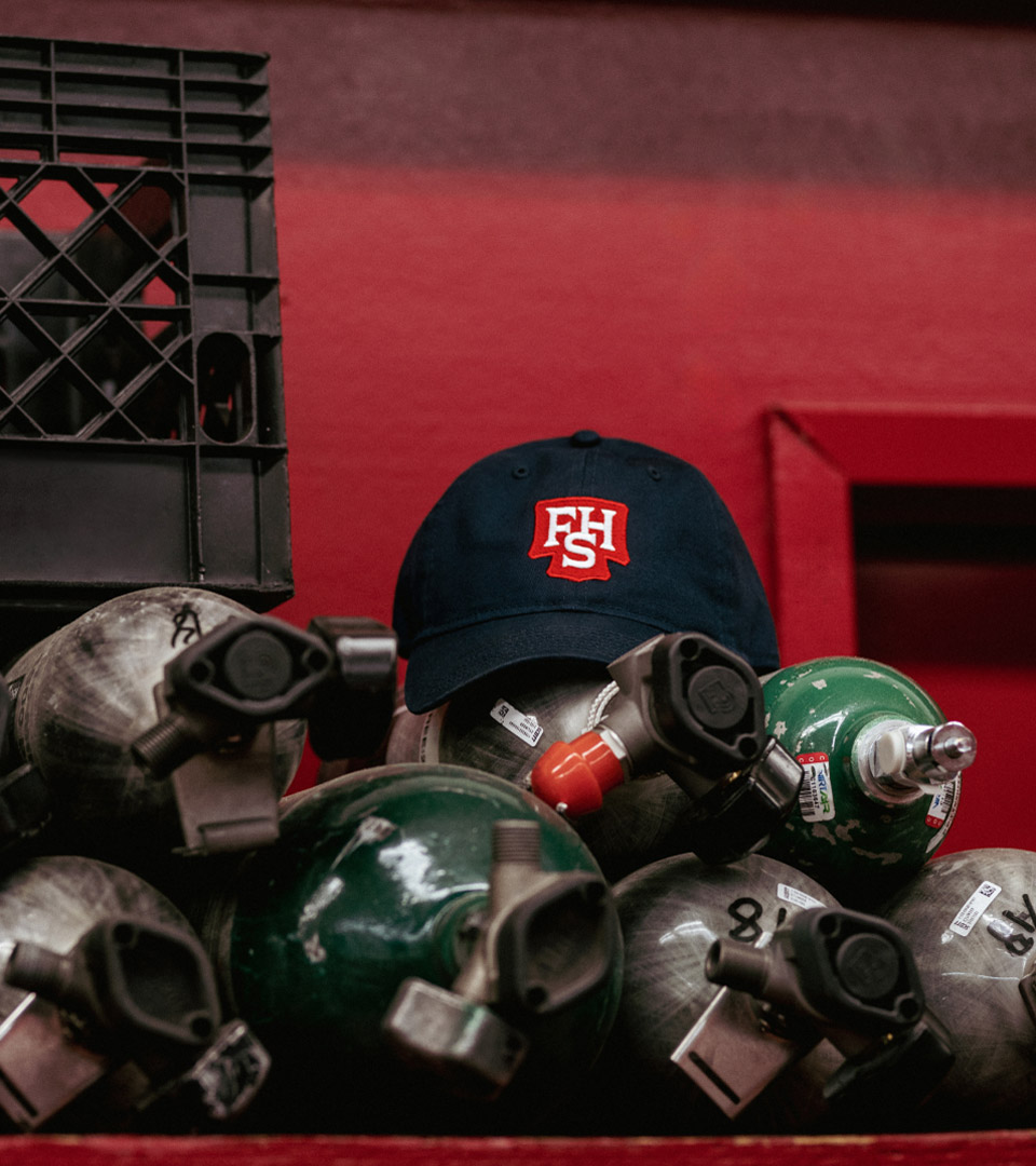
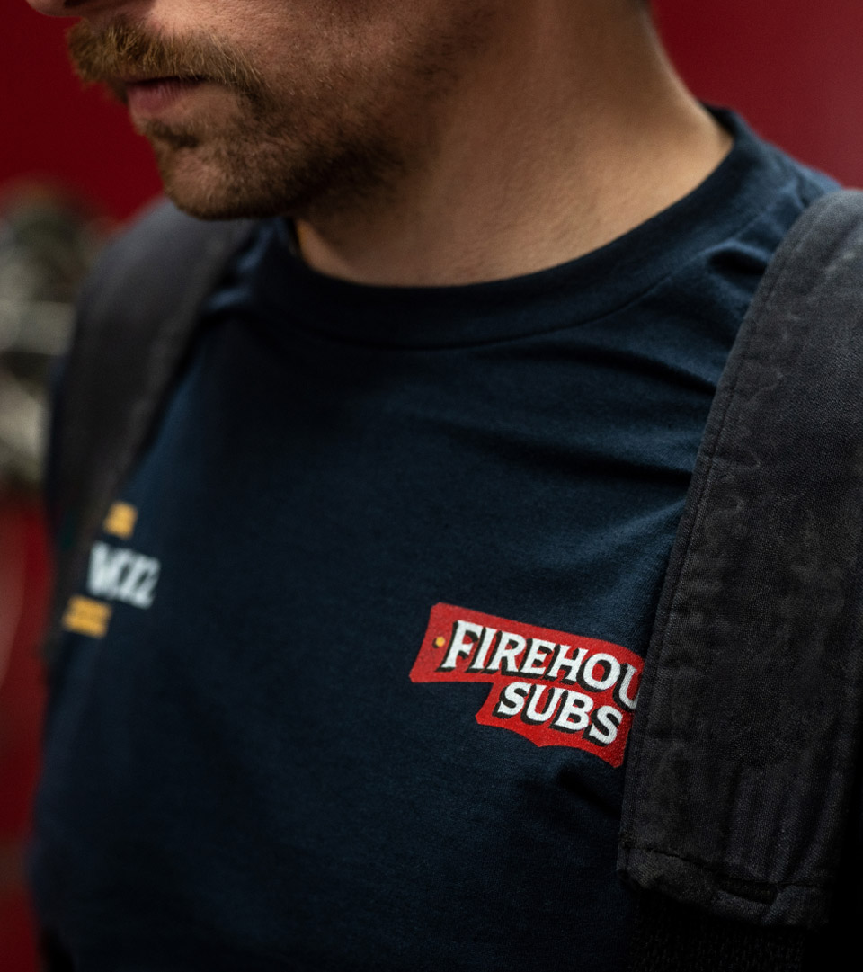
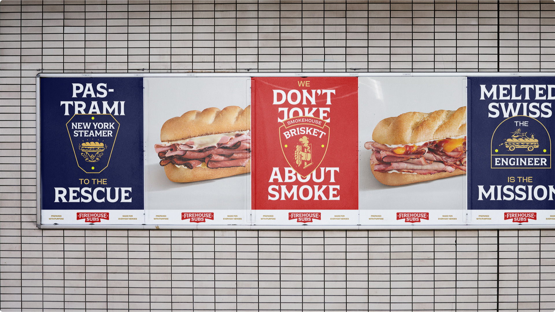
We also worked with Colophon to create two custom typefaces. Hero Serif is a tasty flared display typeface that draws on the more ornate parts of firehouse artifacts, found lettering and uniform badges, while Hero Sans pays homage to the highly utilitarian, almost brutalist lettering found on instrument panels, pump labels, and other tools of the trade.
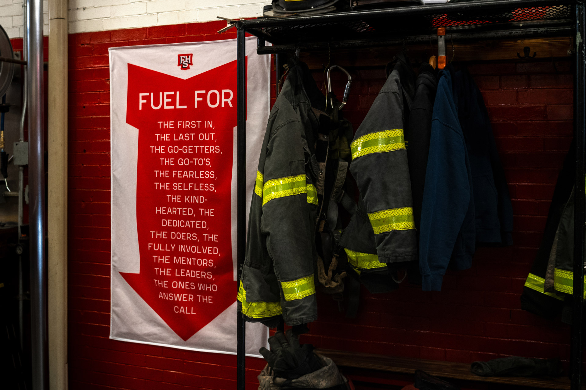
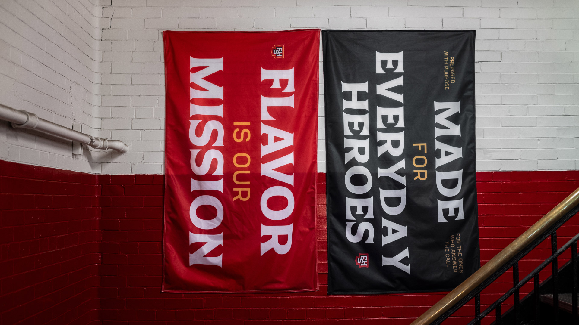
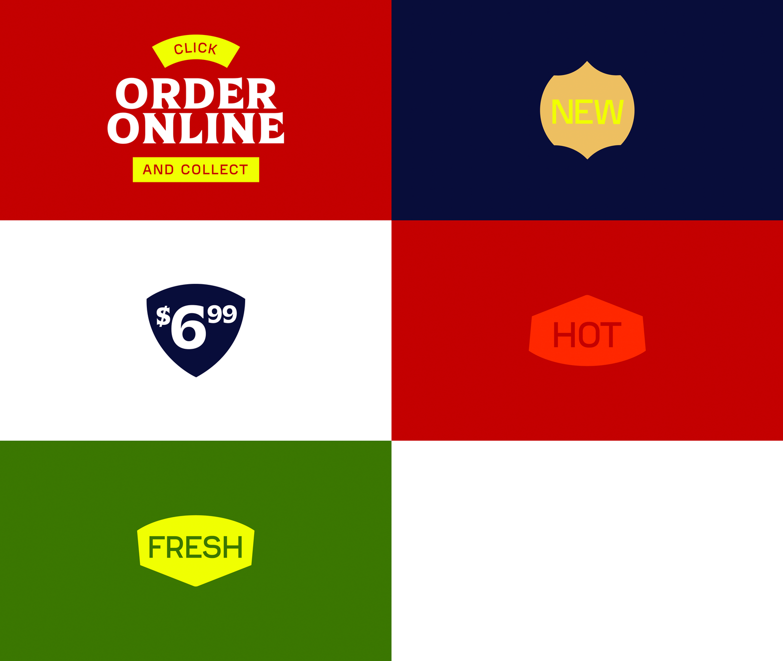
Colors were pulled from a combination of firehouse materials and sandwich ingredients.
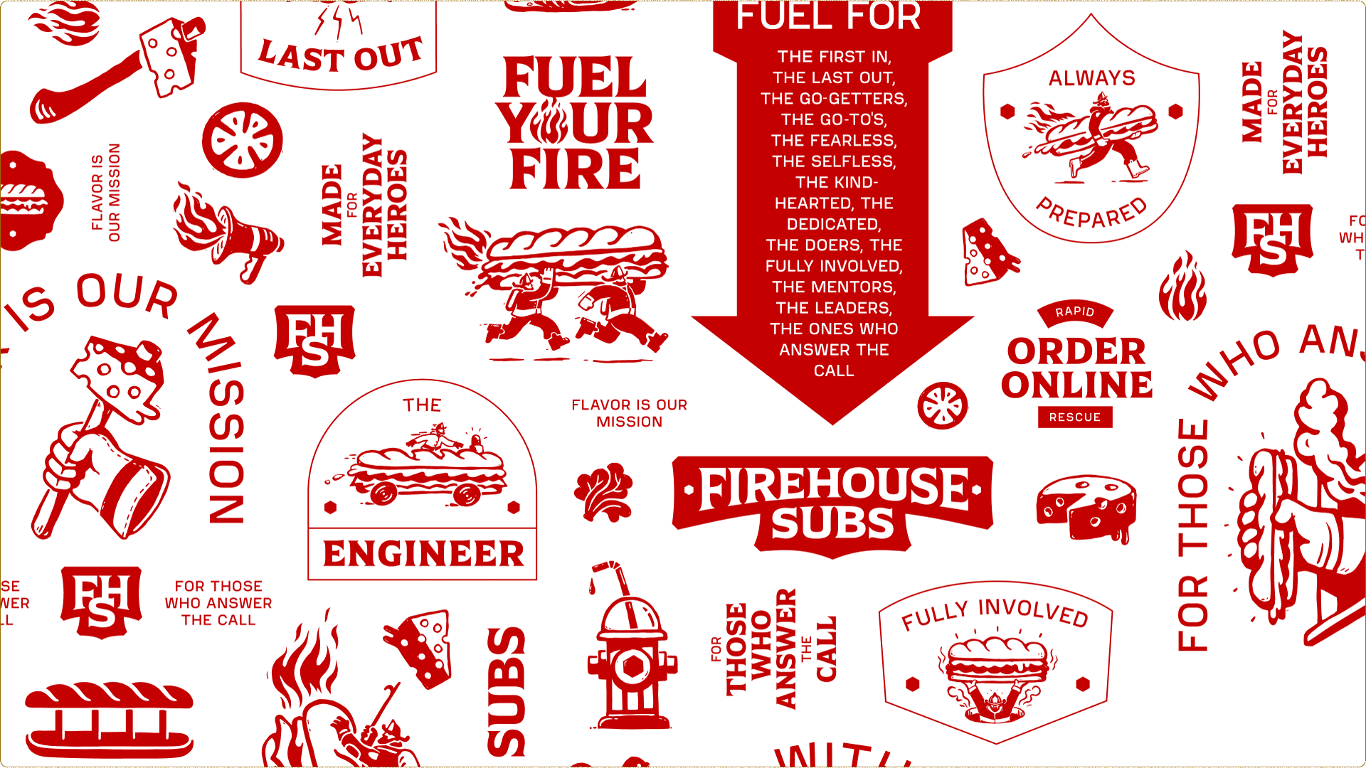
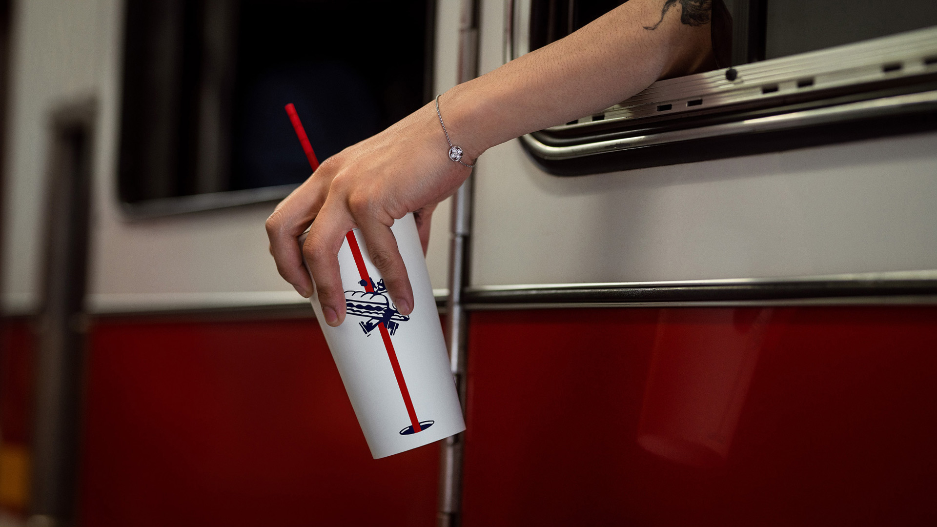
We add energy & personality with patterns taken from first-responder vehicles, and a series of firefighter + food scenes drawn up by the brilliant Marco Palmieri.
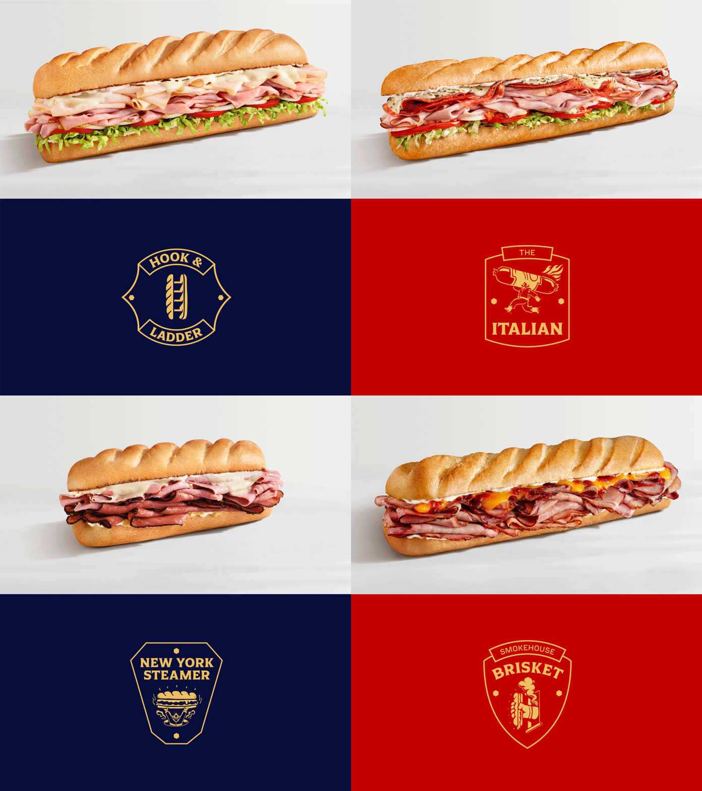
We elevated the food, shooting a new brand photo library and creating custom illustrated badges for each sub.
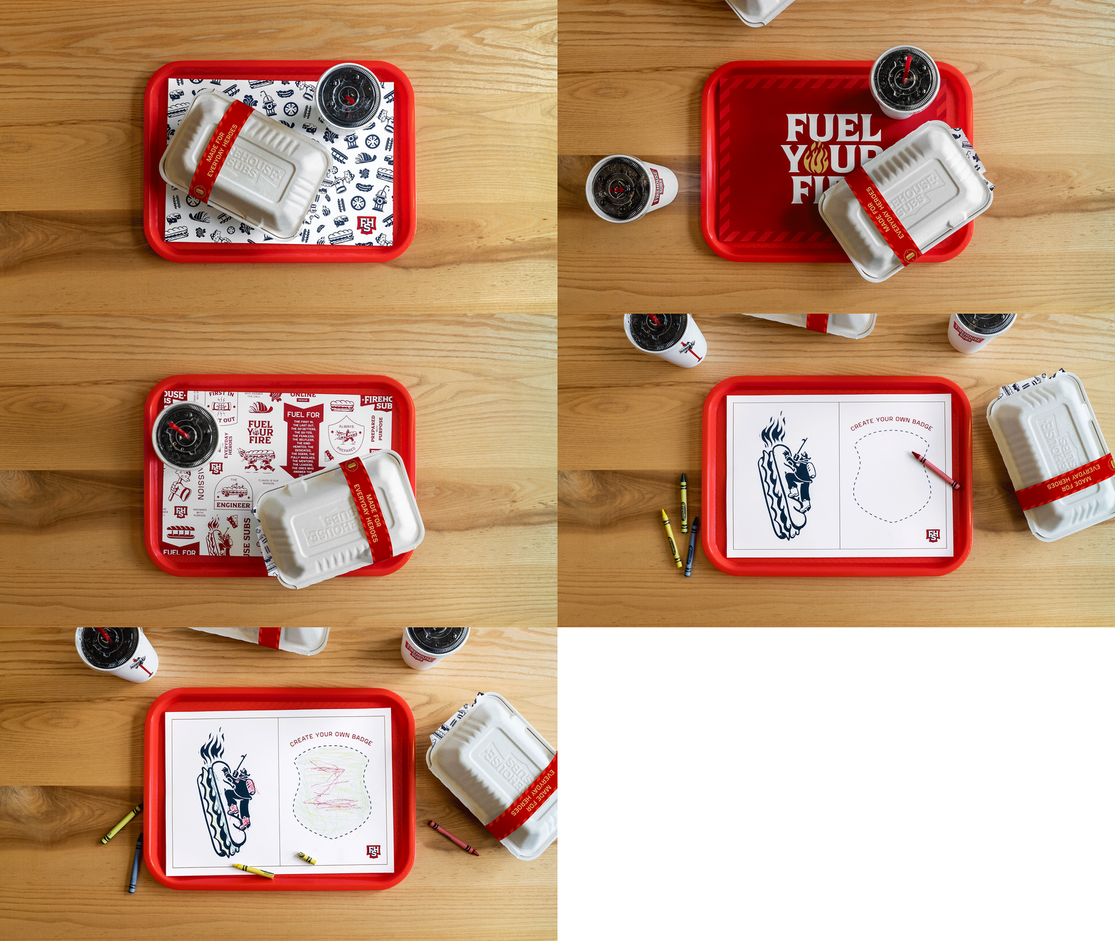
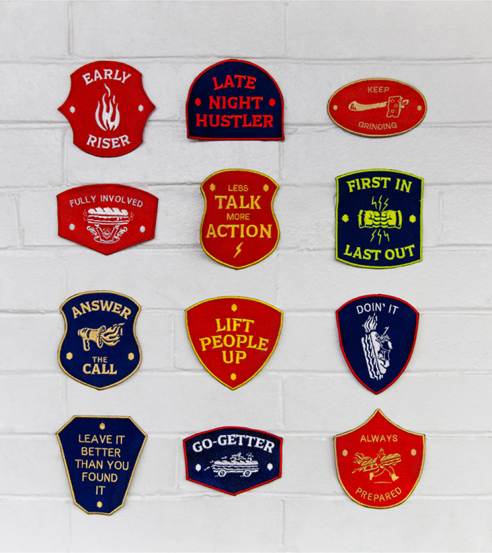
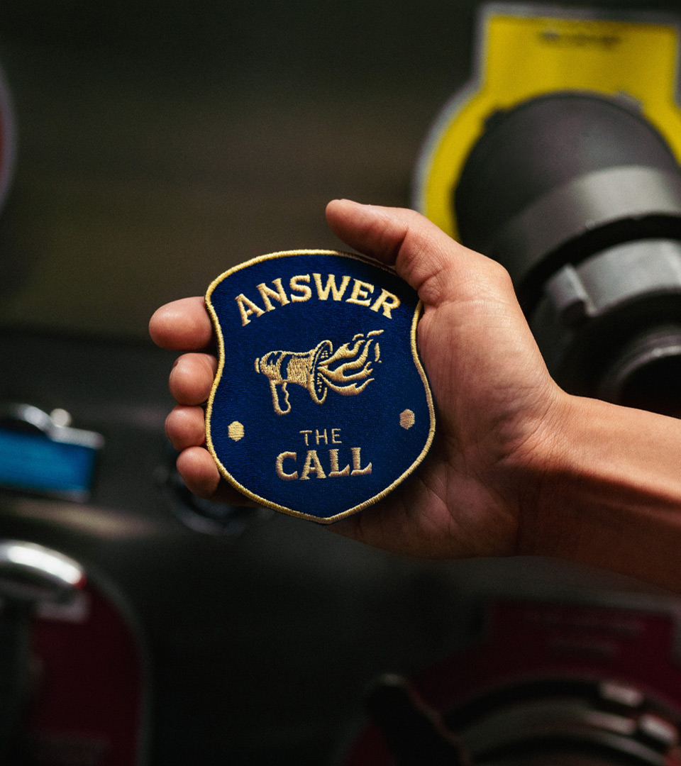
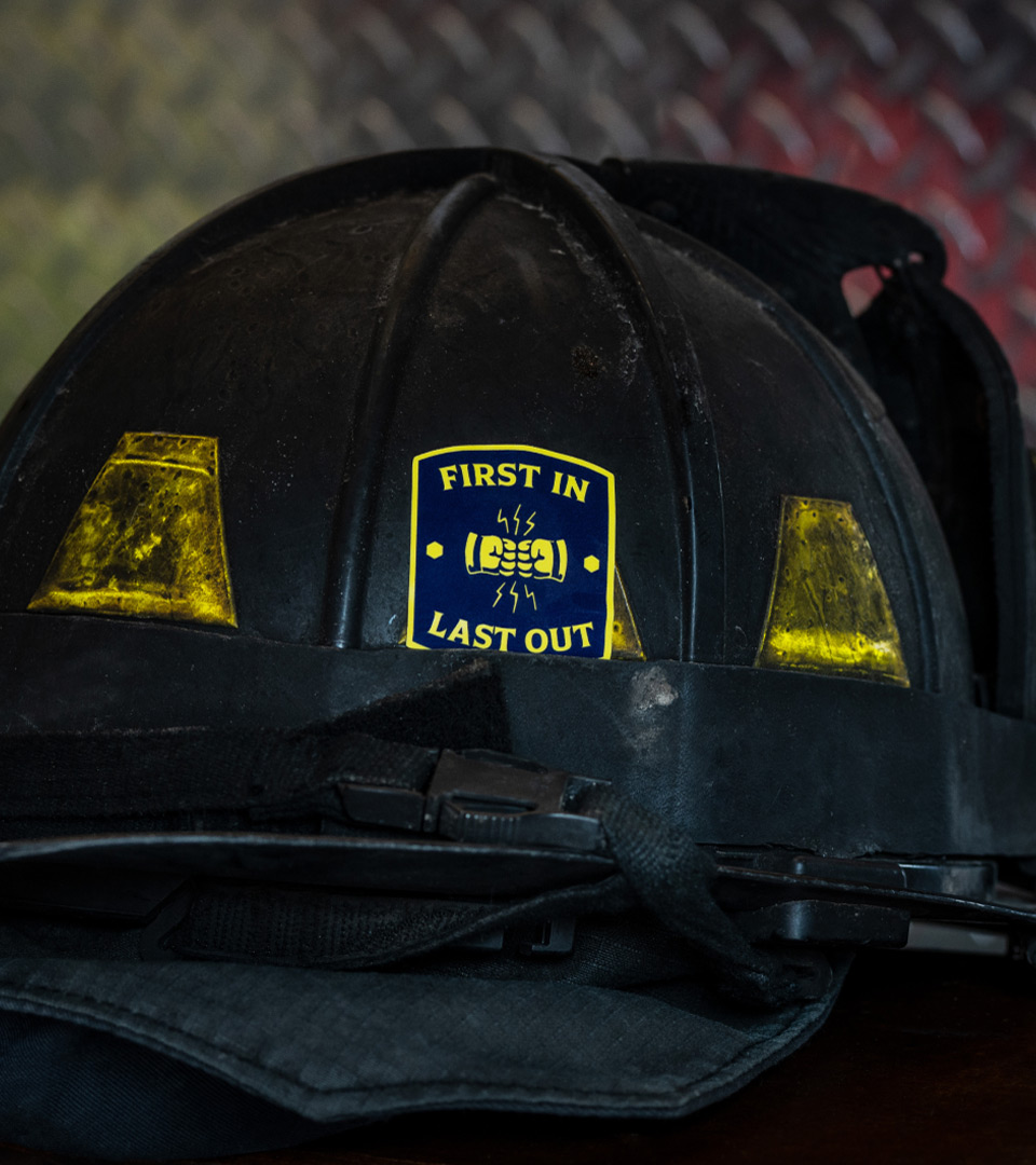
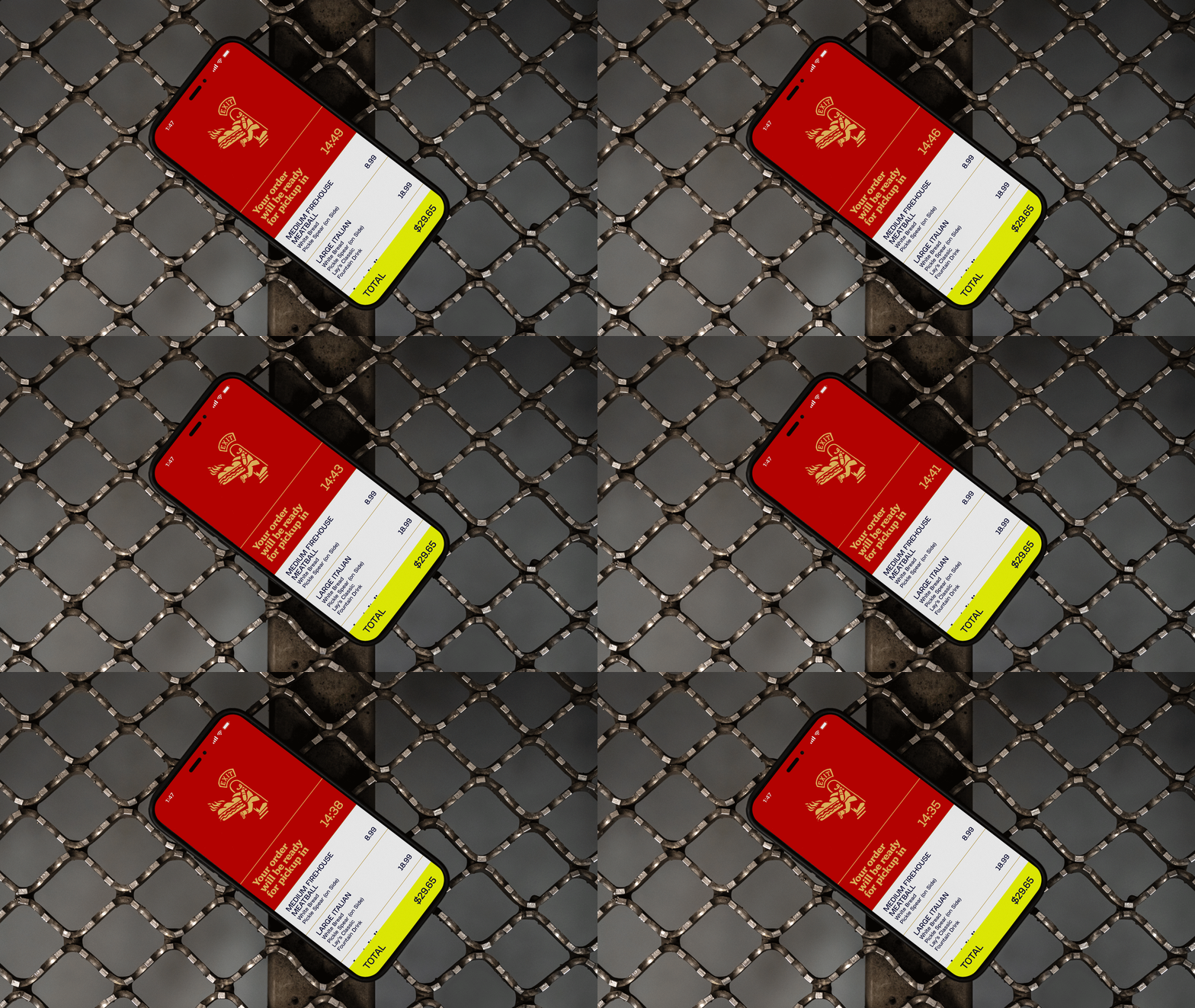
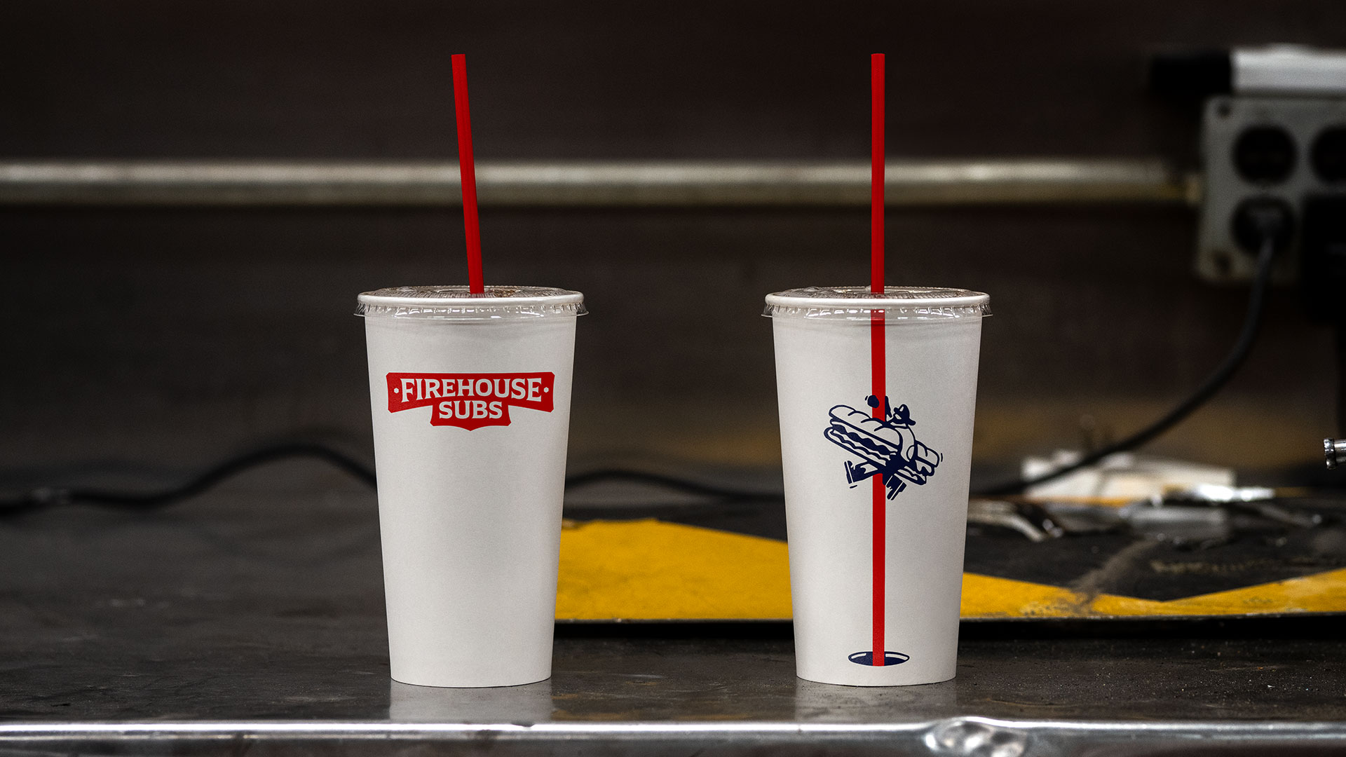
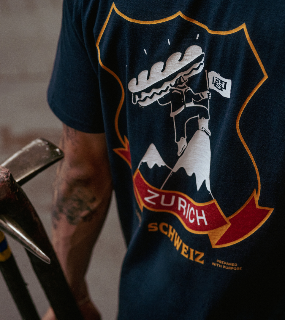
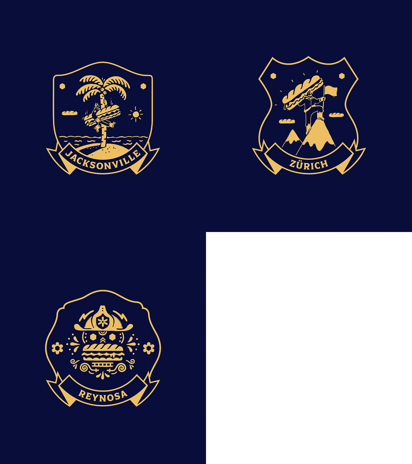
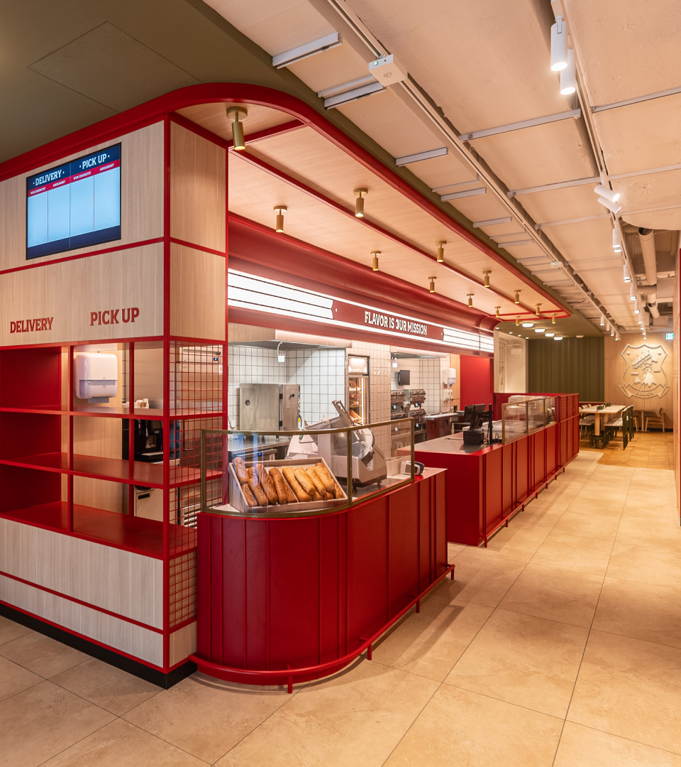
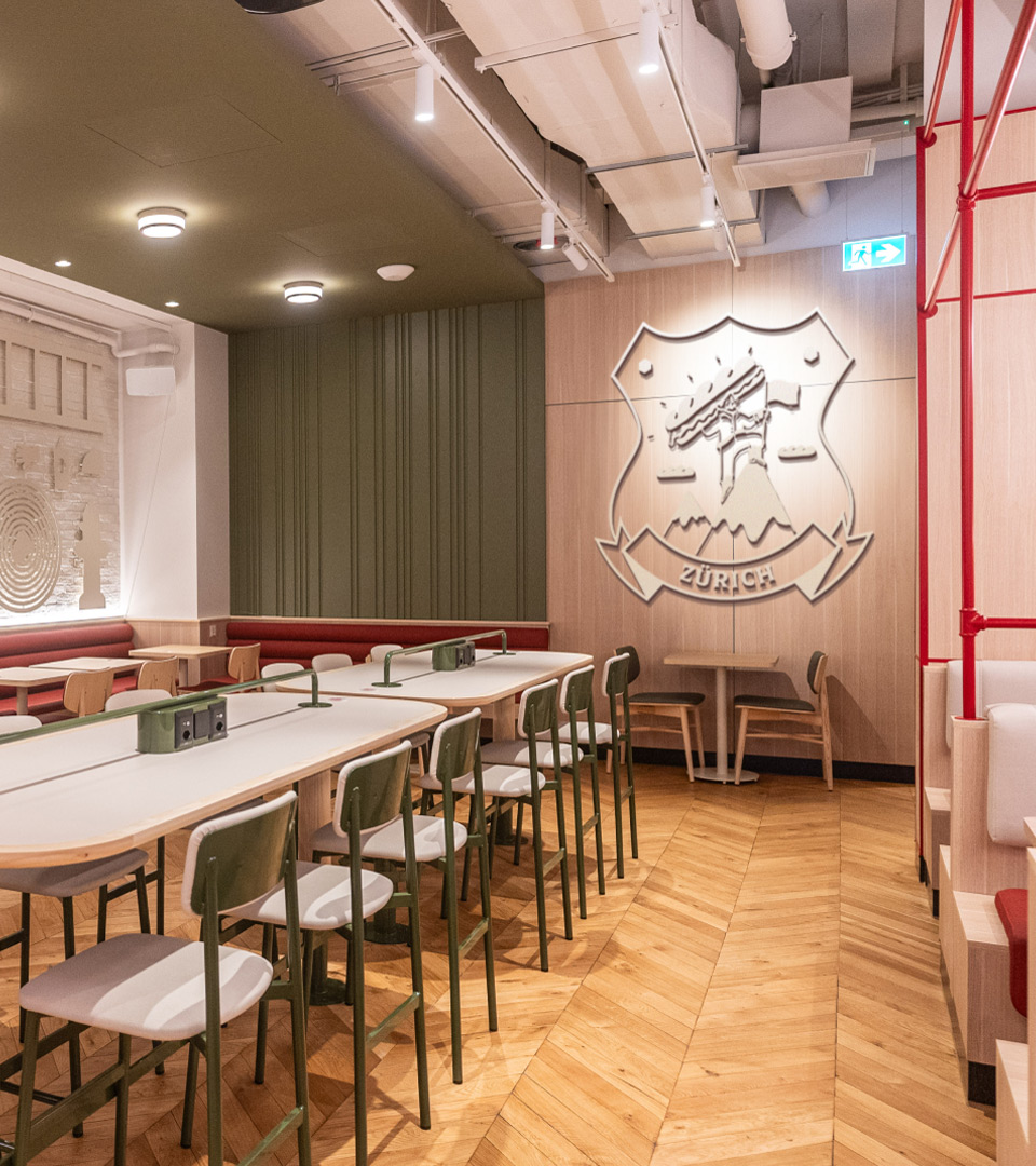
The first new Firehouse Subs restaurants are launching in Switzerland and Mexico; we worked with the FHS team to perfect the in-restaurant experience, materials, et al. and set up a scalable location-based badge system (inspired by firehouse t-shirts) for restaurant artwork and uniforms. Pre-launch renders and post-launch photographs of the Zurich location shown below.
PROJECT LINKS
CAPABILITIES
Branding
Creative Direction
Packaging
Experiential Design
Motion Design