For over 20 years, Sound Physicians has delivered transformative patient care (and bottom-line results) as one of the leading multi-specialty medical groups in the US. Yet their brand sold their story short by blending into the rest of the generic, corporate-feeling groups in the category.

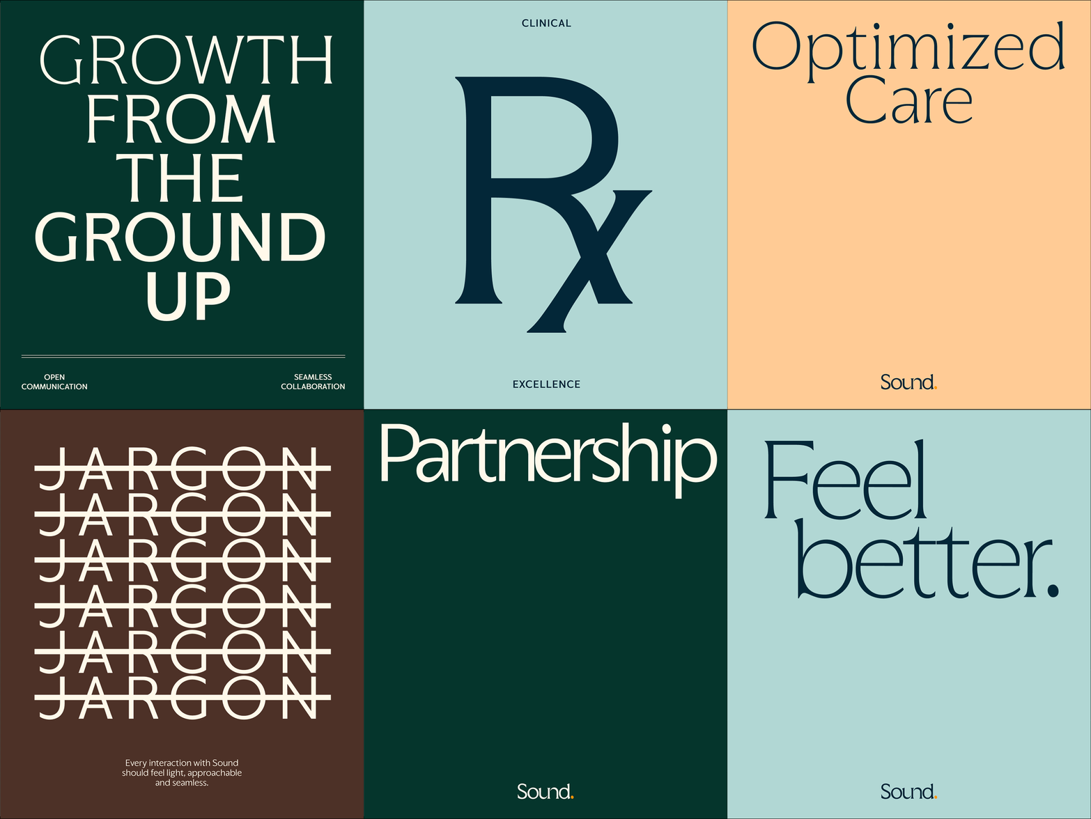
We transformed Sound’s brand around the concept of a care catalyst: a concentrated kick that can immediately accelerate business acumen and empathetic, dignified treatment–lightening the burden of care for patients, clinicians and healthcare systems everywhere.
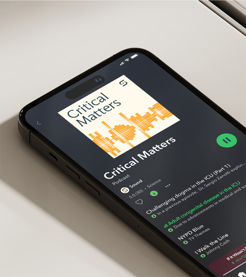
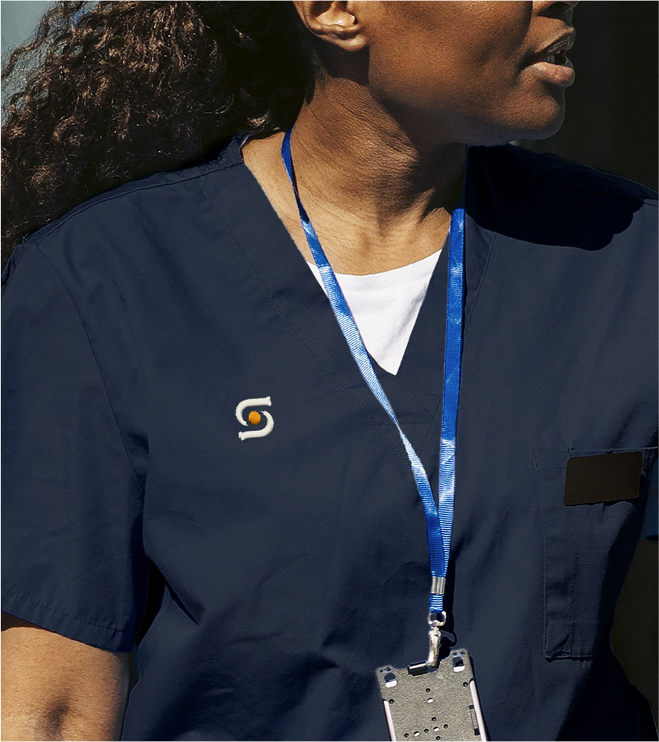
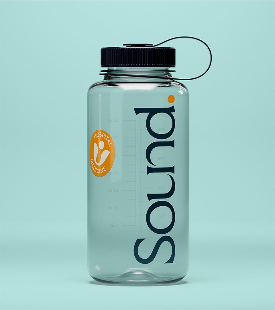
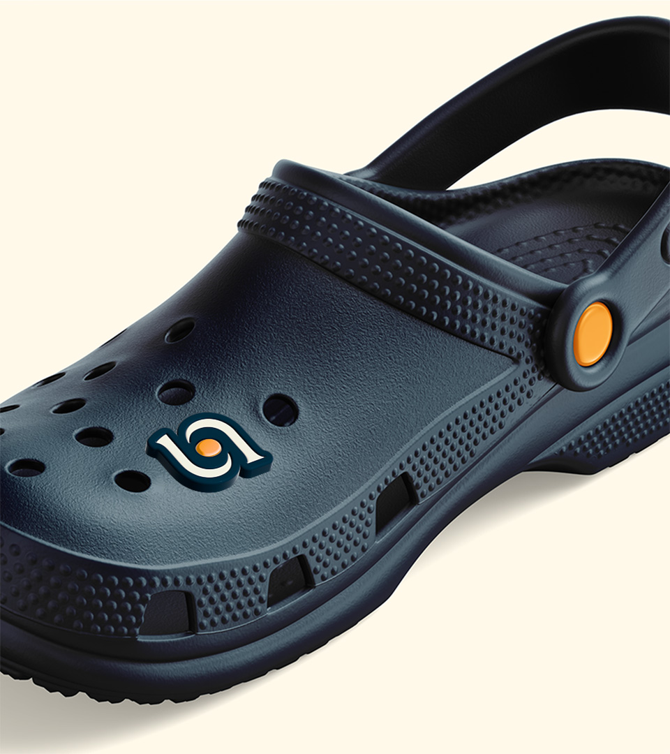
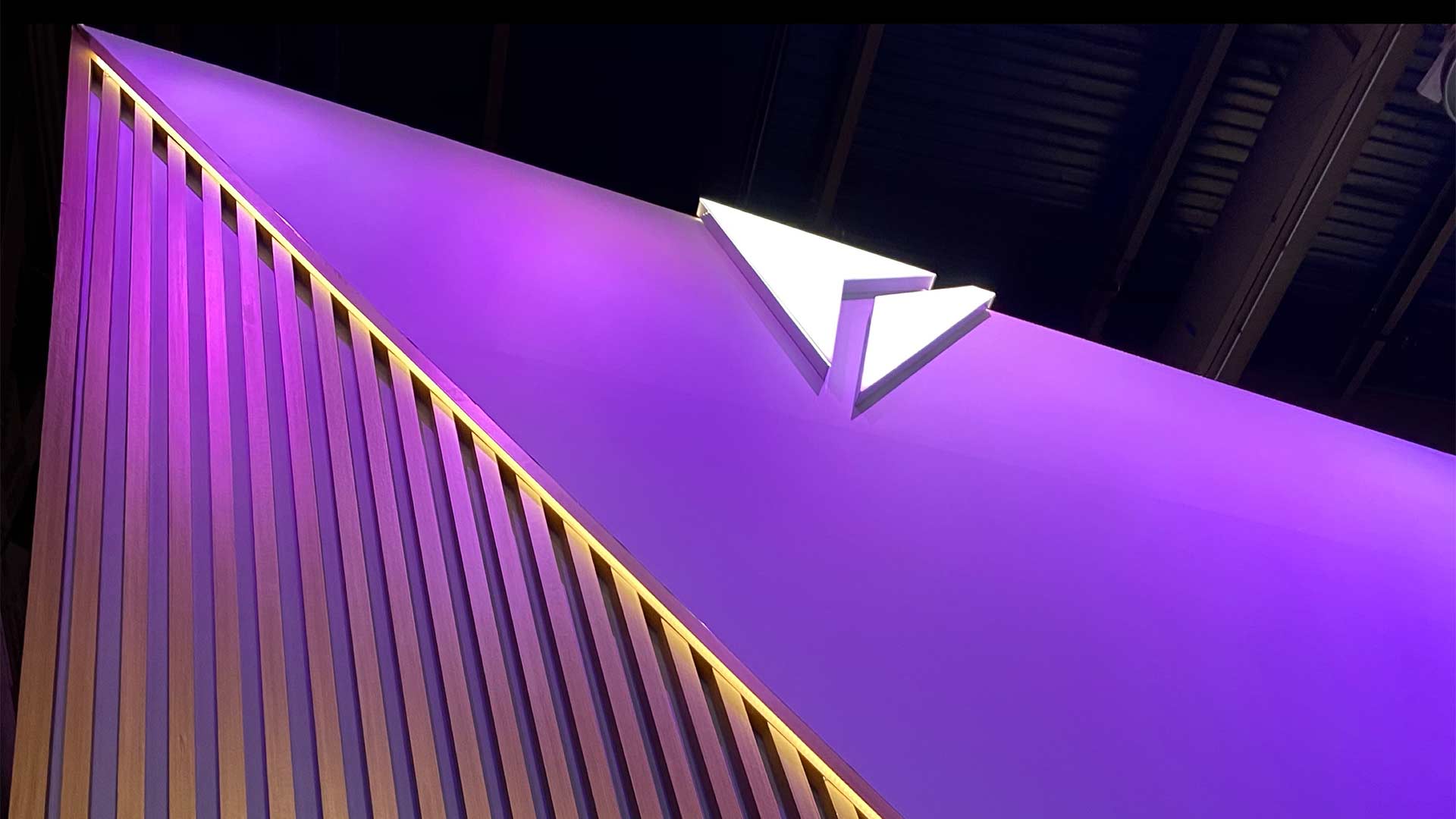
The new logo, monogram and brand positioning is built around the care catalyst idea–starting with a “catalyst” symbol (taken from the counter of the “o”) as our core building block. The logo style and architecture represents Sound as the network of empathetic experts that it is, emphasizing SOUND while allowing the now-smaller PHYSICIANS tag to be swapped out for other service lines as needed, or in some contexts removed entirely.

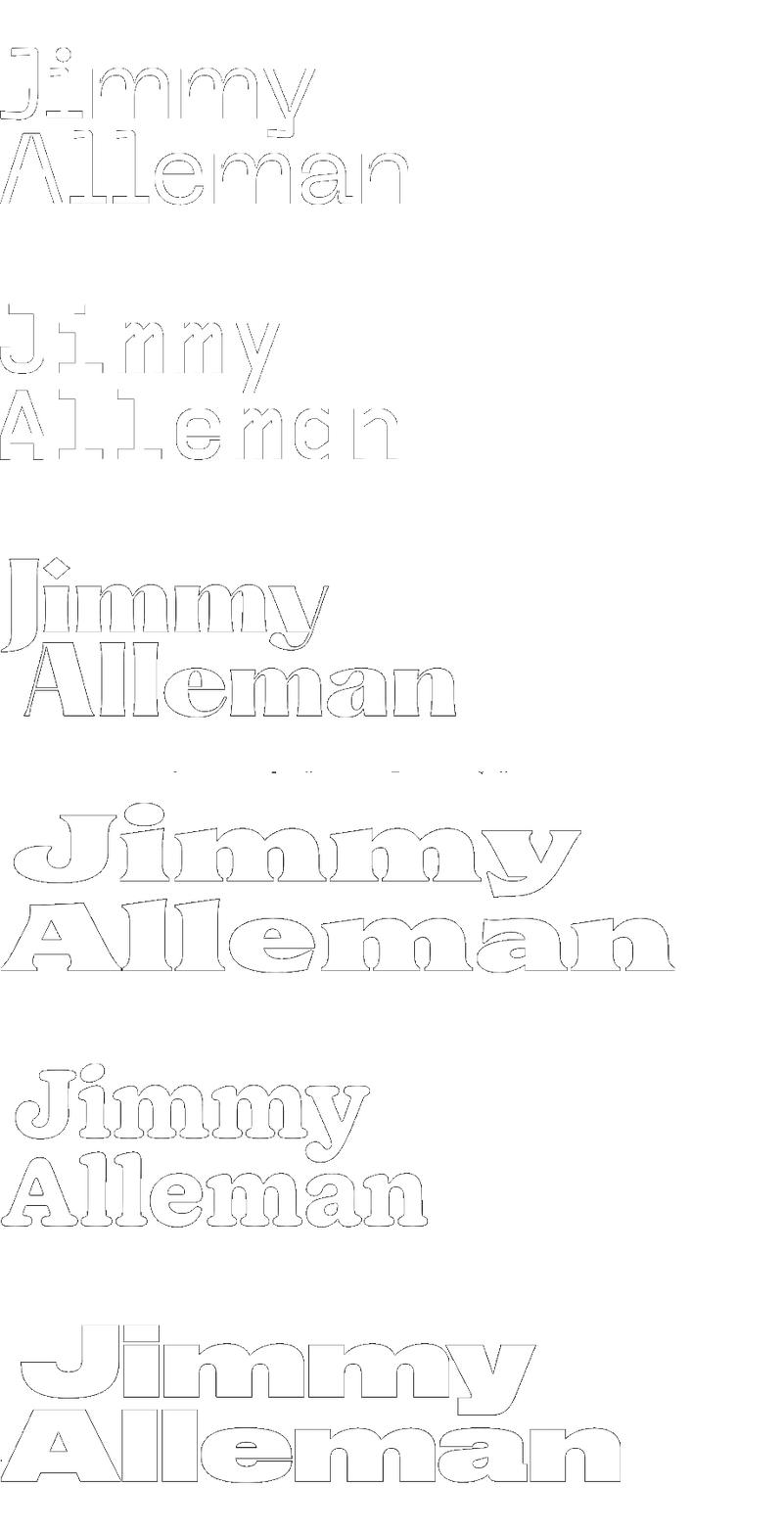
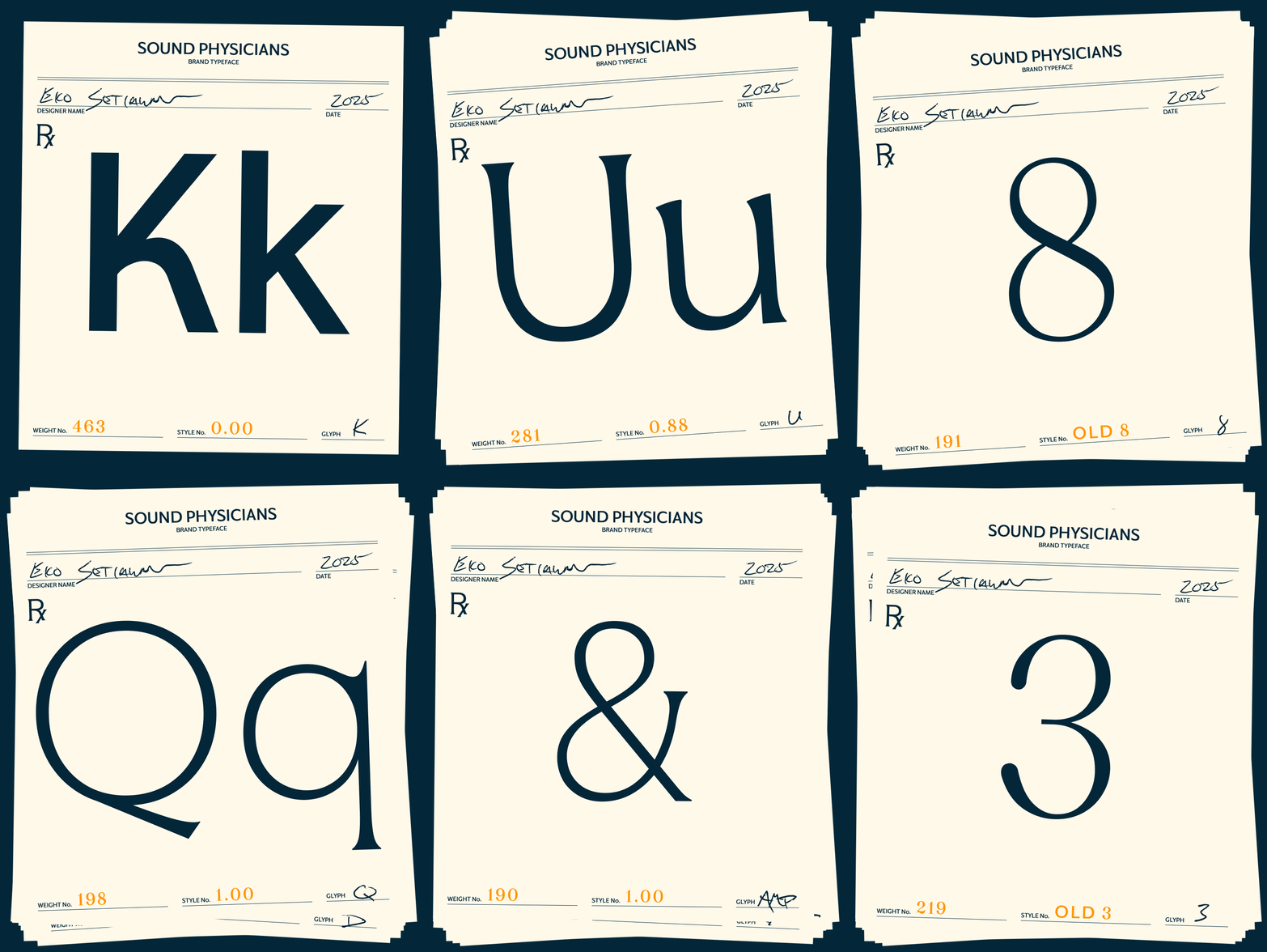
Sound’s wordmark extends to a variable typeface (both designed by Eko Setiawan) that seamlessly transitions from care-inspired serifs to business-inspired sans, in a range of weights. It also includes a set of decorative numerals, inspired by the stamps used on prescription cards from the days when you had a more personal relationship with your physician.
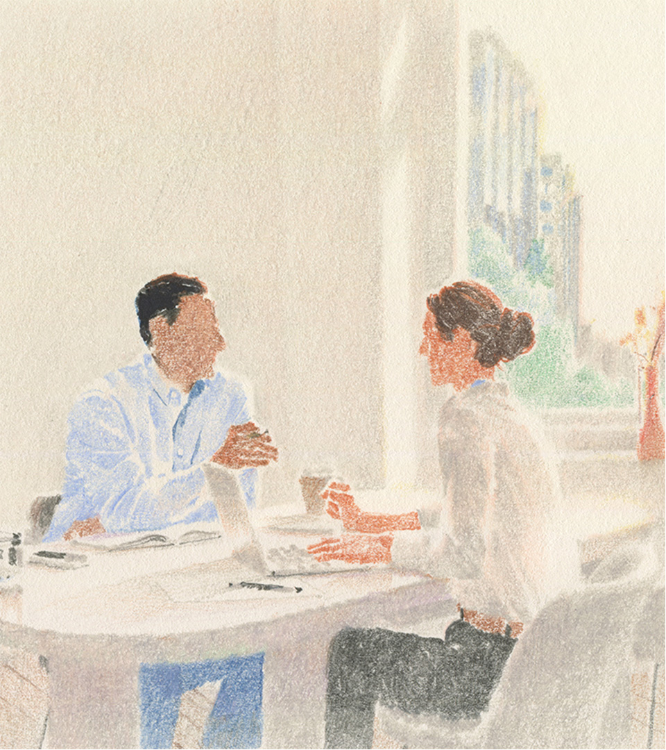
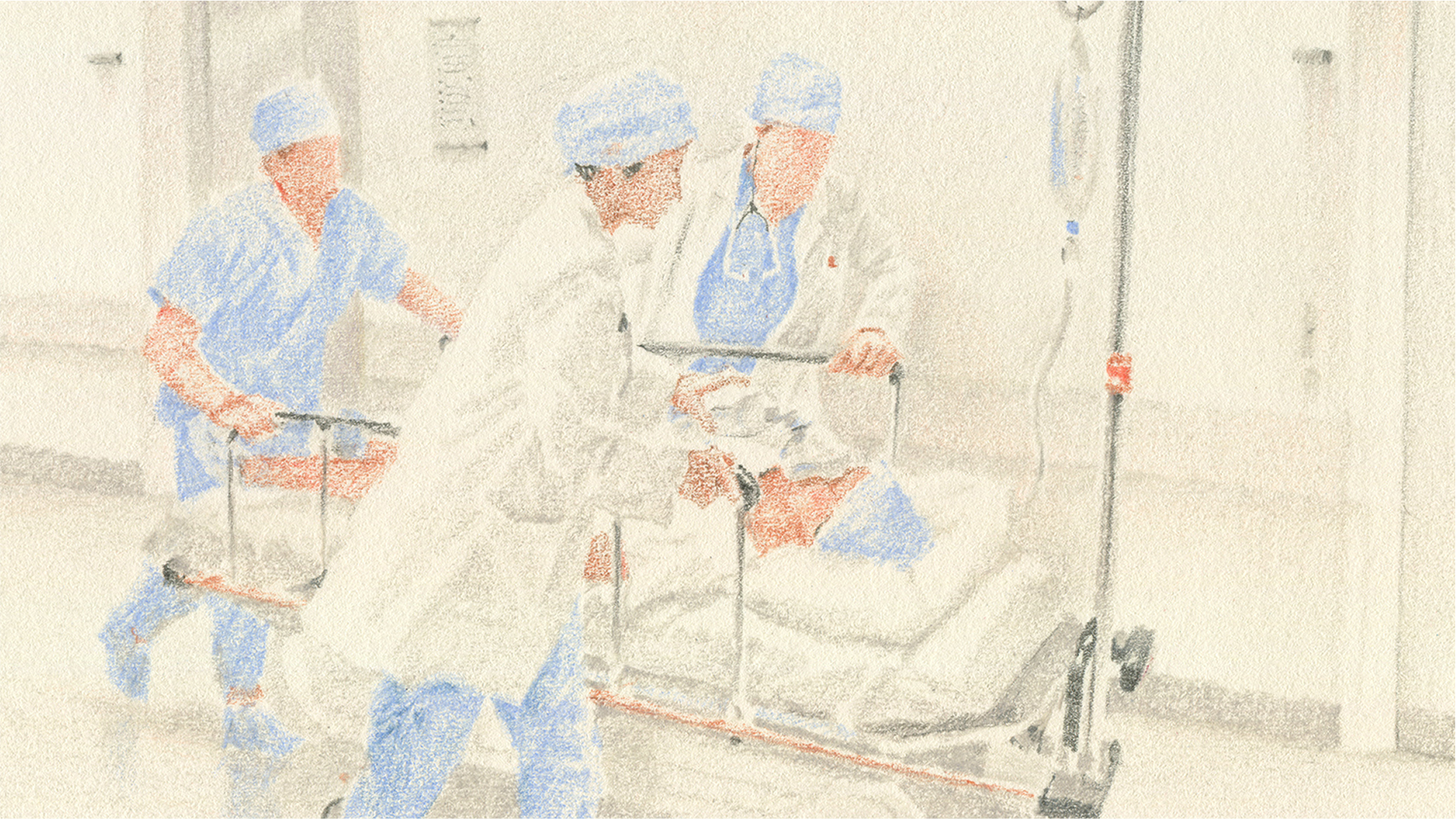
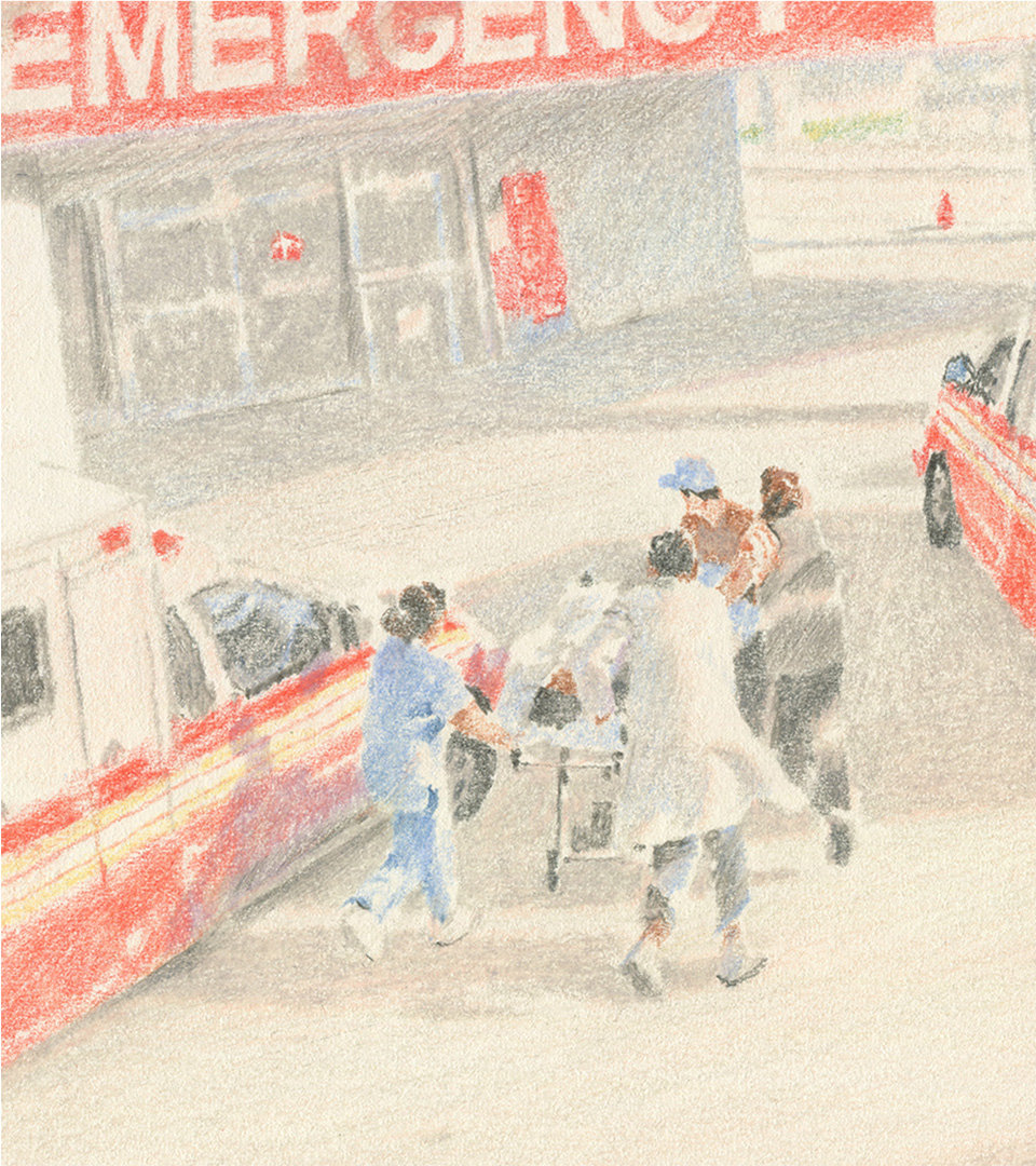
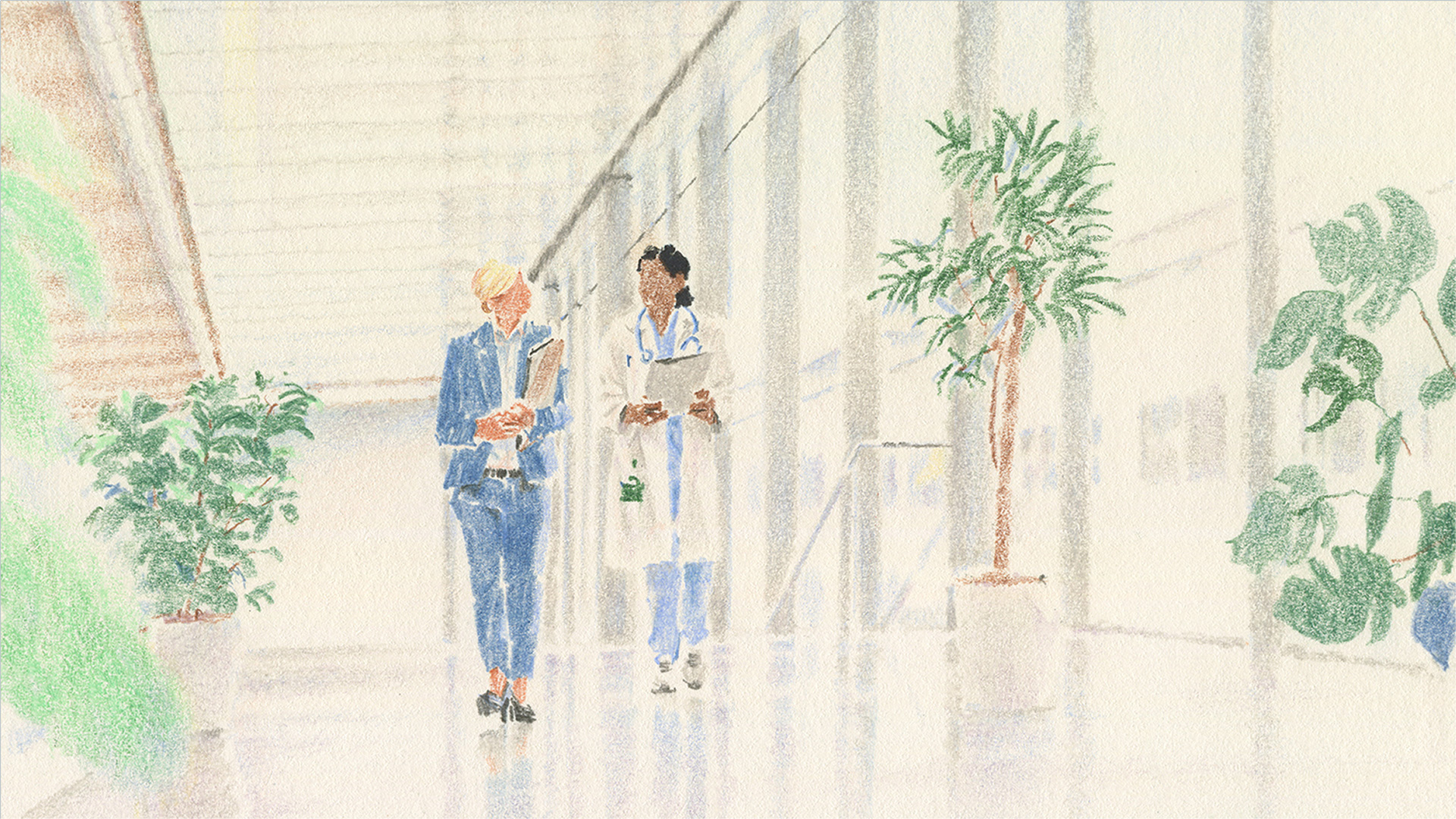
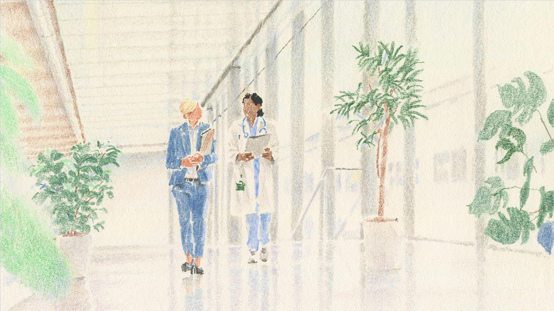
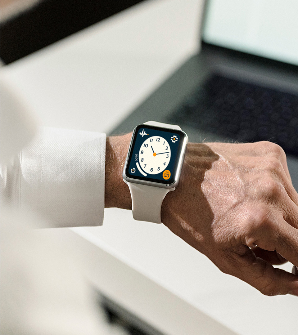
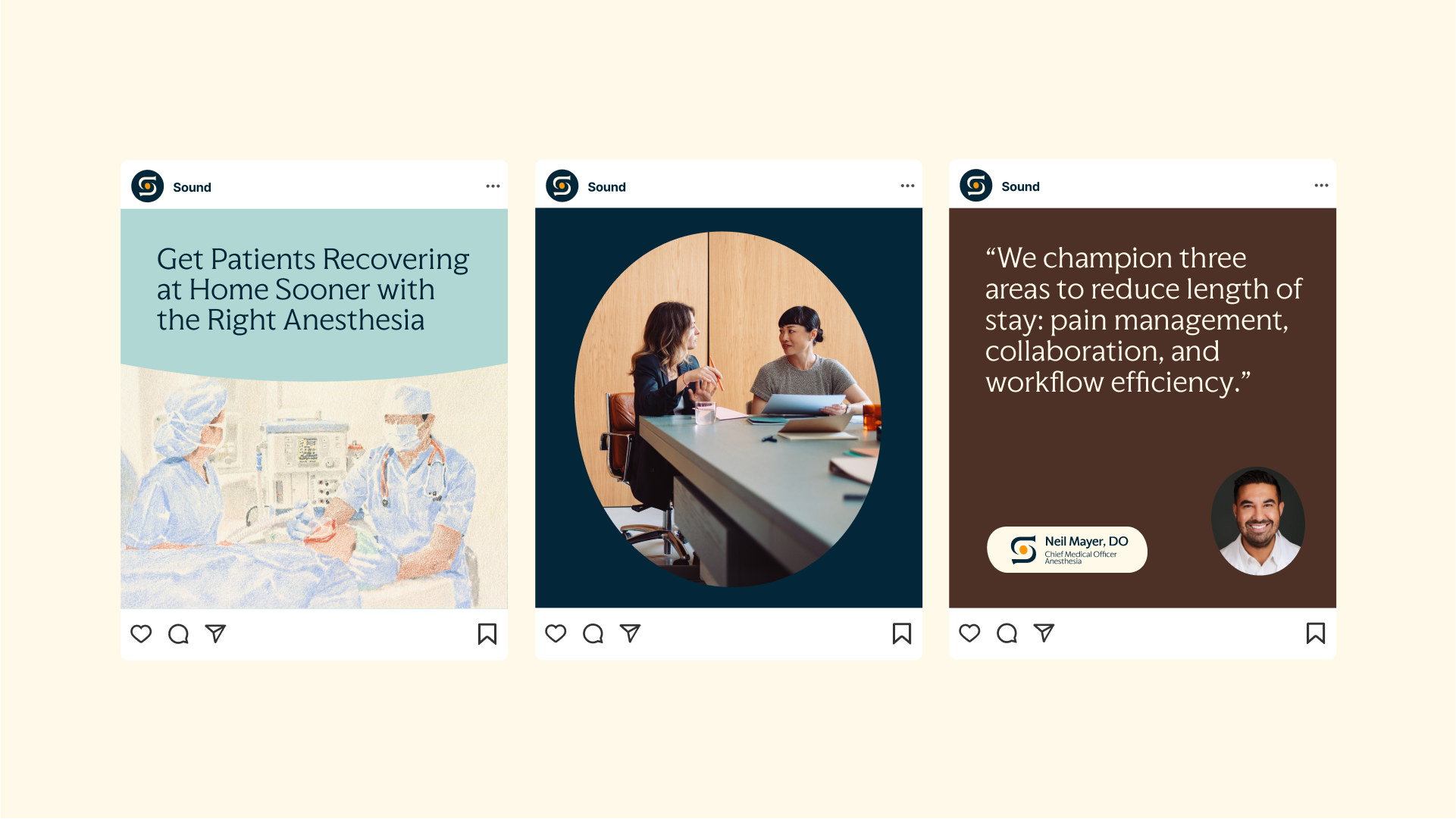
We commissioned Lee Kyutae to create a set of illustrated scenes showing the range of Sound’s service lines in action, in a medium inspired by classic Gray’s Anatomy medical illustrations.

Sound’s imagery library is accompanied by ambient motion graphics that reference the iterative, progressive visuals found in medical testing, results mapping and real-time health monitoring.

The care catalyst appears throughout the design system as a framework for layouts, a persistent UI motif, and a foundational accent in type and information design.
PROJECT LINKS

Brand New Review

CAPABILITIES

Branding

Creative Direction

Type Design

Motion Design
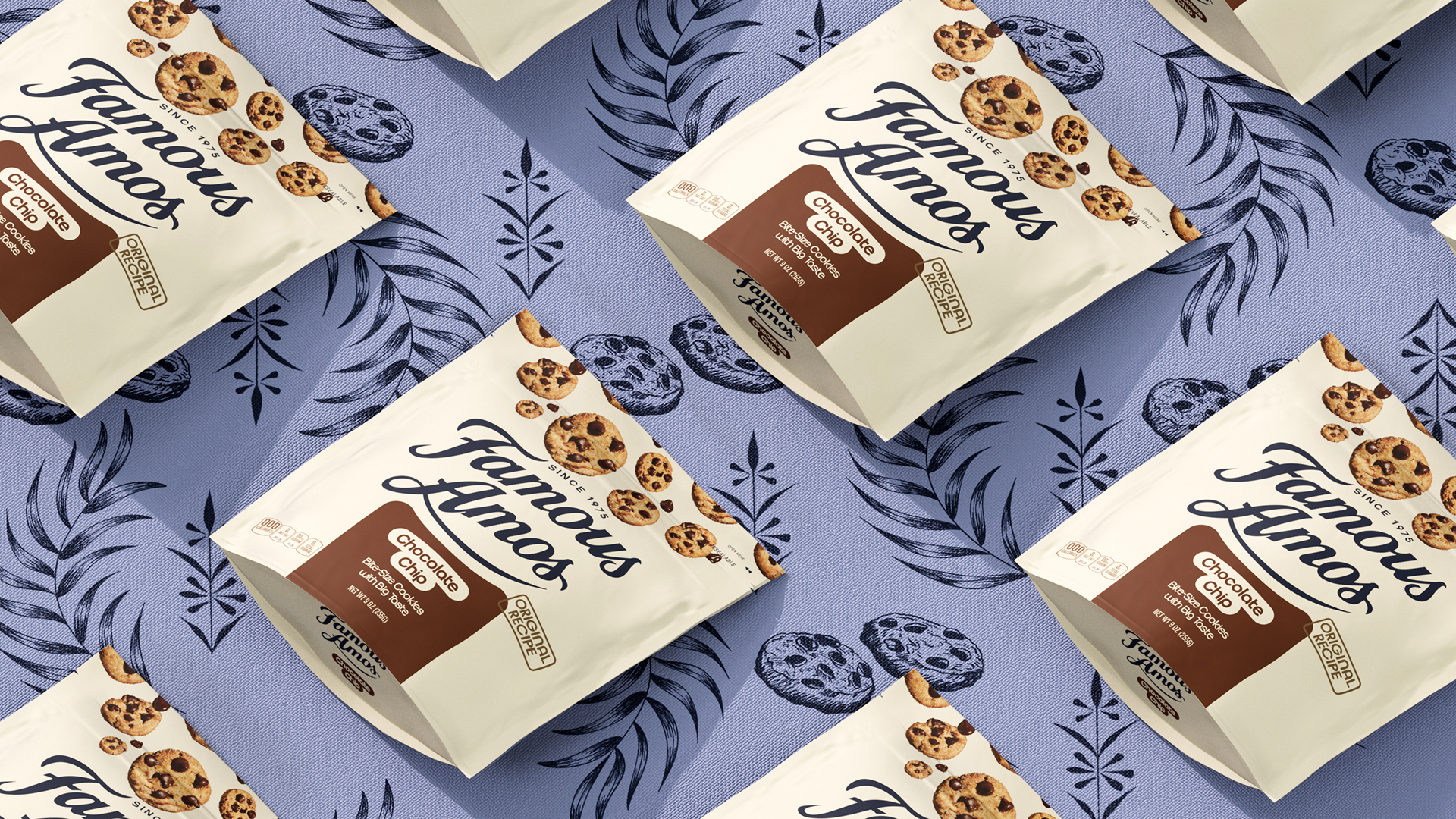
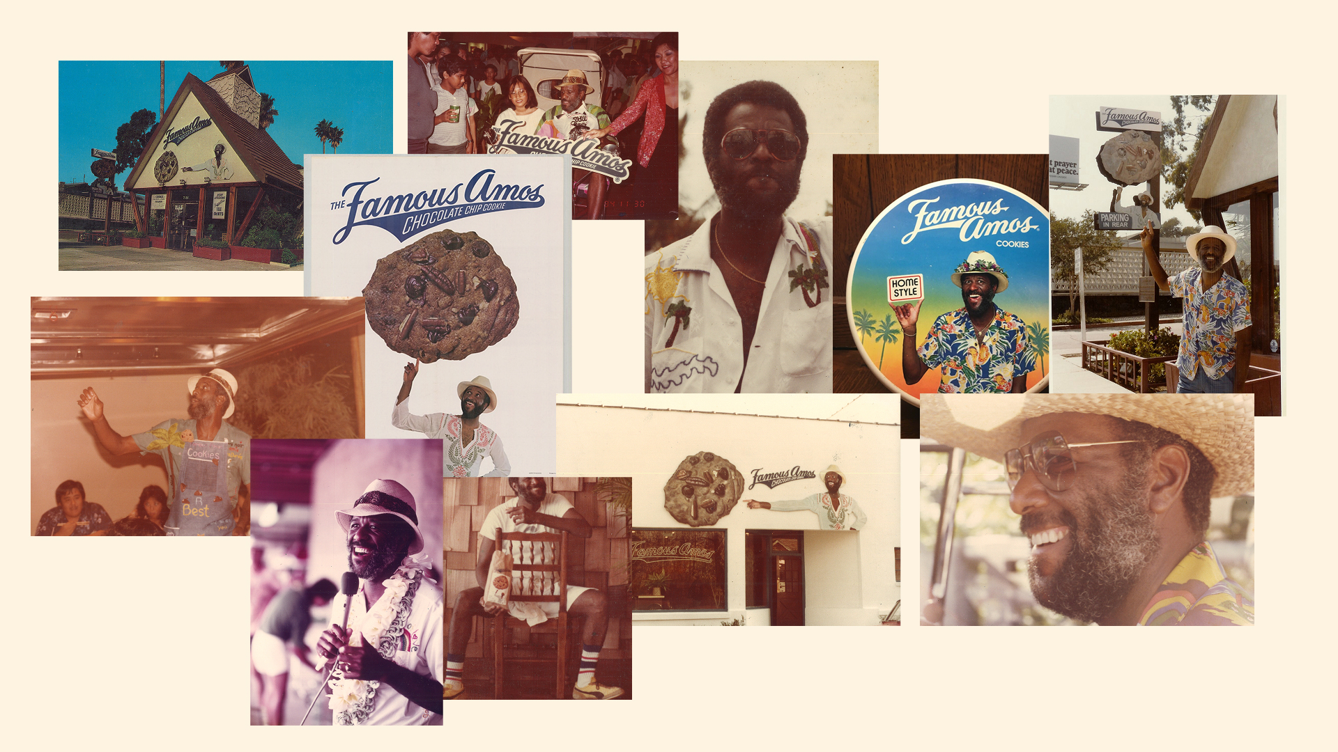
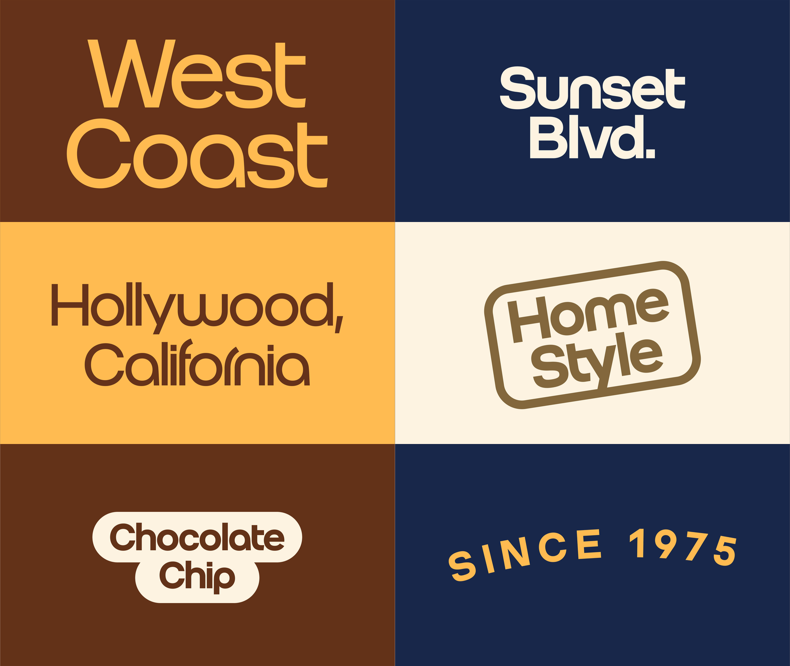
Famous Amos is a bite-size crunchy cookie brand with a truly original founder. Wally Amos was a music talent agent in Hollywood, “famous” for bringing fresh baked cookies to meetings with artists and reps. He opened the original Famous Amos location on Sunset Blvd. in Hollywood, with investments from artists & icons like Marvin Gaye and Helen Reddy. We helped them reclaim their roots and evolve: from east-coast, cookie-cutter-classic vibes, to a cornucopia of west coast cookie energy; inspired by Wally’s unmistakable personality & style.

We simplified the Famous Amos logo as a nod to some of our classic wordmarks, and for better clarity and functionality across both print and digital mediums/formats.

We celebrate our west coast heritage with Roko, created by Erik Marinovich. It references 70’s-era Los Angeles and the stamps featured on the original Famous Amos packaging.

Roko is accompanied by Sunset Script – a custom font designed by Eko Setiawan that acts as a tasty extension of our wordmark.

Wally loved (and ultimately relocated to) Hawaii, and could usually be seen sporting a variety of Hawaiian shirts. We honored his signature style with new accent colors and a library of illustrated patterns, featuring hidden cookies and chocolate chips throughout. Each pattern is tile-able and available in several colorways.

We’re also turning up the volume on taste. Our cookies are bite-size, crunchy, and meant to be enjoyed by the handful. We show that off through artwork made from stacks of cookies – cookie patterns, cookie drops, cookie cutouts – each treatment dialing up the big taste in every bite.

PROJECT LINKS

Brand New Review

CAPABILITIES

Branding

Creative Direction

Motion Design

Packaging

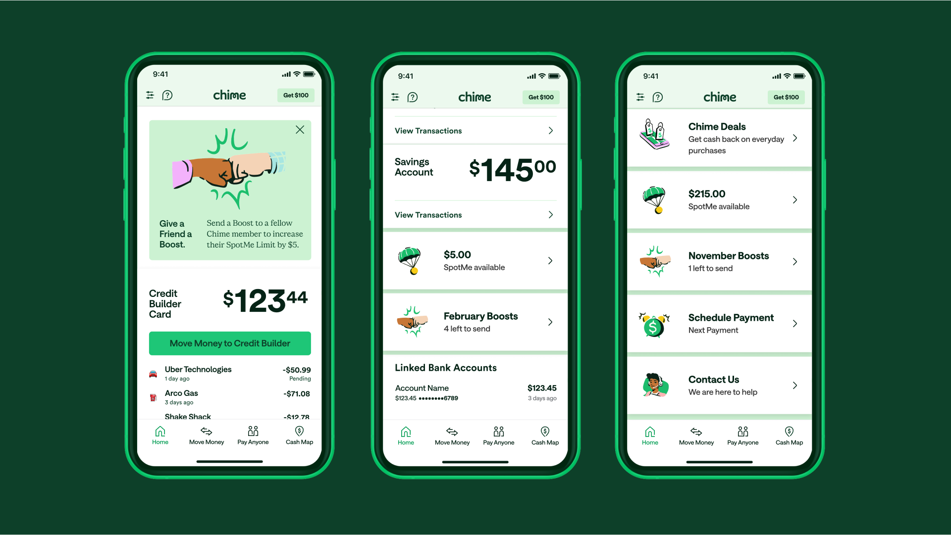
Chime needed to grow up their brand to reach new, more aspirational segments and compete with big banks—without losing their cultural relevance. We made sure to honor their history and key signature assets, while evolving their visual identity to activate their new mission of “uniting everyday people to unlock their financial progress”.

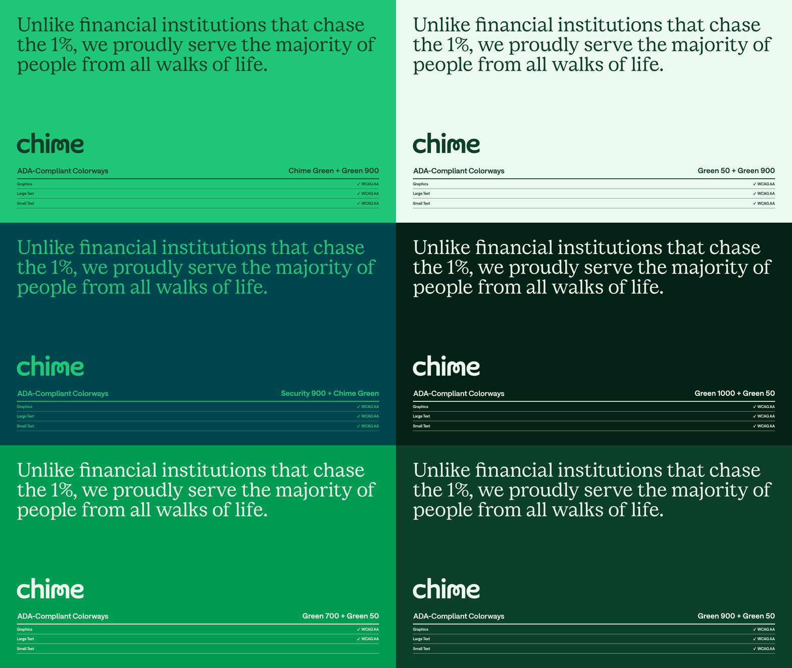
Chime’s old color palette was limiting; Chime Green + white didn’t meet ADA compliance, which led to channel-specific solves and a lack of consistency. The secondary colors were all the same value as Chime Green, so it was impossible to combine without having colors vibrate.

We expanded Chime Green to a series of tints and shades, while introducing a new secondary palette inspired by the emotions our audience associates with financial progress. This amplifies Chime’s new mission while promoting accessible color combinations and ensuring their green DNA is always present.

We cue a foundation of stability with a tailored version of Saans by Displaay) that feels smarter and more direct, with increased functionality and accessibility.

It’s complemented with a custom secondary serif (designed in collaboration with our friends atColophon) that adds credibility without sacrificing personality.

For type-led compositions, we amplify the idea of unlocking with a custom set of “unlocked” characters from Colophon. Each character is a seamless transformation of its Chime Saans base; free, expressive and forward-moving.

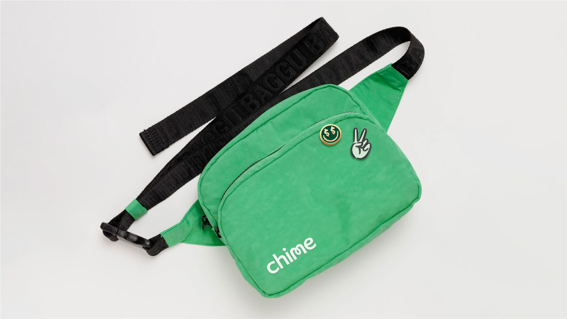
Letters can also be unlocked with a set of Chime-mojis, drawn by Marco Palmieri.

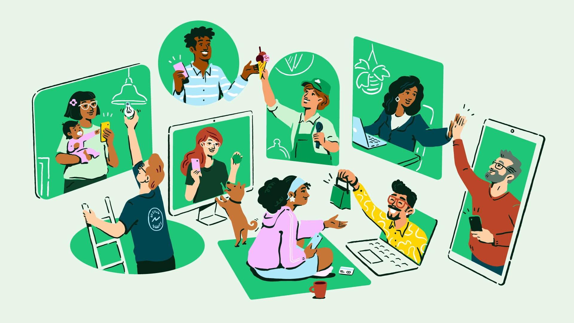
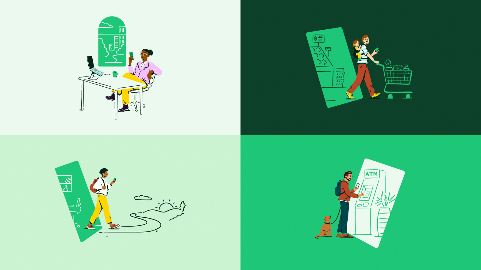
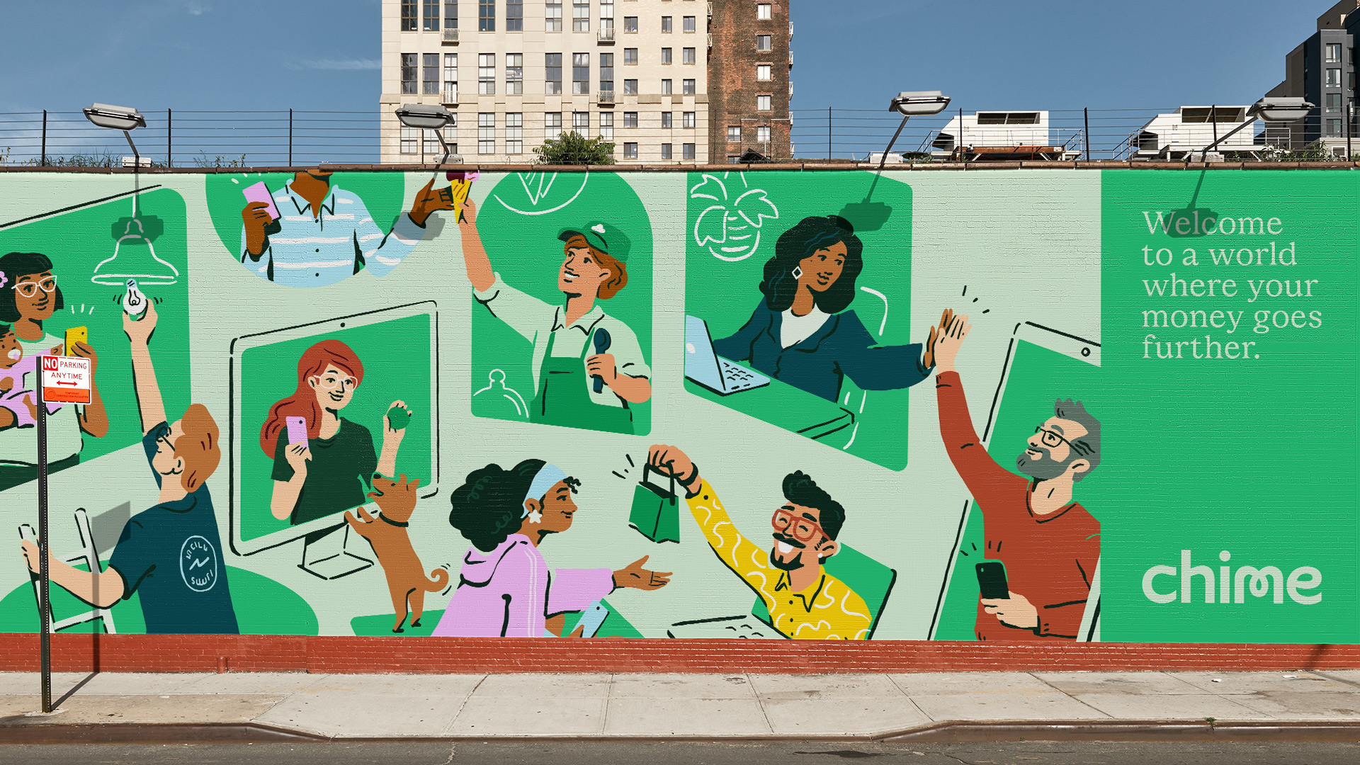
We invite people into Chime’s world of financial progress with a series of illustrations that raise the bar for what representing Chime’s community looks like (also drawn by Marco Palmieri).

Our focus was on representing true diversity, using realistic body proportions/anatomy; natural skin tones from the Von Luschan and Fitzpatrick scales; and making sure that things like hair color, facial features and wardrobe celebrate our community’s range of personalities and cultures.

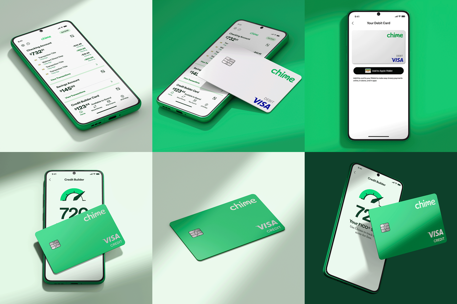
Portals are at the center of how we activate Chime’s brand mission—either with actual products that transform into worlds of financial progress, or more open-ended, metaphorical representations of progress.

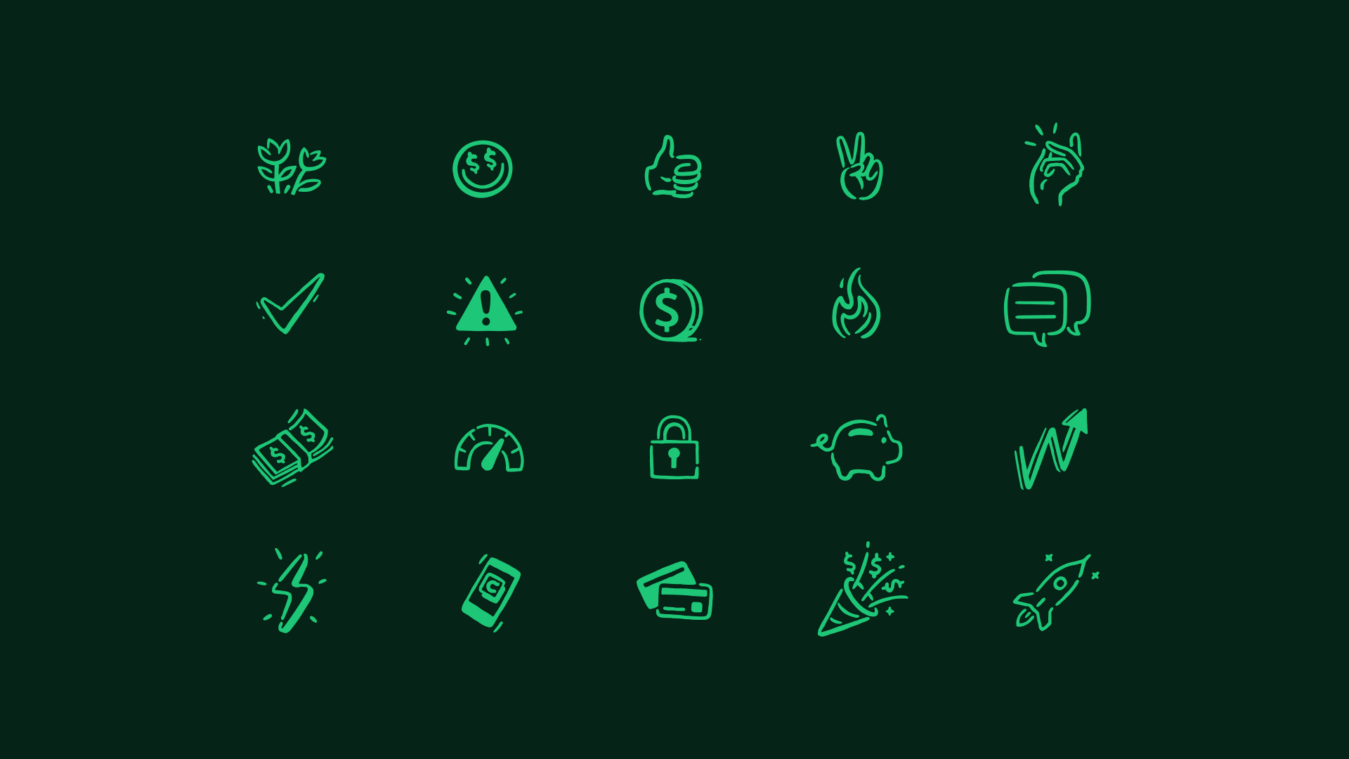
Chime’s illustration style extends to every touchpoint, including a responsive set of feature icons that accommodate all product and marketing design use cases.

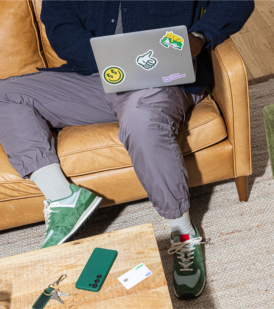
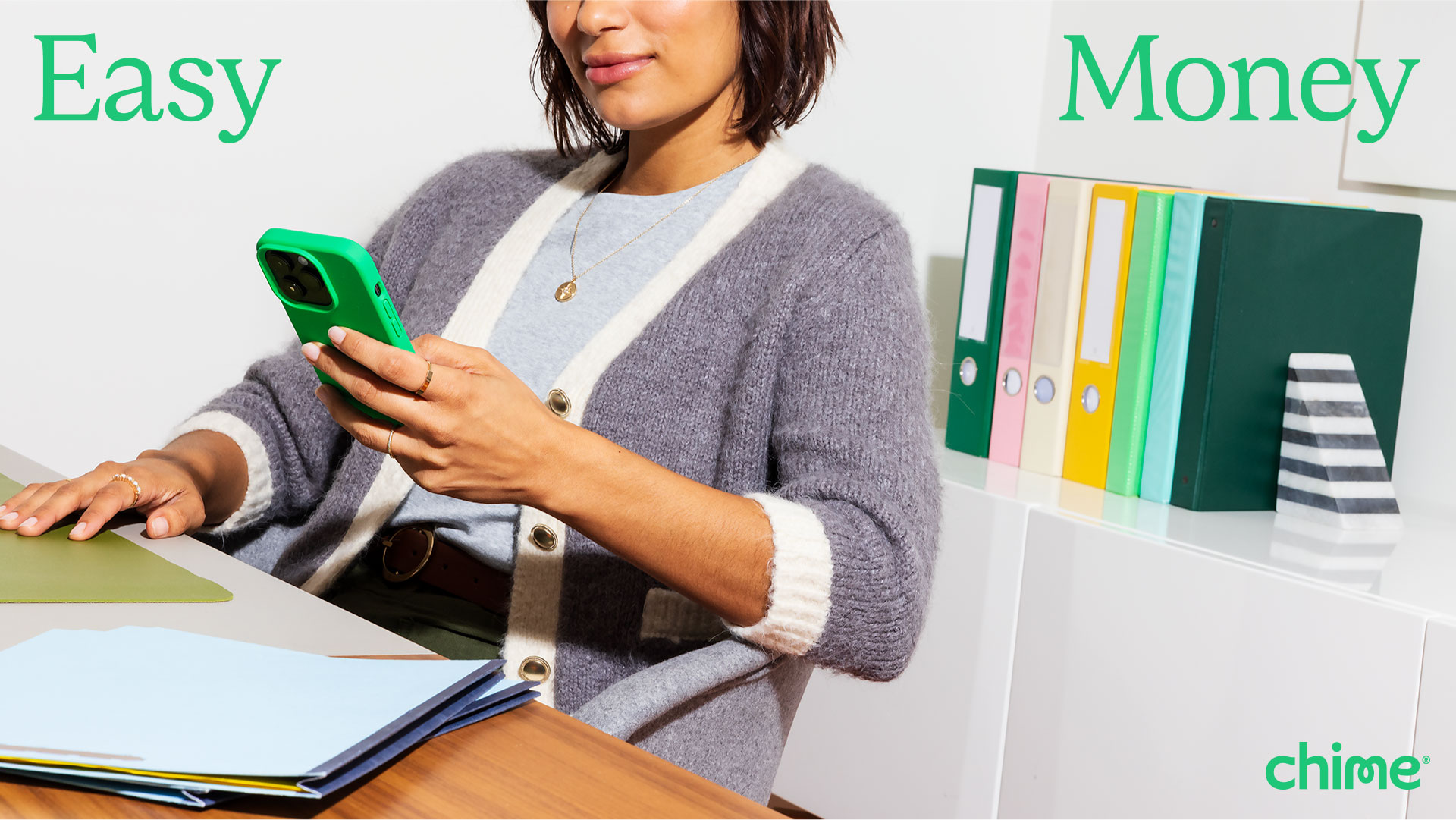
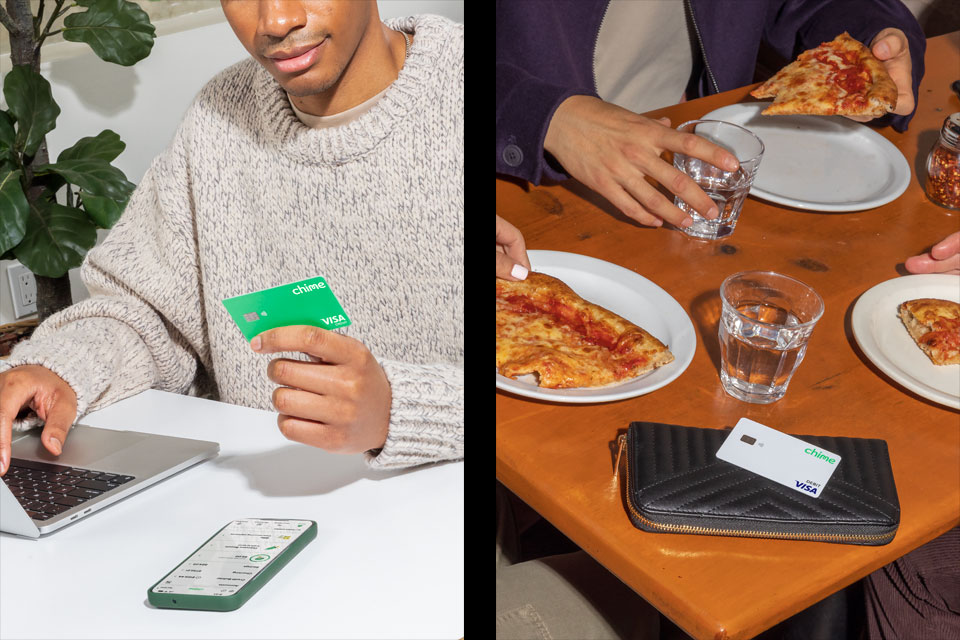
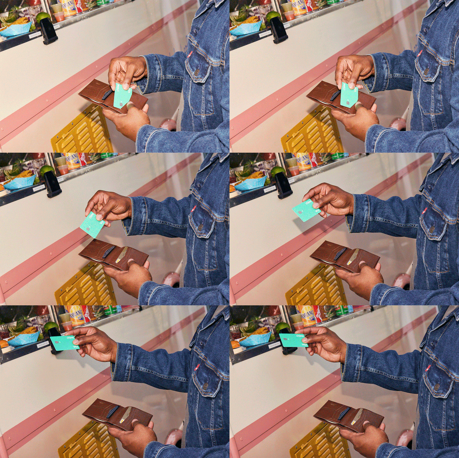
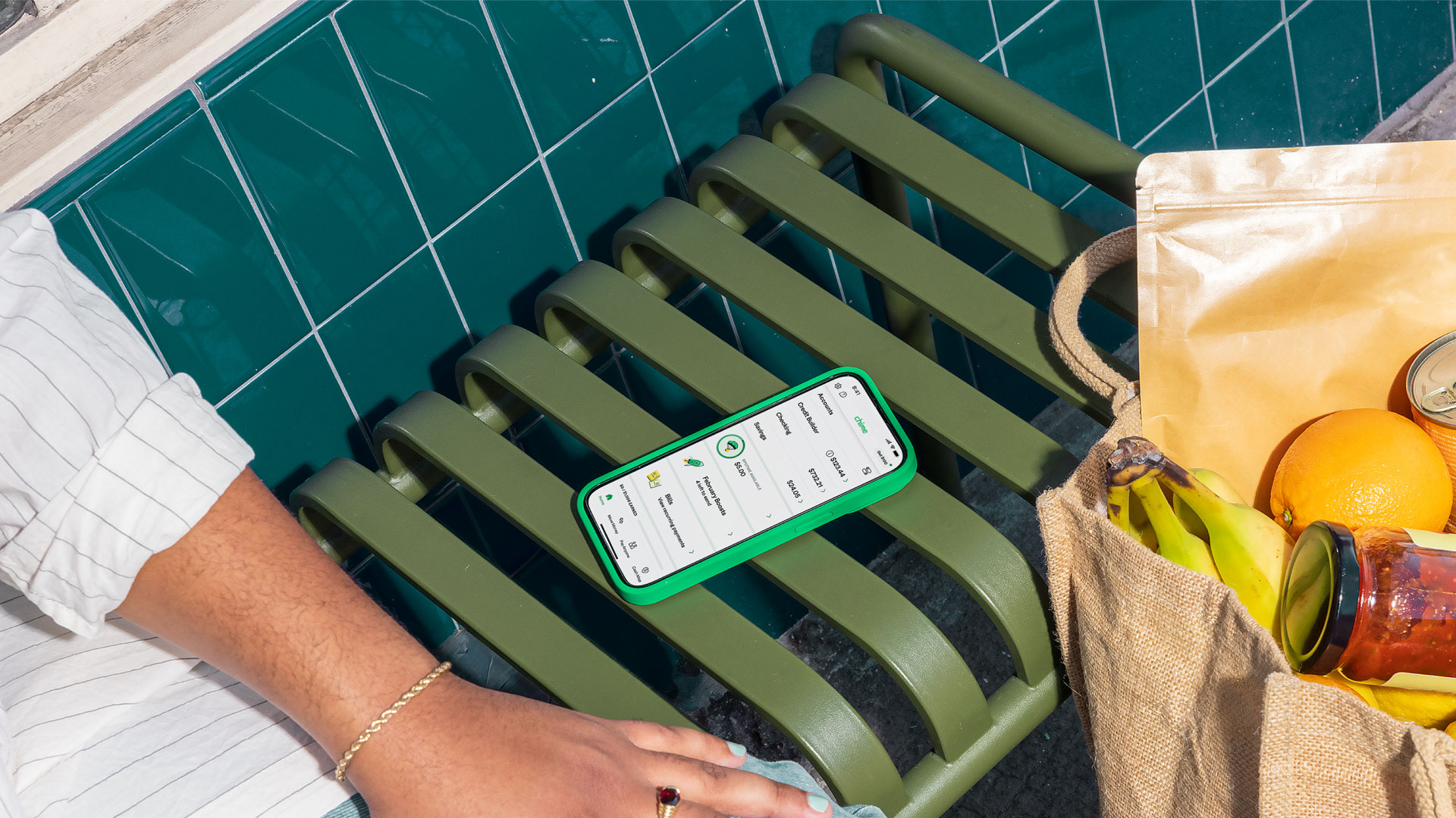
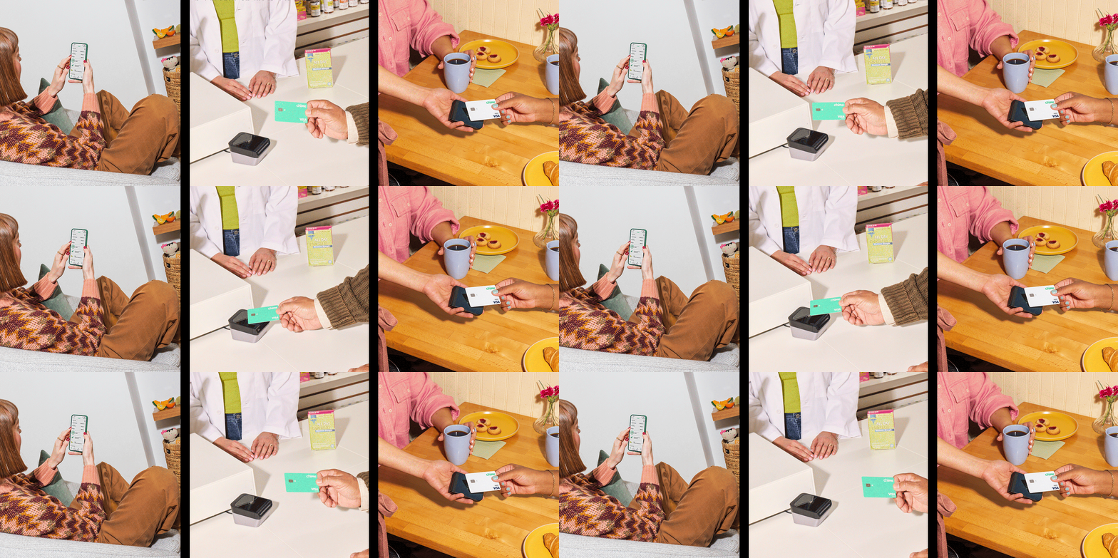
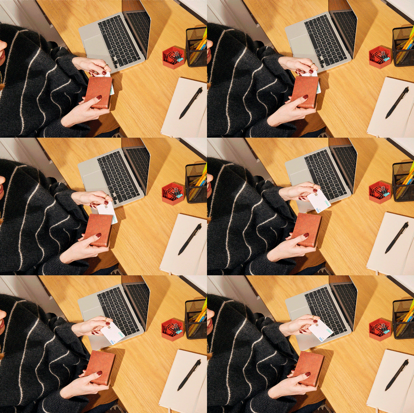
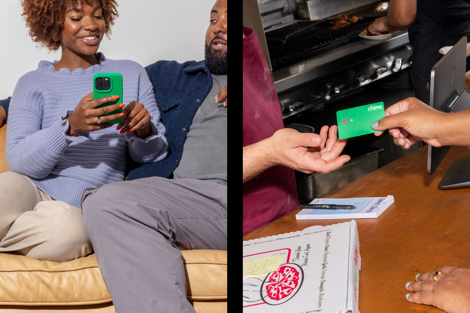
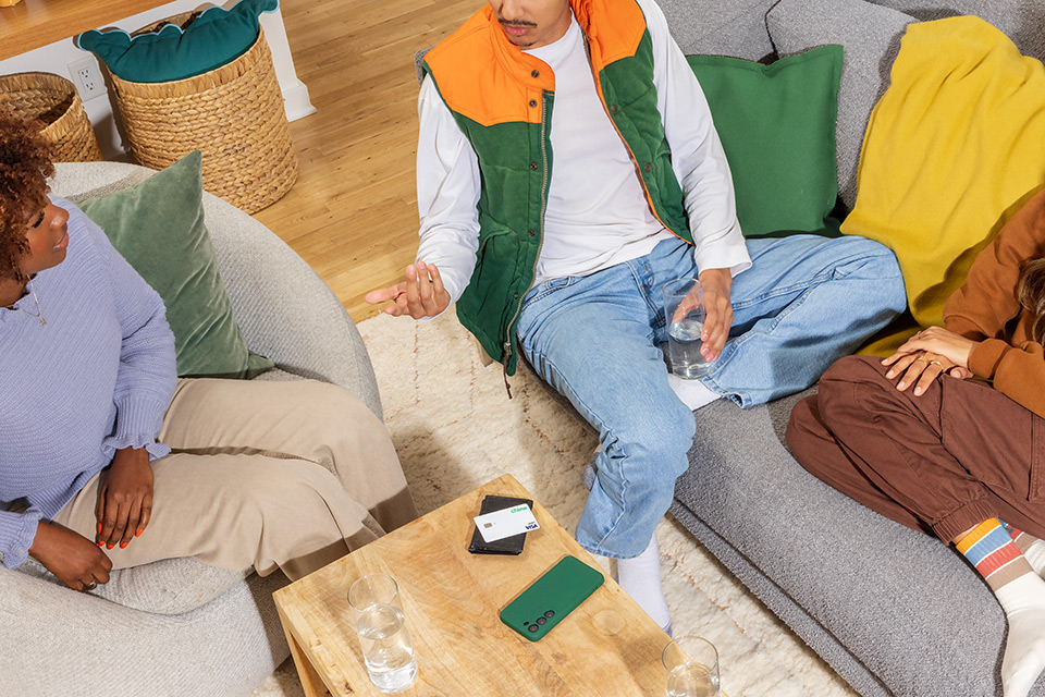
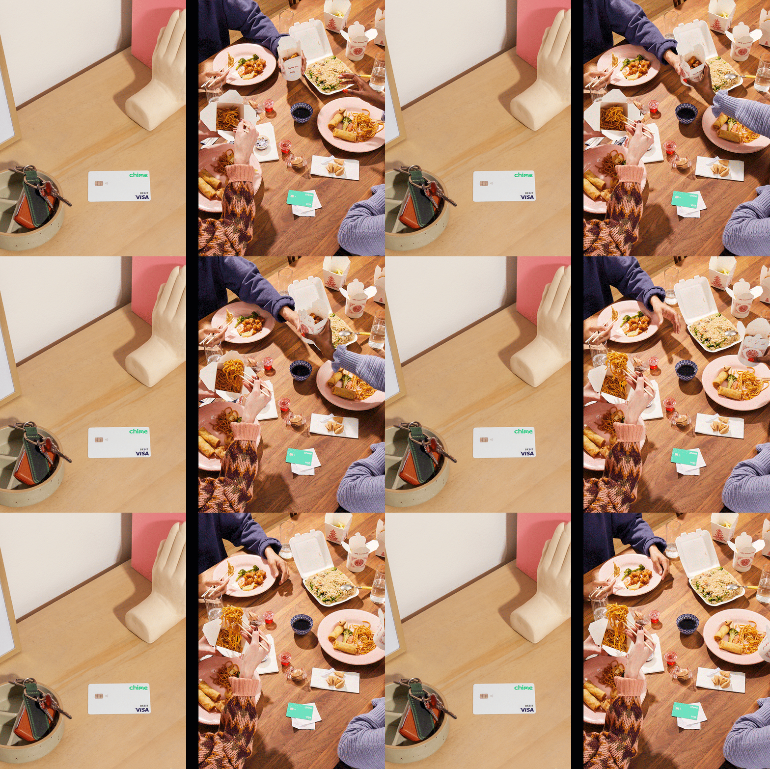
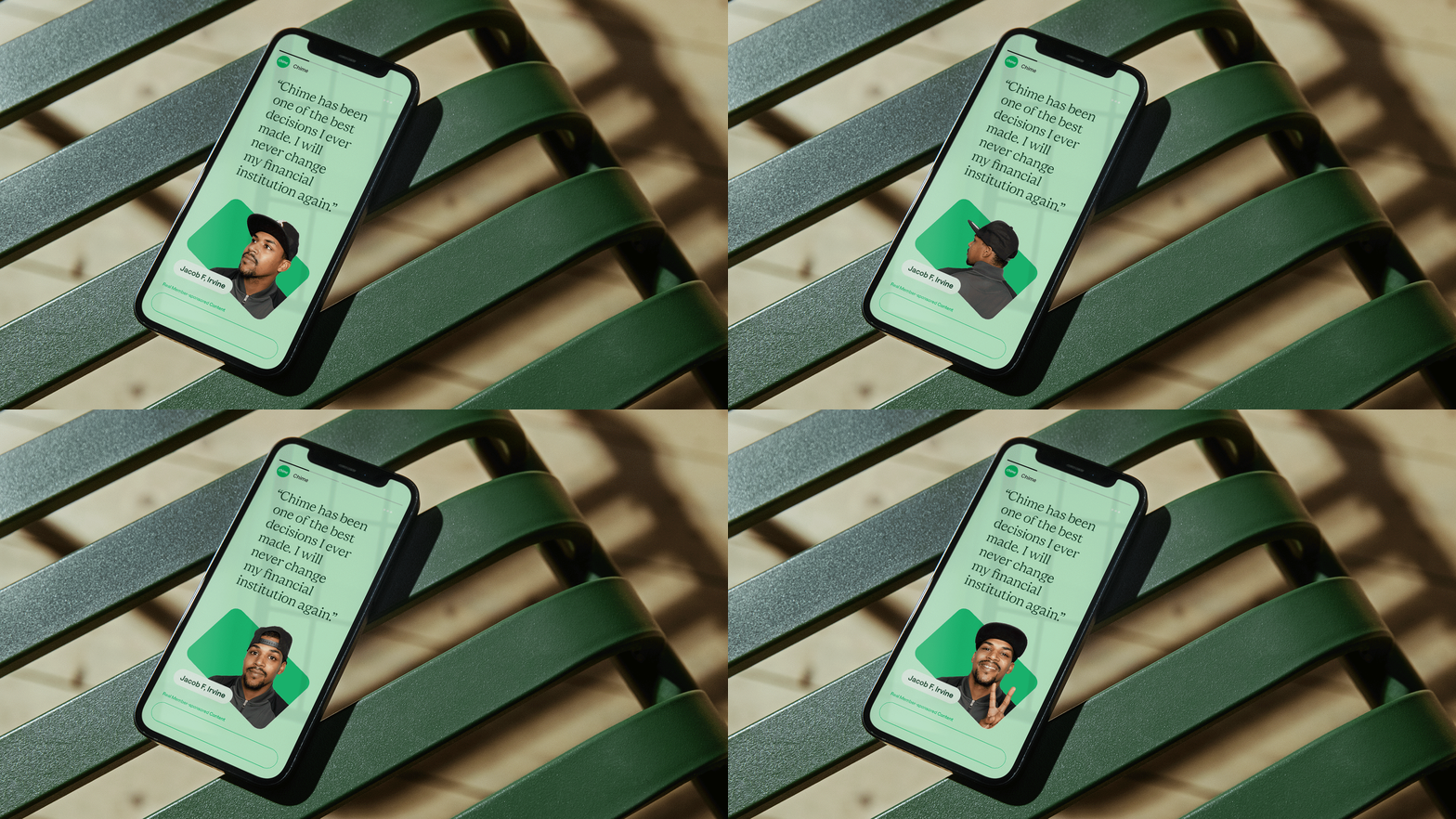
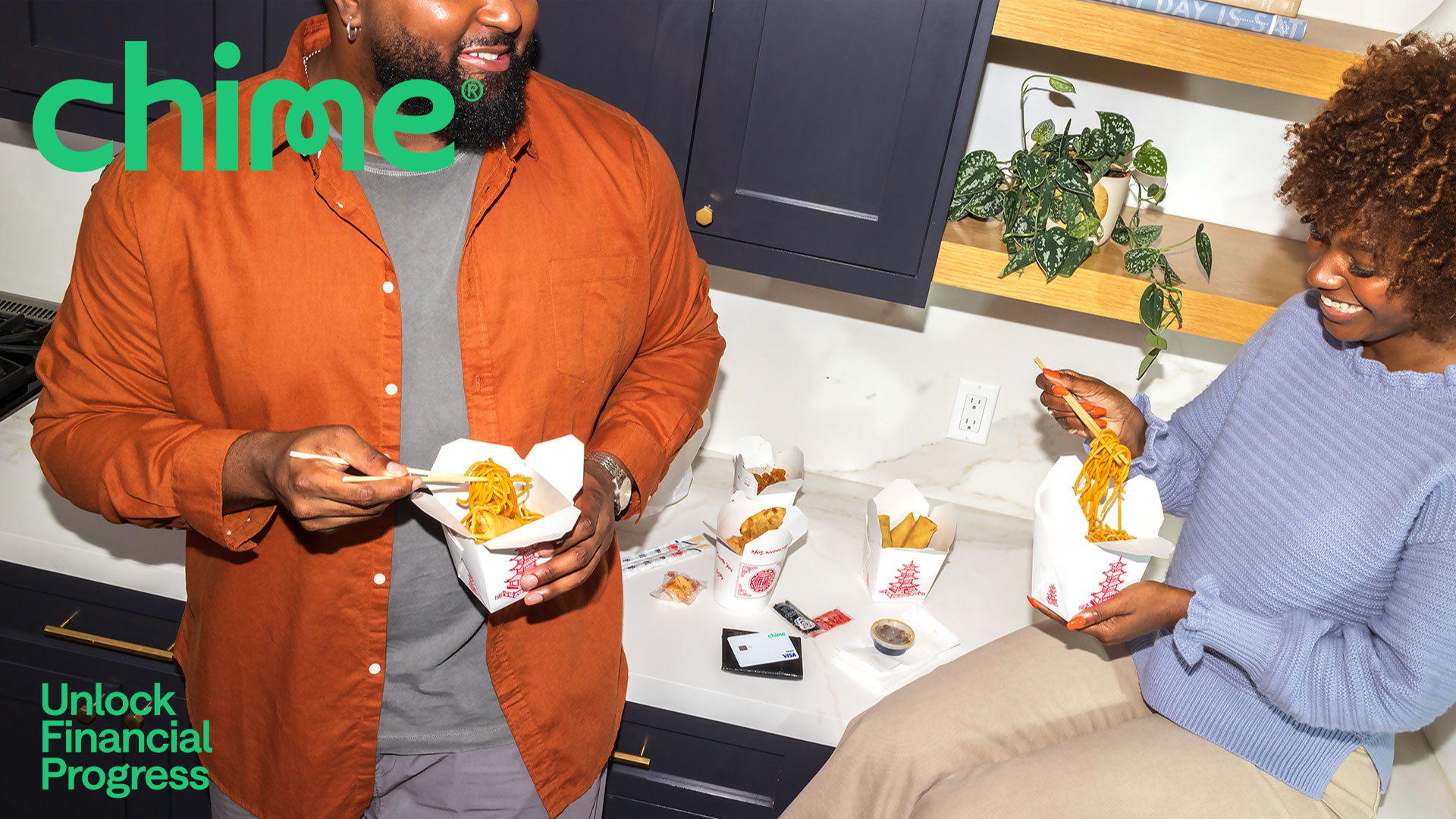
Chime’s first-ever brand photo library is a collection of elevated expressions of everyday moments, featuring real Chime members as talent.

PROJECT LINKS

Brand New Review

CAPABILITIES

Branding

Creative Direction

Type Design

Motion Design
HTML/CSS

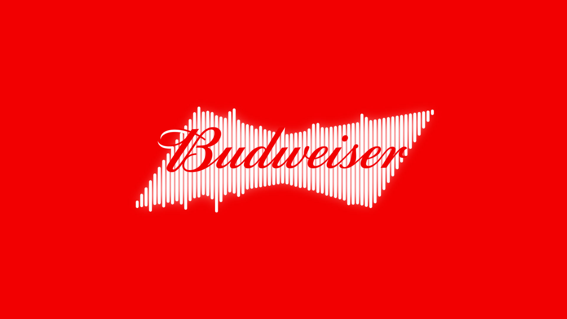
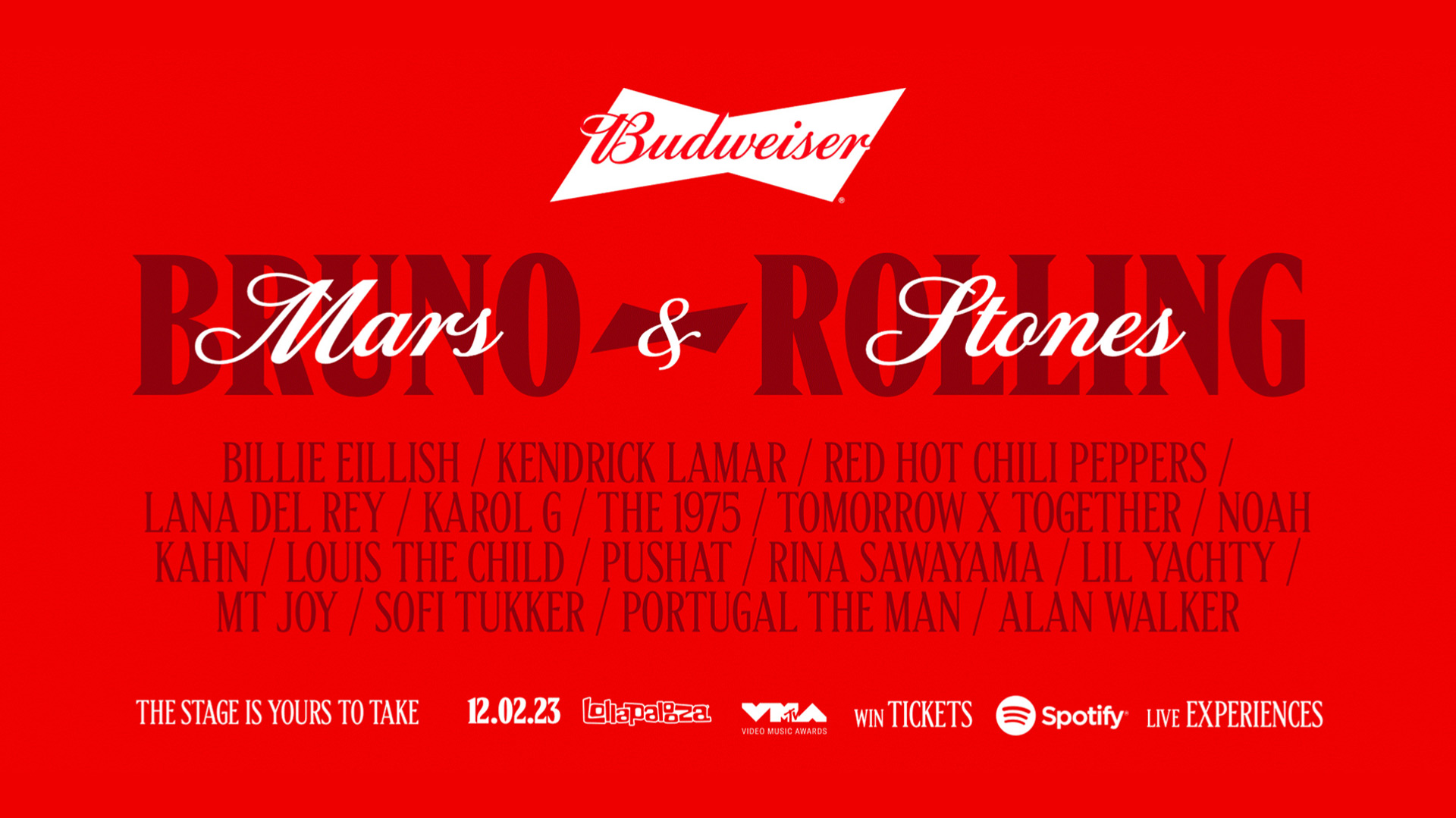
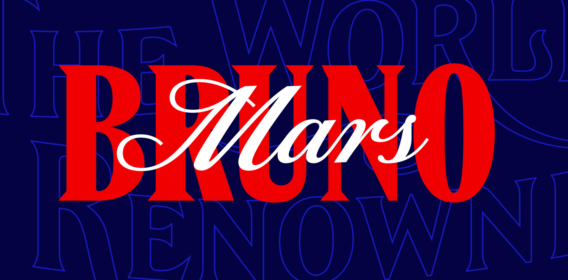
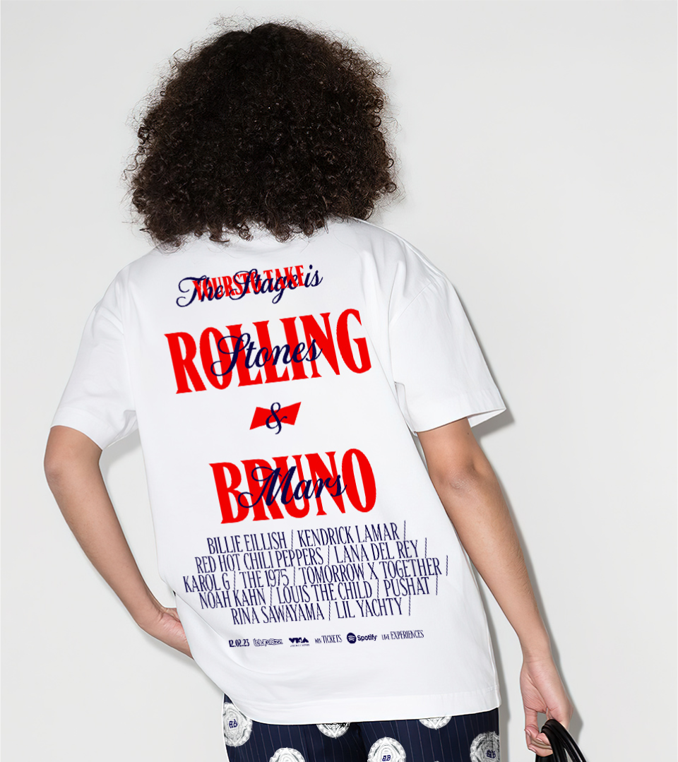
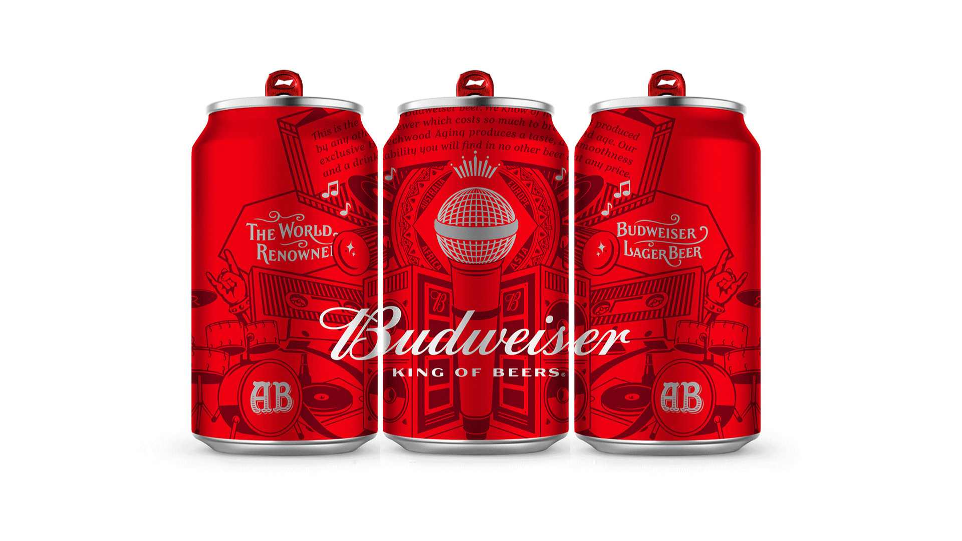
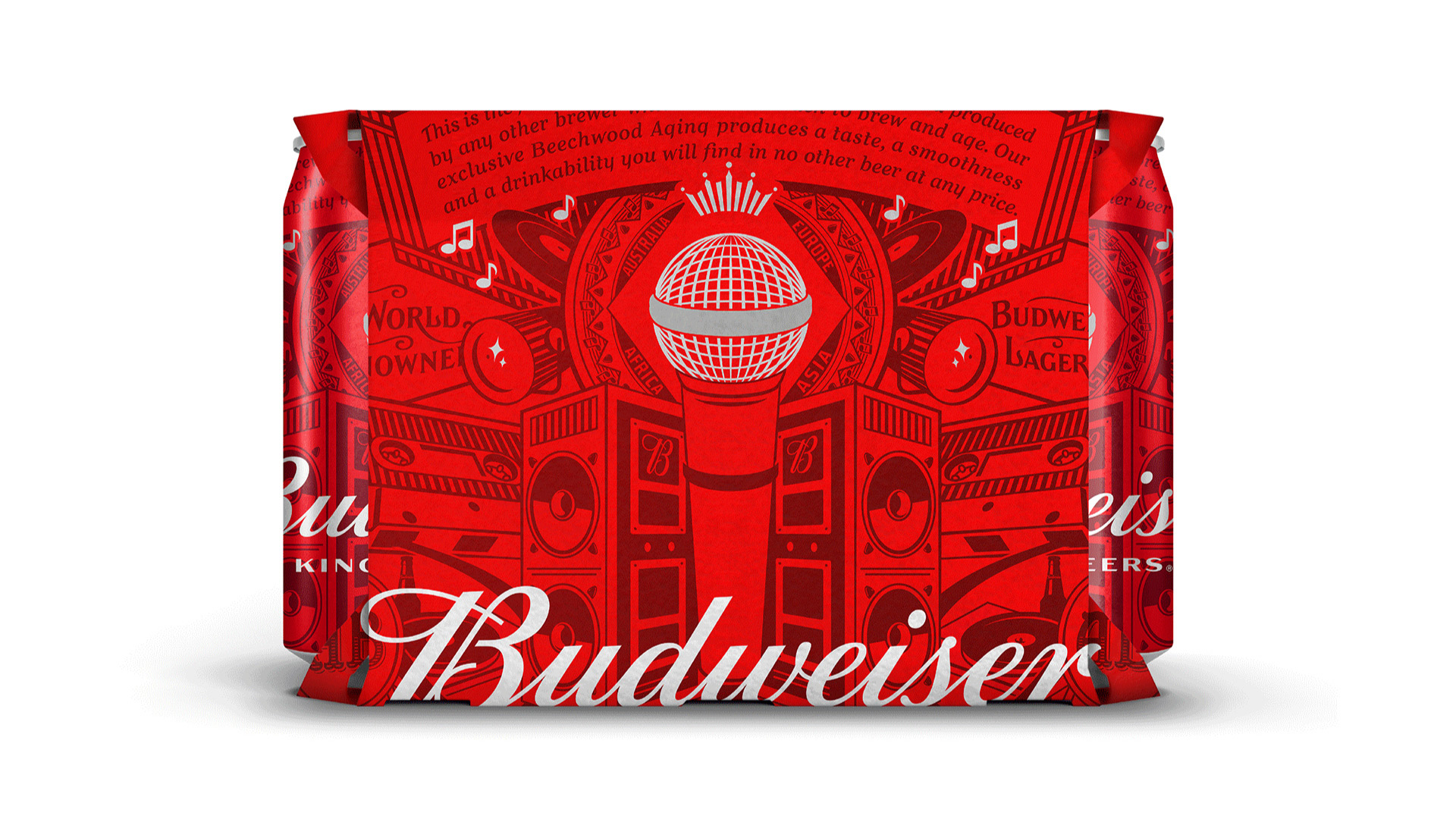
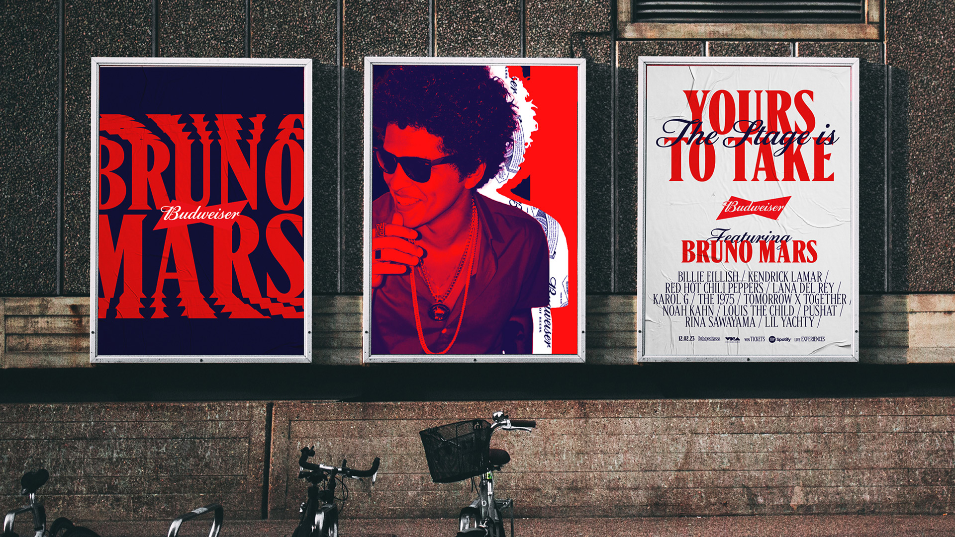
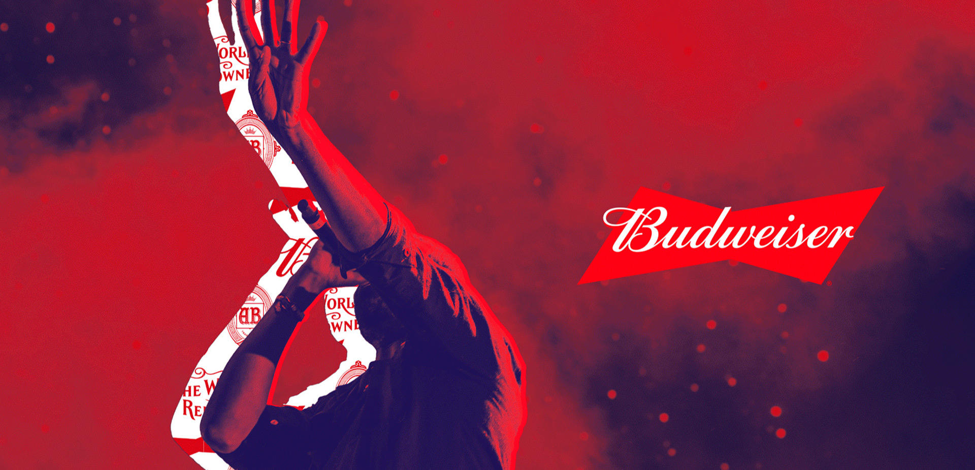
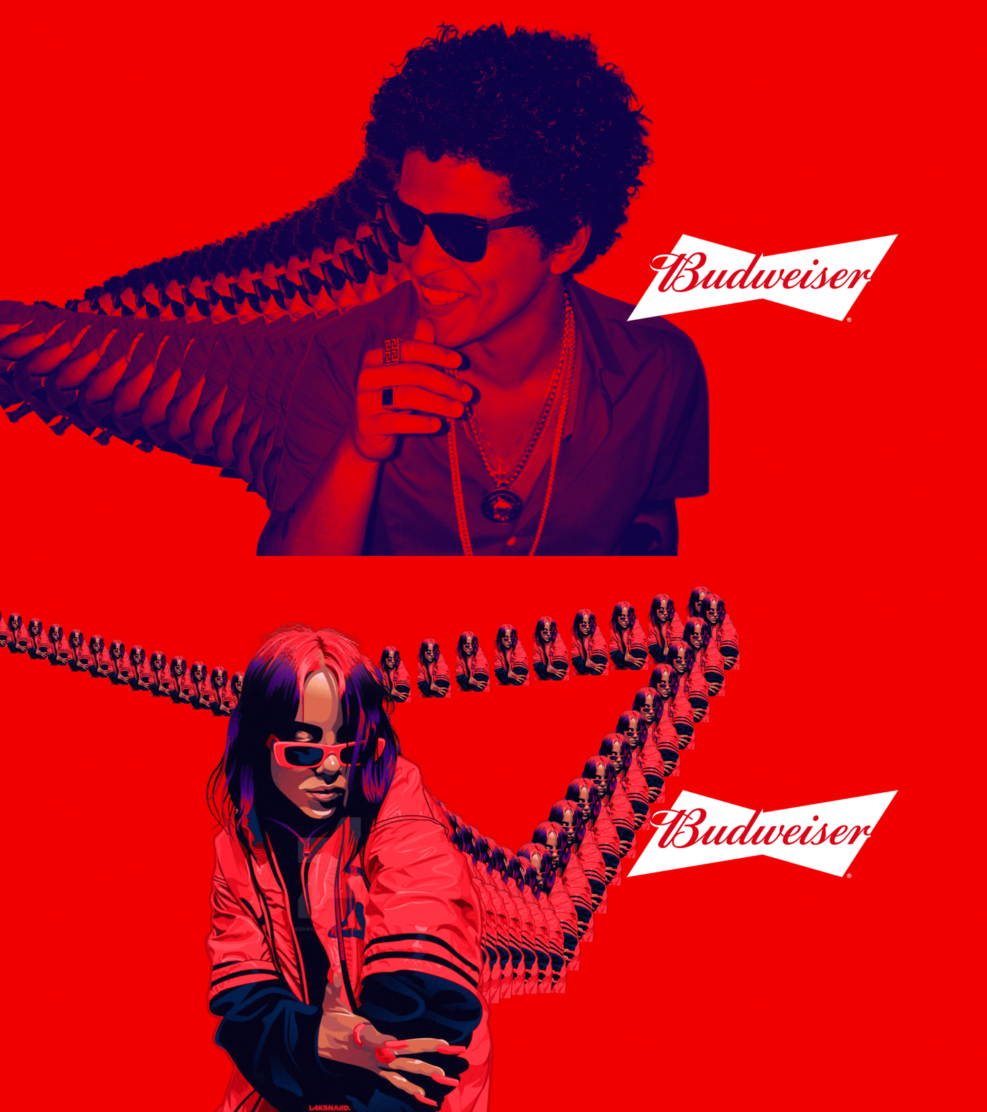
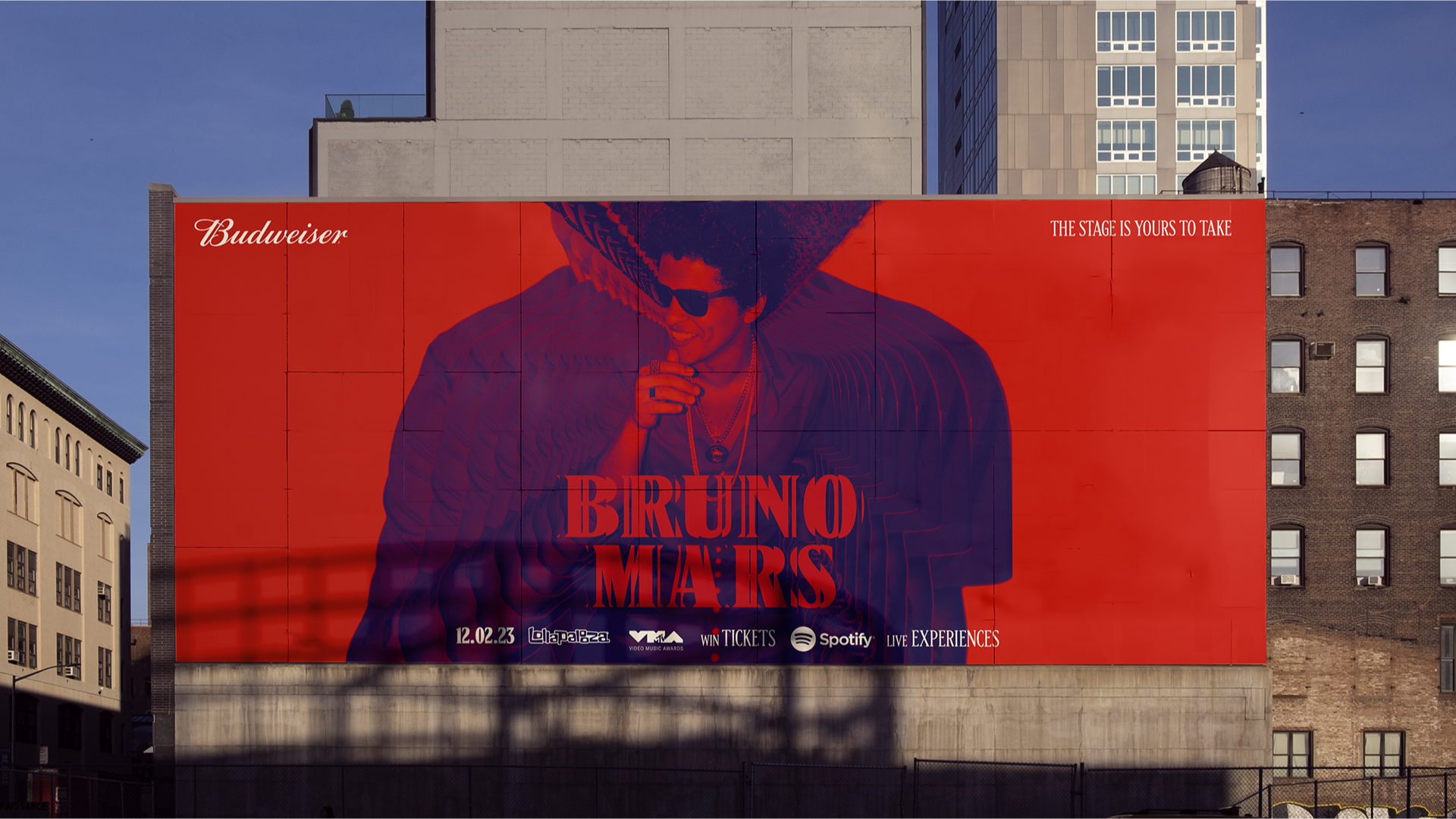
Budweiser has a rich history of driving music culture that they are looking to reclaim with a global platform, featuring countless partnerships with iconic and emergent artists, festivals and awards shows, all around the world. We remixed the Budweiser visual identity system to amplify the emotions, cultural impact and visceral experience of music. This was applied to everything from limited edition packaging, to festival posters, to live events—any music-related extension of the brand.

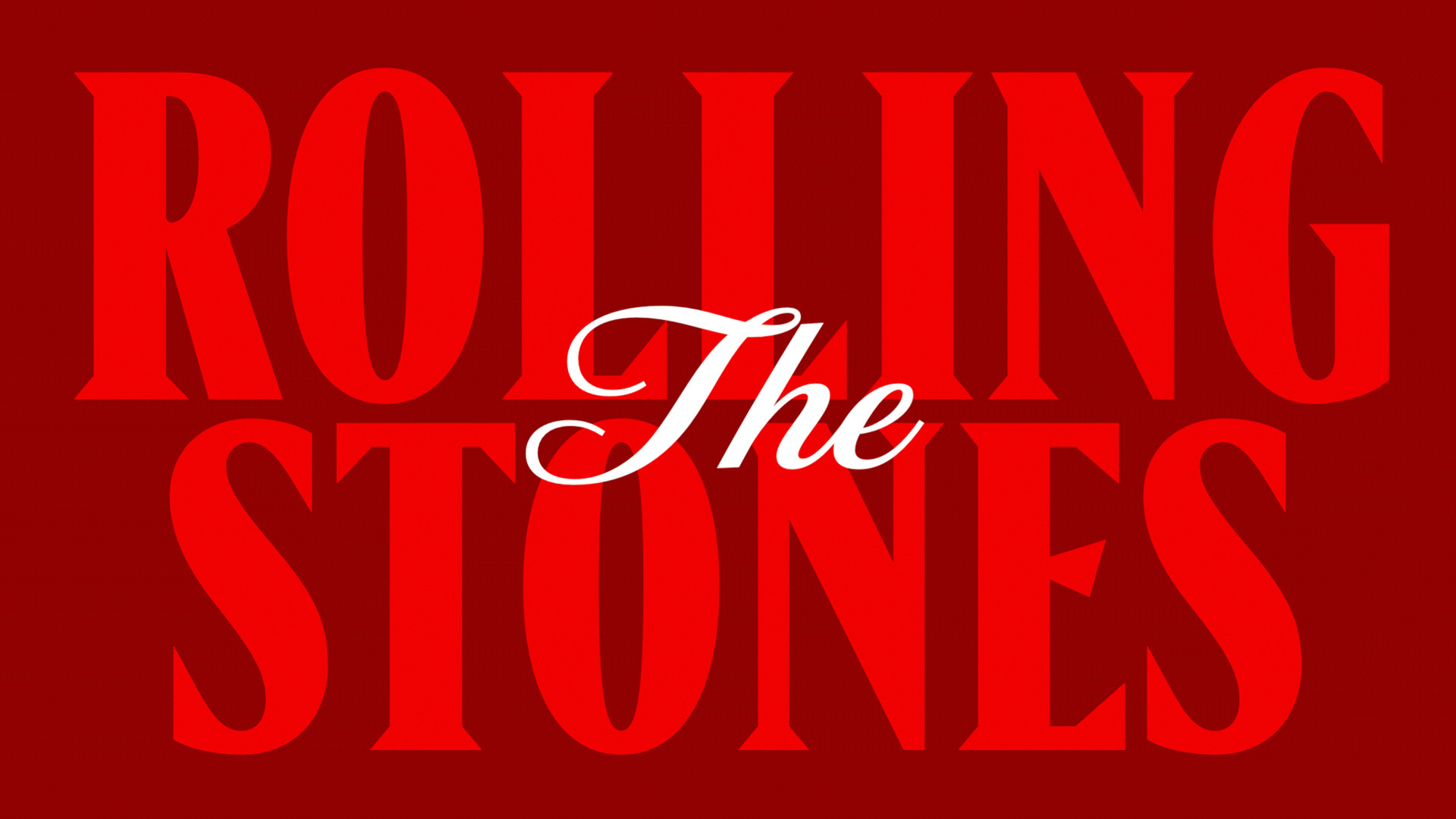
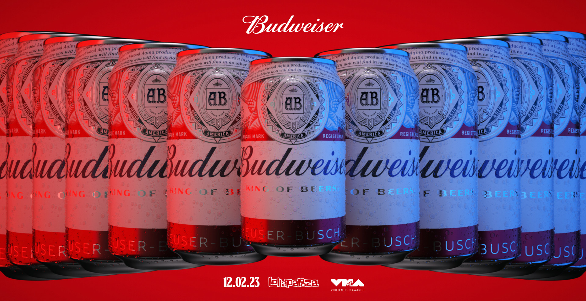
We started by looking at core assets like typography, color and graphics. Music venues are typically dark with a lot of vibrating lights and colors, so we used Bud’s blue more liberally, even letting it butt up against and vibrate with the red. We also promoted their script font to a consistent secondary element to draw on some of what we see in merch and album art.

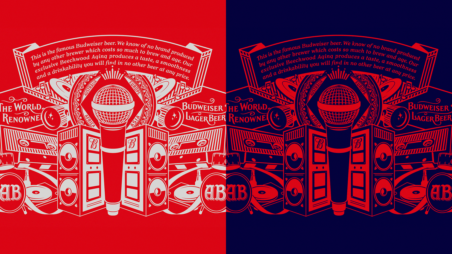
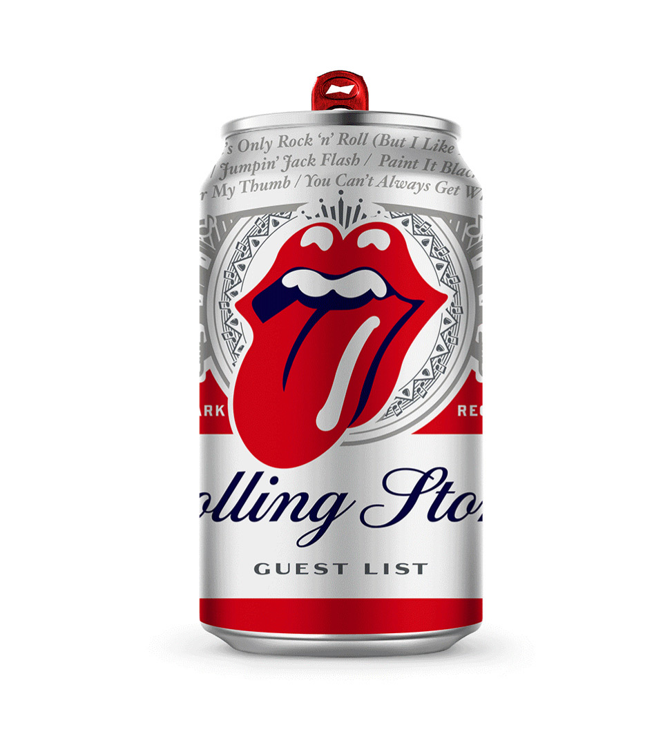
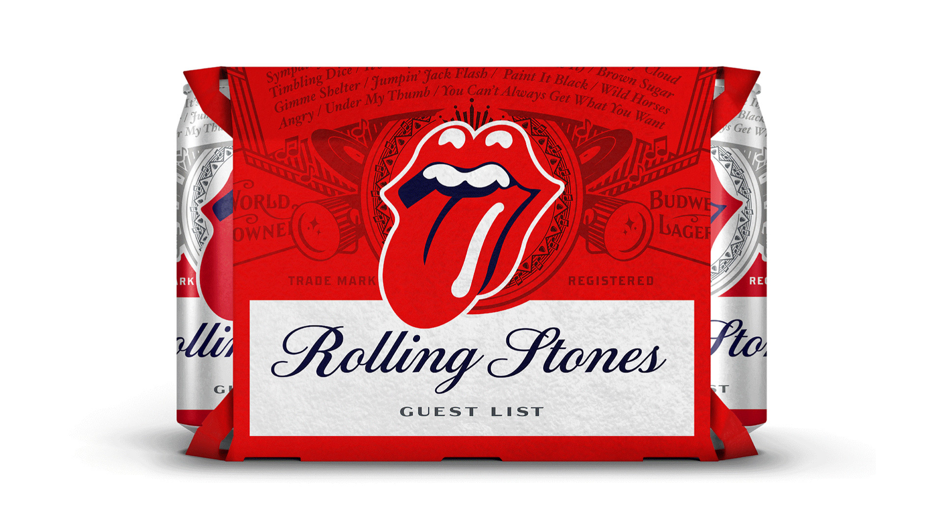
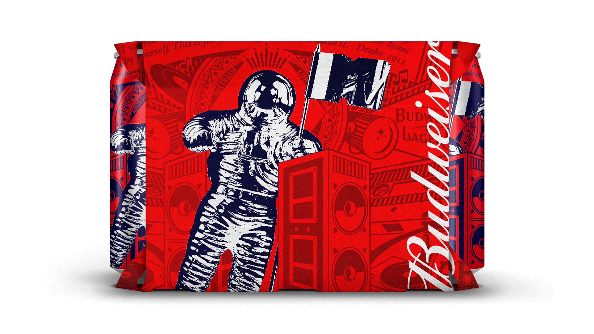
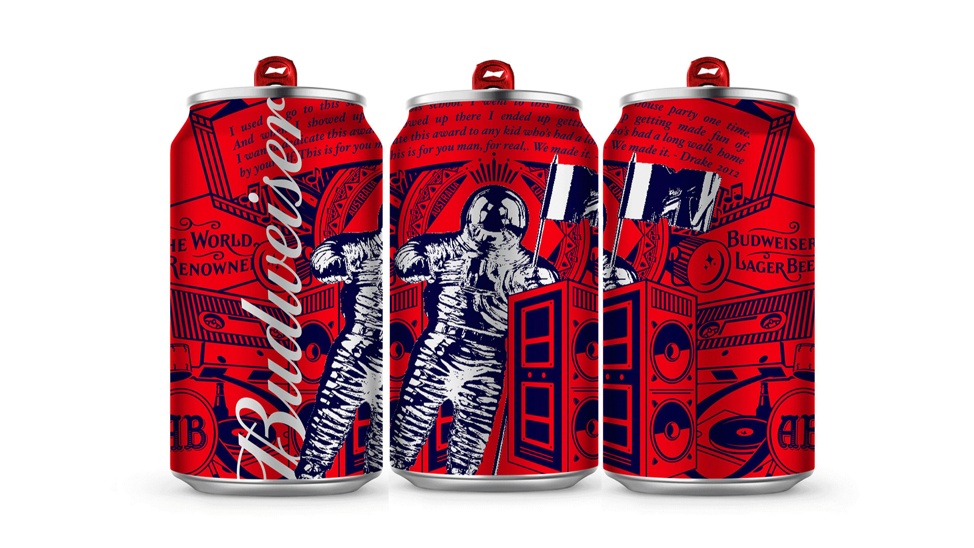
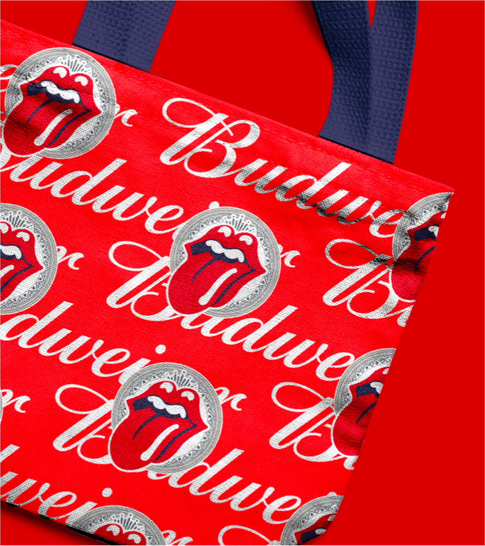
Budweiser has this incredible tapestry of heritage graphics that appears on their packaging; we turned that into a combination of bud heritage and music cues (originally drawn by Kasi Turpin). We also looked for opportunities to “feature” artist and partner IP in mashups with Budweiser brand elements.

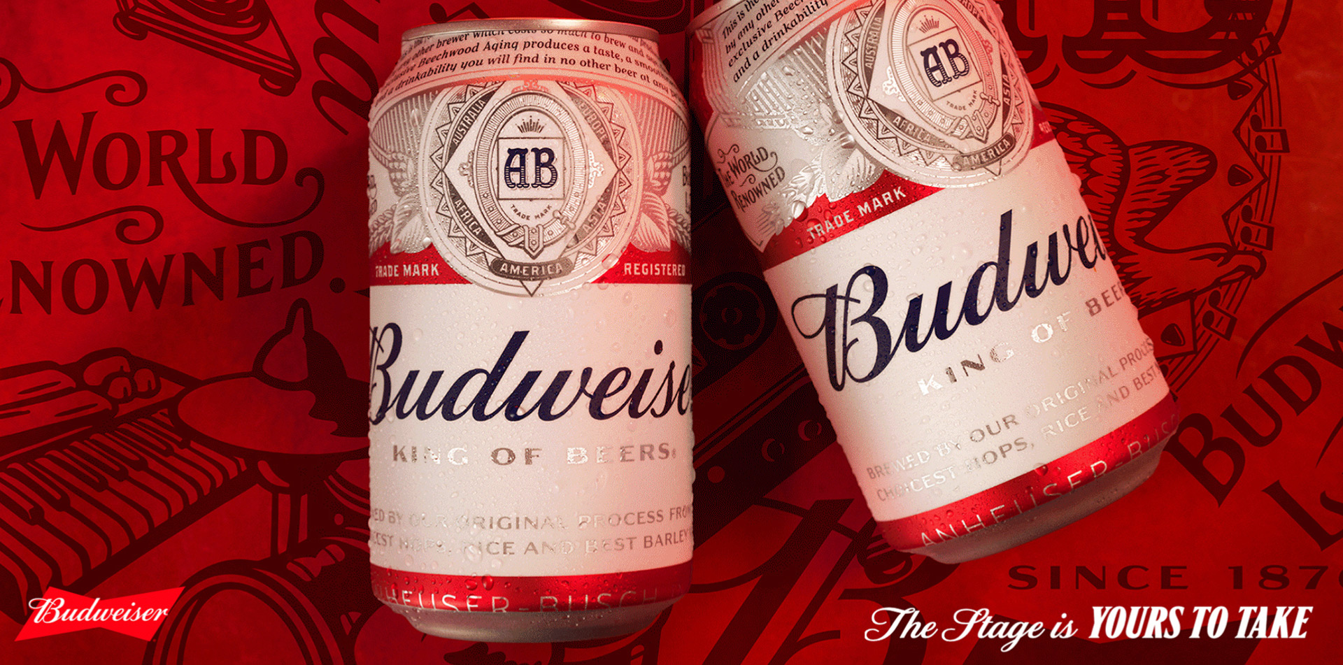
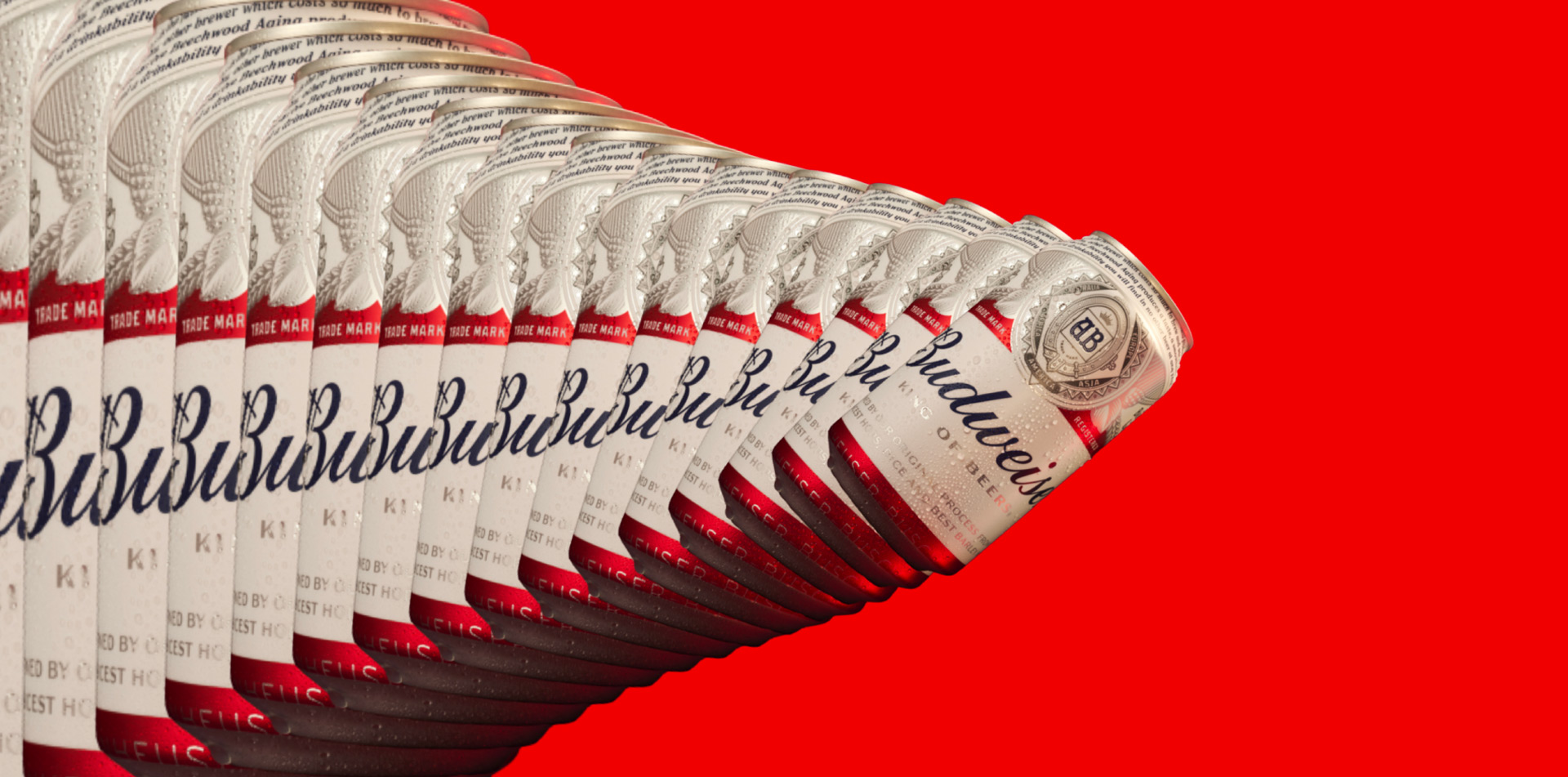
We developed a system for loads of limited-time-only packaging, combining the Budweiser look with art and lyrics from artists, festivals, and any other music partners Bud collaborates with—plus a “general” Bud Music expression using our music graphics.

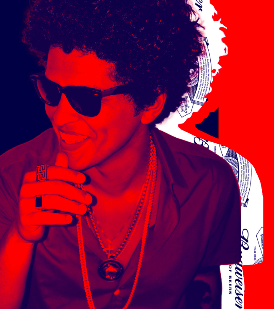
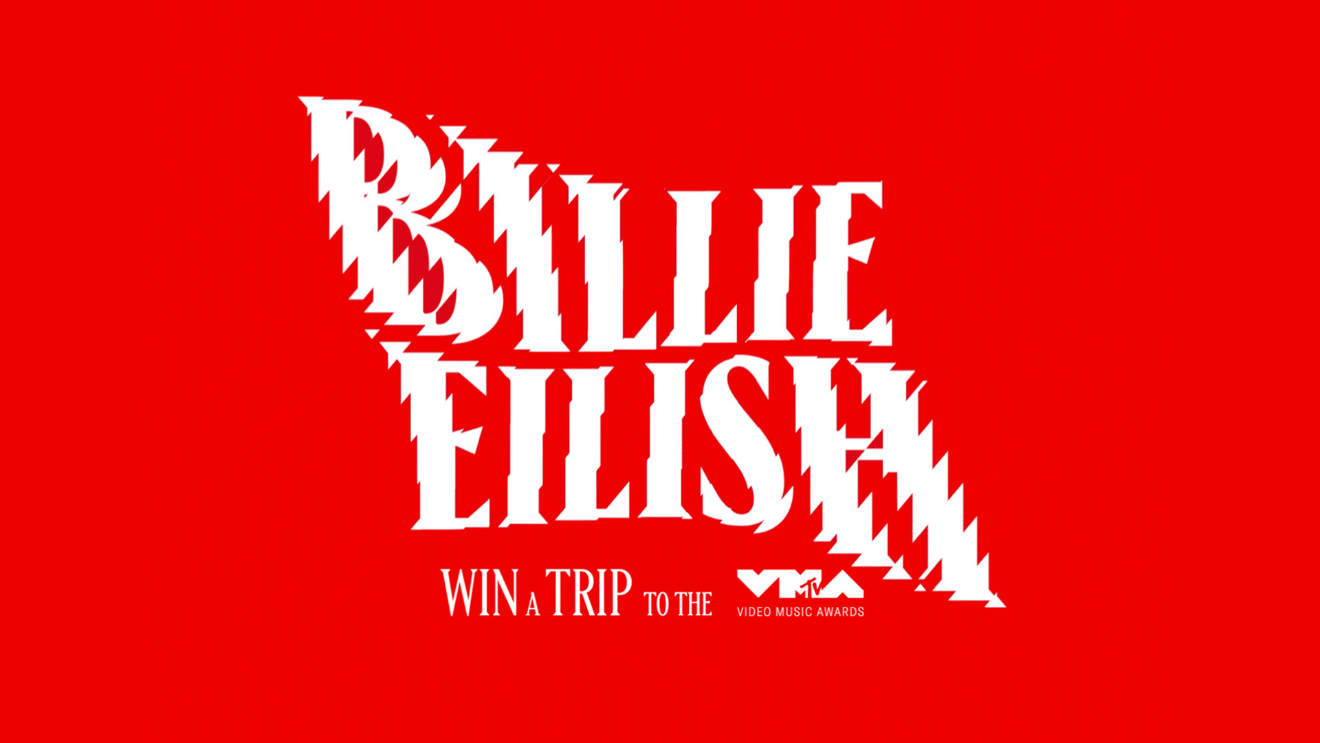
For campaign & marketing executions, we developed a collage-style treatment and creation tools that helps any partner quickly create on-brand imagery using whatever artist photography they’re given.

We also developed a suite of music visualizers that can create connected but distinct assets for any artist, or even respond in real time to music or community inputs for experiential events and performances.

PROJECT LINKS

CAPABILITIES

Branding

Creative Direction

3D Art

Motion Graphics

Generative Art/Creative Coding

Experiential Design

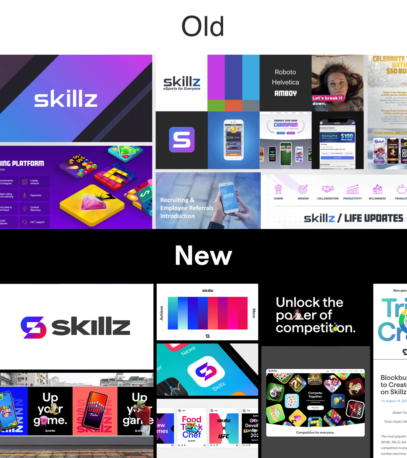
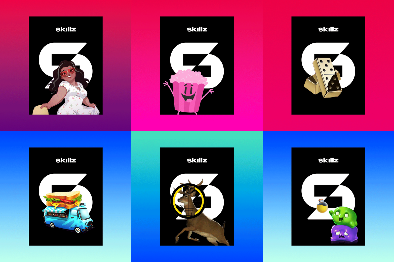
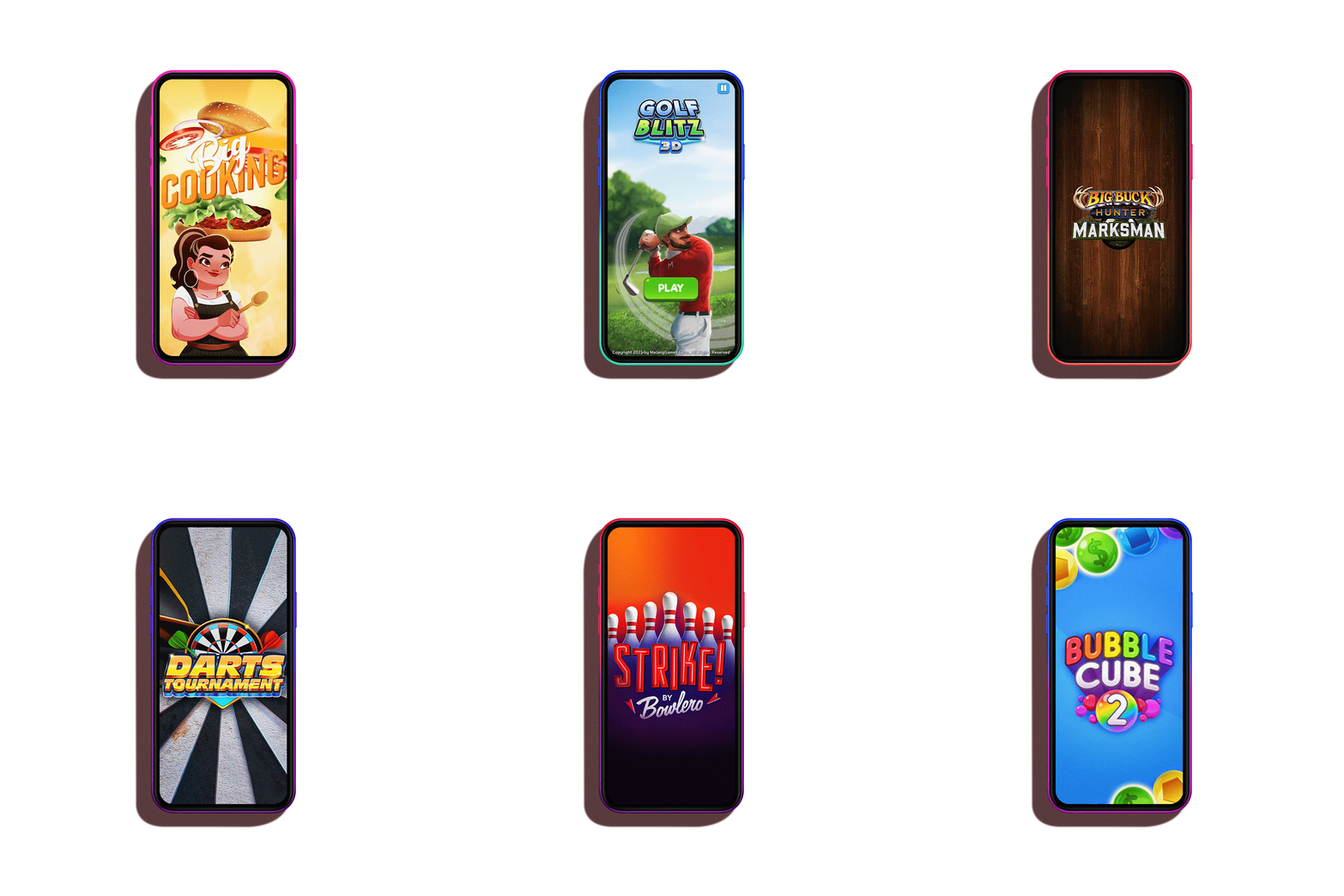
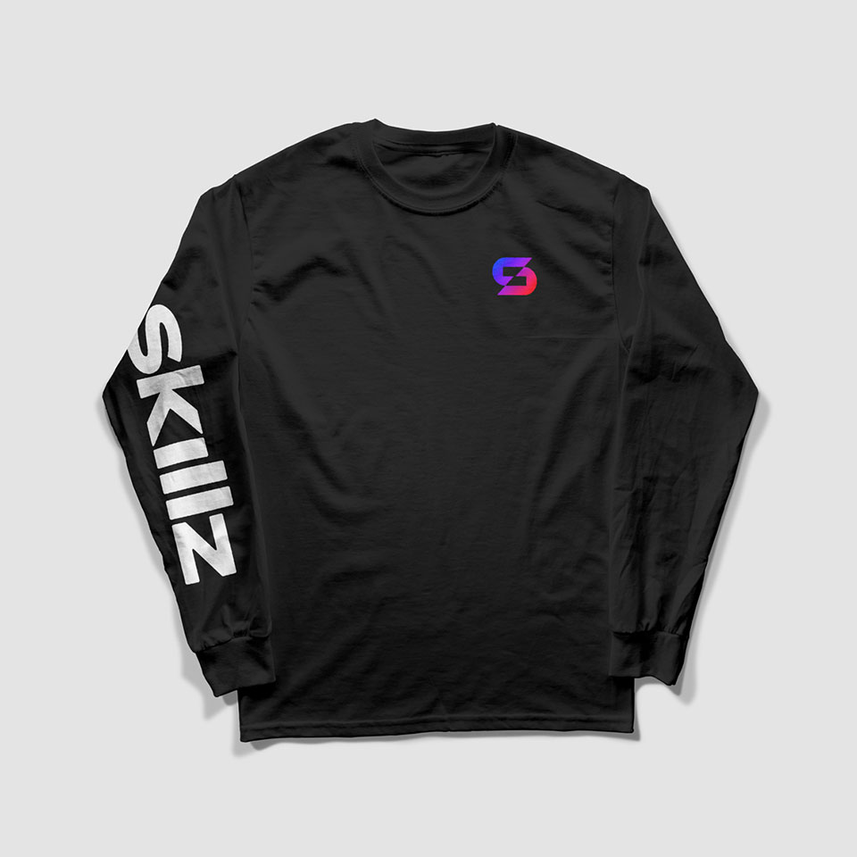
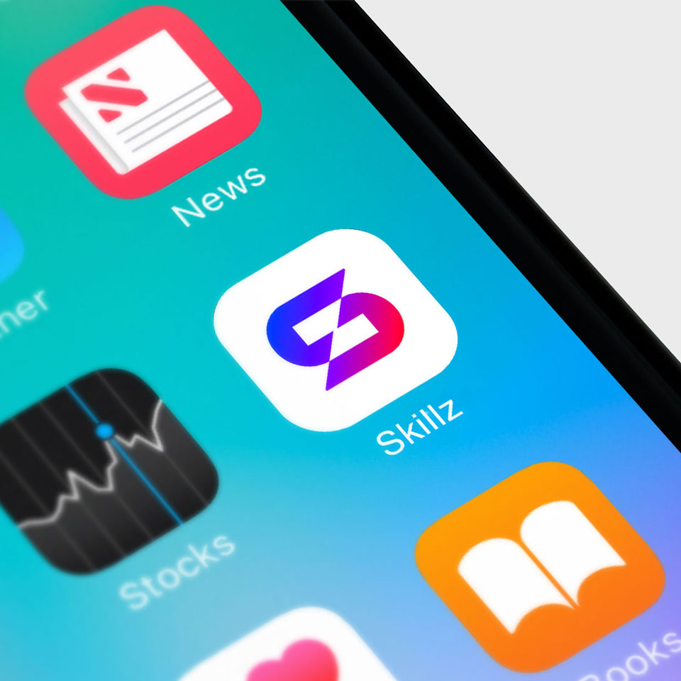
Skillz is a mobile games platform that let’s people compete with other people around the world for either real cash or our virtual in-game currencies. They features 500+ games from independent developers, and more than 7 million active users, but a lack of consistency and craft in their identity created mistrust with prospective players and devs. We built a new visual ID for them evoking a secure global platform on a mission to bring out the best in everyone through competition.

In any Skillz game, you go head-to-head with one real-life player who matches your skill level. Competing with real people shows you what’s possible and brings out your best. The new Skillz mark builds on that, with two balanced sides coming together to compete and push each other to new heights. Their core colors are red and blue, a common head-to-head trope dating back to the beginning of gaming (video or otherwise). When they combine, they create a new color in the center. We round it out with a custom wordmark that feels safer and more welcoming than the previous logo, with extended letterforms for a “competitive” stance.

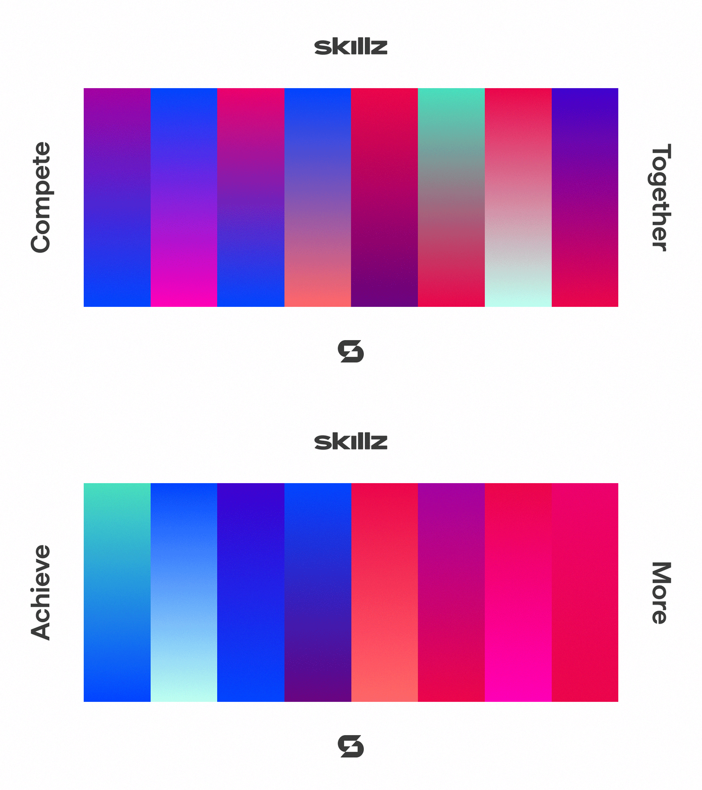
The core red and blue colors extend to form a “red team” and a “blue team”. One color from each team combines to create two sets of head-to-head gradients: one “compete together” set (colors from opposing teams) and one “achieve more” set (colors from the same team). Each combination retains either the core red or blue for consistency.

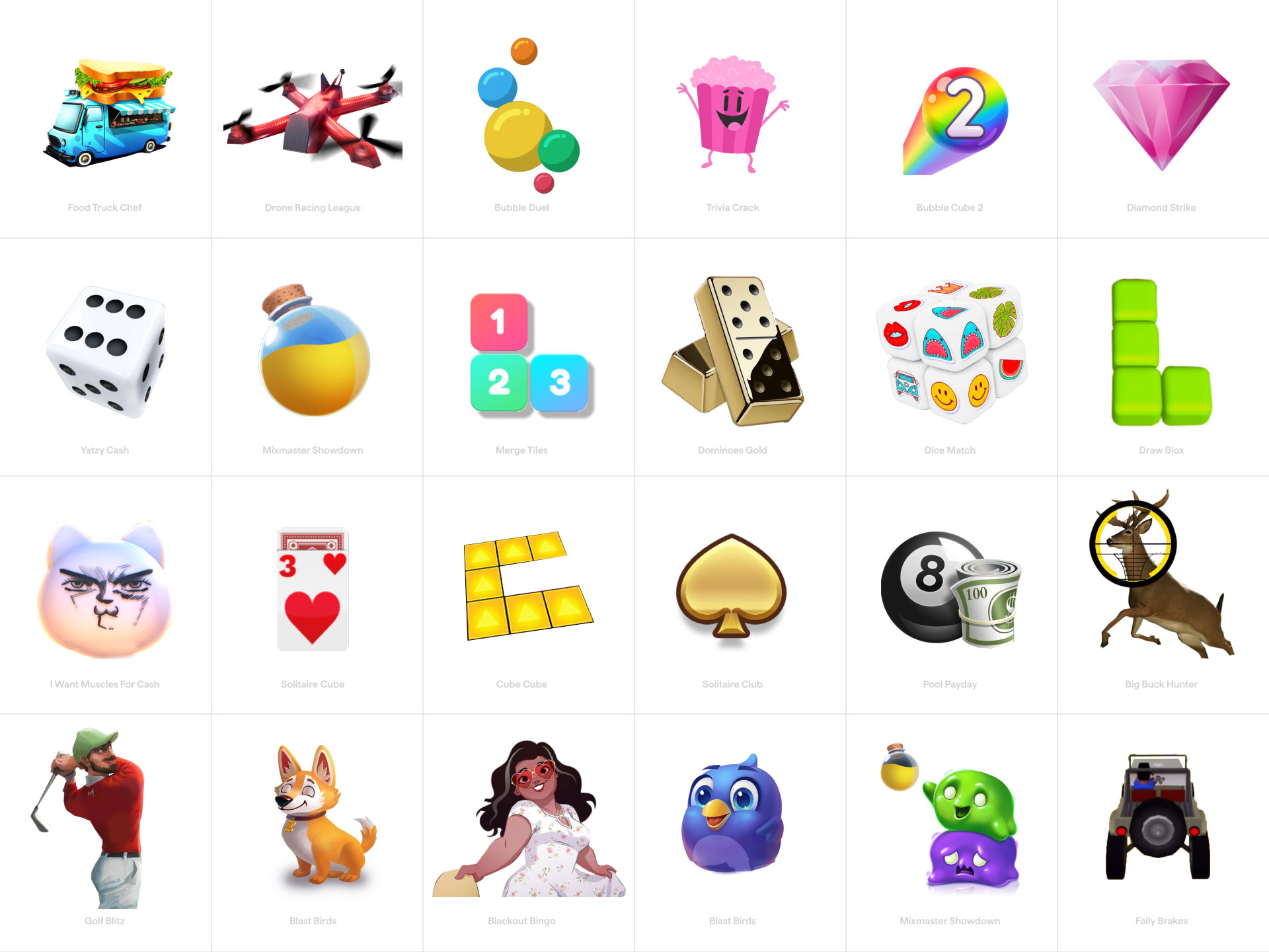
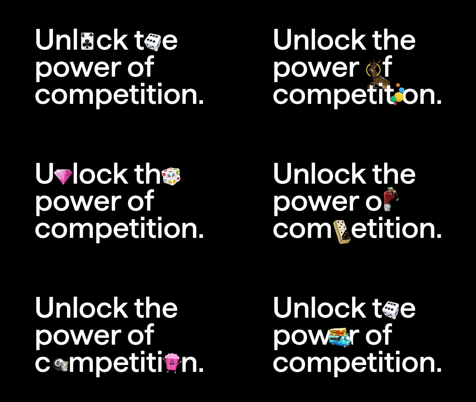
We shine a spotlight on Skillz games through a playful combination of app icons, game elements and “game-mojis”. This helps capture the breadth of the Skillz universe and make competition accessible (and fun) for everyone.

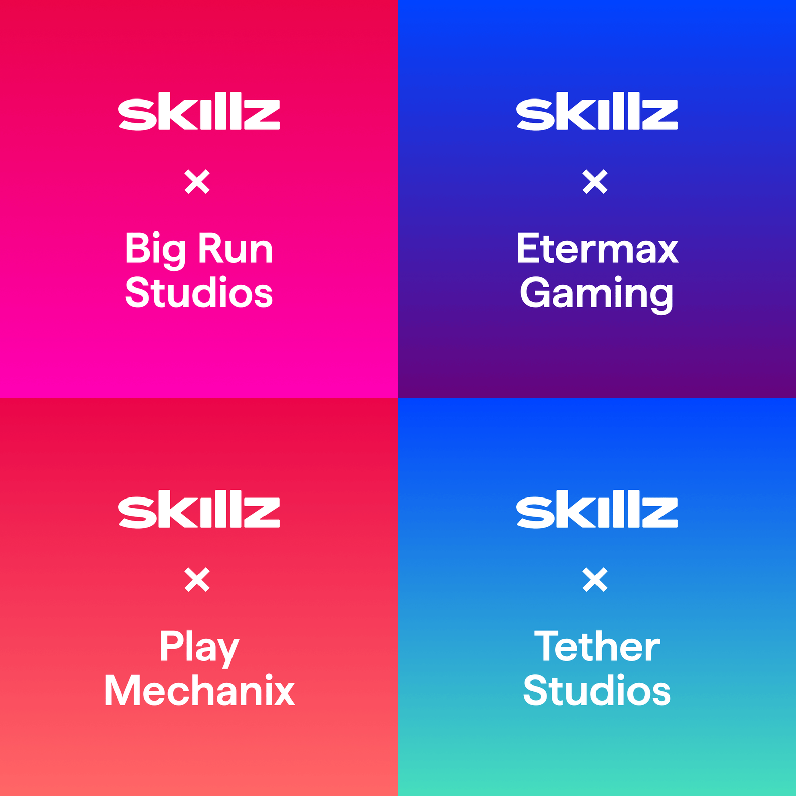
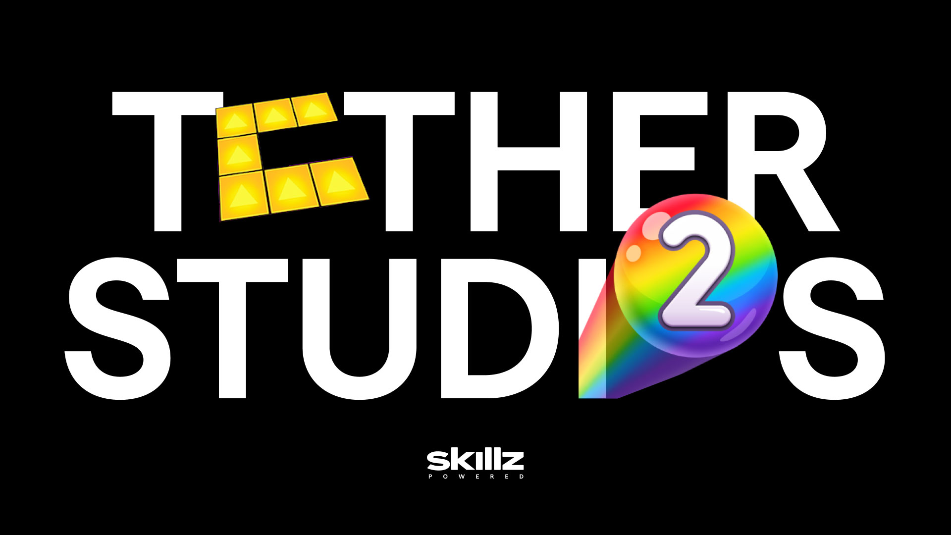
Empowering independent developers is a huge part of the Skillz model. We extended key identity elements for instances where we are highlighting our partnerships with gaming studios.

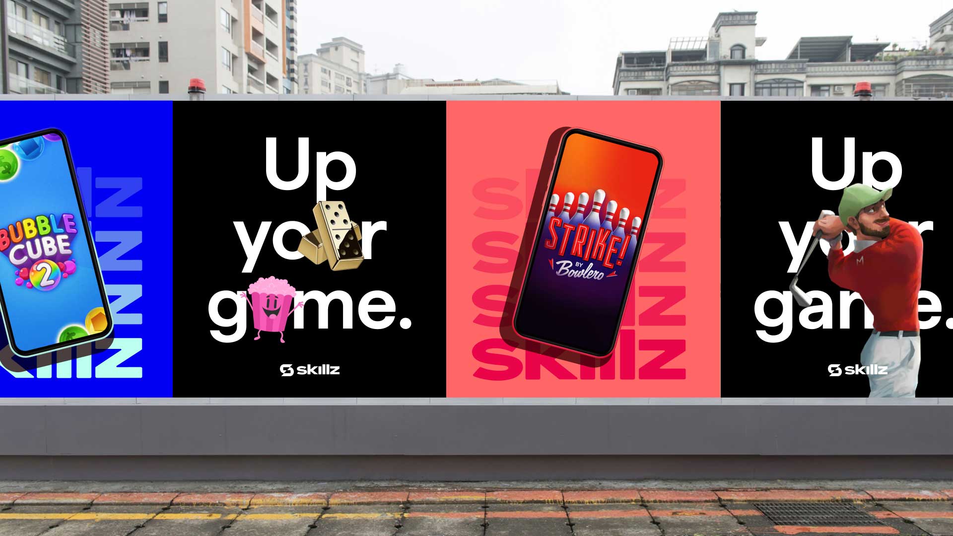
Details of the Skillz mark were deconstructed to create a set of animated super graphics that add energy and interest to messages and announcements. Graphics are grouped into four categories: Competition, Achievement, Community and Partnerships.

PROJECT LINKS

Skillz Brand Guide

CAPABILITIES

Branding

Creative Direction

Type Design

Motion Design
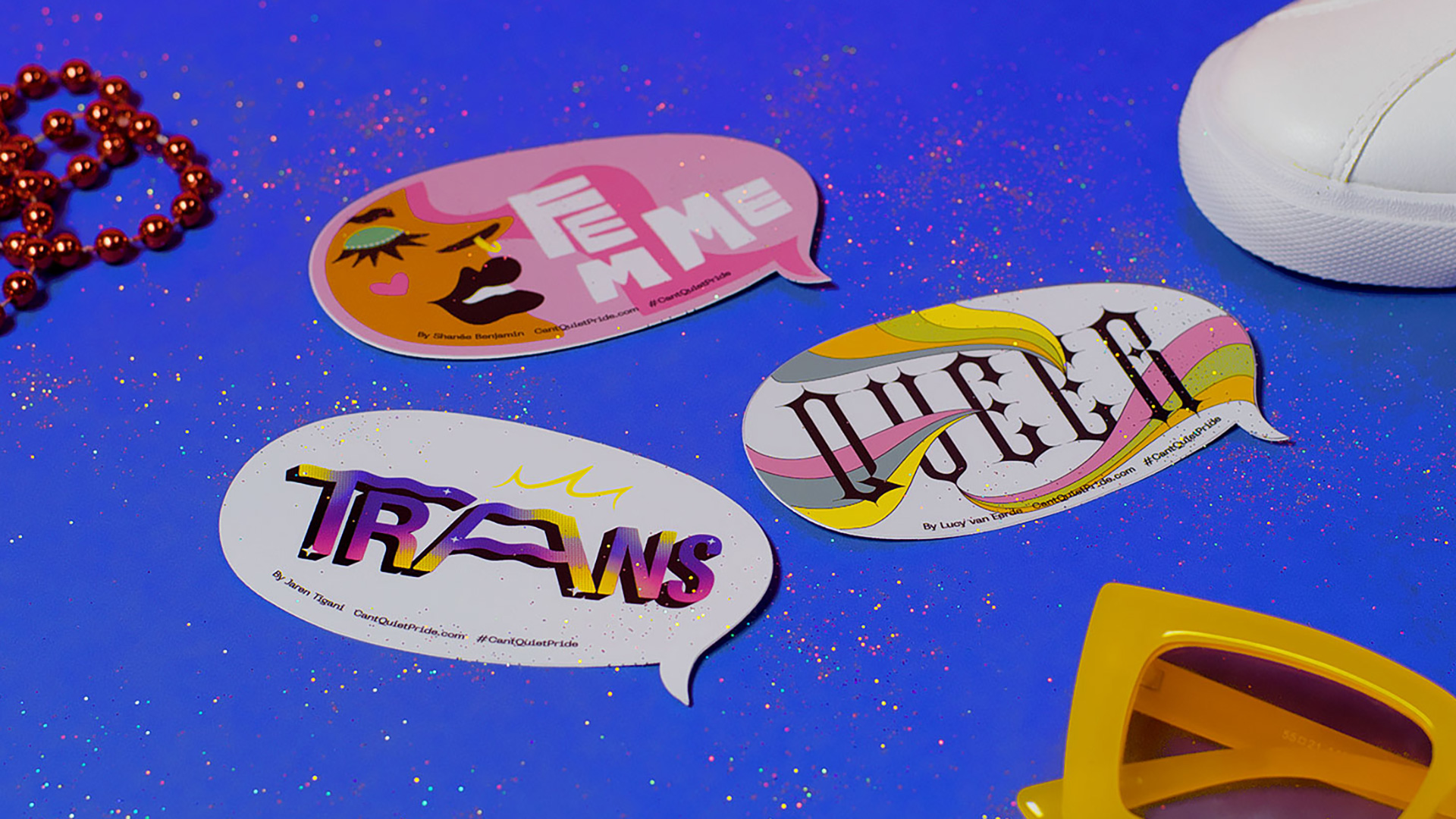
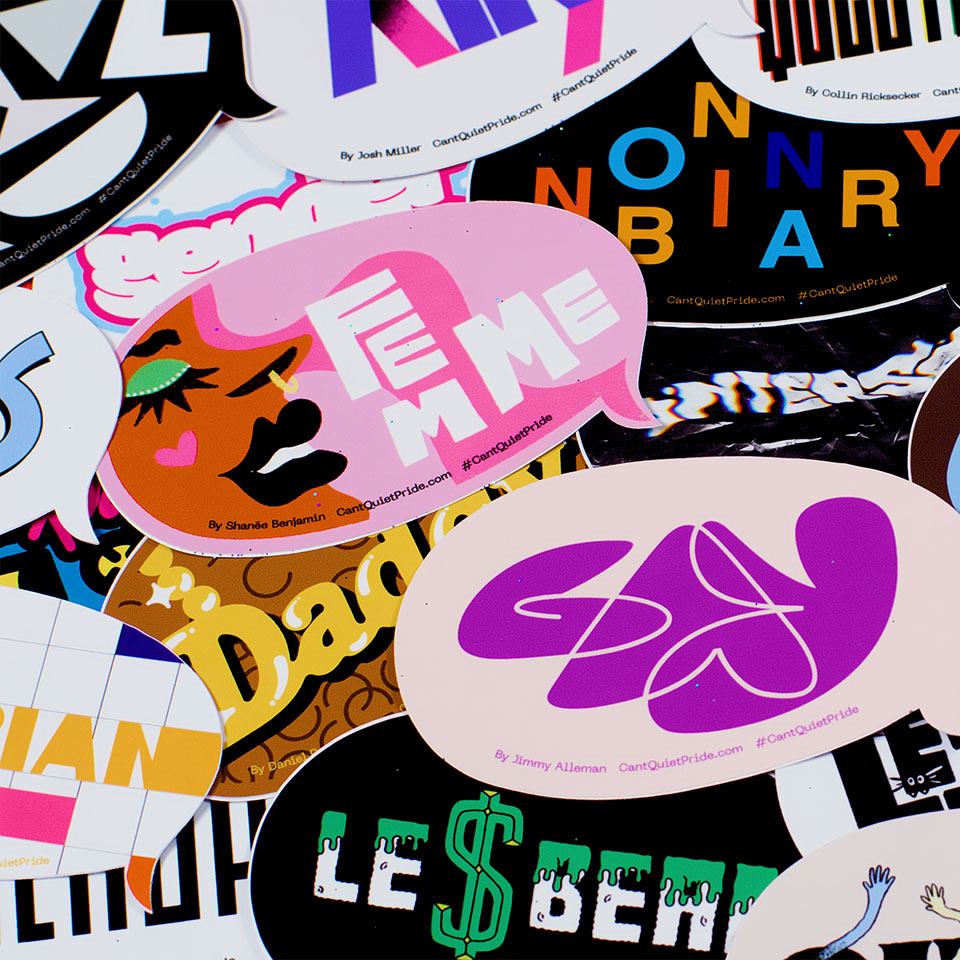
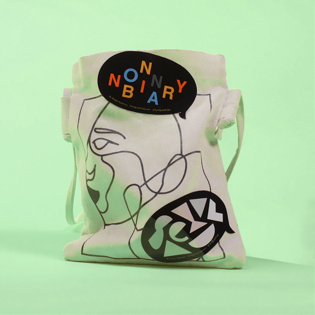
In a year where long-celebrated LGBTQIA+ labels faced the threat of extinction, we spent pride month un-censoring them with a series of artist-made labels and stickers to help everyone keep the conversation front and center.

With a growing number of states passing or considering anti-LGBTQIA+ legislation—including the “don’t say gay” bill that bans public schools from teaching about gender identity—it was important to us to provide something for the queer community to rally around during PRIDE month that could ensure people’s identities are celebrated, not muted.

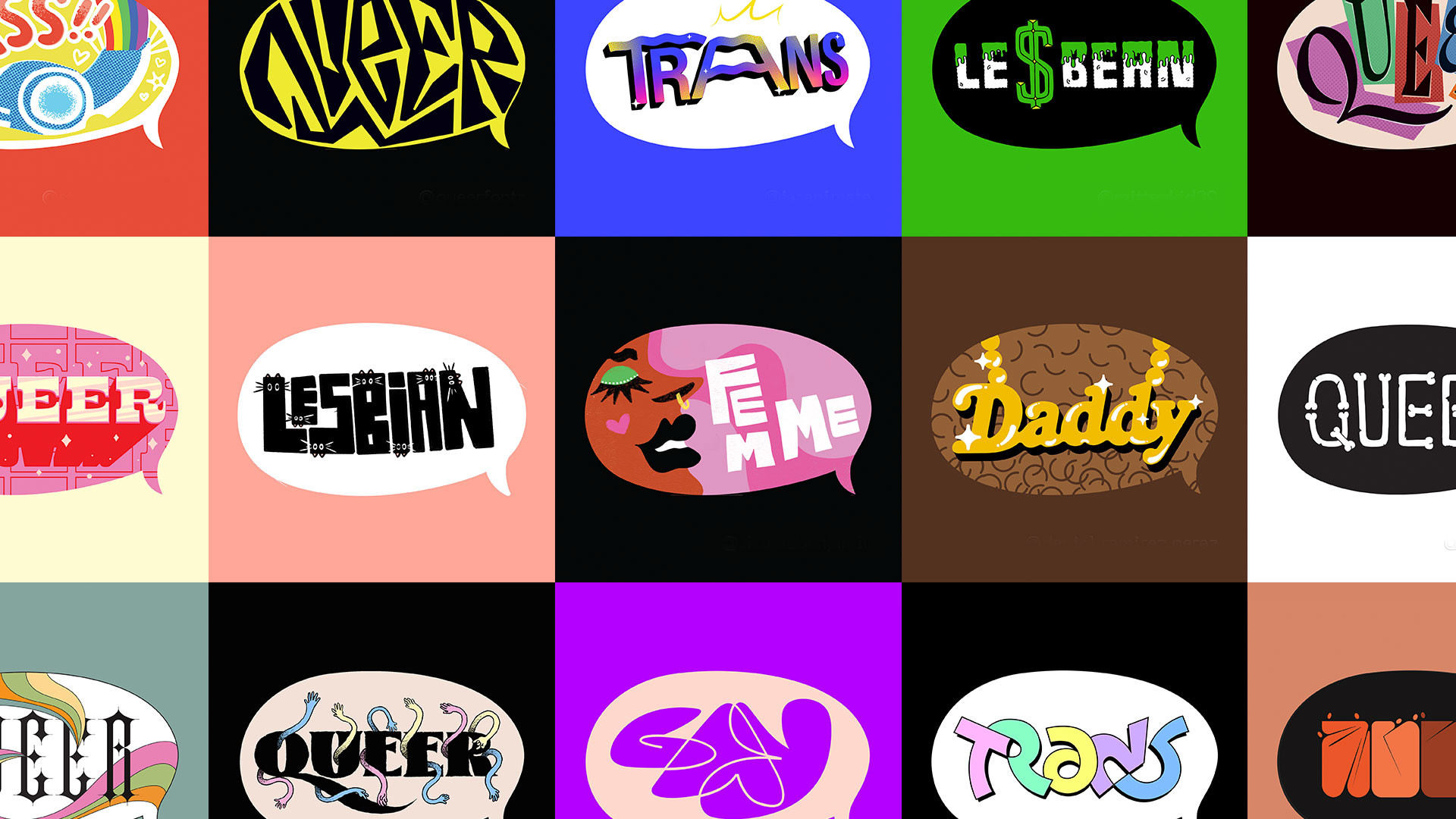
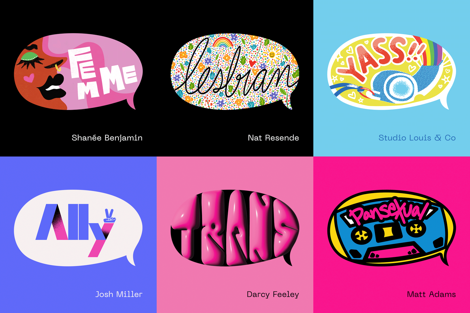
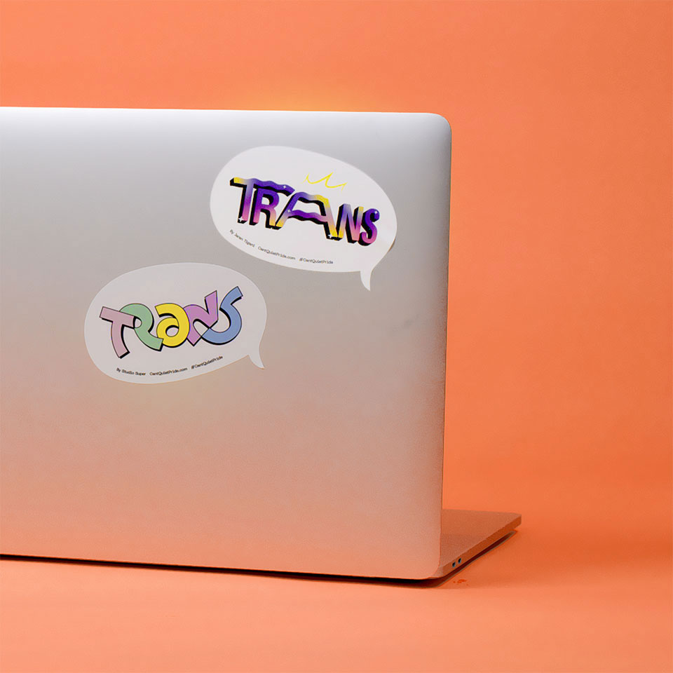
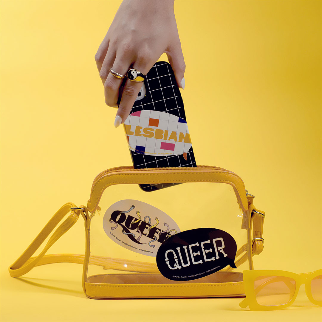
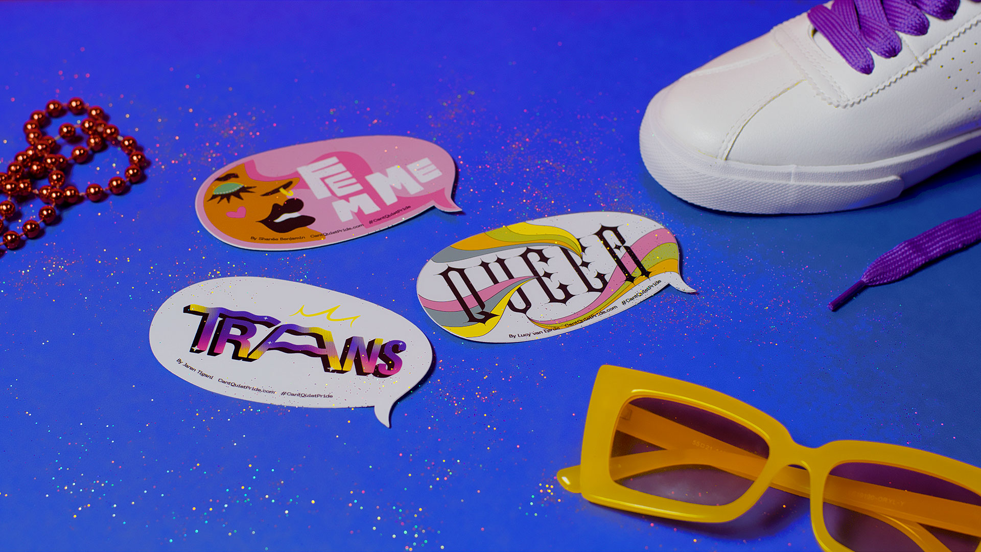
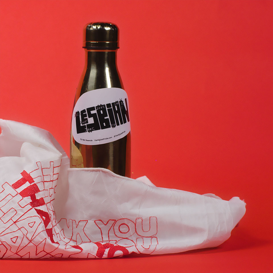
We commissioned LGBTQIA+ artists & allies to create a set of speech bubbles representing the many identities on the LGBTQIA+ spectrum—celebrating the community while also giving both influential and emergent queer artists a platform.

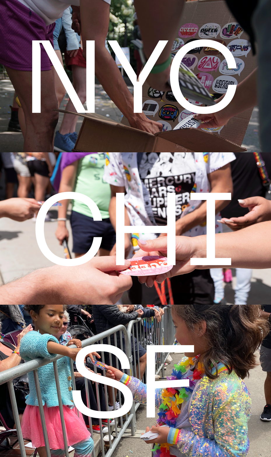
The labels were made available as digital stickers for use on social as well as physical versions that were freely available via massive sticker drops at several pride marches around the country.

PROJECT LINKS

Project Website

CAPABILITIES

Creative Direction

Illustration

HTML/CSS/Javascript

Print Production

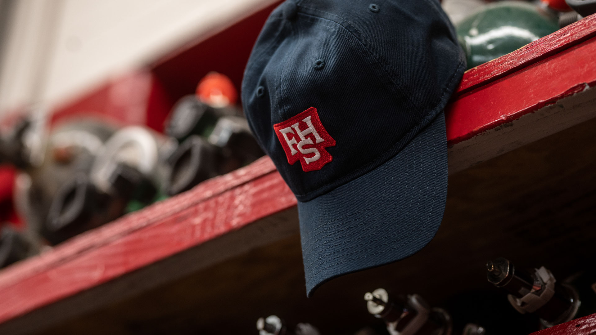
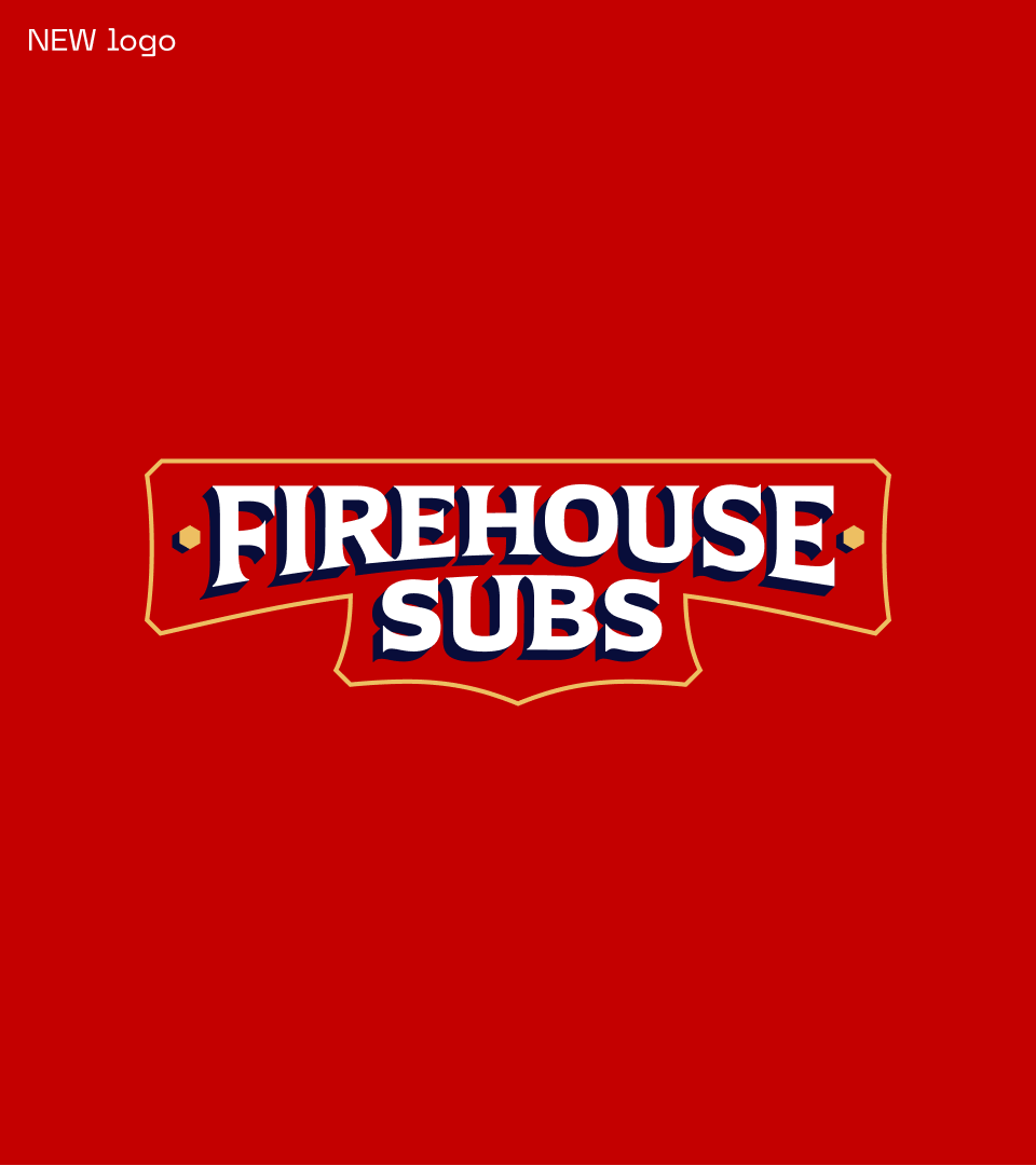
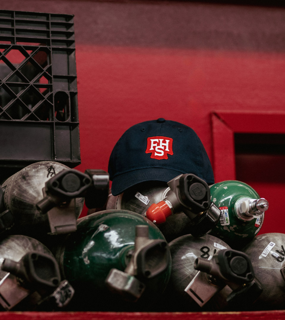
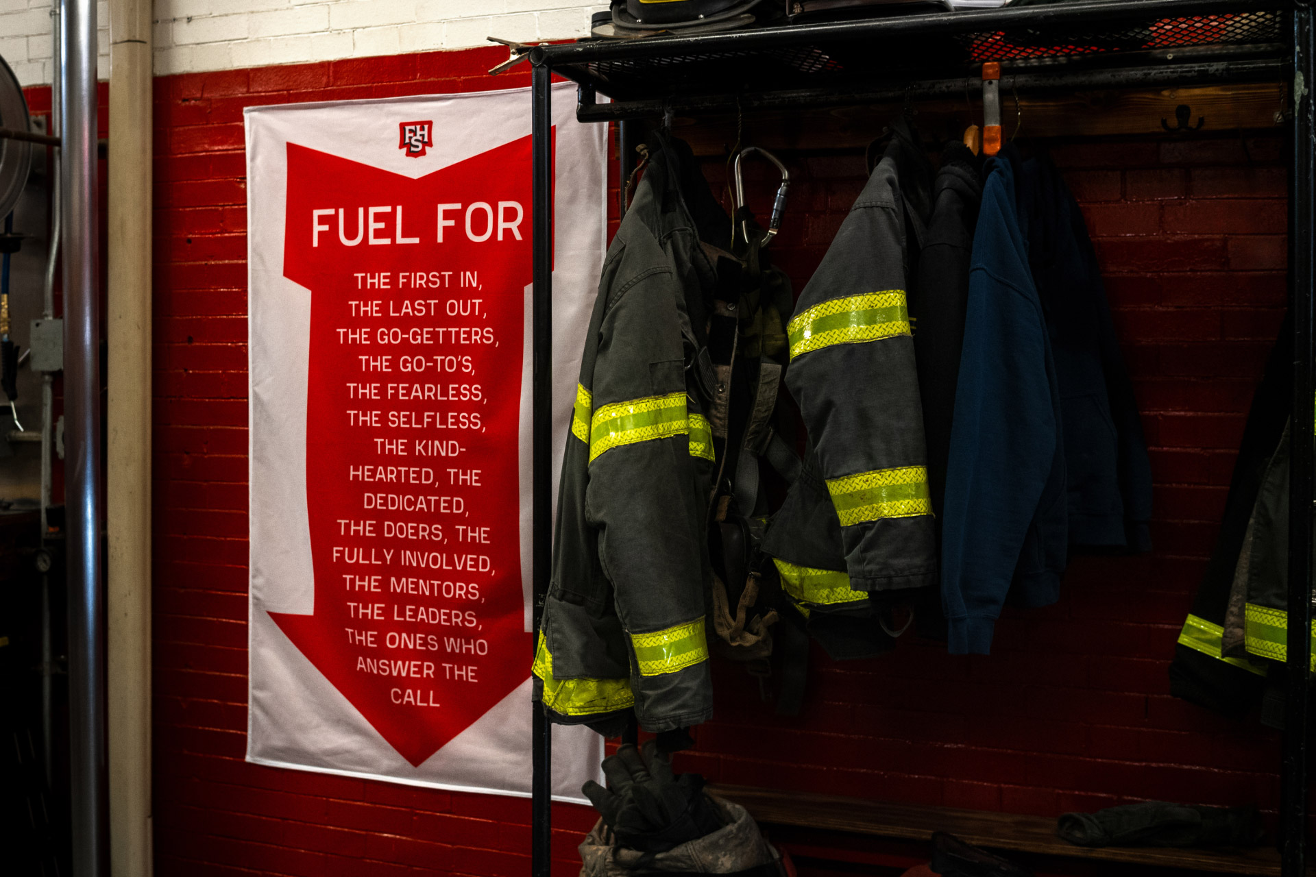
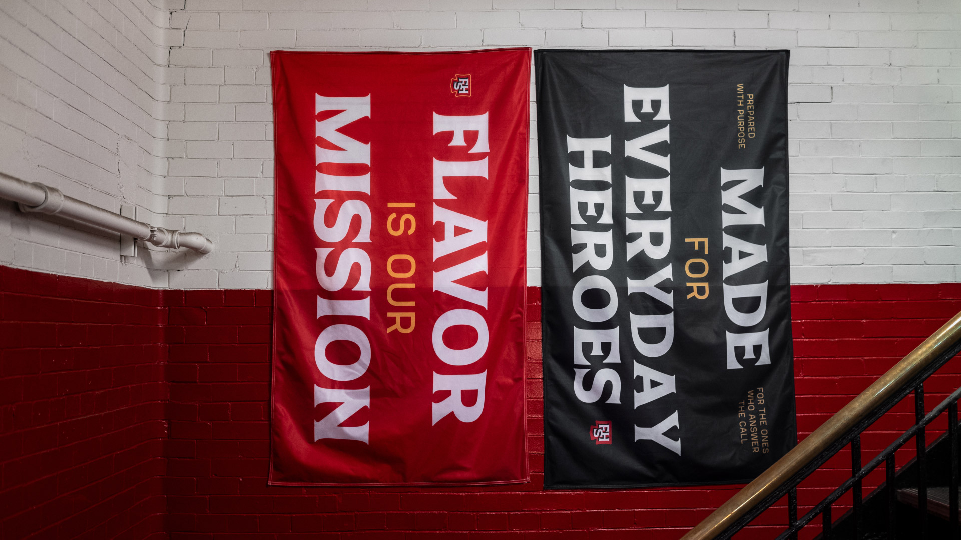
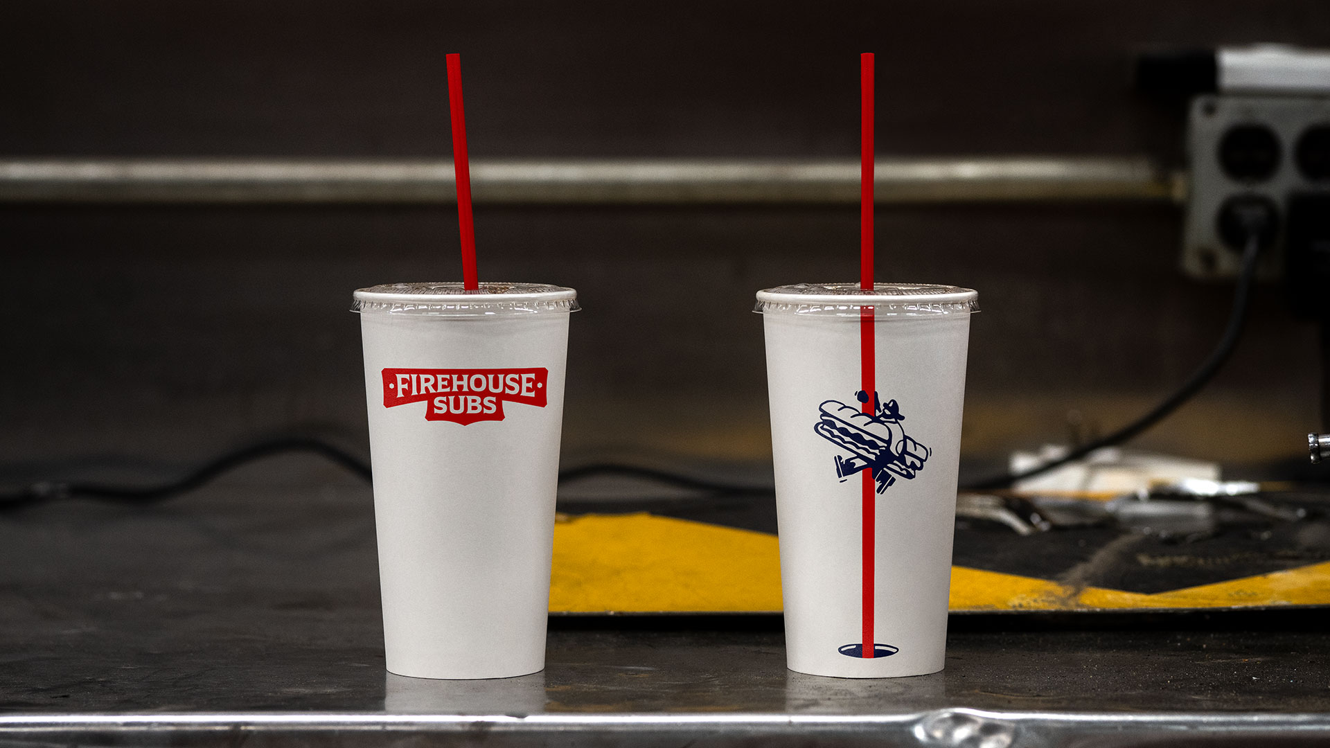
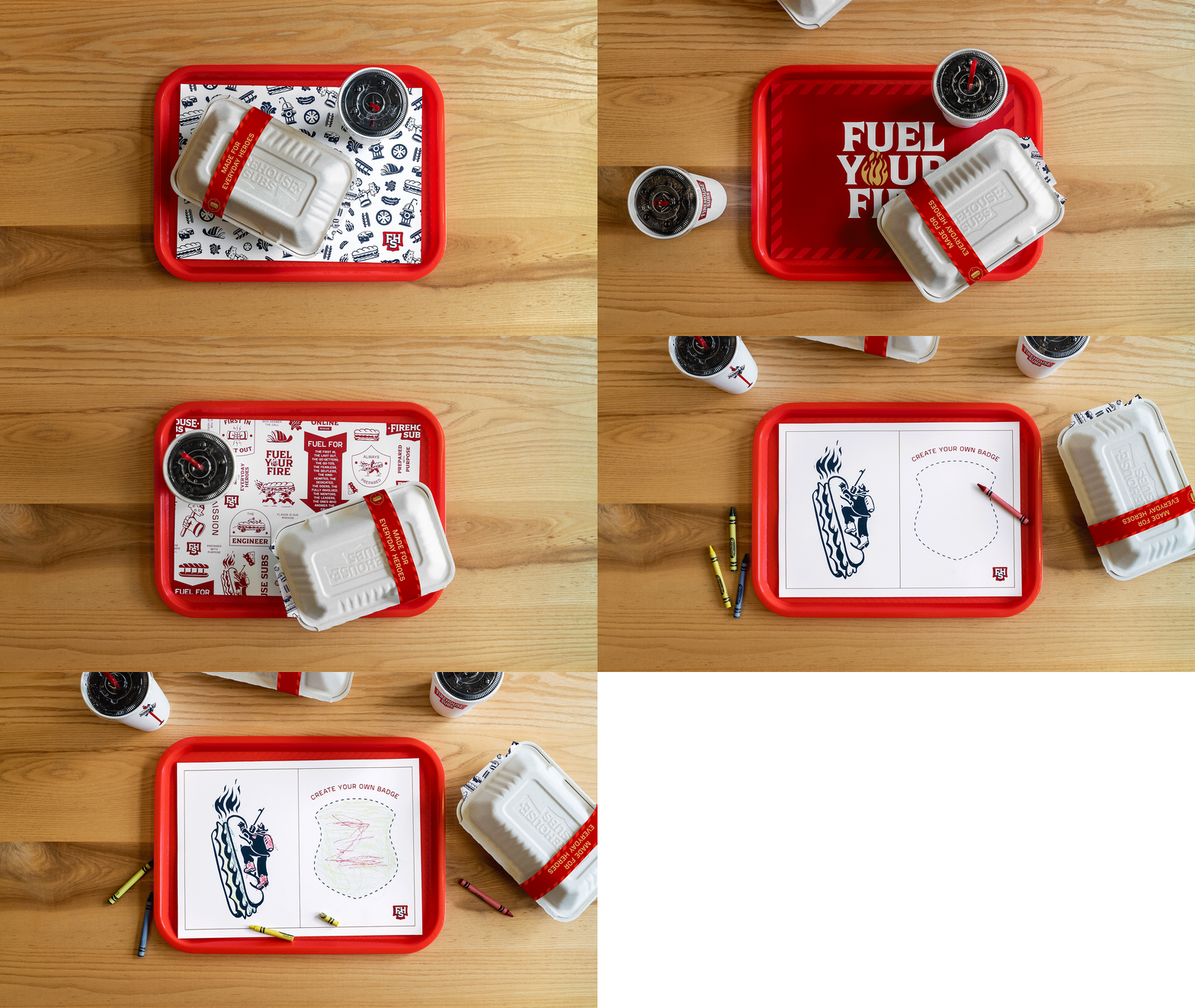
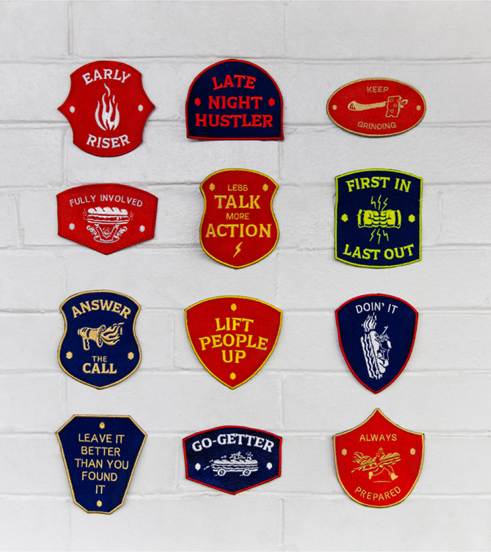
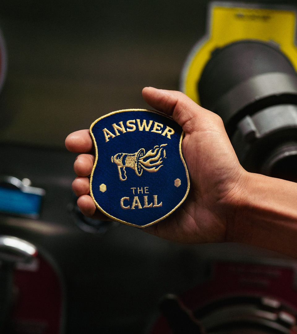
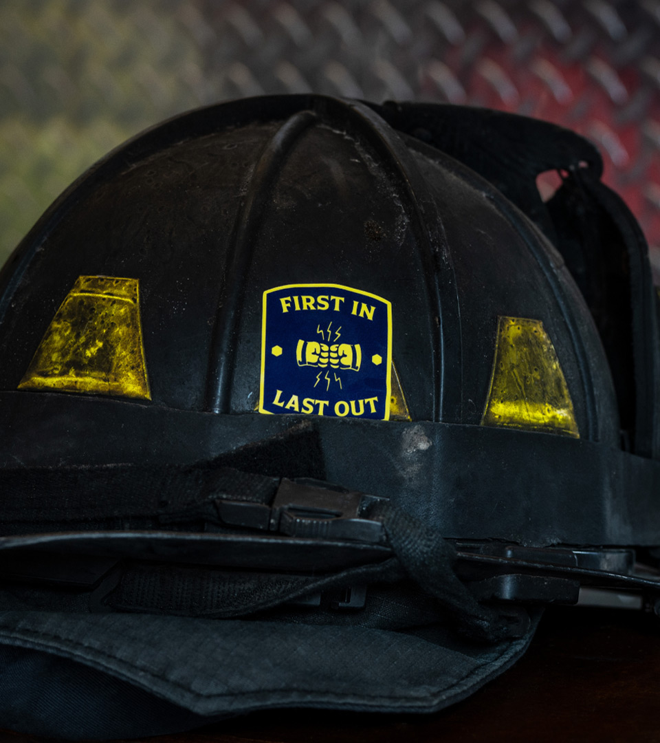
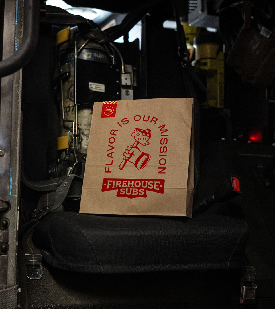
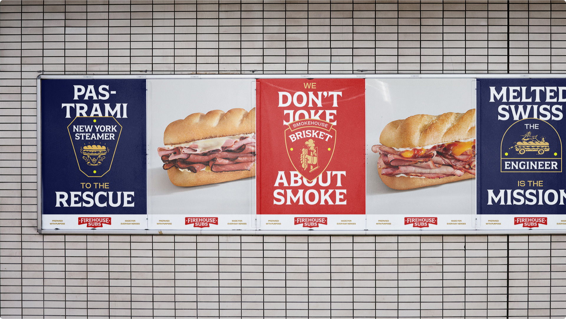
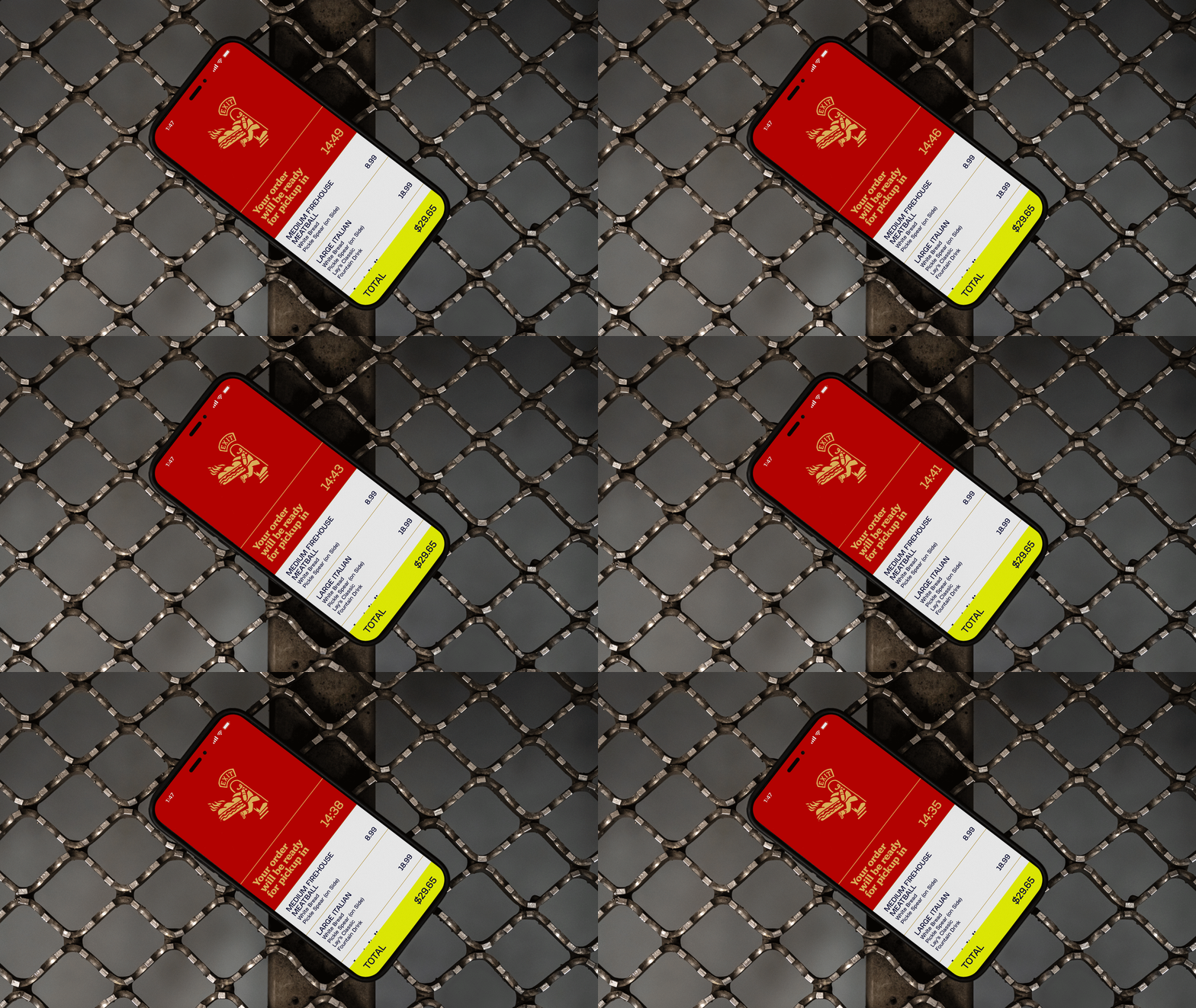
As Firehouse Subs expands globally, they needed to retain their mission and origin story, while better emphasizing taste to resonate with international markets. We developed a new Purpose, Positioning and comprehensive Brand Identity that is warmly crafted, deliciously bold, inspiring and energetic. It amplifies the culture of the firehouse, while celebrating “community captains” all over the world that embody the firehouse spirit.

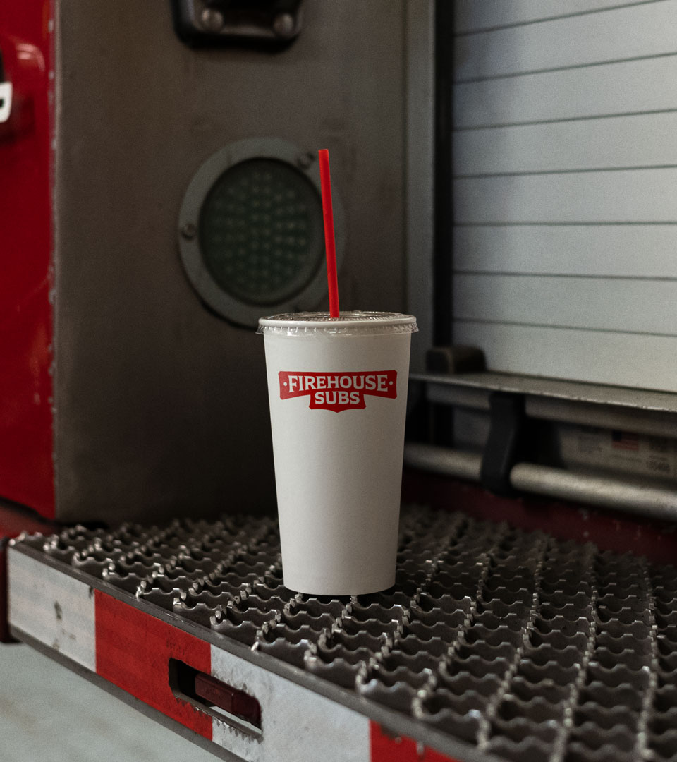
We partnered with the lovely folks at Colophon to create an evolved Firehouse Subs wordmark that takes the most distinctive elements from the original logo—the helmet-badge-inspired holding shape & bolts, flared type, and contrasting strokes—and simplifies them, creating a more taste-led, digital-friendly logo that can transform into a monogram at small sizes.

We also worked with Colophon to create two custom typefaces. Hero Serif is a tasty flared display typeface that draws on the more ornate parts of firehouse artifacts, found lettering and uniform badges, while Hero Sans pays homage to the highly utilitarian, almost brutalist lettering found on instrument panels, pump labels, and other tools of the trade.

Colors were pulled from a combination of firehouse materials and sandwich ingredients.

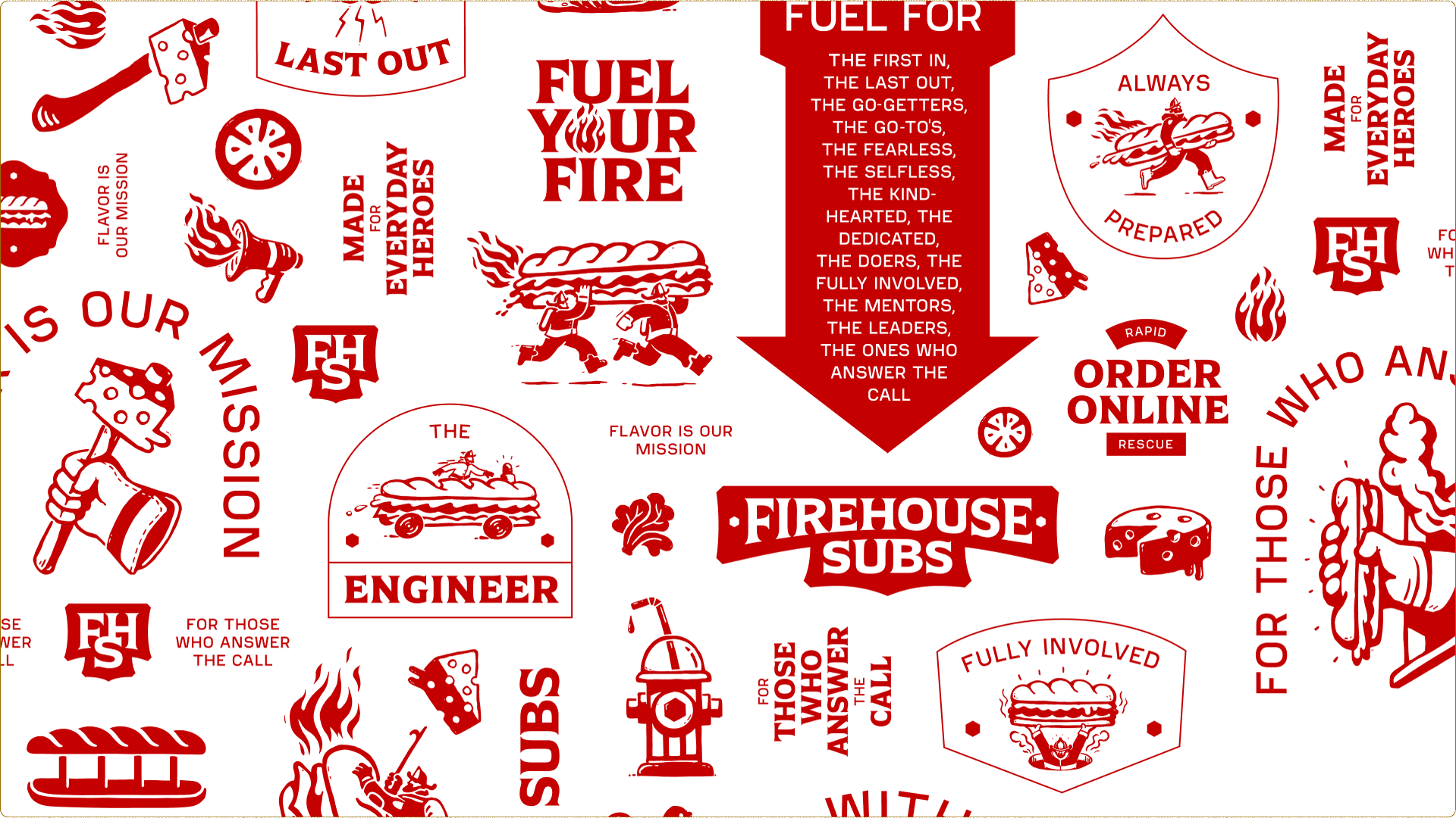
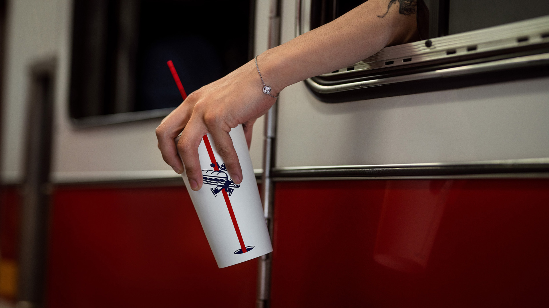
We add energy & personality with patterns taken from first-responder vehicles, and a series of firefighter + food scenes drawn up by the brilliant Marco Palmieri.

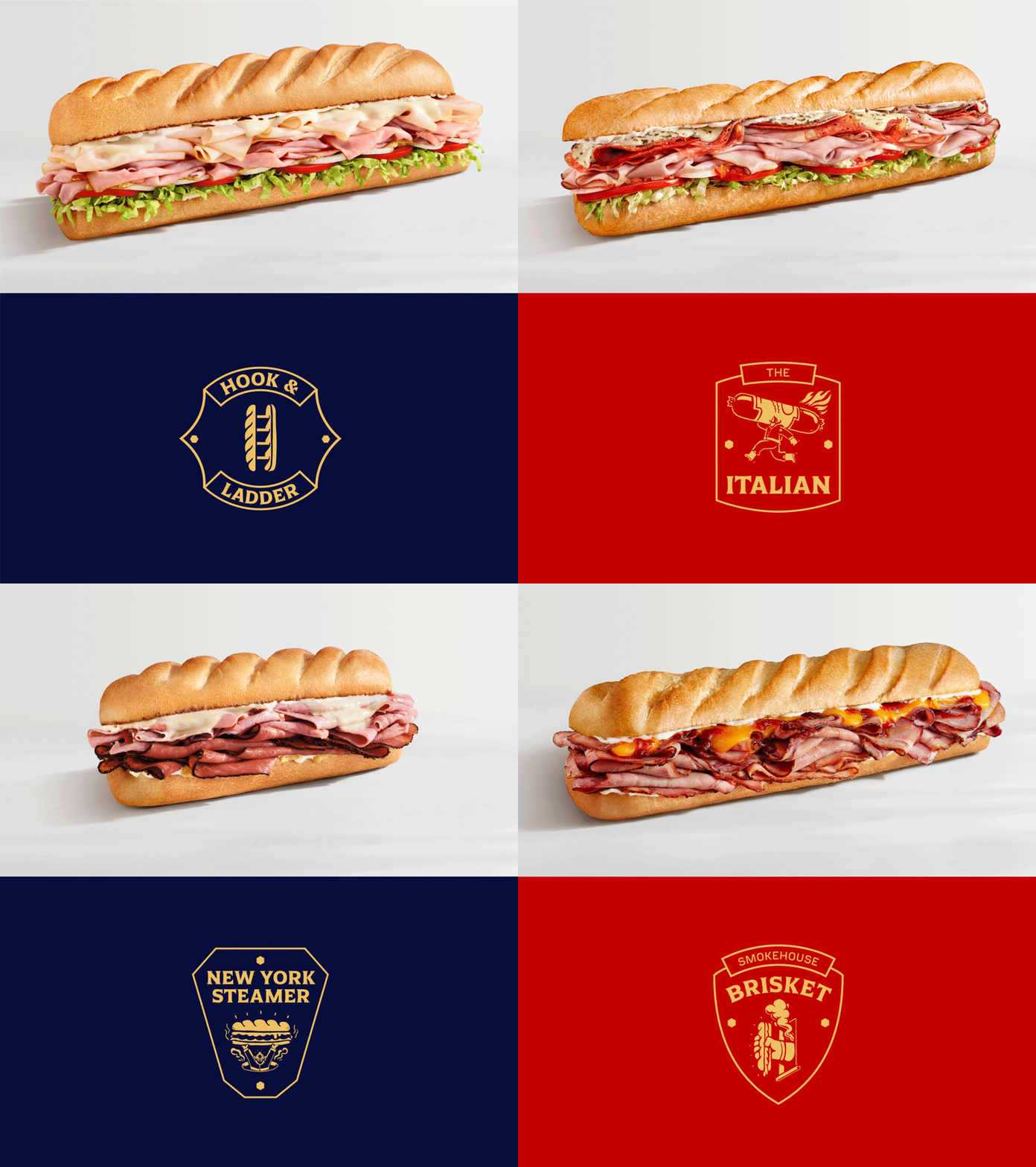
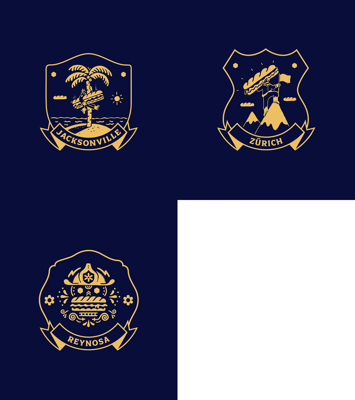
We elevated the food, shooting a new brand photo library and creating custom illustrated badges for each sub.

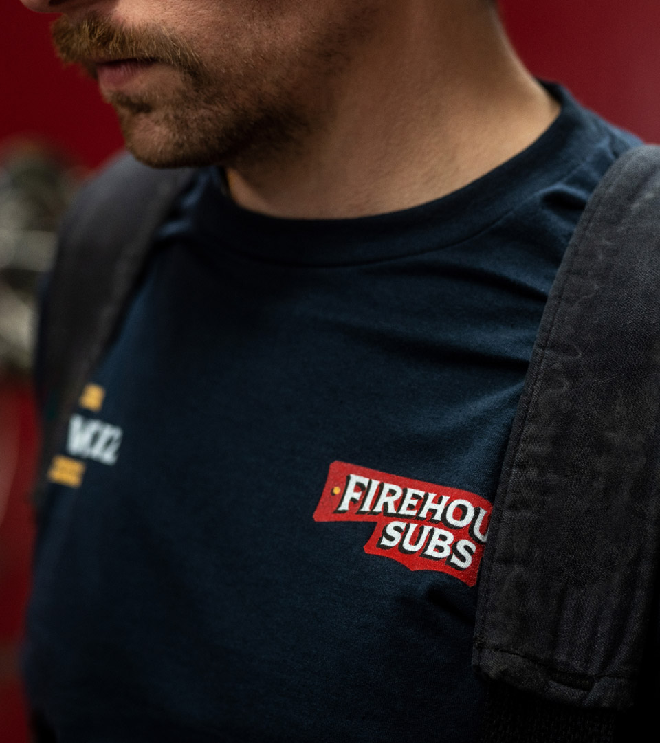
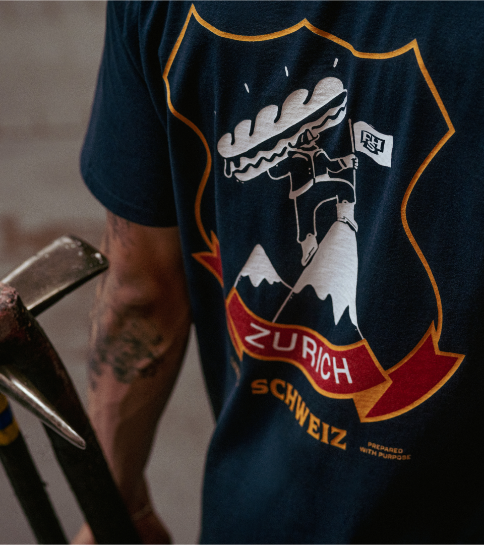
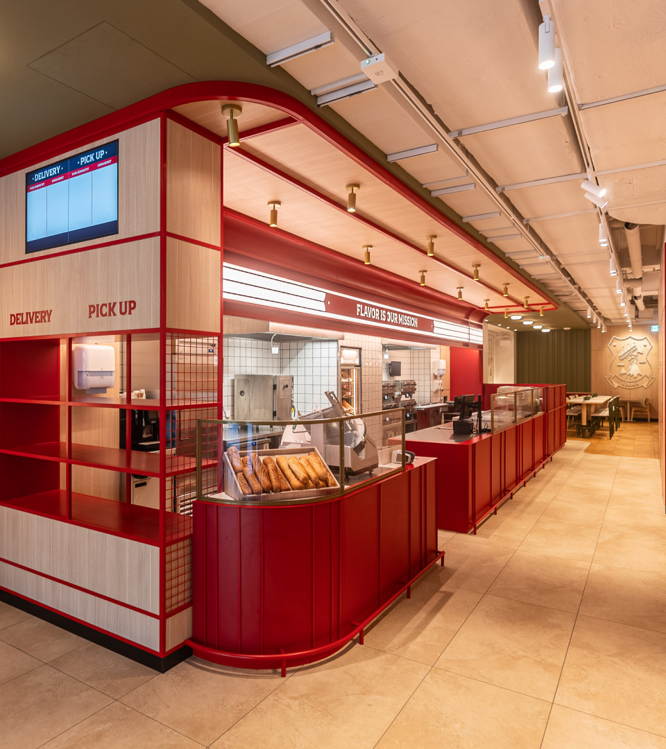
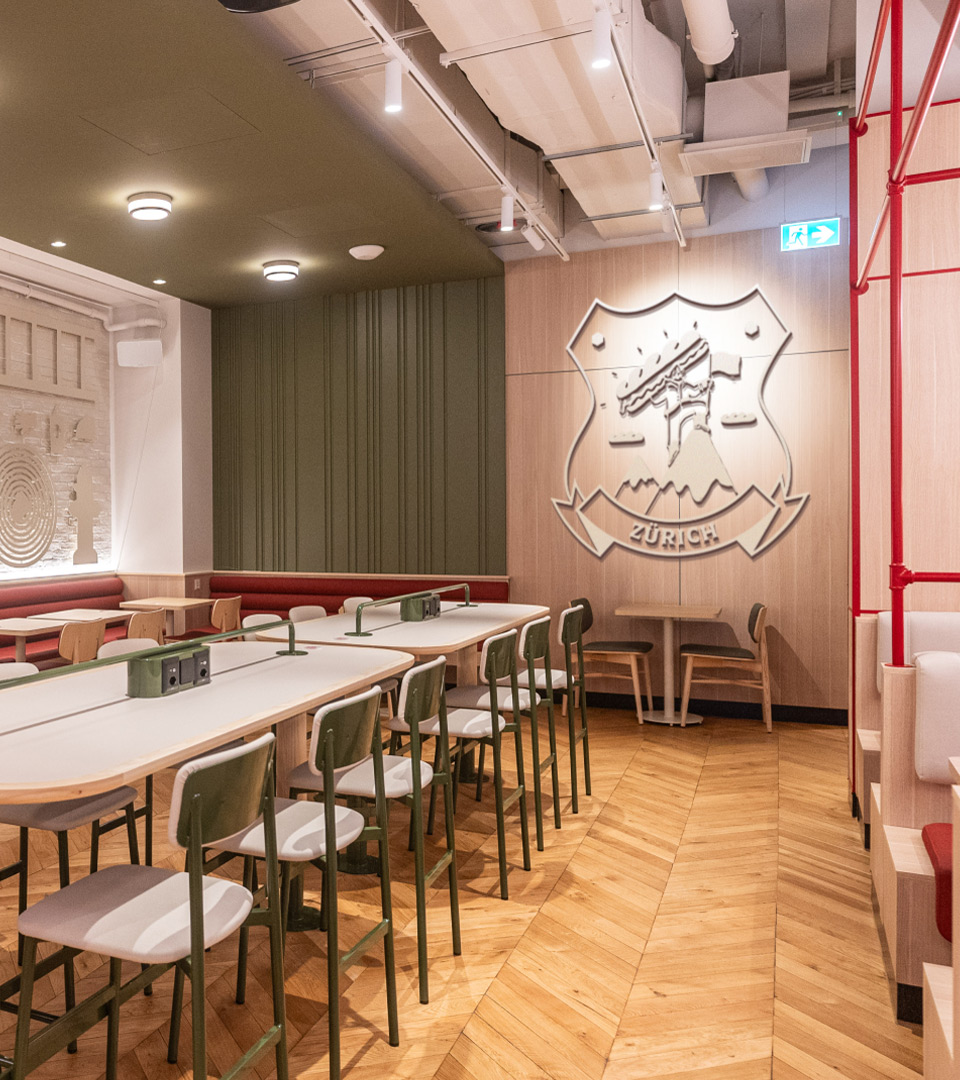
The first new Firehouse Subs restaurants are launching in Switzerland and Mexico; we worked with the FHS team to perfect the in-restaurant experience, materials, et al. and set up a scalable location-based badge system (inspired by firehouse t-shirts) for restaurant artwork and uniforms. Pre-launch renders and post-launch photographs of the Zurich location shown below.

PROJECT LINKS

D&AD Shortlist

CAPABILITIES

Branding

Creative Direction

Packaging

Experiential Design

Motion Design
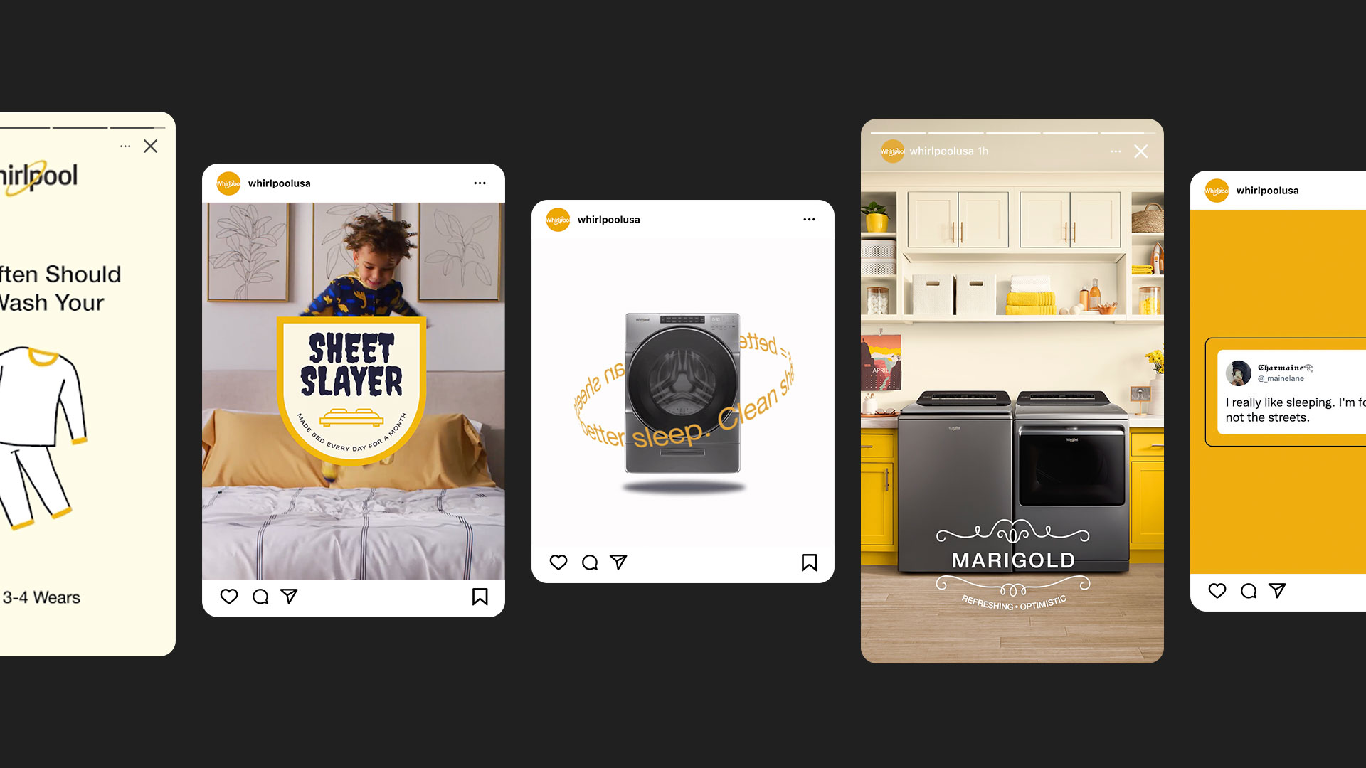
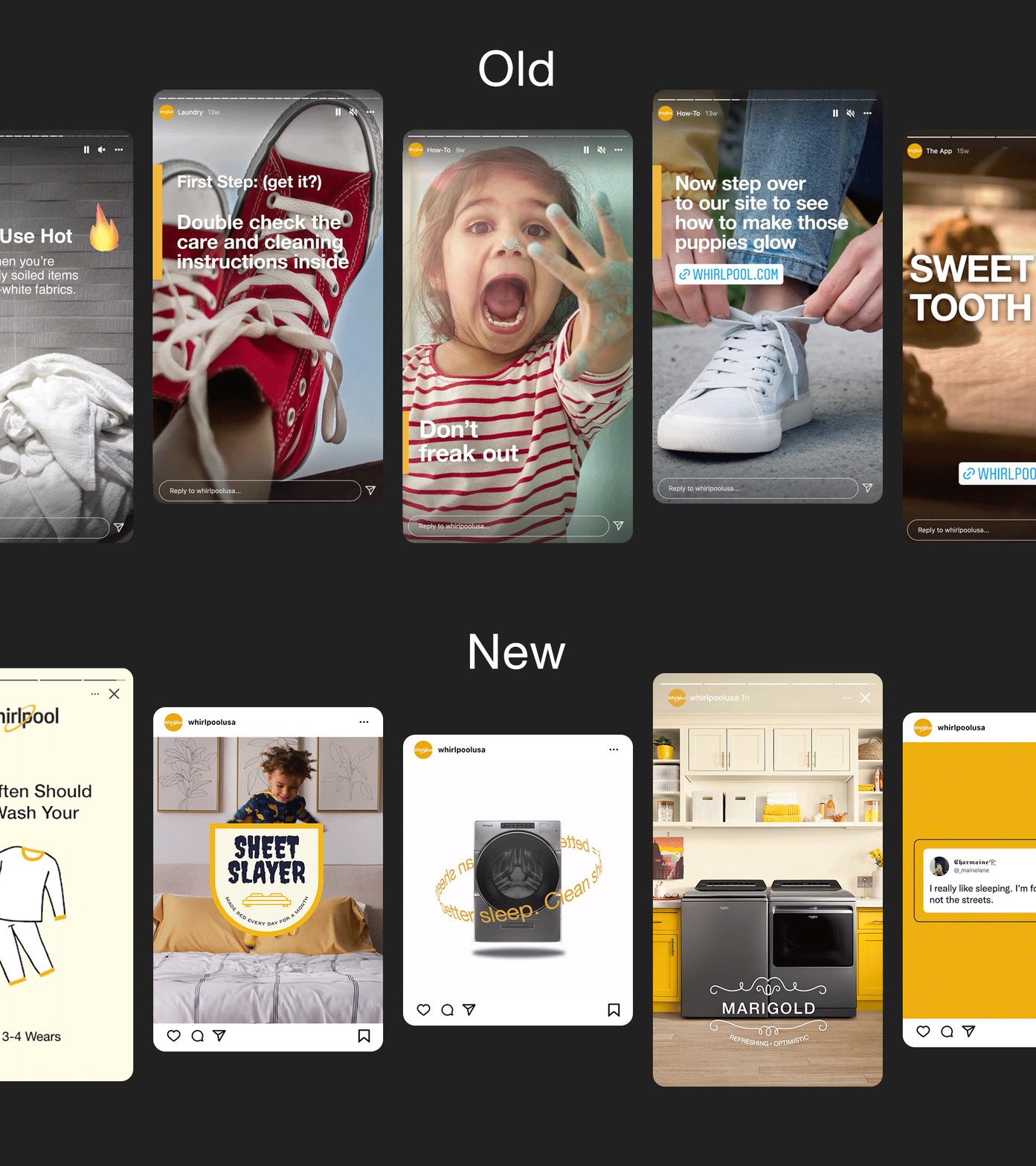
Whirlpool’s brand had gotten stale. It was especially apparent on social channels, where they had never measured anything other than negative brand sentiment on a post. By extending their color palette, refining their typography, and introducing new approaches for voice, graphics, photography, illustration & content strategy, we delivered measurably positive brand sentiment on social for the first time in company history.

Whirlpool was showing up on social using a templated approach to layout combined with an inconsistent execution of type, imagery and messaging details. We turned that philosophy inside out, focusing on consistency and sophistication in their brand elements, a more liberal use of their gold (as well as a fresh new “marigold” color) and photography that reinforces their color palette and brand persona. Not to mention a new illustration approach and more relatable subject matter.

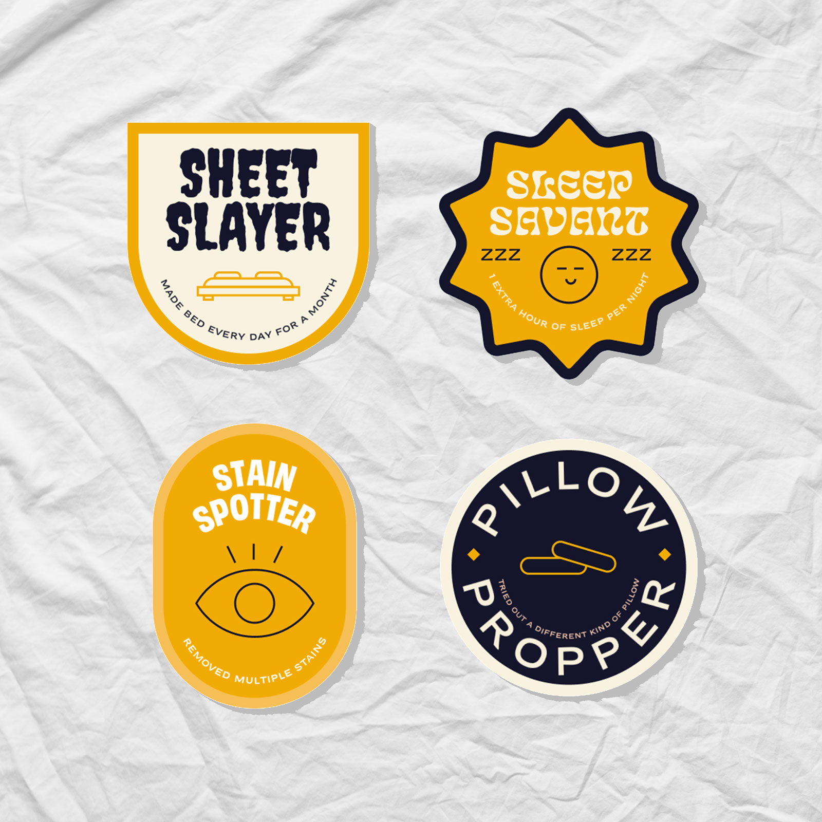
The new look has been rolled out across social channels, starting with last quarter’s “Clean Sheets, Better Sleep” content (shown below) and will continue to be built on in the coming months and years.

PROJECT LINKS

Whirlpool on Instagram

CAPABILITIES

Branding

Creative Direction

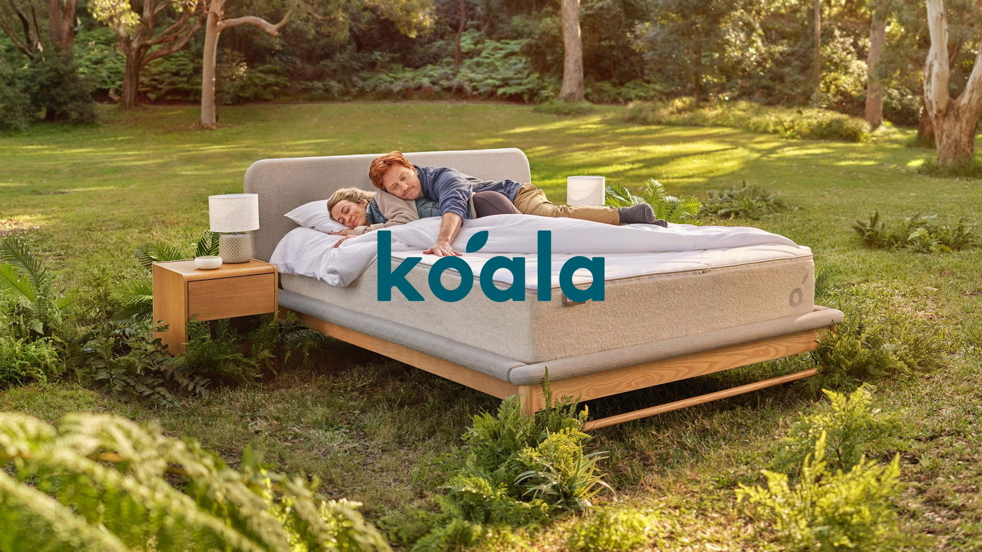
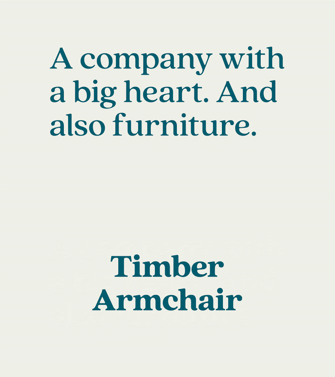
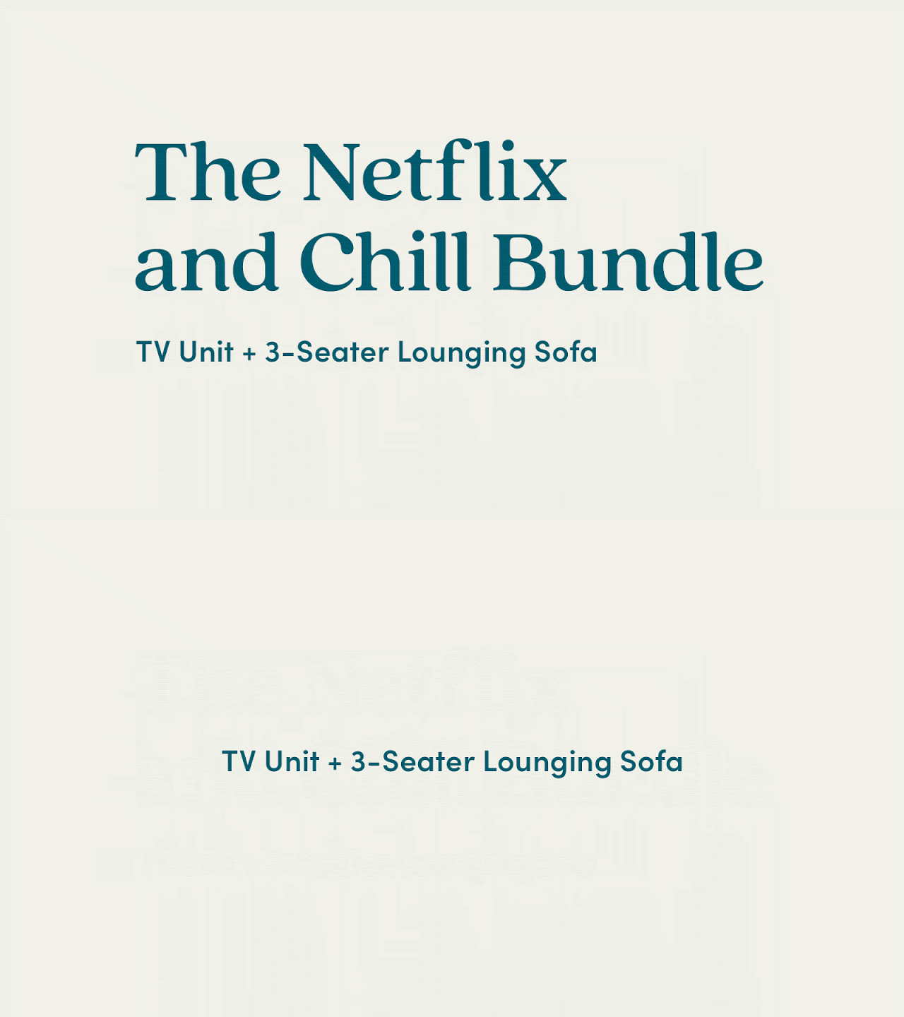
We partnered with the incredible in-house creative team at Koala to evolve their brand as they expand from an Australian mattress startup to a global furniture icon – without losing their uniquely Aussie roots.

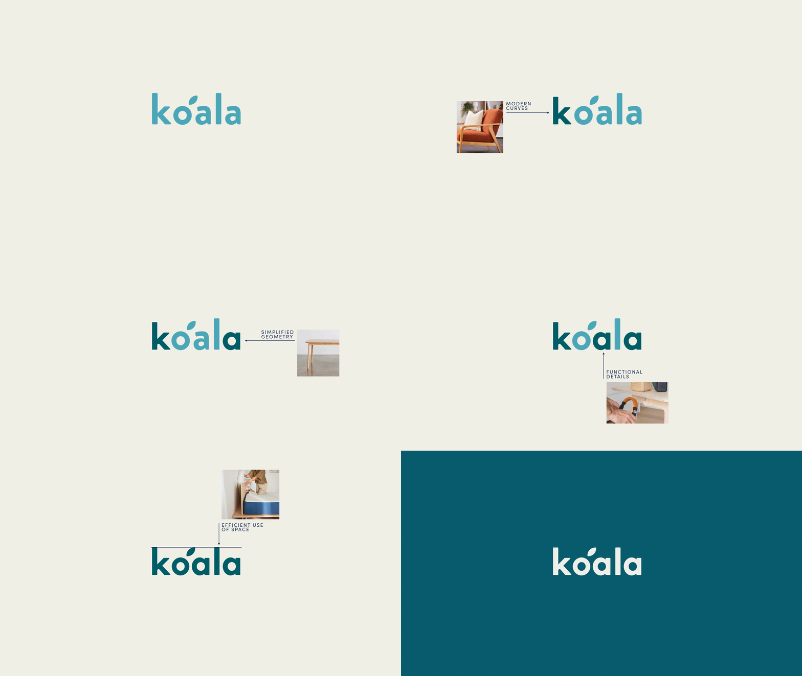
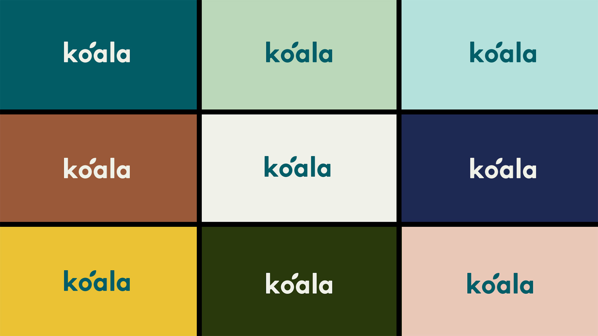
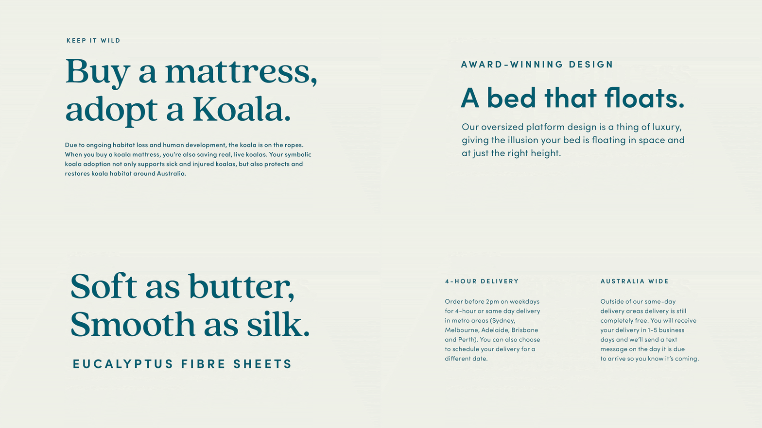
First order of business was to create a custom word mark that retained “o leaf” mark, replacing Brandon Grotesque with custom lettering inspired by their product design principles.

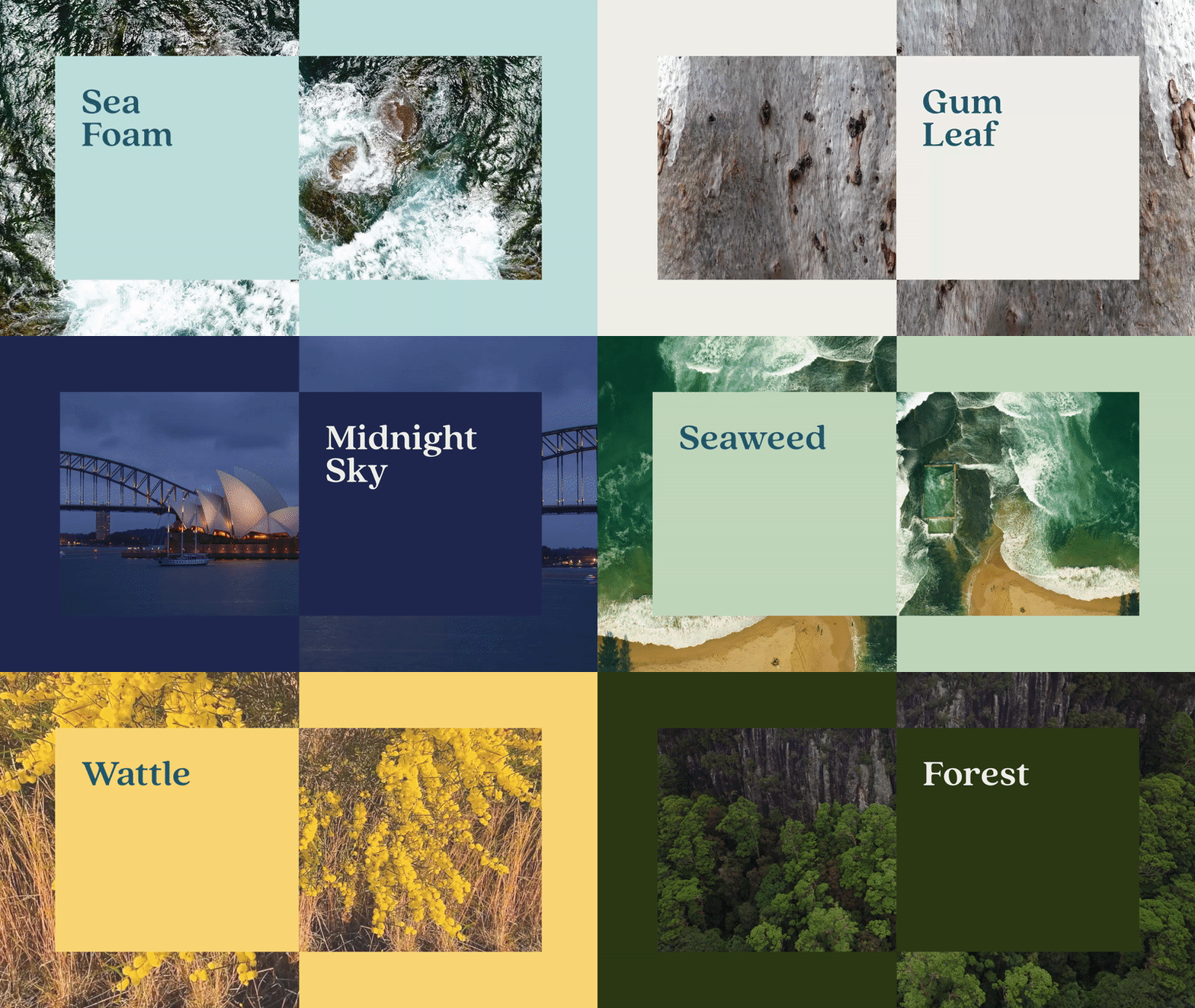
Koala’s primary blue anchors a color palette inspired by Australia’s distinctive landscape.

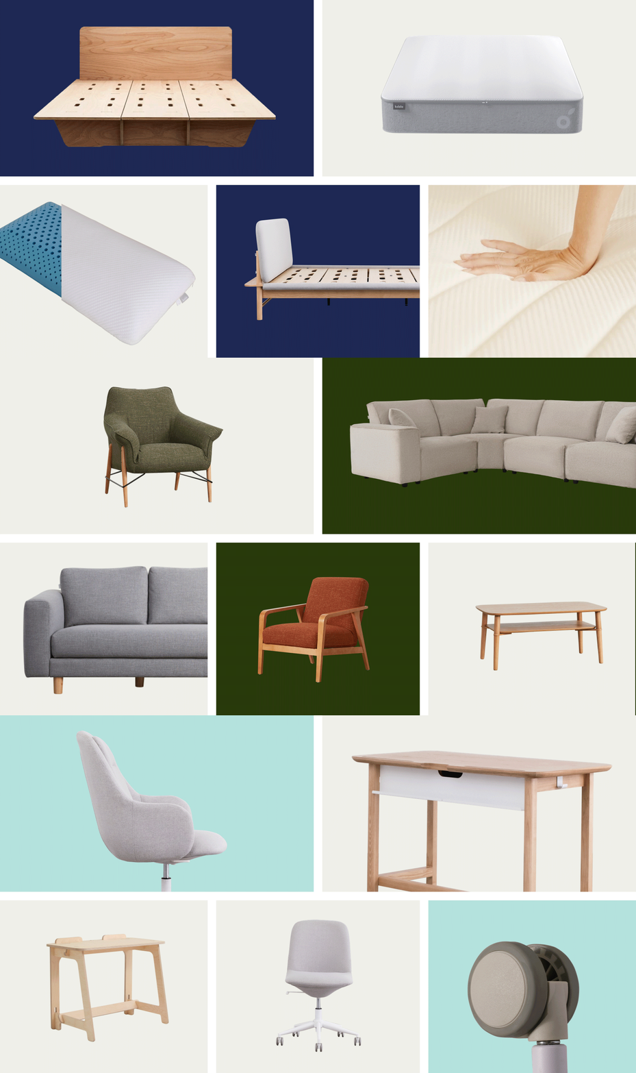
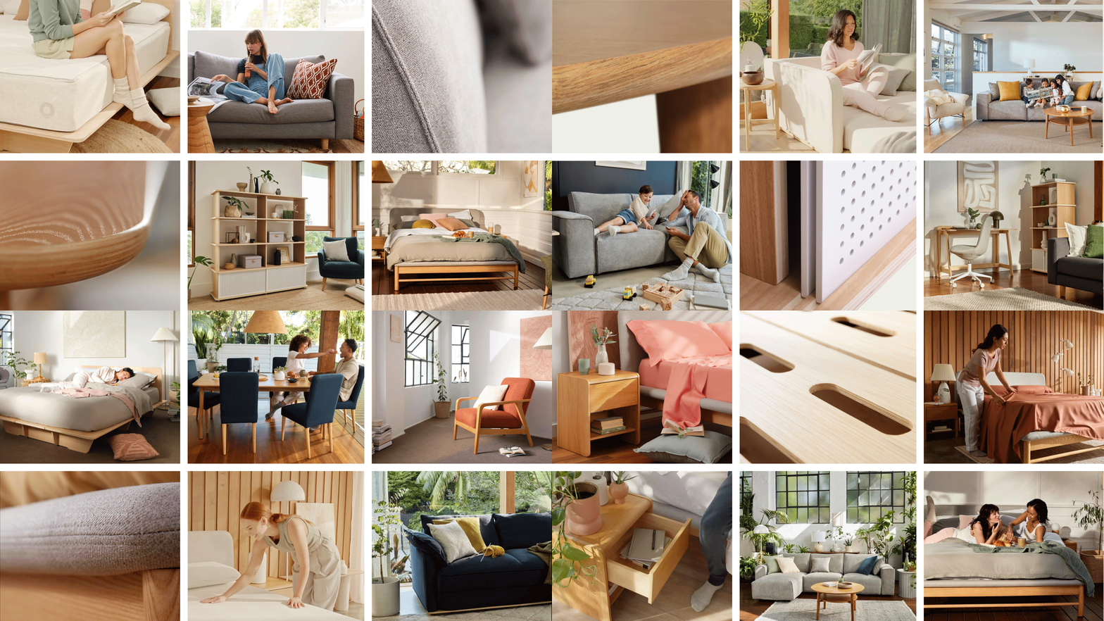
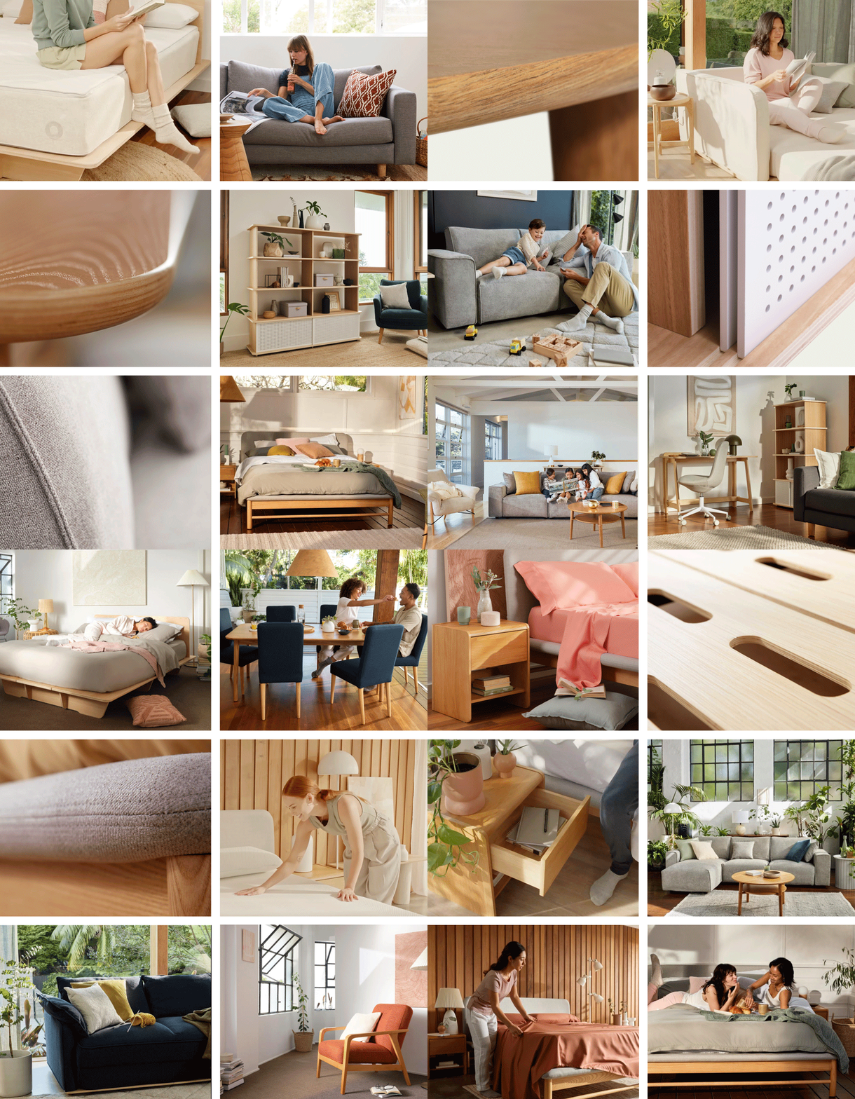
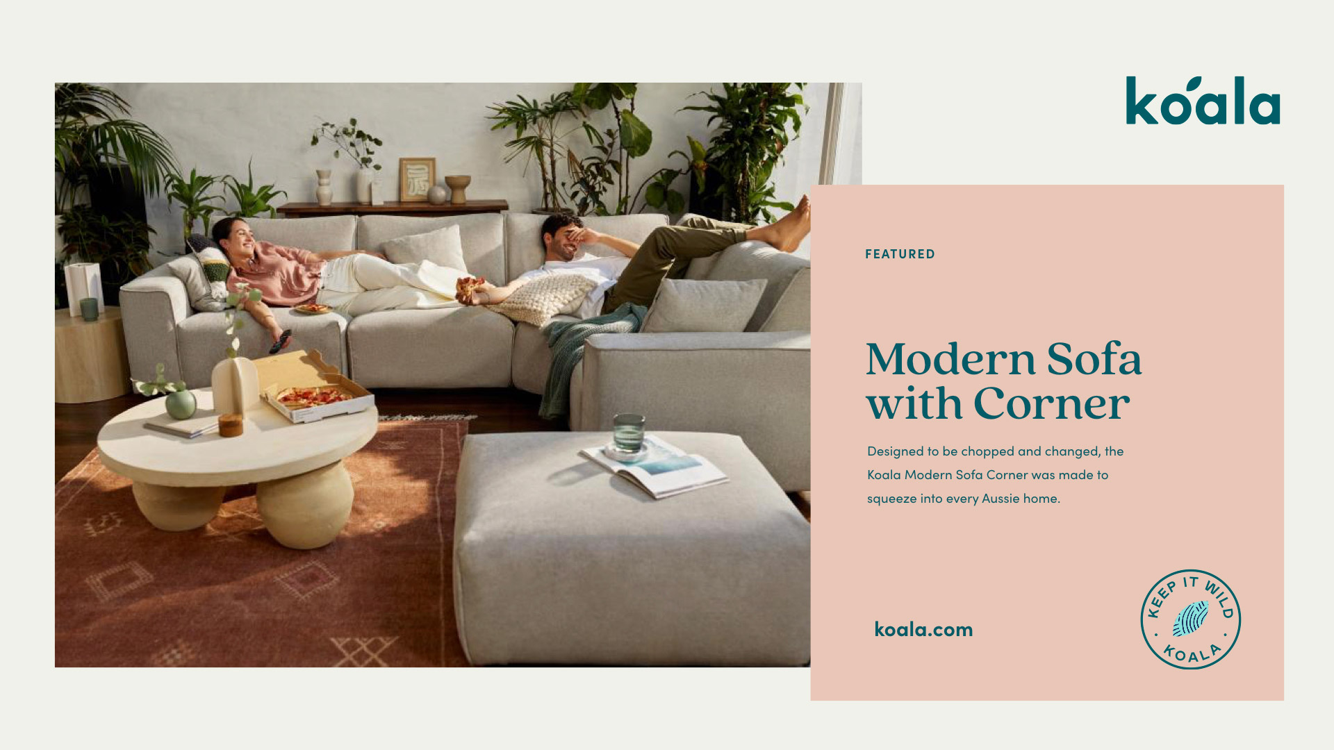
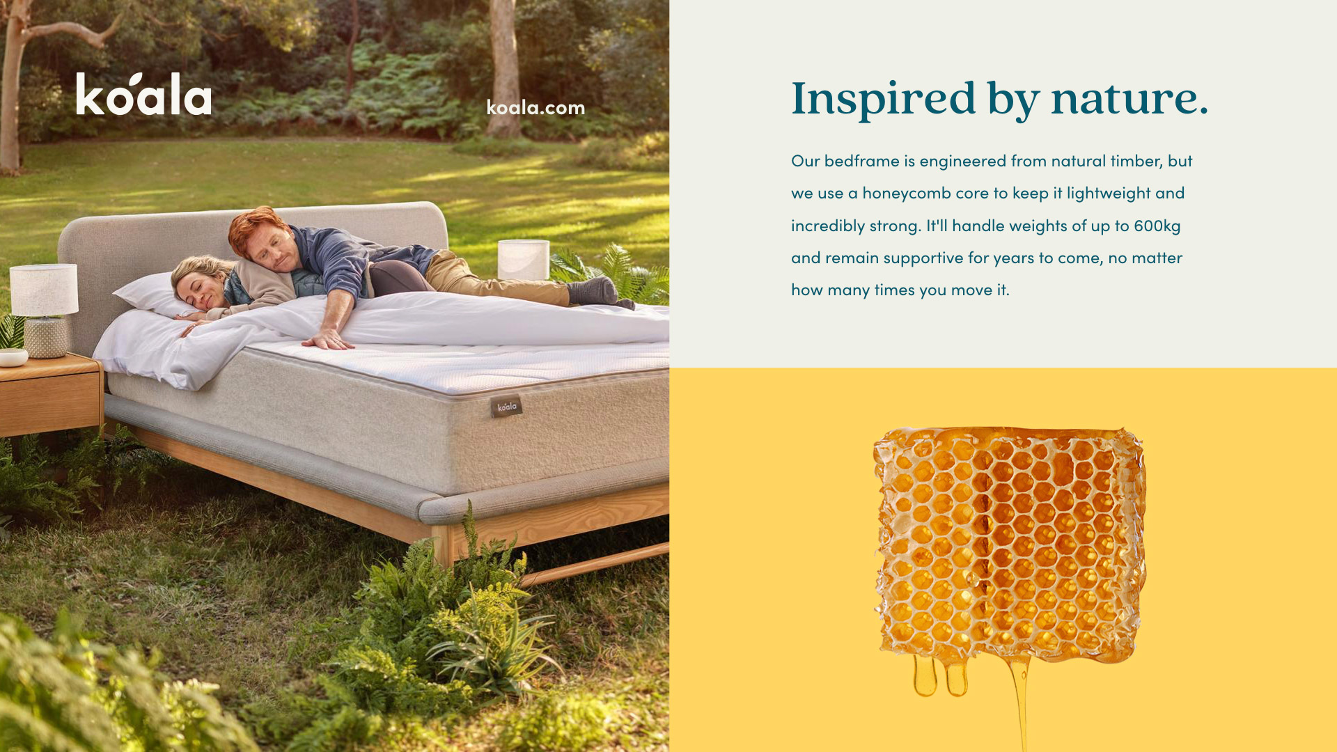
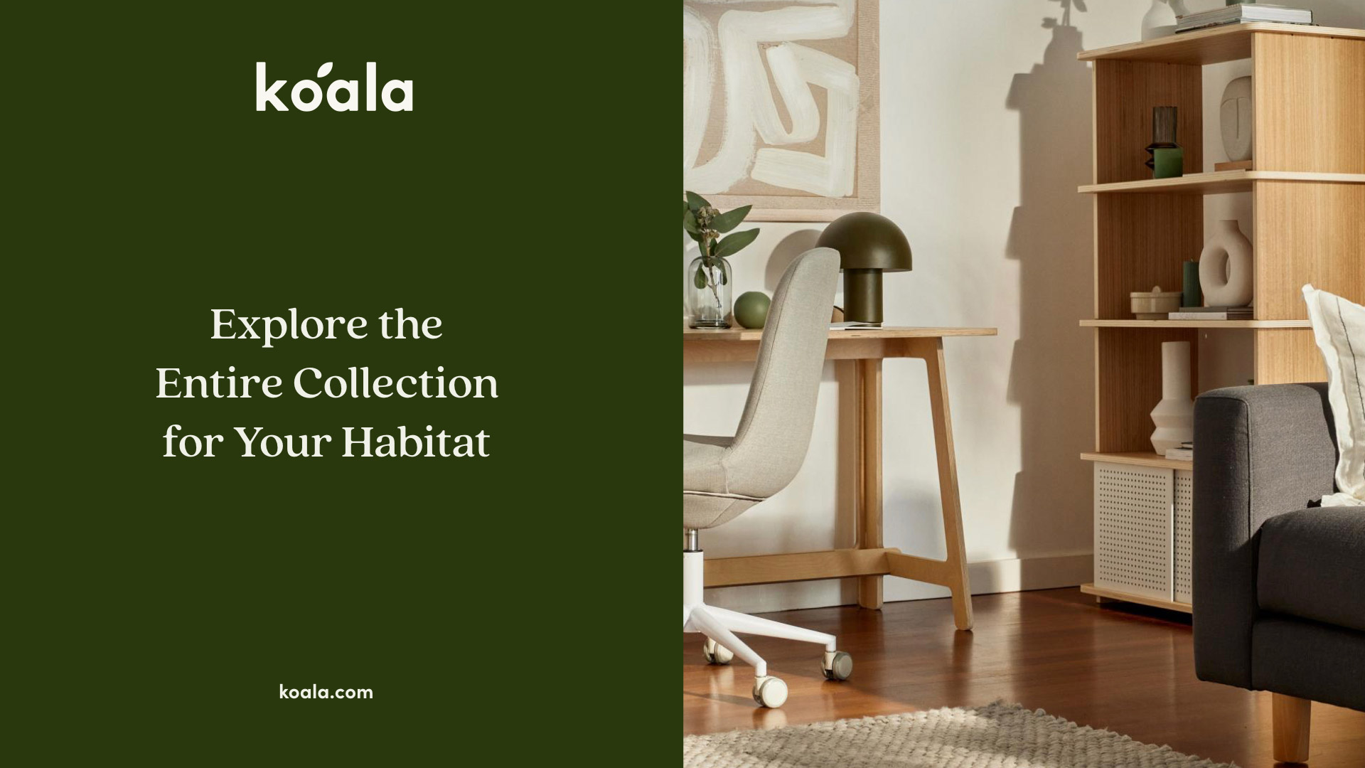
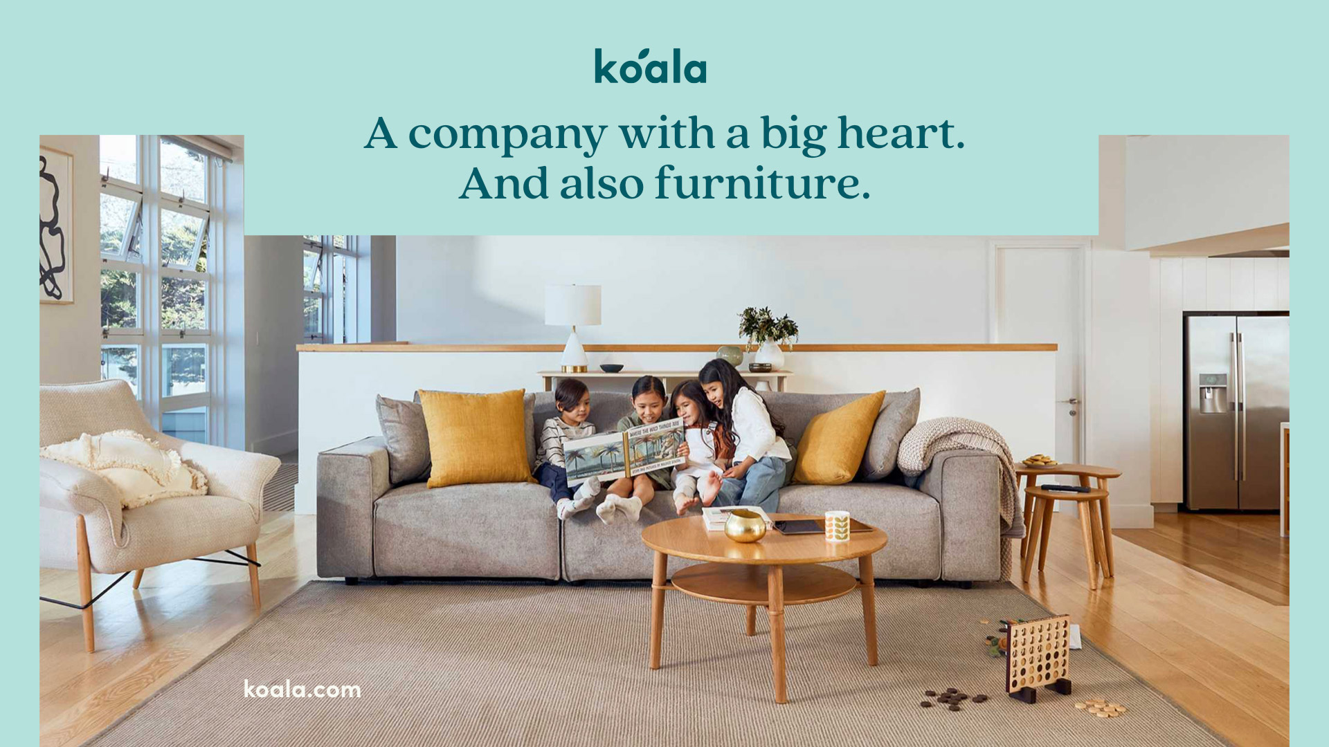
We use color accents to signal different room collections for isolated product photography. Lifestyle photography focuses on bringing nature into the room through light and shadow play, and interiors that complement the warmth of the product materials. Koala’s team directed and produced a massive photo library that brought everything to life – even going so far as to hide Eucalyptus plants (koala food) in most scenes!

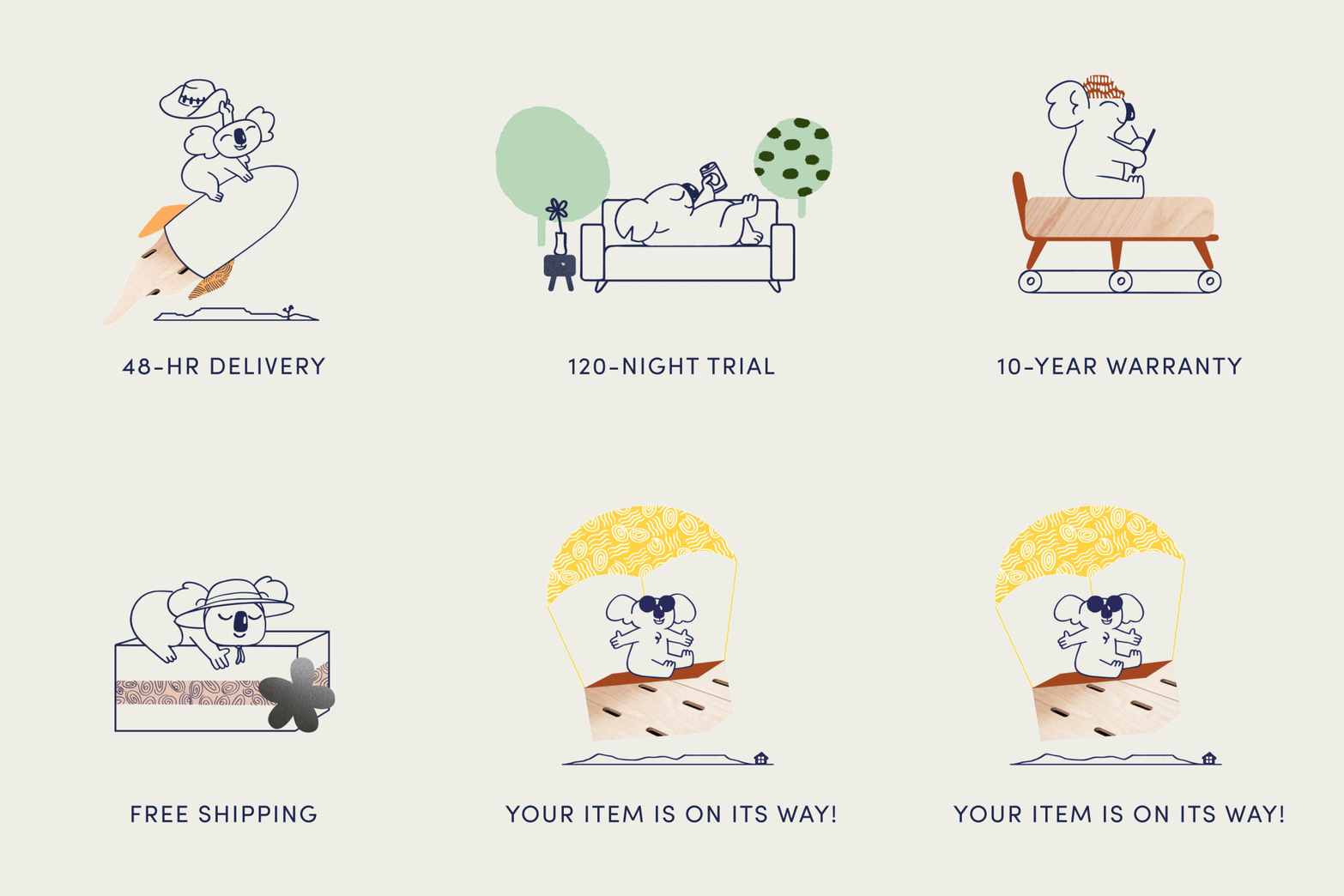
We evolved the Koala mascot to incorporate hints of their product textures and aboriginal-inspired patterns.

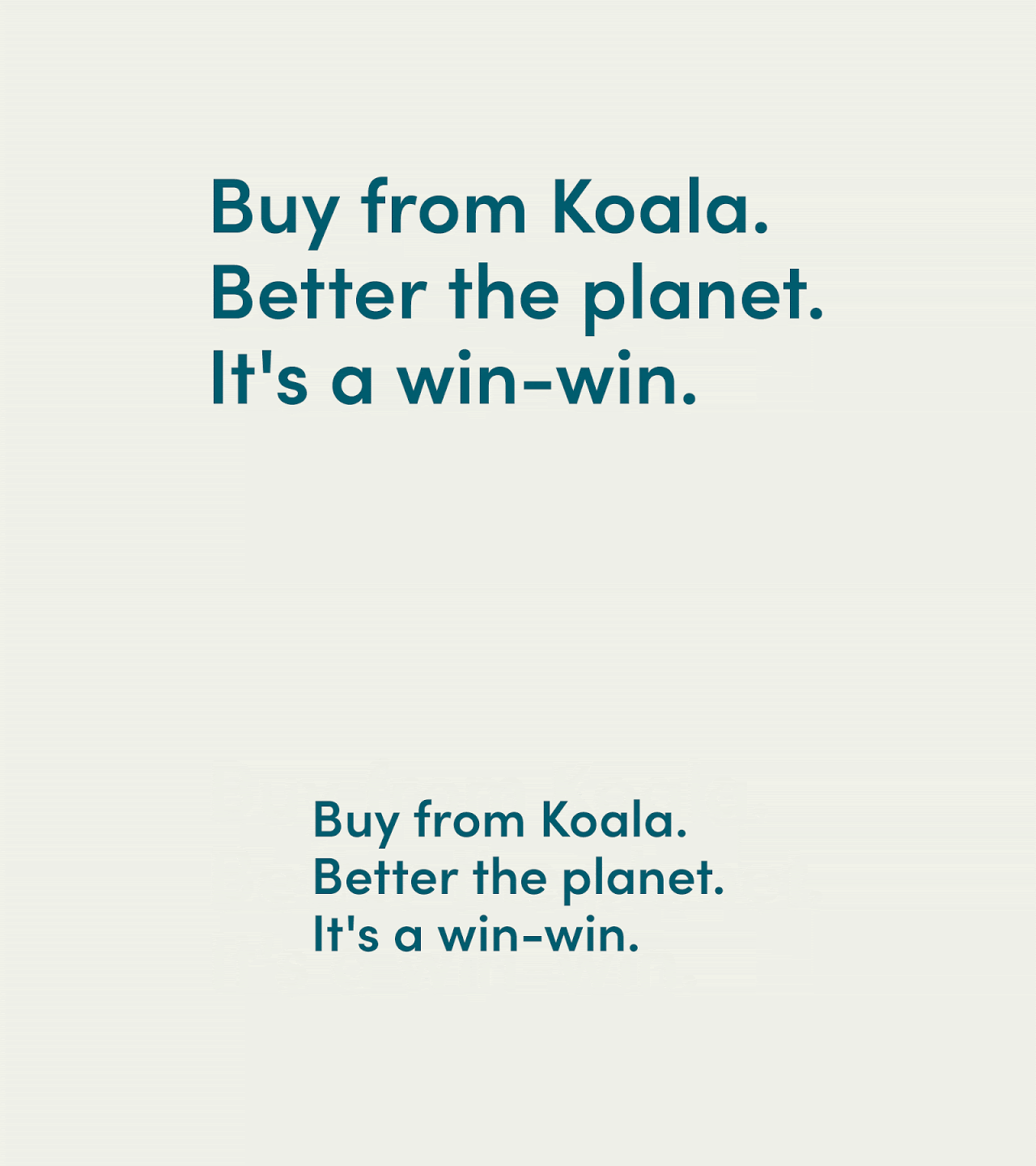
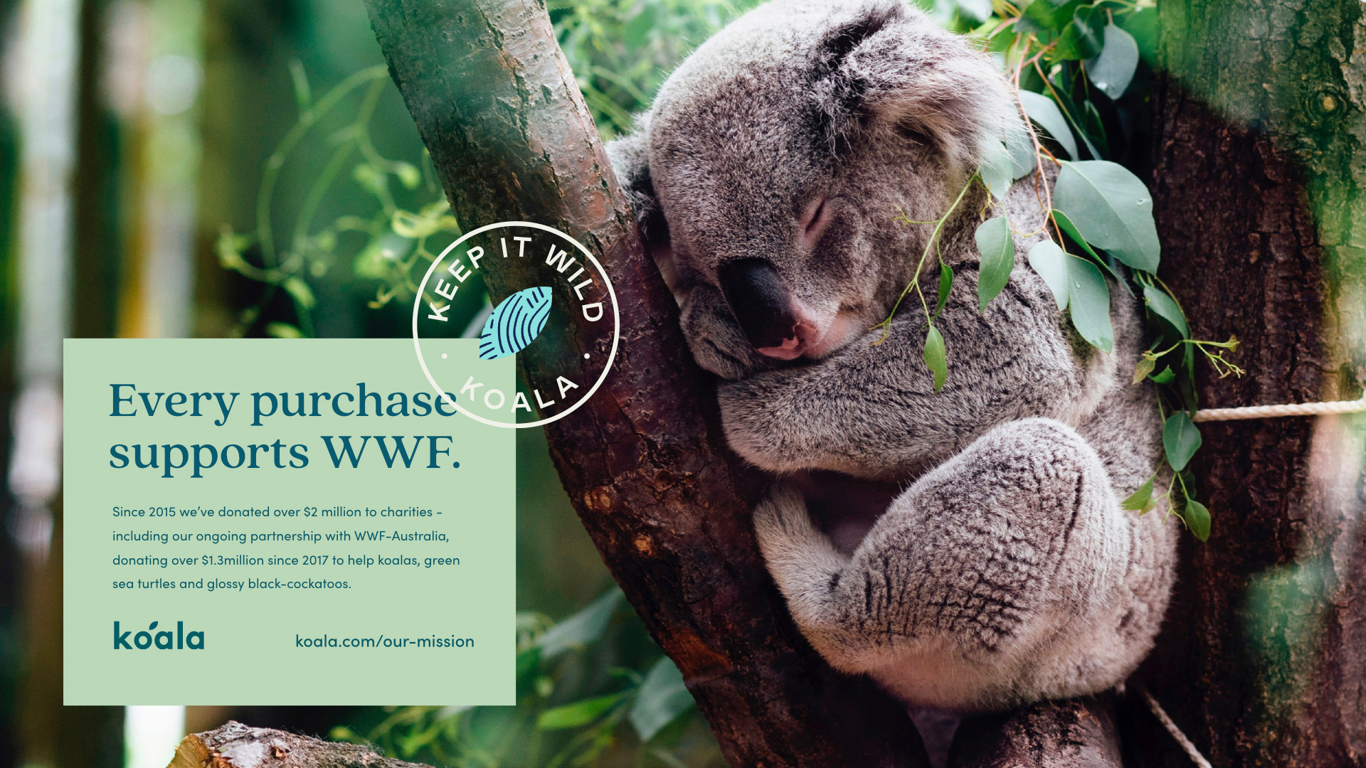
Koala has an incredible mission that includes giving 1% for the Planet, a partnership with the WWF, B-Corp certification, mattress recycling and more. To support expanding this initiative, we created a KEEP IT WILD trustmark that appears next to any products or communications that are directly advocating to Keep Australia Wild.

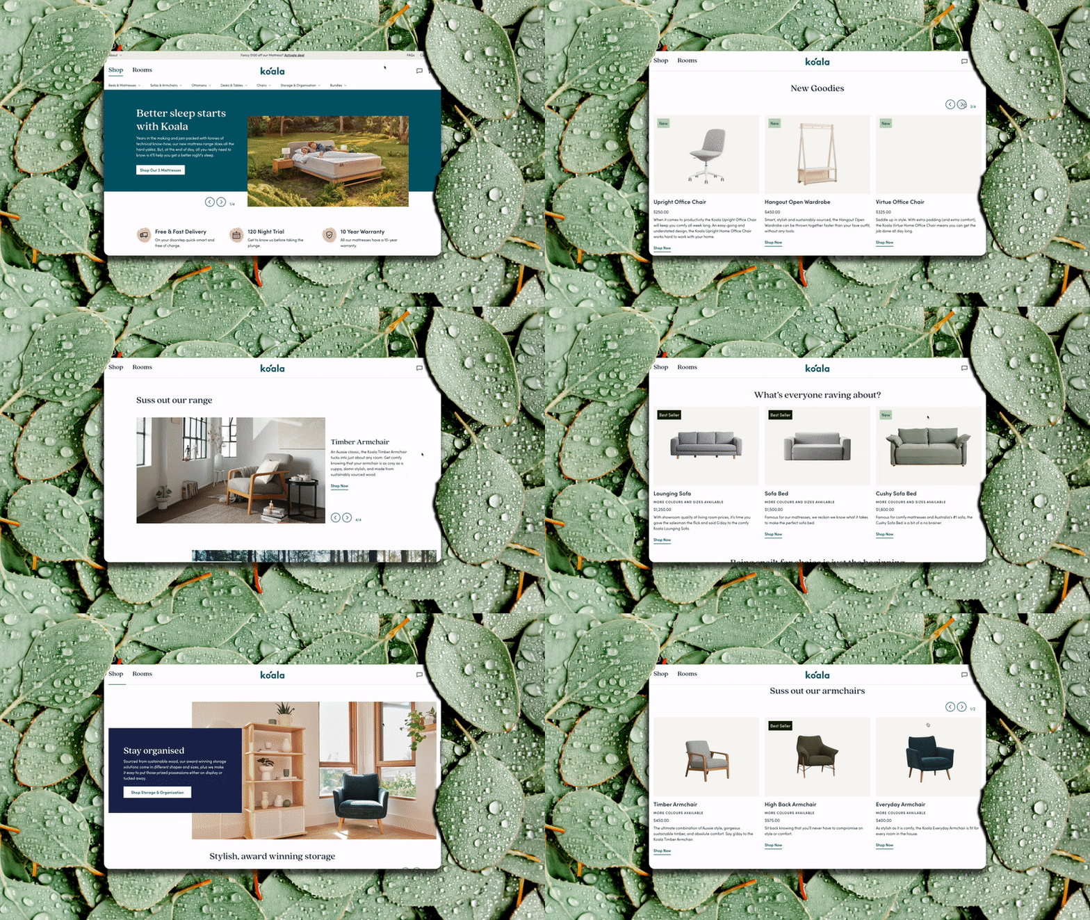
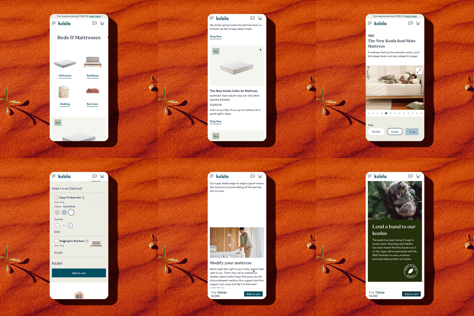
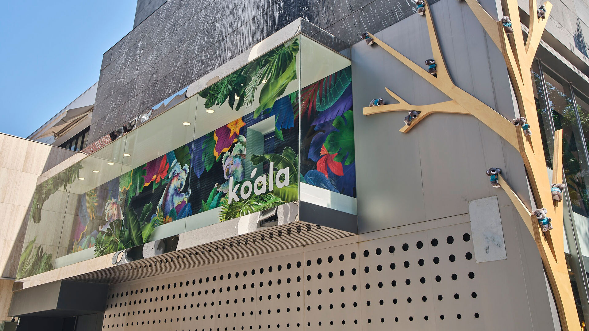
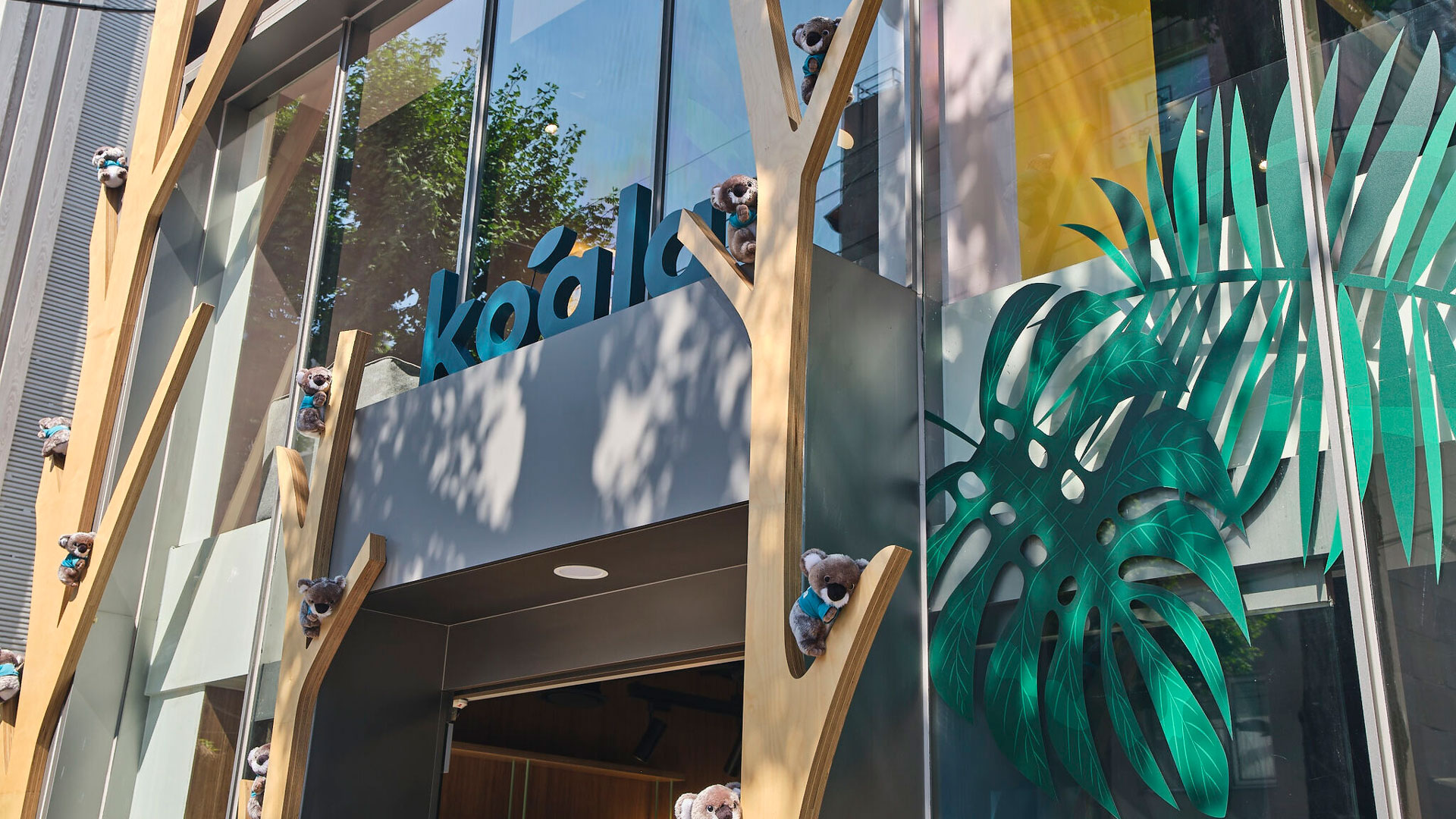
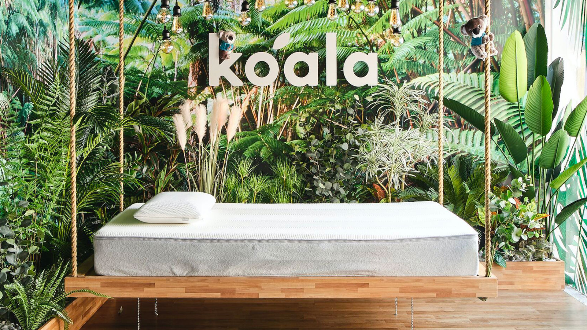
We launched Koala’s brand evolution through a robust website, giving them a scalable shopping experience for their rapidly expanding global audience, product line and mission. The new look is also spreading to showrooms around the world, starting with their brand new Koala Korea flagship. Cheers!

CAPABILITIES

Branding

UI/UX Design

Illustration

Creative Direction

Ecommerce

To amplify Delta’s vision for the future of travel at CES, we imagined how the future of the Delta brand would look, sound and feel. We applied this to CEO Ed Bastian’s Keynote speech to kick off the event, as well as their CES booth.

49347576008_e08b2e3f96_o

CAPABILITIES

Creative Direction

Branding

Motion Design
Experiential Design
Video Production