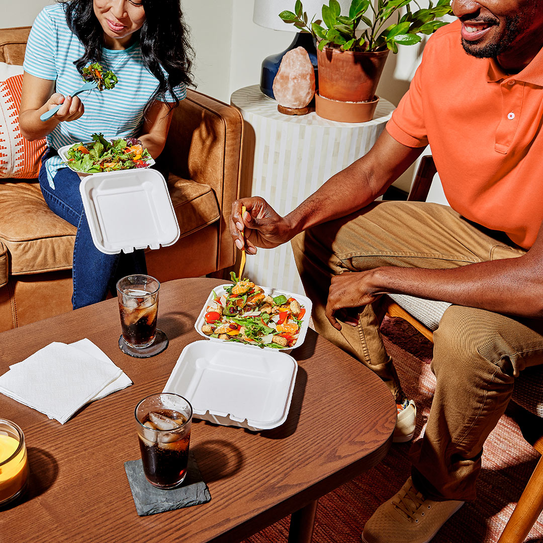
The Cheesecake Factory asked us to re-think their website so people could easily navigate their massive menu, seamlessly place an online order, and get more use out of the locations page, all while building brand appeal around their inclusive brand promise of “something for everyone”.

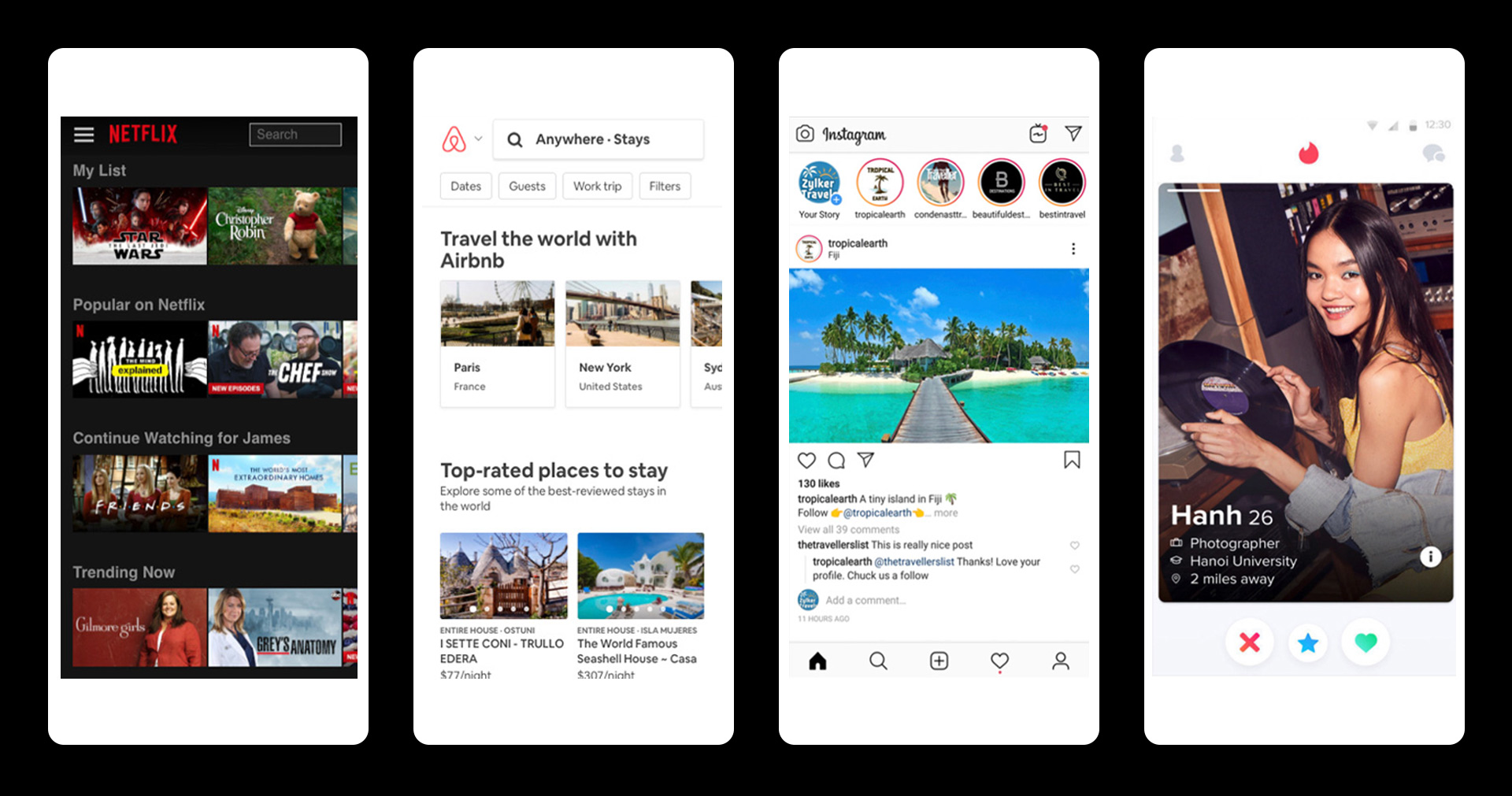
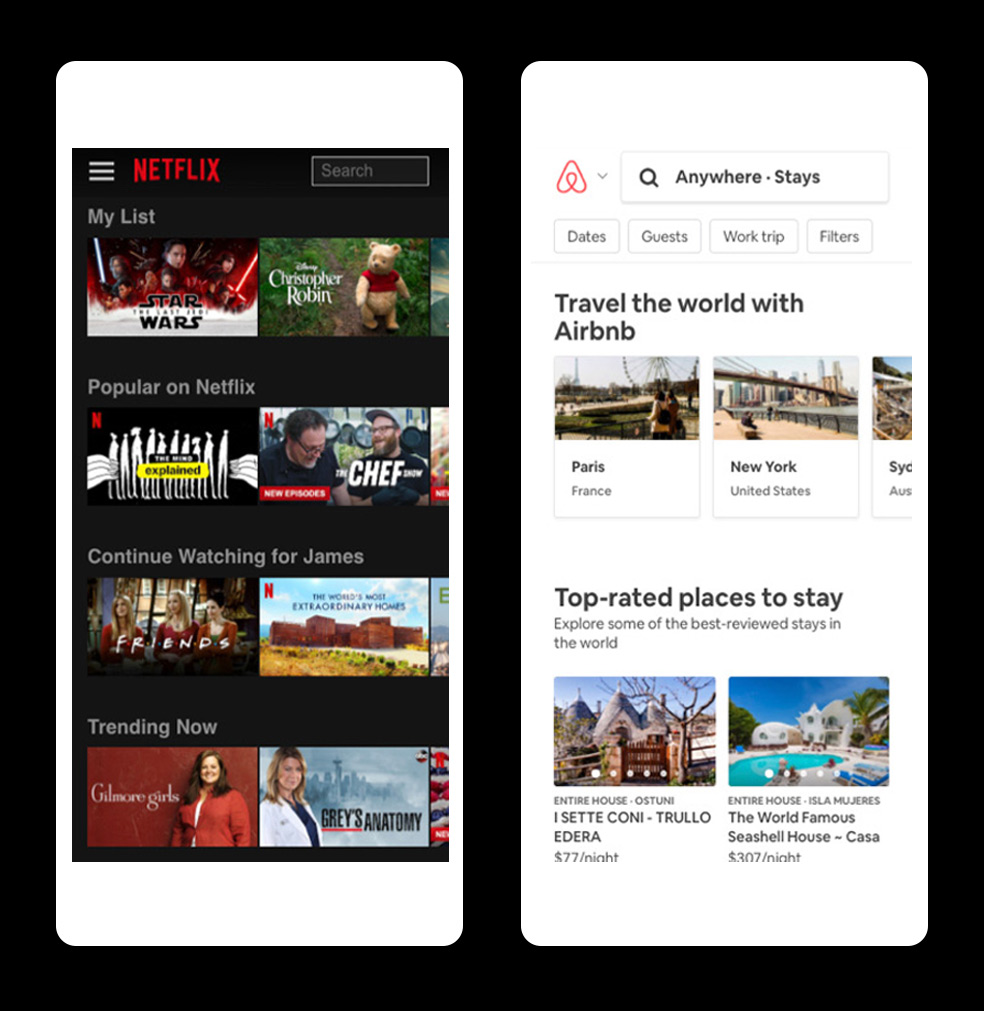
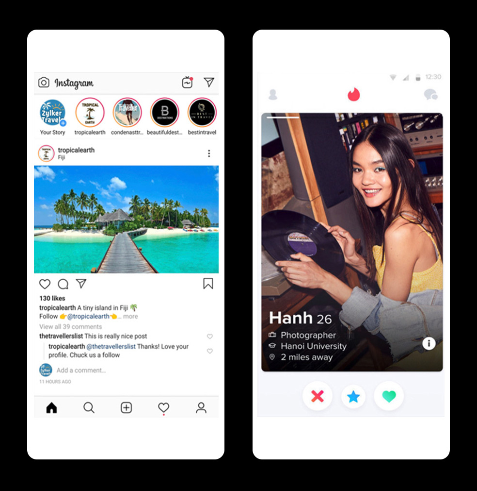
Knowing TCF was looking to grow their appeal for a younger generation, we started by benchmarking some of the UI patterns that our target audience uses most. We were drawn to the way Netflix and Airbnb make it easy and highly visual to navigate large content sets, as well as how Instagram and Tinder allow people to flag content they love (or pass on content they don’t).
We used a component-based approach that would allow TCF to re-use and re-skin our proposed site architecture for different sub brands, so for example their restaurant site can feel more festive while their The Cheesecake Factory At Home (grocery) brand can feel more intimate.

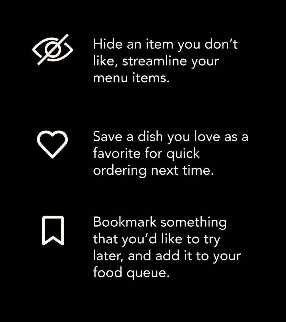
TCF has a famously huge menu (over 200 made-from-scratch items!) in an effort to ensure everyone feels welcome and can find a dish they like. For large amounts of similar items, people have an easier time parsing them when you give them images. So we built a filter-able Netflix-inspired side-scrolling menu that also allows you to hide, save, or add items to your cheesecake queue as you go.
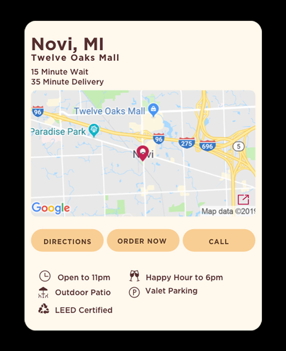
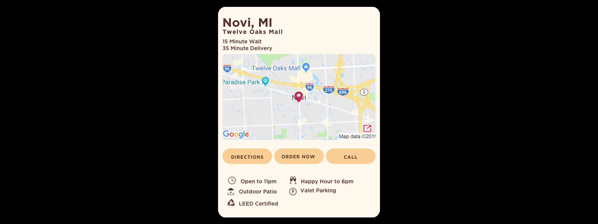
We found that for locations, people will typically use their native apps to map and get directions, but they come to the site’s location page for specific location information. This led to a re-prioritization of content, going from a giant map and hiding restaurant info behind a click, to a card-based approach that surfaces detailed restaurant info and links to your map apps for directions.
As another way to help people quickly parse the menu, we created a “food mood” quiz that can act as a virtual server, walking you through a series of this-or-that prompts to narrow in on a select list of recommendations.

PROJECT LINKS

CAPABILITIES

Creative Direction

UI Design

Design Strategy
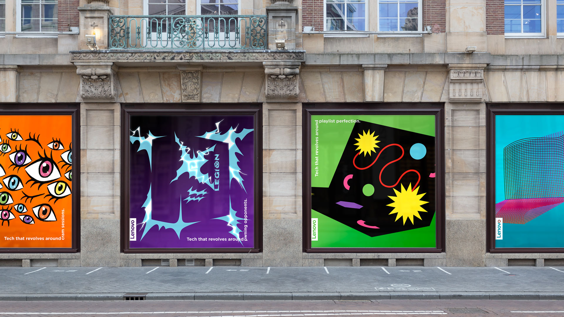
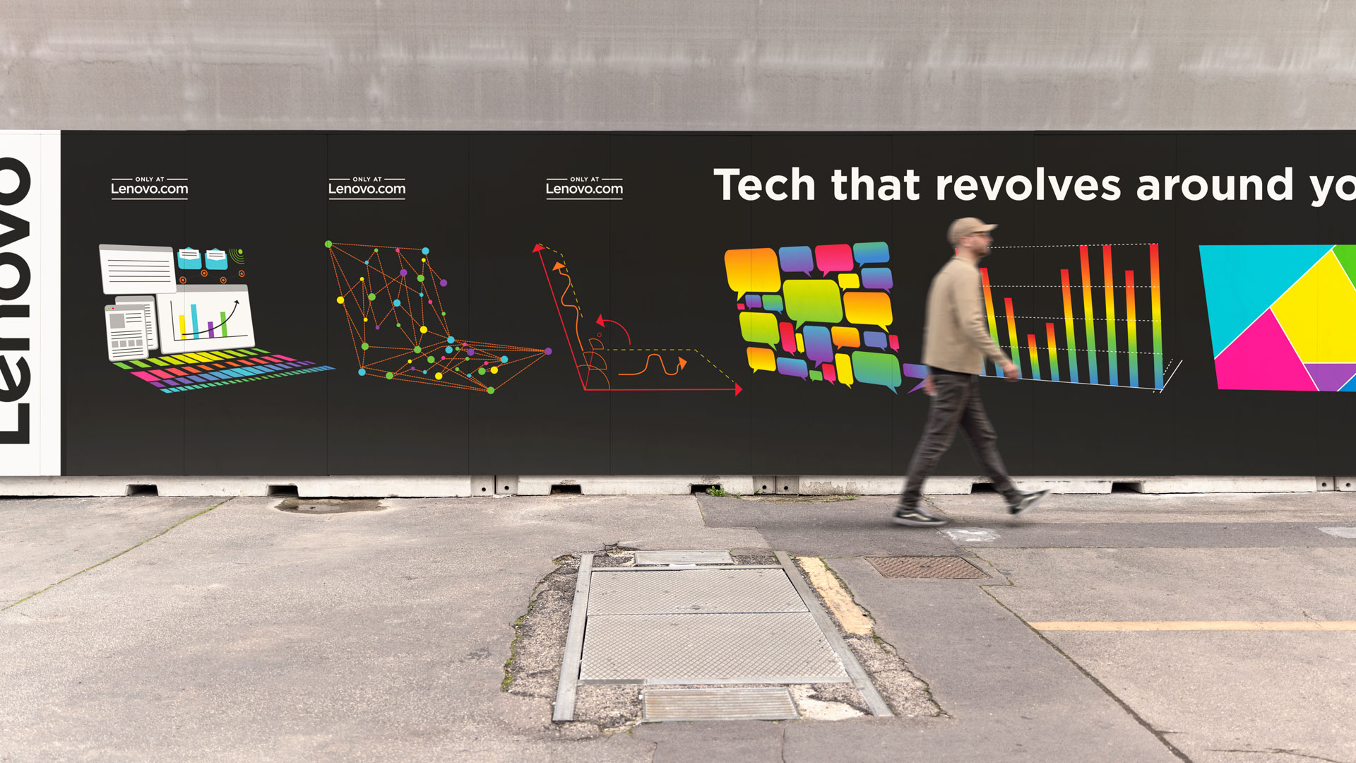
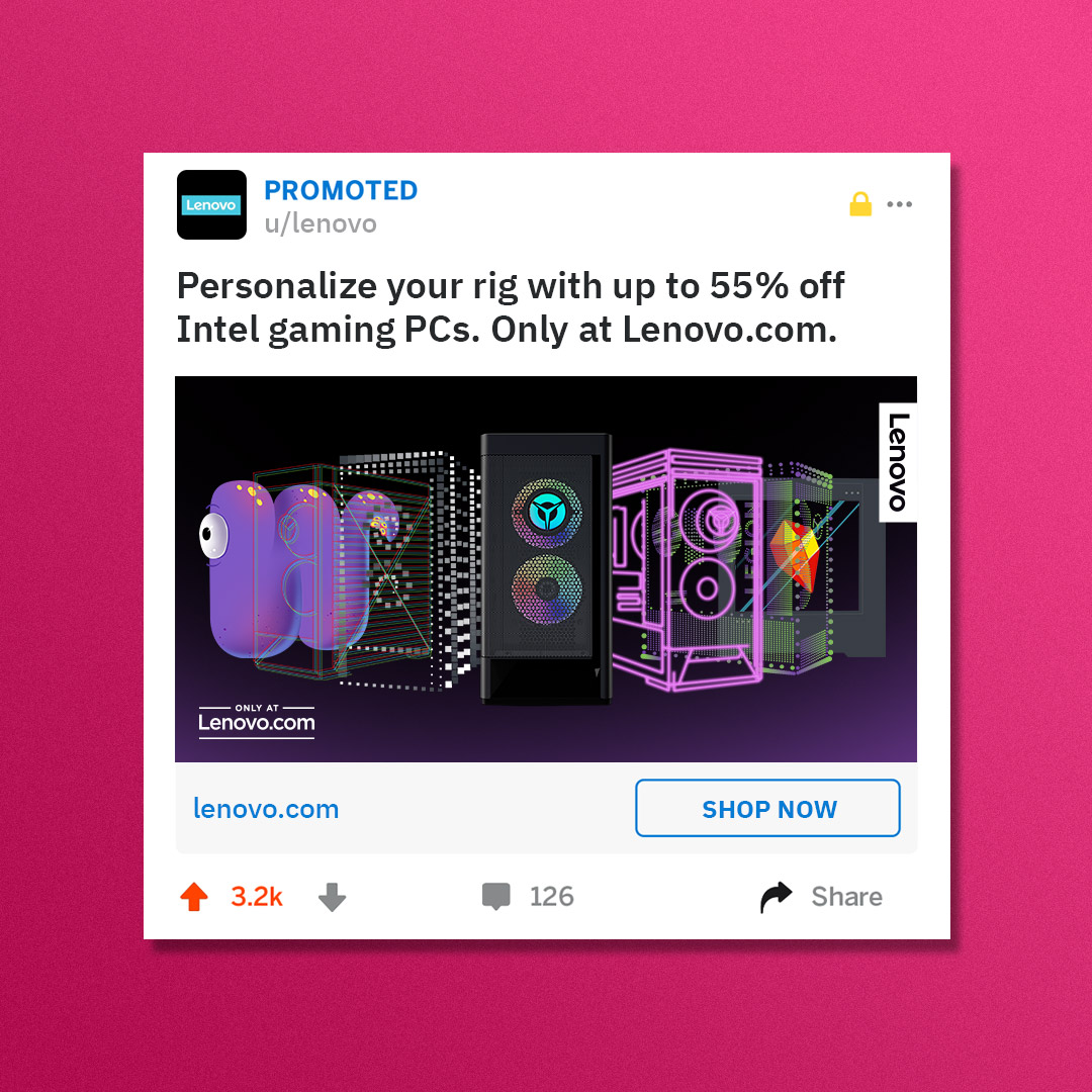
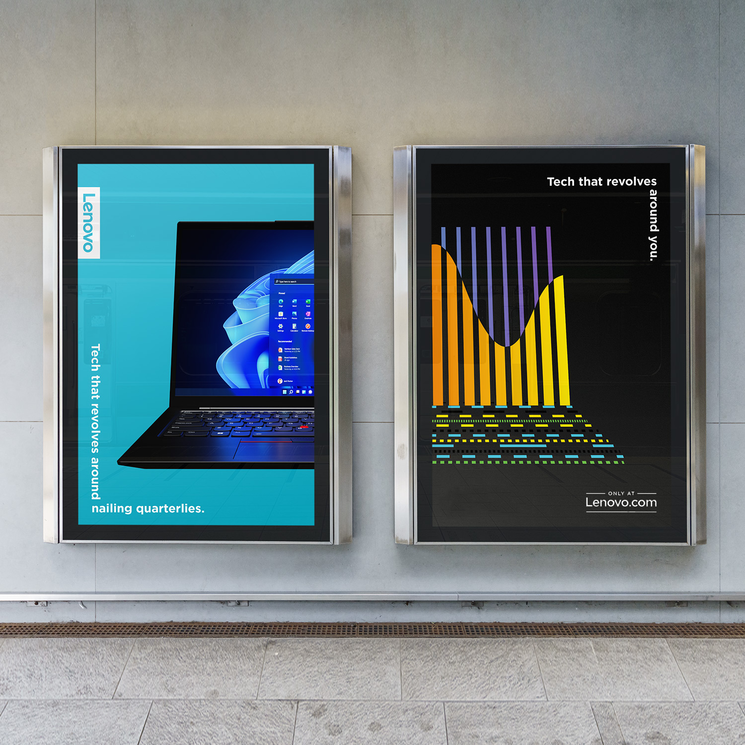
Lenovo asked us to create a look and feel for a year’s worth of promotional content positioning Lenovo.com as the biggest destination for personalized tech. The challenge: create a human connection, while remaining product-centric. And oh by the way, no budget to shoot new assets.
We used that constraint to our advantage by stitching together 360s from available product data, and using them as springboards into animated, always-(r)evolving worlds inspired by each of their four major audiences.
PROJECT LINKS

CAPABILITIES

Creative Direction

Animation

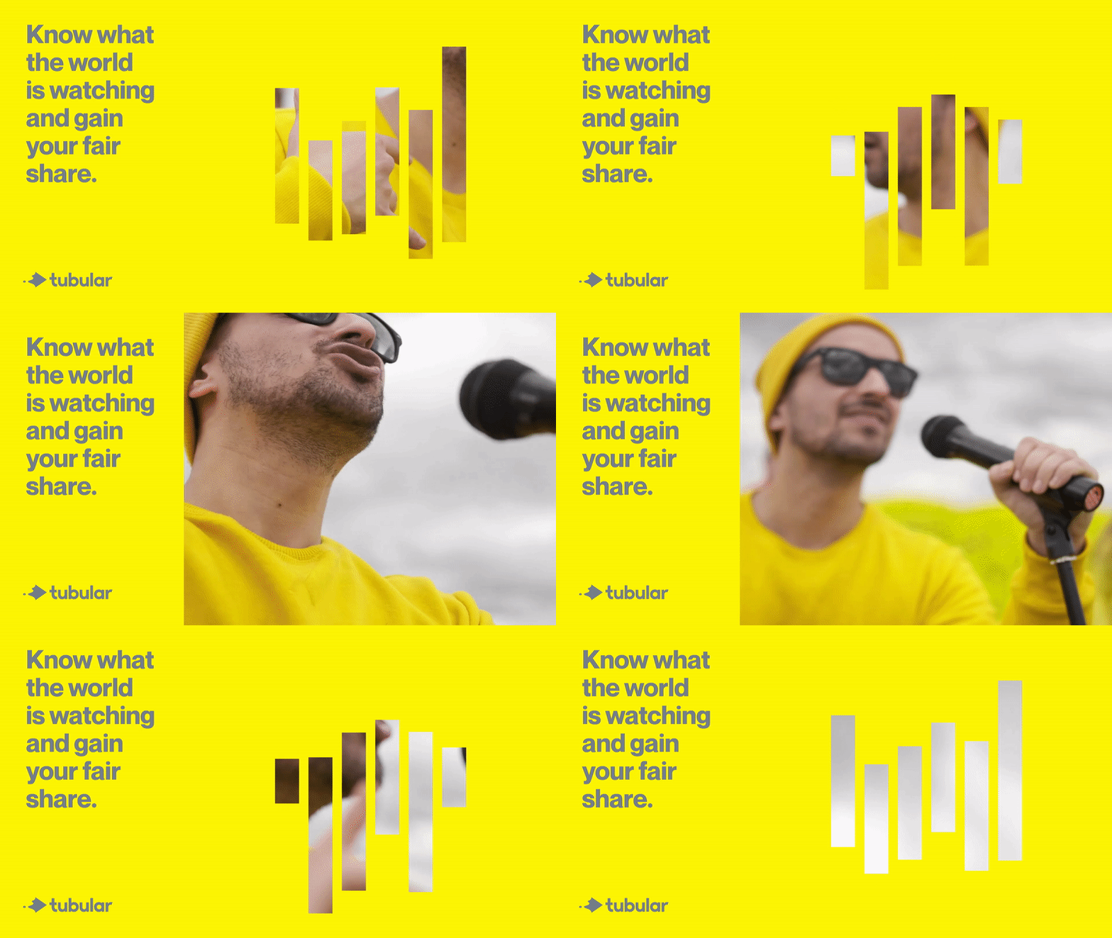
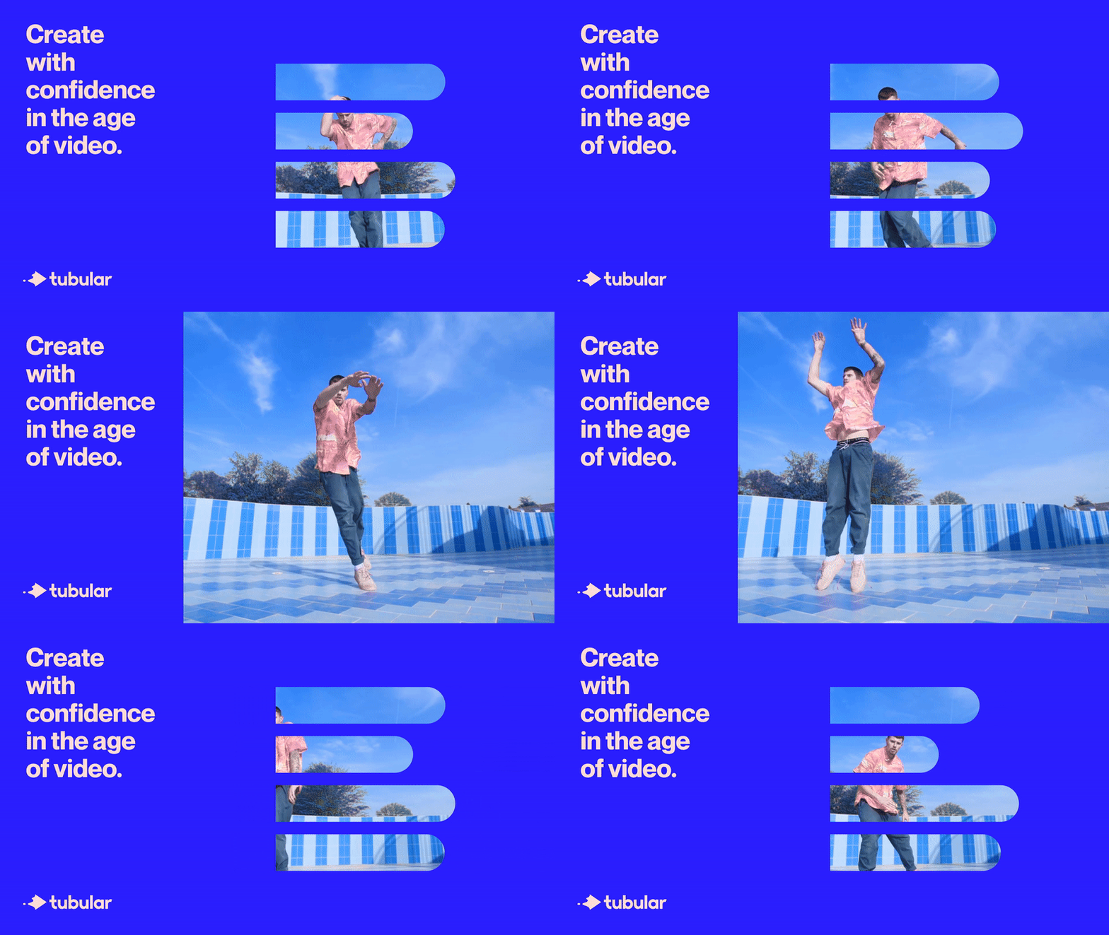
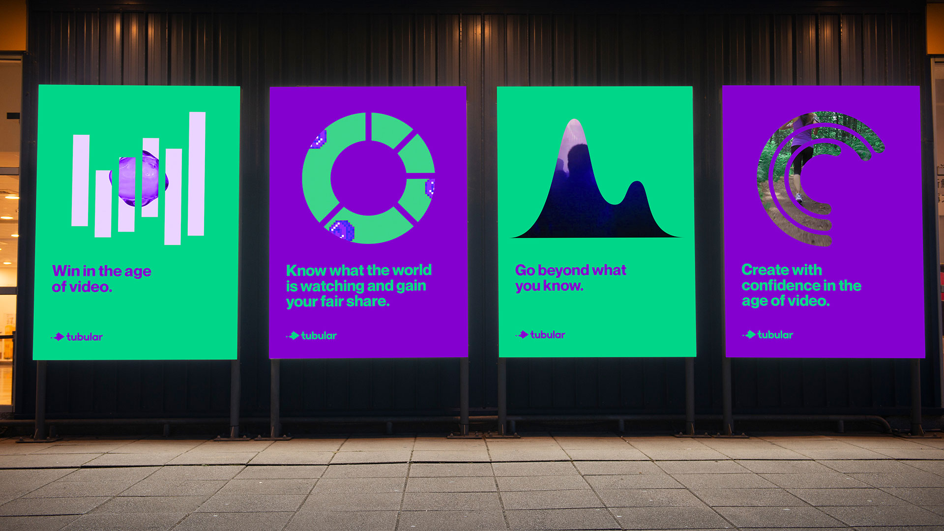
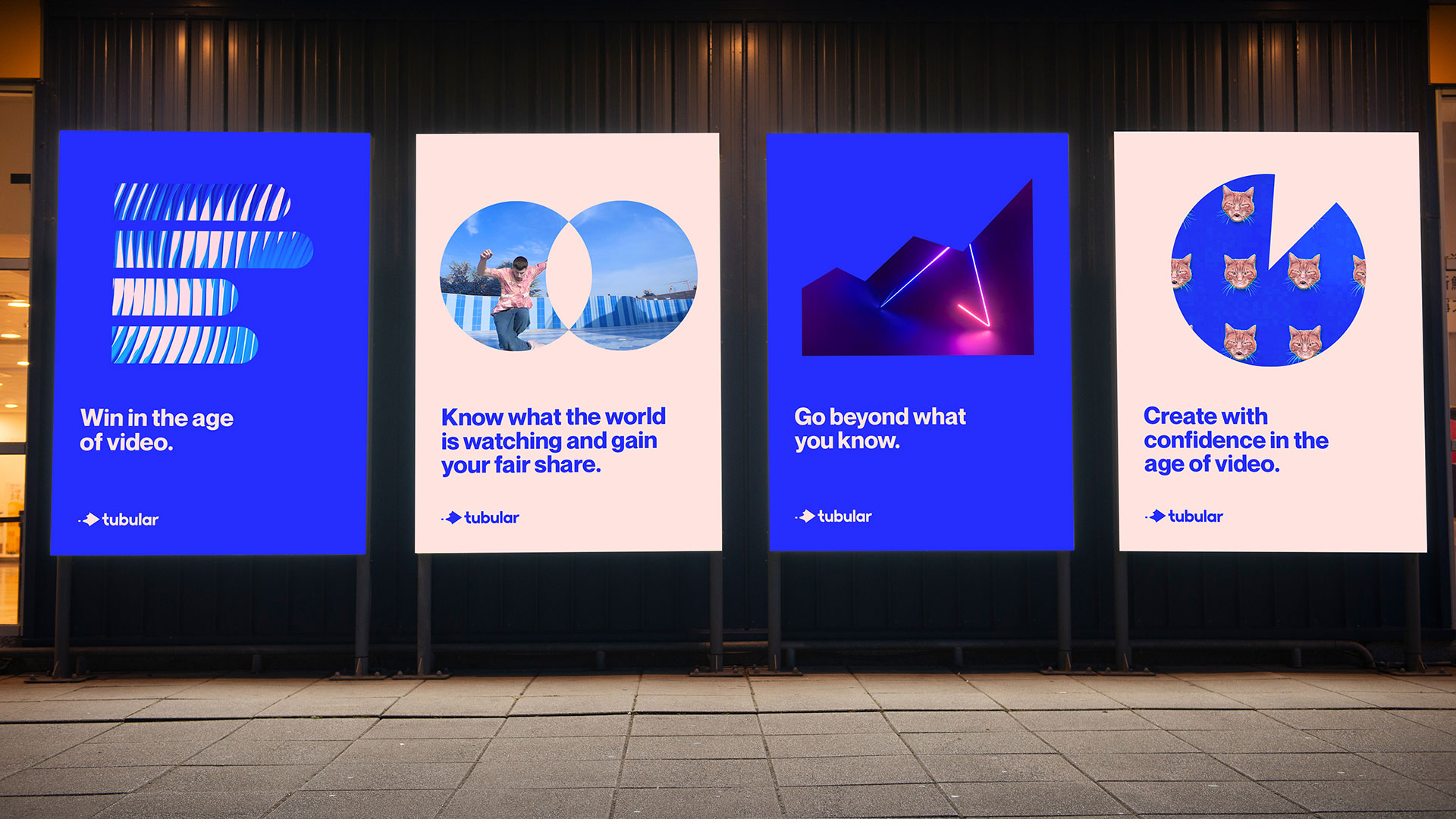
To elevate the look and feel for the global leader and modern global standard in video analytics, we imagined an always-on world where the most compelling video content on the internet is driving a bold but clear representation of data.

PROJECT LINKS

Brand Guidelines

CAPABILITIES

Branding

Creative Direction

Animation

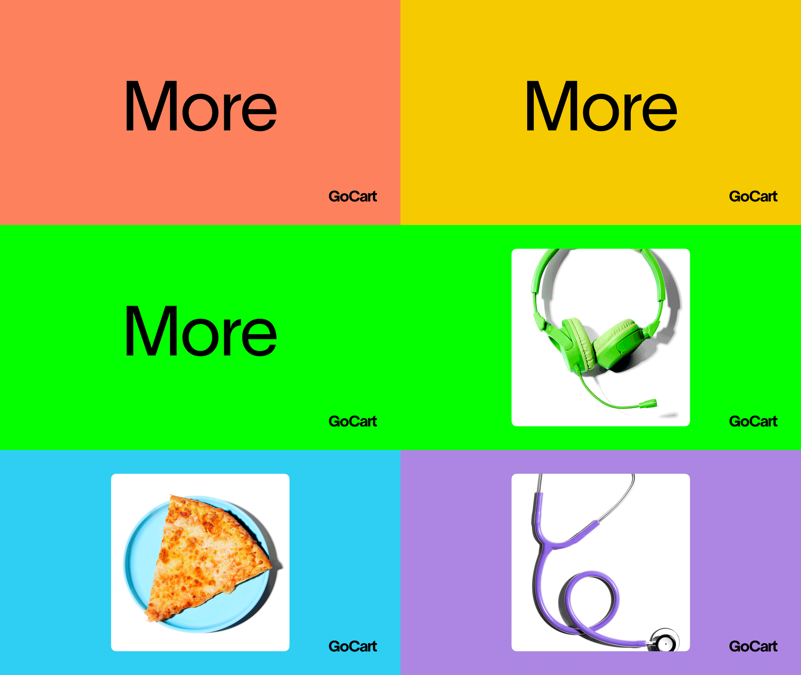
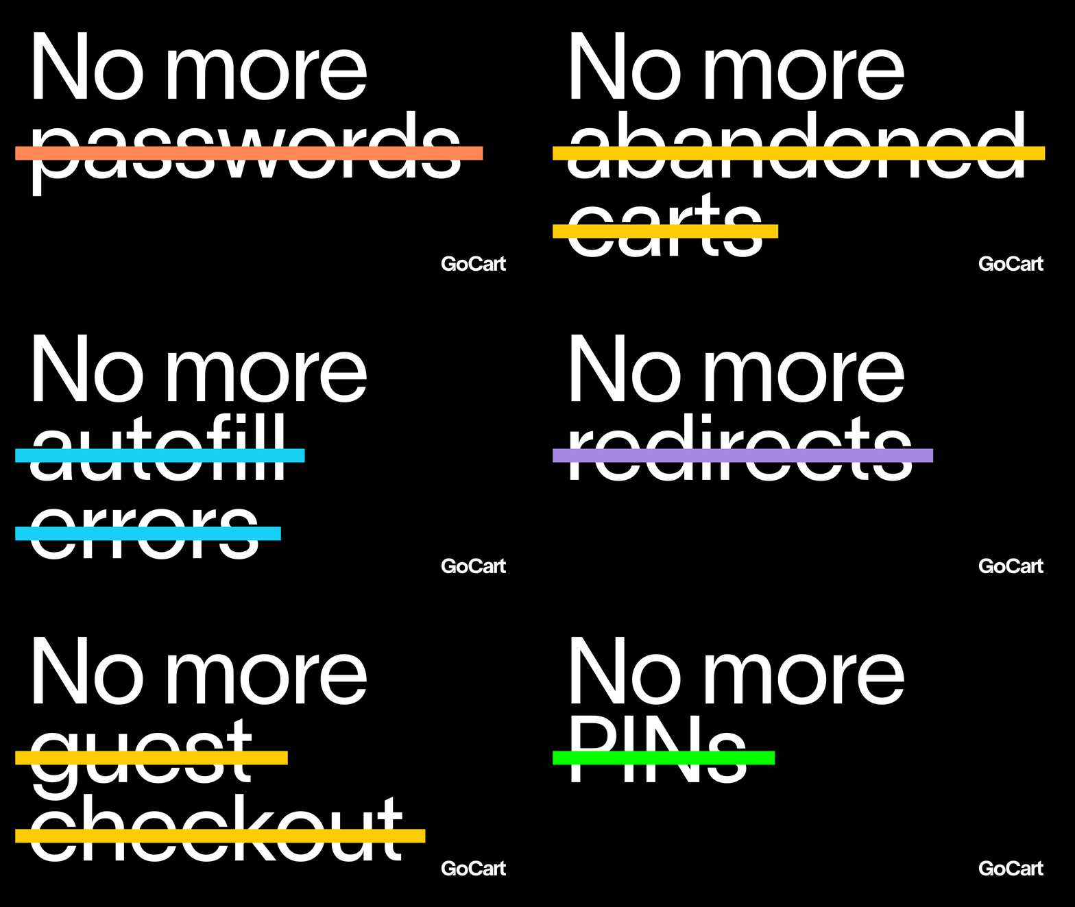
GoCart is a new payment platform with a fresh voice for a crowded category: it automatically recognizes you at checkout, so you can seamlessly pay for anything (even healthcare & professional services), using any payment method you want. So rather than focusing on the same old “fast checkout” talk, we positioned them as a brand on a mission to destroy payment friction for everyone.

The effect of GoCart is a payment process that feels invisible; seemed like a good starting point for the backbone of the identity. The logo is a modified version of Nizar Kazan’s Lausanne, and we extend that deadpan approach to the type and color, which starts with a black and white base.

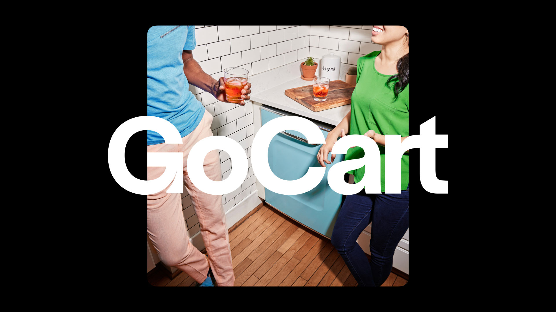
It gets fun when we introduce ultra-bright pops of color in graphics and photography, as we transition to showing the possibilities GoCart unlocks: being able to seamlessly pay for anything, anywhere, any way you want. Our bright and diverse color palette stands out from the sea of blues and singular color approaches taken by most of their competitors.

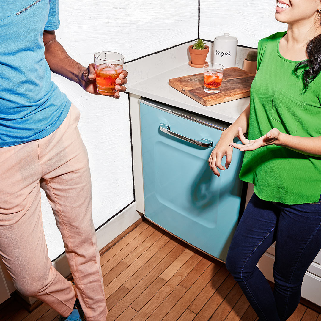
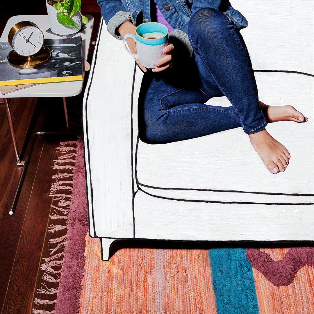
With this being a brand new platform, a huge priority was educating people on exactly how it works. We blended actual product UI, custom photography (with hand-painted elements emphasizing things GoCart helps you pay for more easily), and “transparent” graphics in a series of fluidly animated layouts expressing various product features.

We launched the new offering and look with gocartpay.com, which emphasizes a clear story, seamless interactivity and energetic style, especially for the financial category.

PROJECT LINKS

GoCart Website

CAPABILITIES

Branding

Creative Direction

Animation

Illustration

Photography

Website Design

HTML/CSS/JS

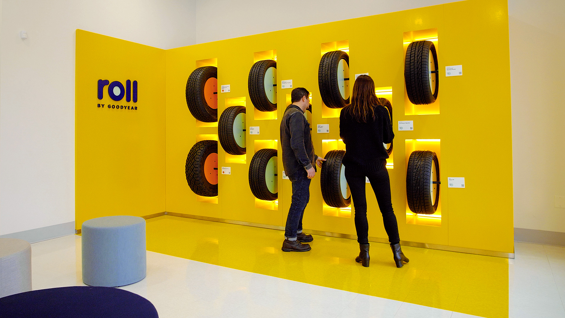
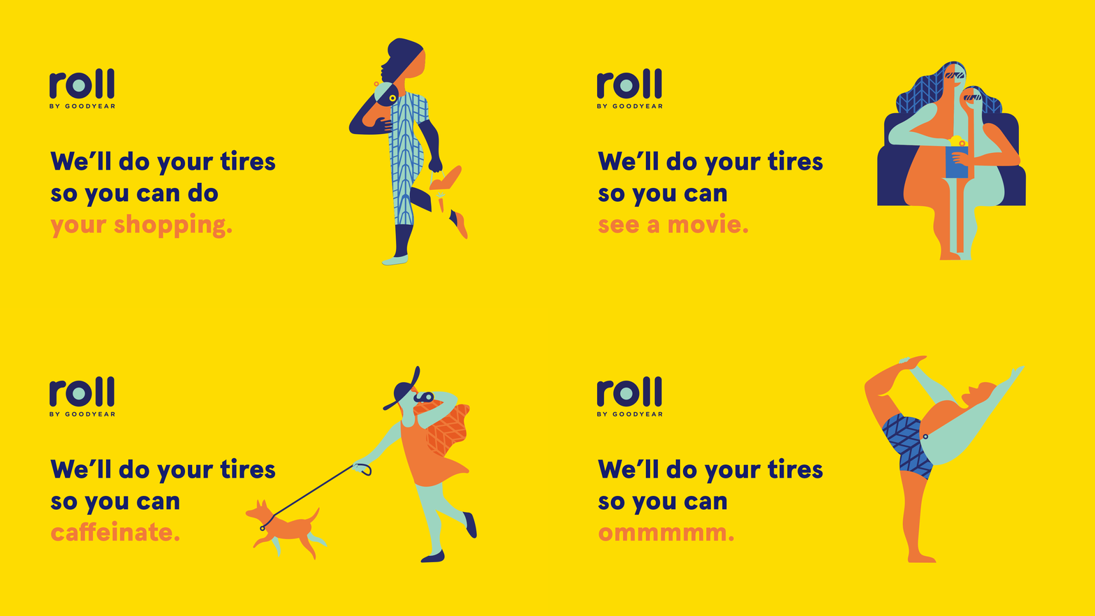
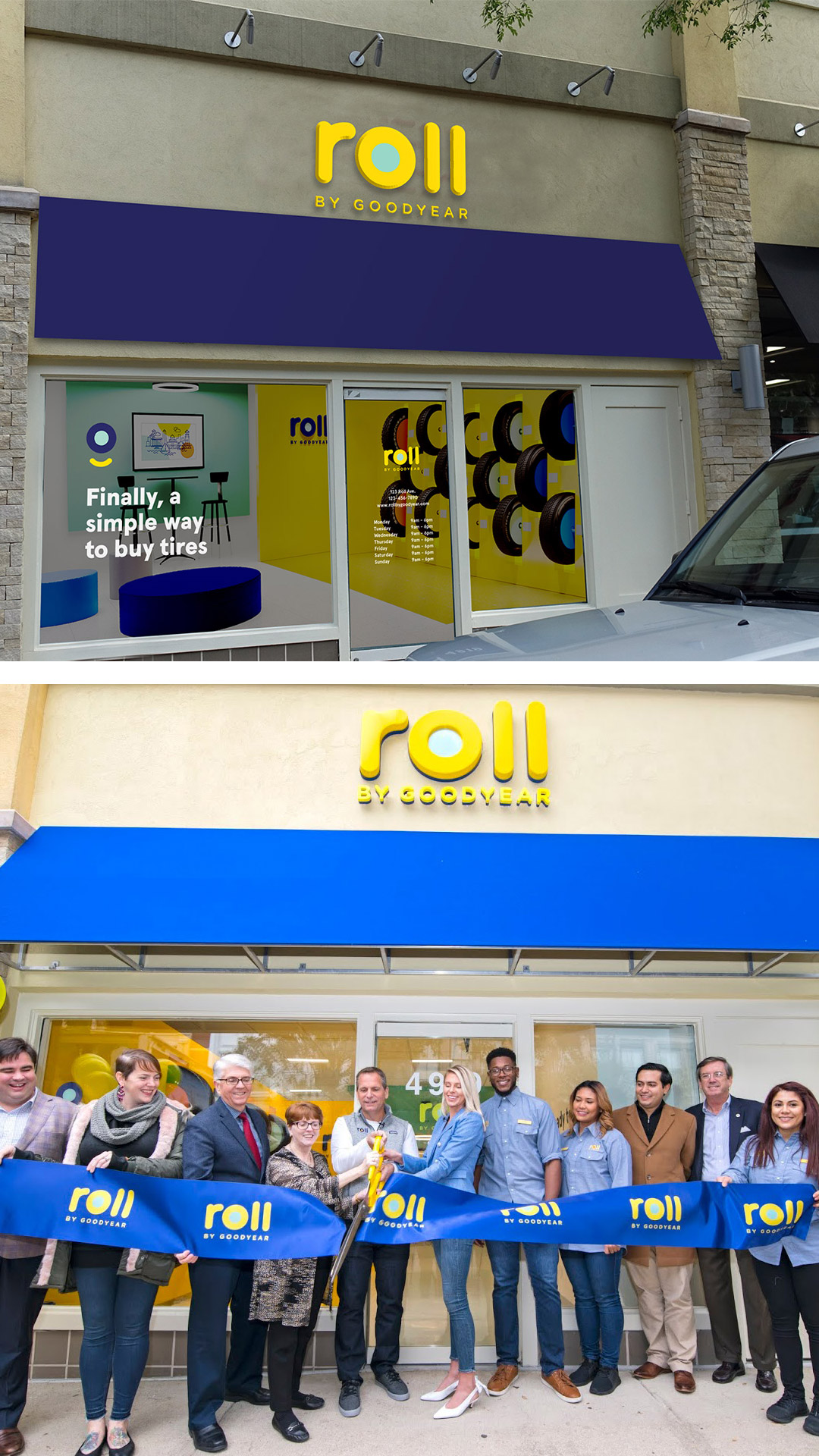
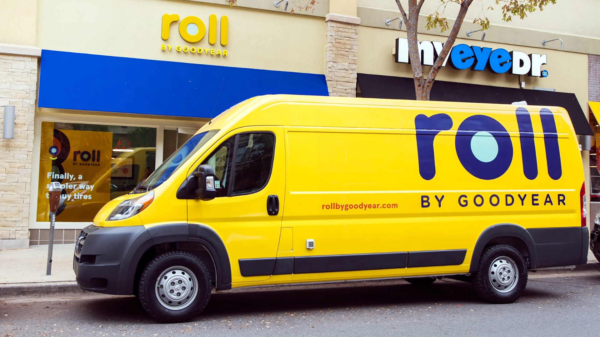
The current tire buying process isn’t fast, easy, or convenient. We helped Goodyear transform expectations and disrupt their category with a whole new way to shop for, buy, and install new tires—built on the idea of tire shopping on your terms.

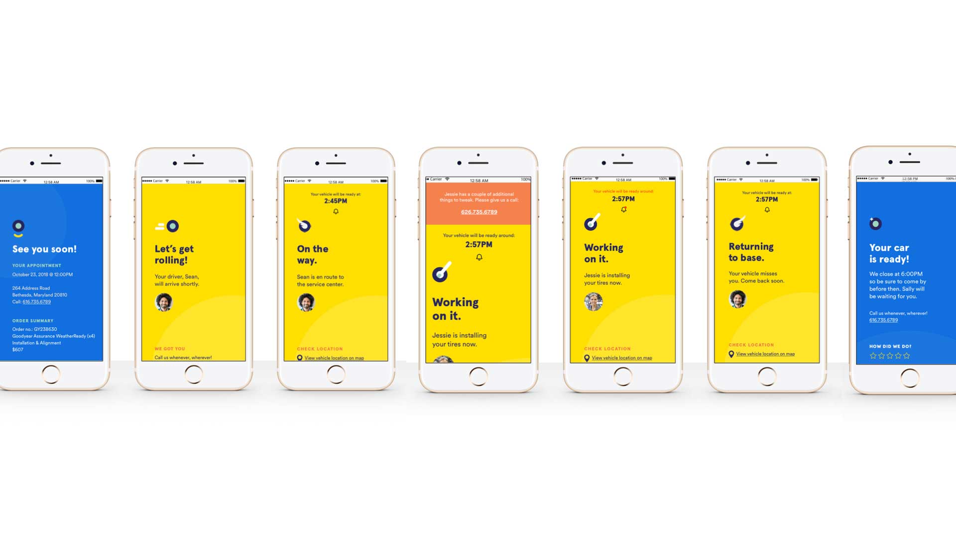
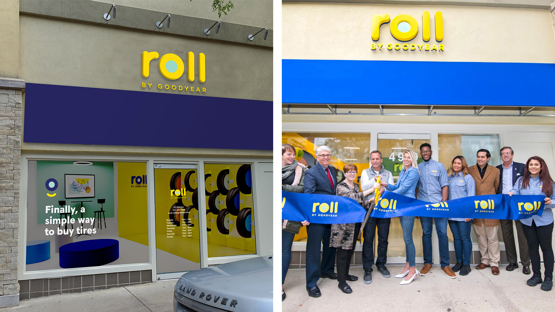
We also reimagined the entire customer journey, from digital kiosks to web apps to in-store architecture and trucks.

PROJECT LINKS

Roll by Goodyear Website

CAPABILITIES

Creative Direction

Branding

Animation

Experiential Design

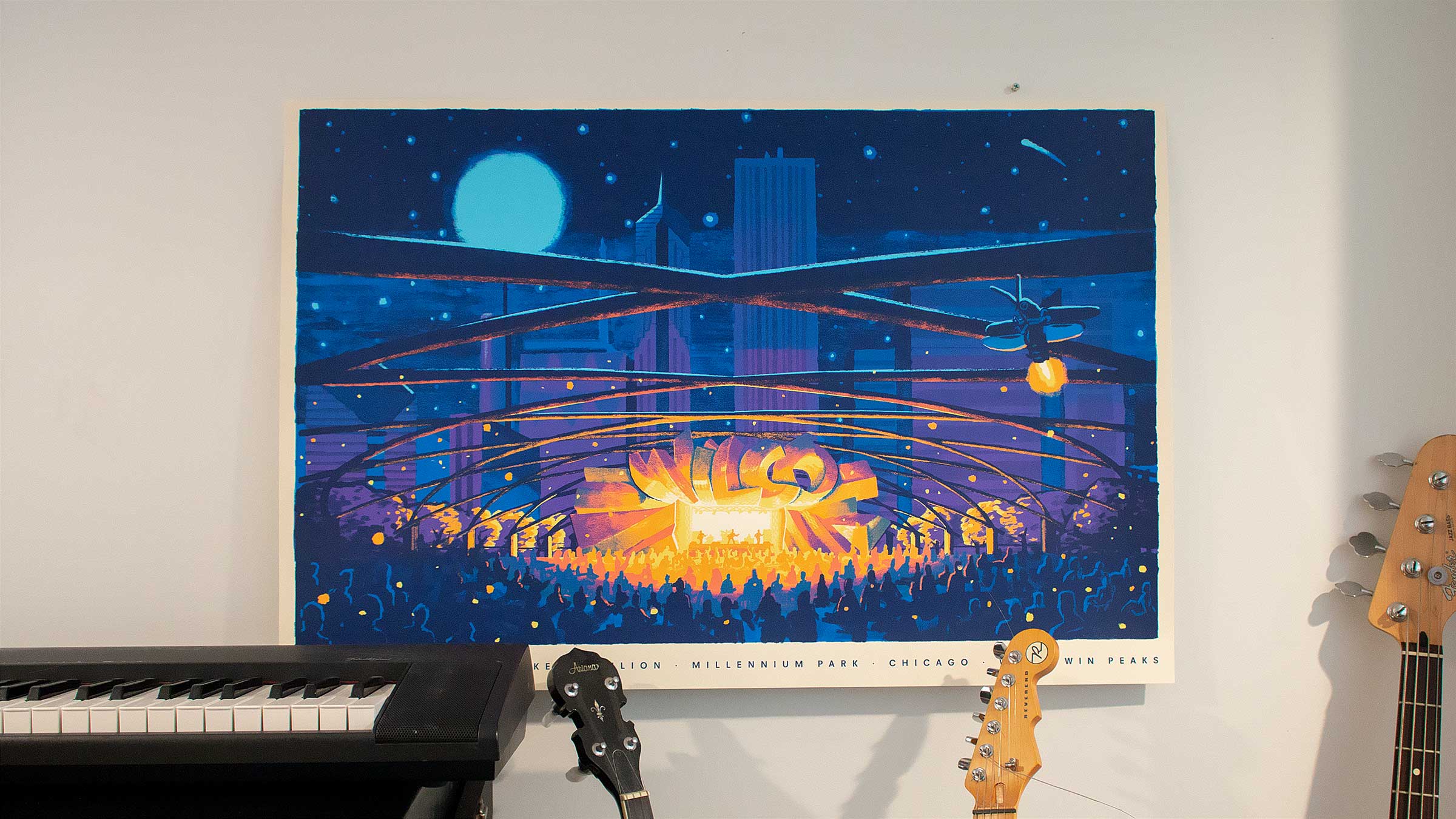
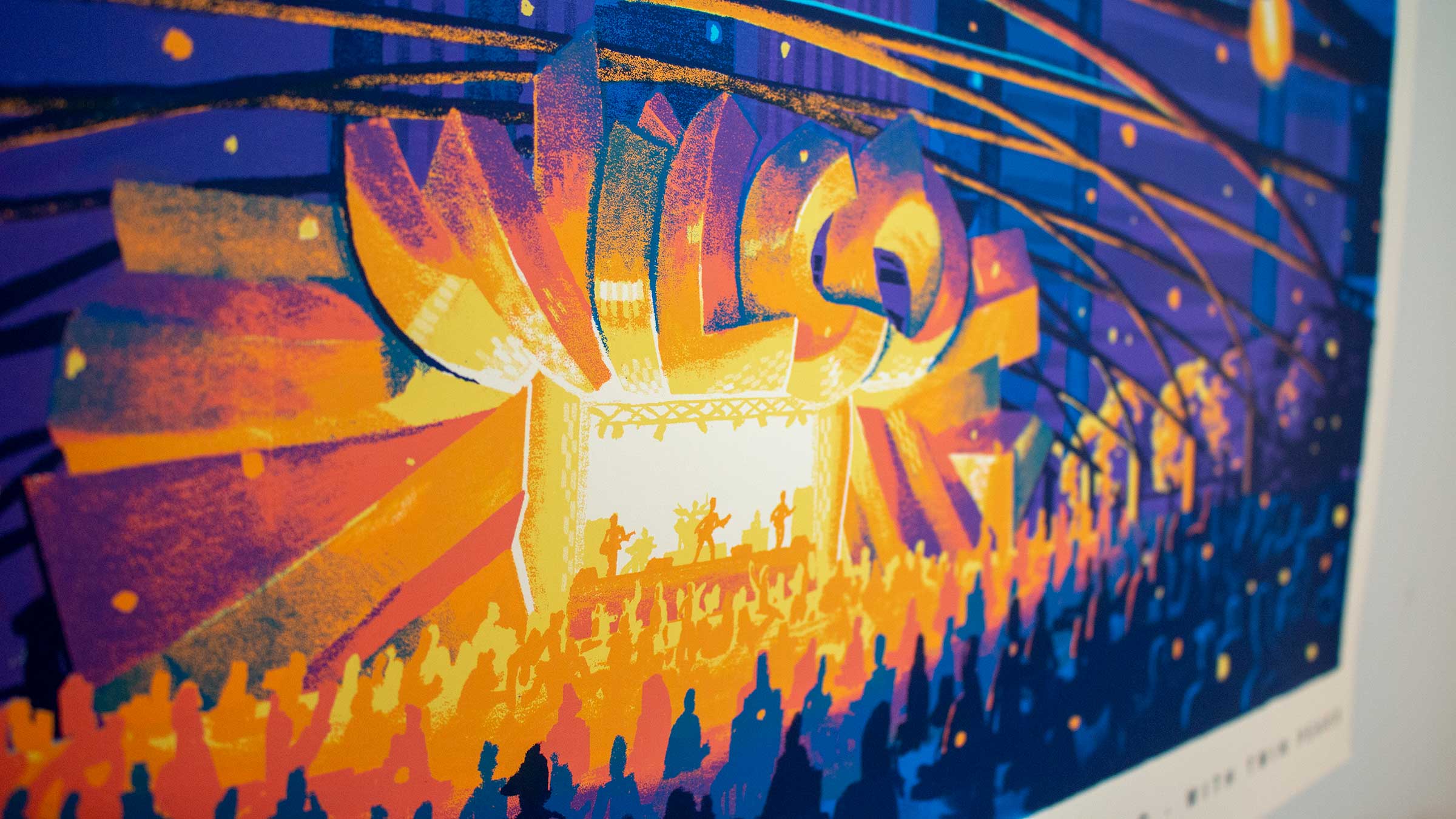
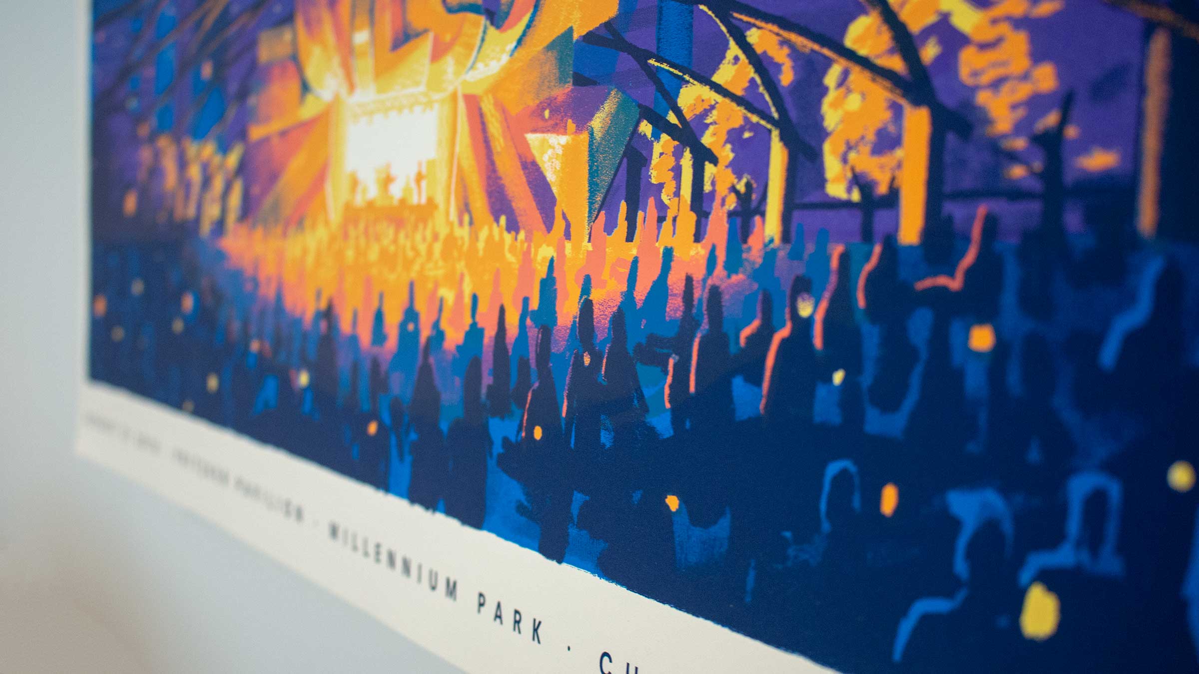
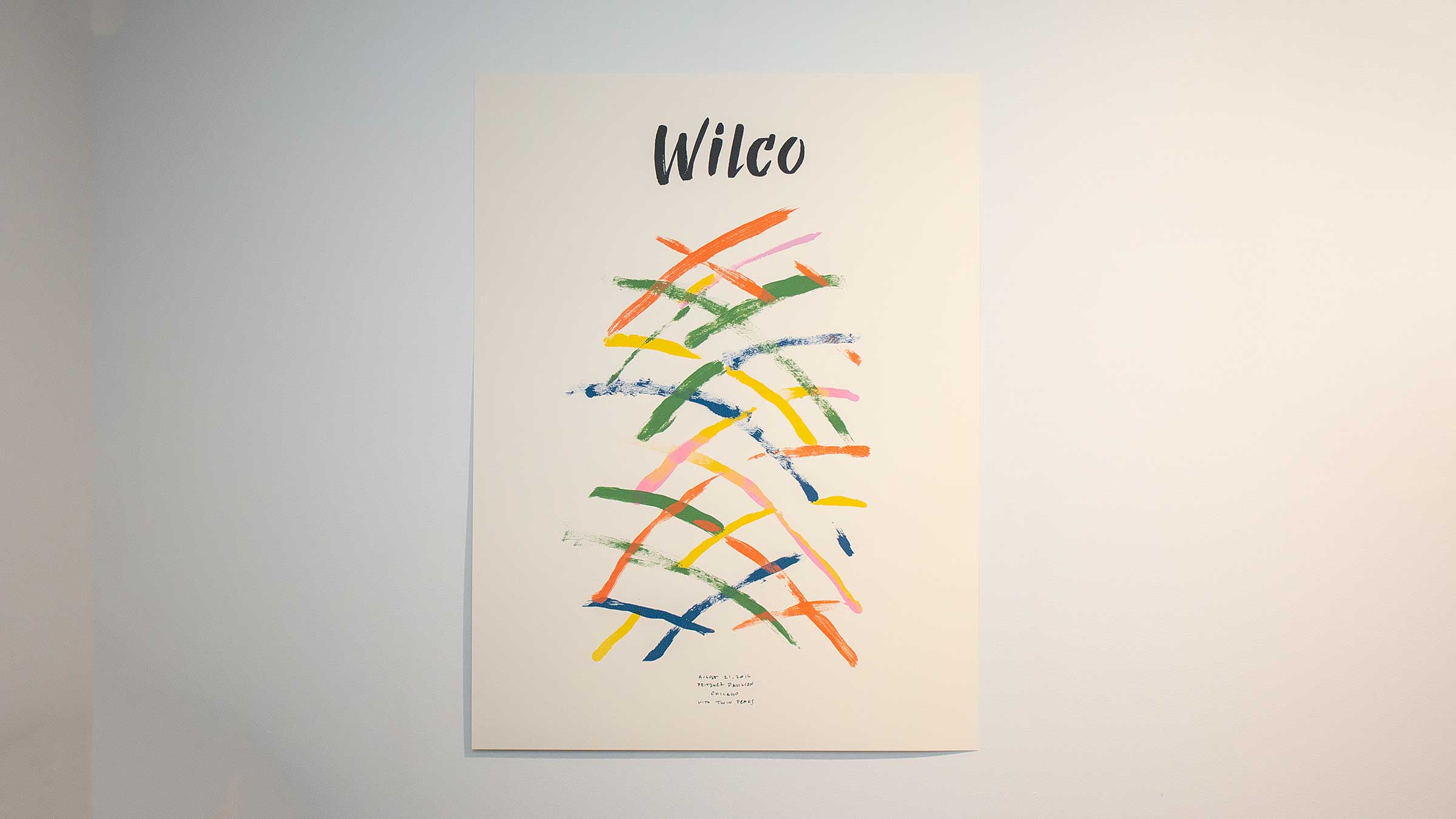
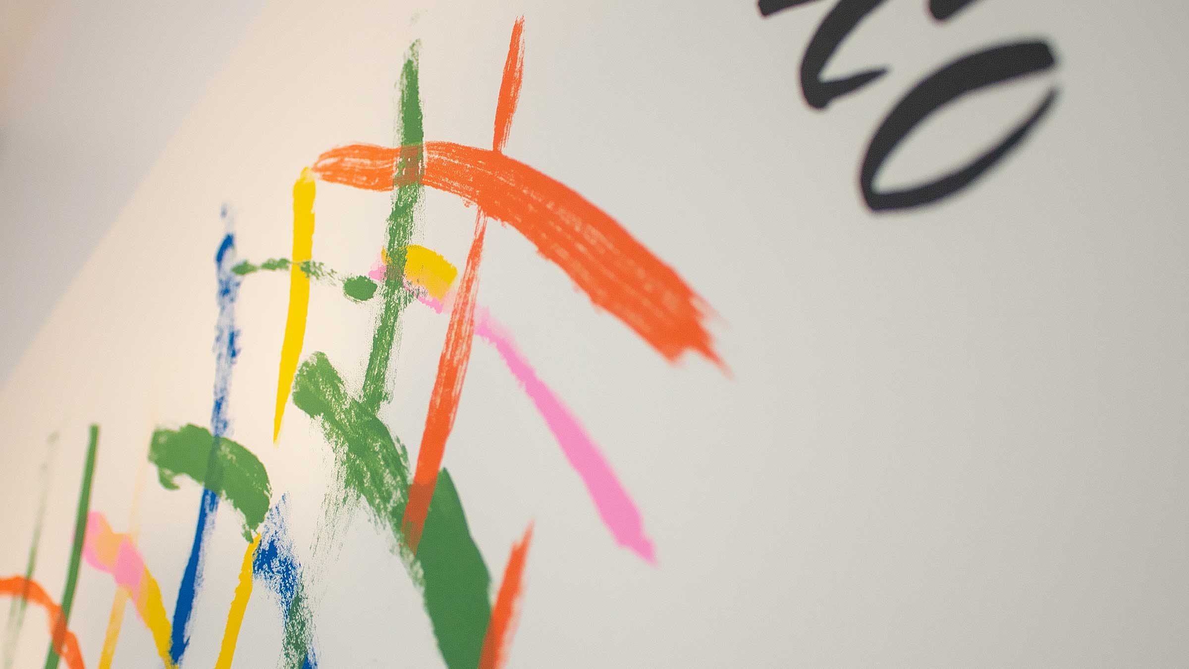
Two posters for a memorable Wilco performance in Chicago, inspired by the pavilion itself and drawing stylistically on artistic movements that came out of the Windy City.

PROJECT LINKS

CAPABILITIES

Creative Direction

Illustration

Type Design

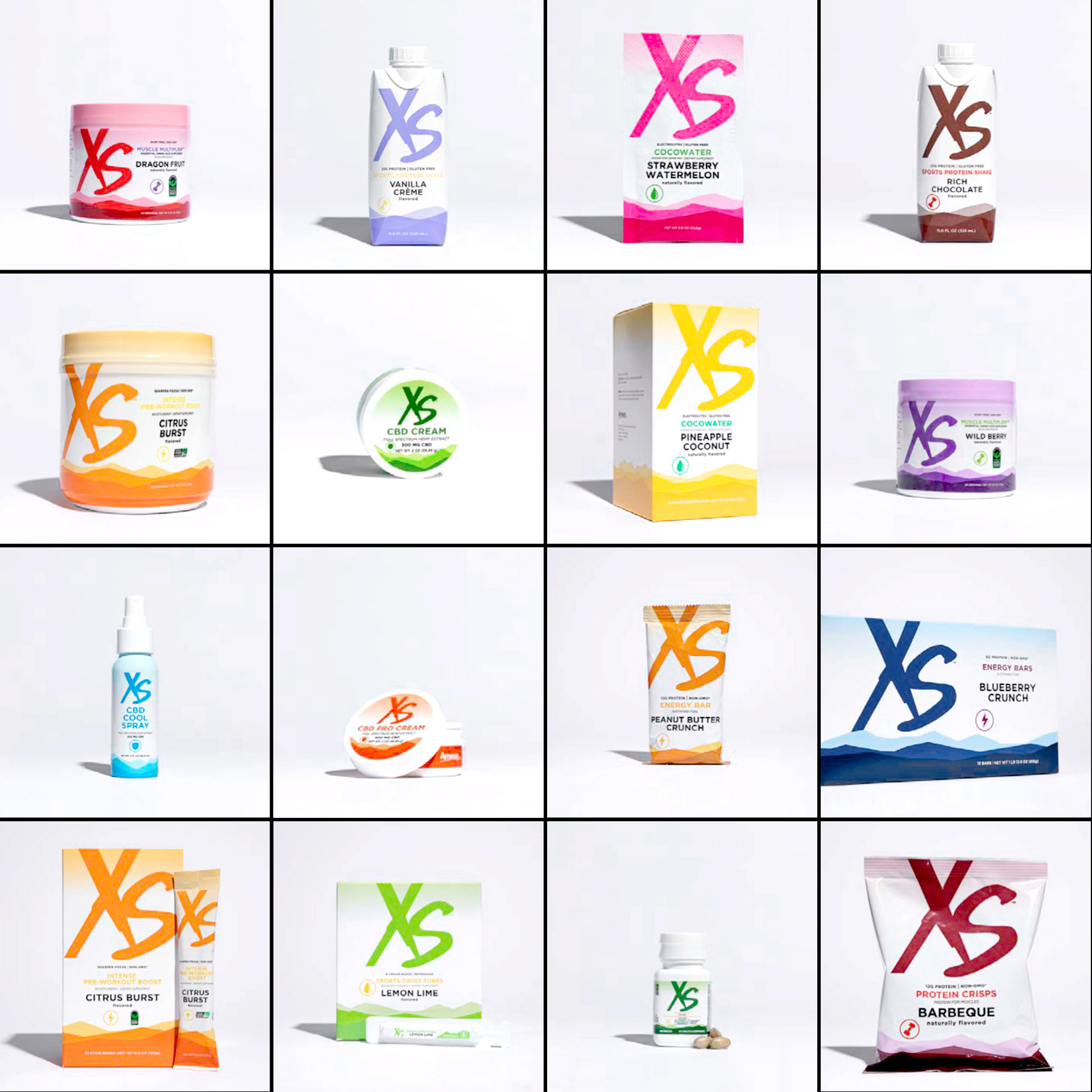
As part of their recent brand update, XS asked us to upgrade their product detail pages. We re-worked their page flow, refreshed their content approach, and shot a new library of product and lifestyle photography and videos to tell the XS story.

We started by ordering their PDPs to prioritize a more natural flow, and flagging the different types of video and photographic content they’d need.

For product shots, we went from their current CGI to traditional photography with a contemporary lighting approach, for a more authentic feel.

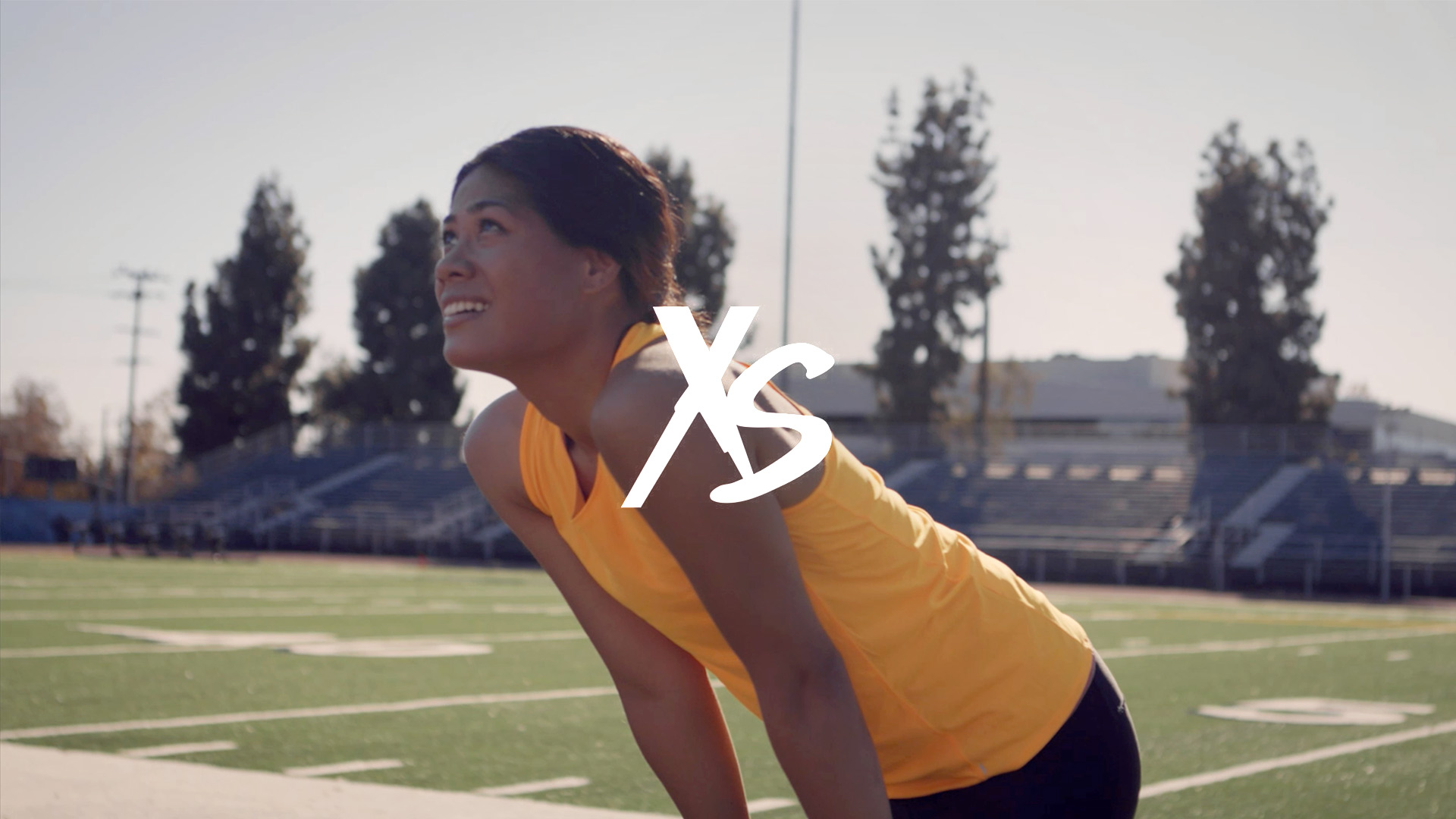
All 20+ products got their own lifestyle video. We had to shoot during the pandemic which presented a unique set of circumstances for casting and shooting, but we were pleased with how the scenes turned out given the constraints. A few favorites below.

We proposed each product come with a couple “hacks” to help people imagine how it can become a part of their routine, which we called XS Pro Tips. Each Pro Tip is delivered by an XS-sponsored athlete.

Amway (who distributes XS) plans on bringing this approach to all their sub brands in the near future.

PROJECT LINKS

CAPABILITIES

Creative Direction

Video Production

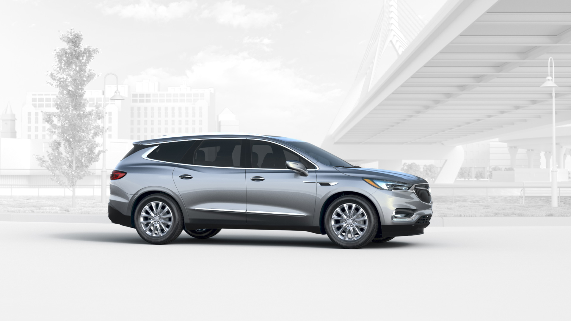
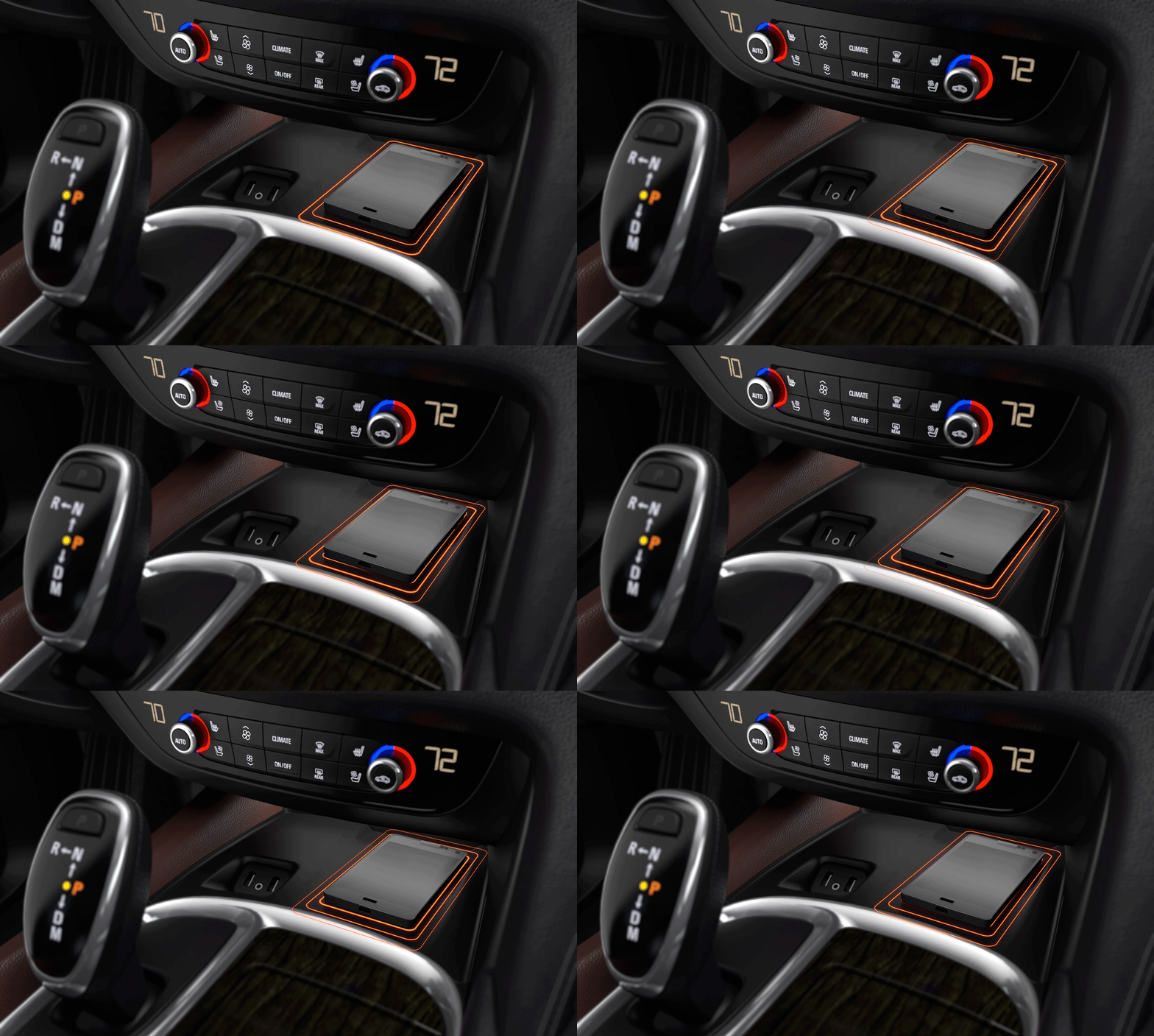
Creating a place to build buzz for Buick vehicles between reveal and production, without photography. We used vehicle 3D data and imagined a high-tech “blank canvas” world around each vehicle inspired by the lifestyle it empowers. Vehicles were revealed on a bespoke website that acted as a way to get up close with all the key features, design and tech, and help people take a virtual test drive.

The virtual test drive platform has given Buick a sophisticated and efficient way to launch multiple generations of vehicles.

e2jb_LandingPages_exterior

Content was designed to be easily ported from the launch website to other online advertising and the model overview page on Buick.com post-launch.

PROJECT LINKS

CAPABILITIES

Creative Direction

UI Design

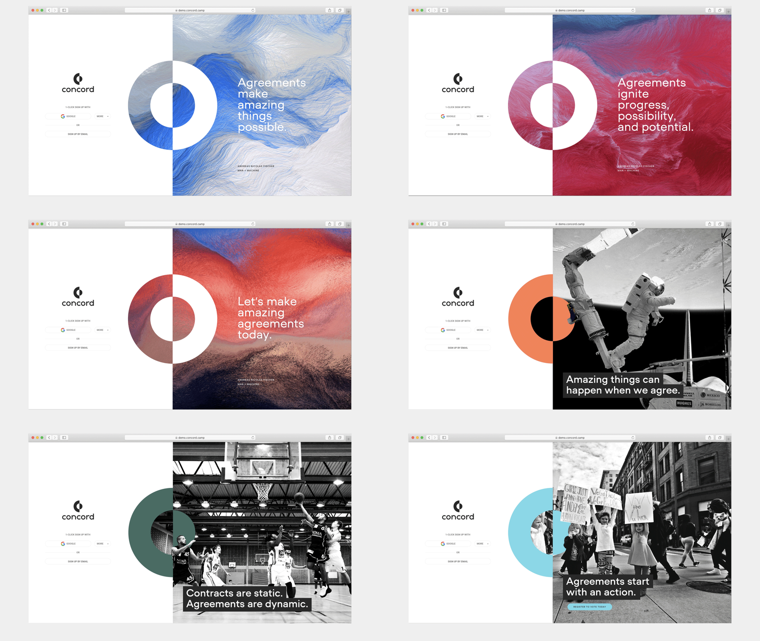
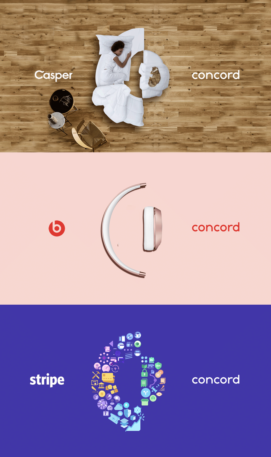
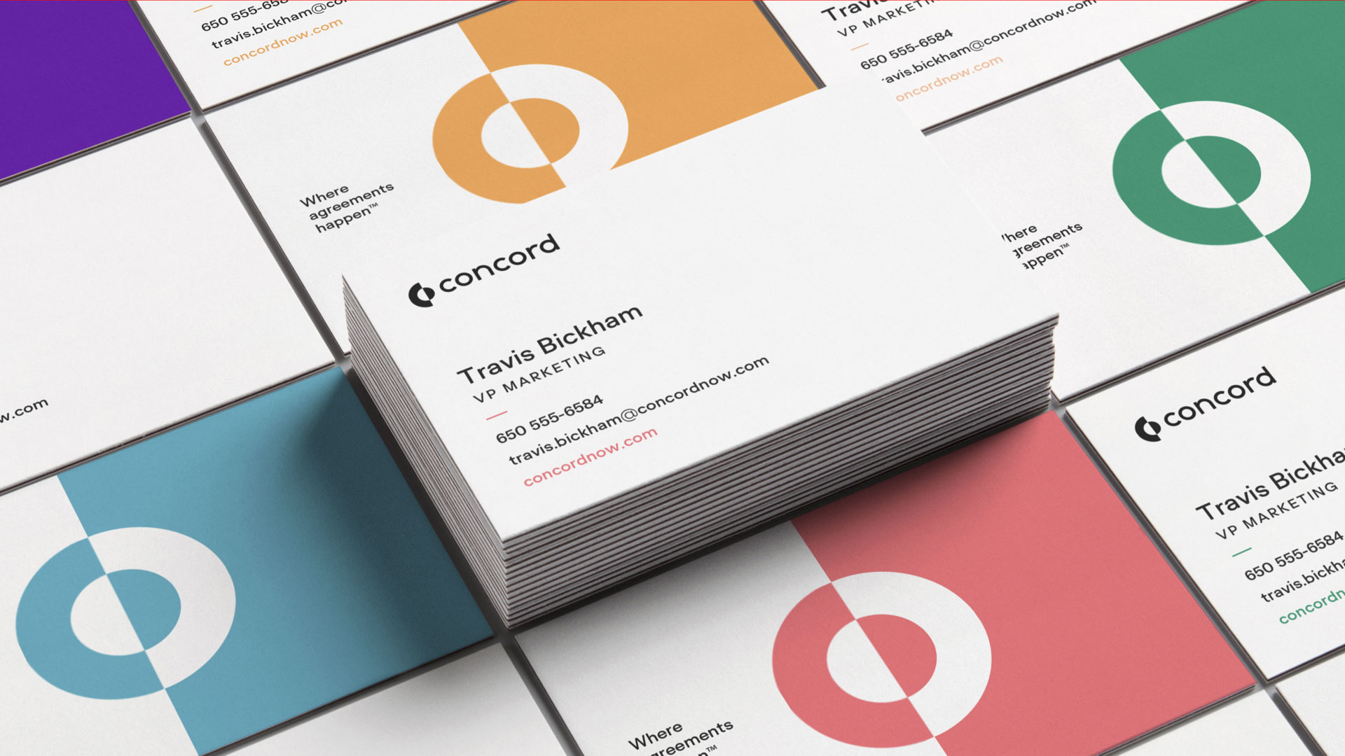
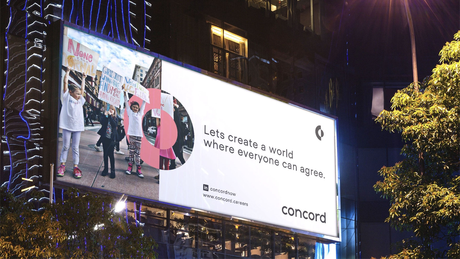
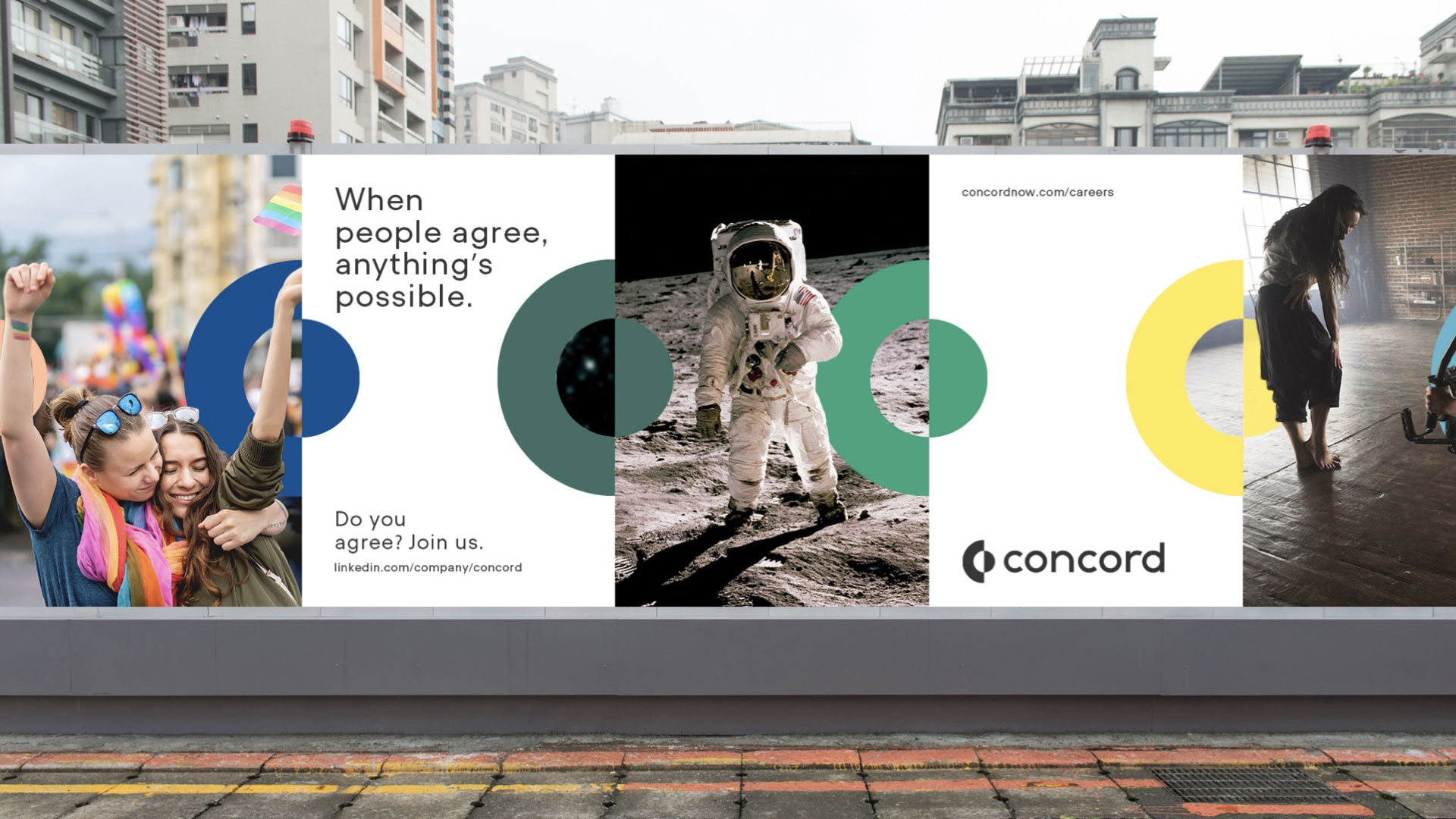
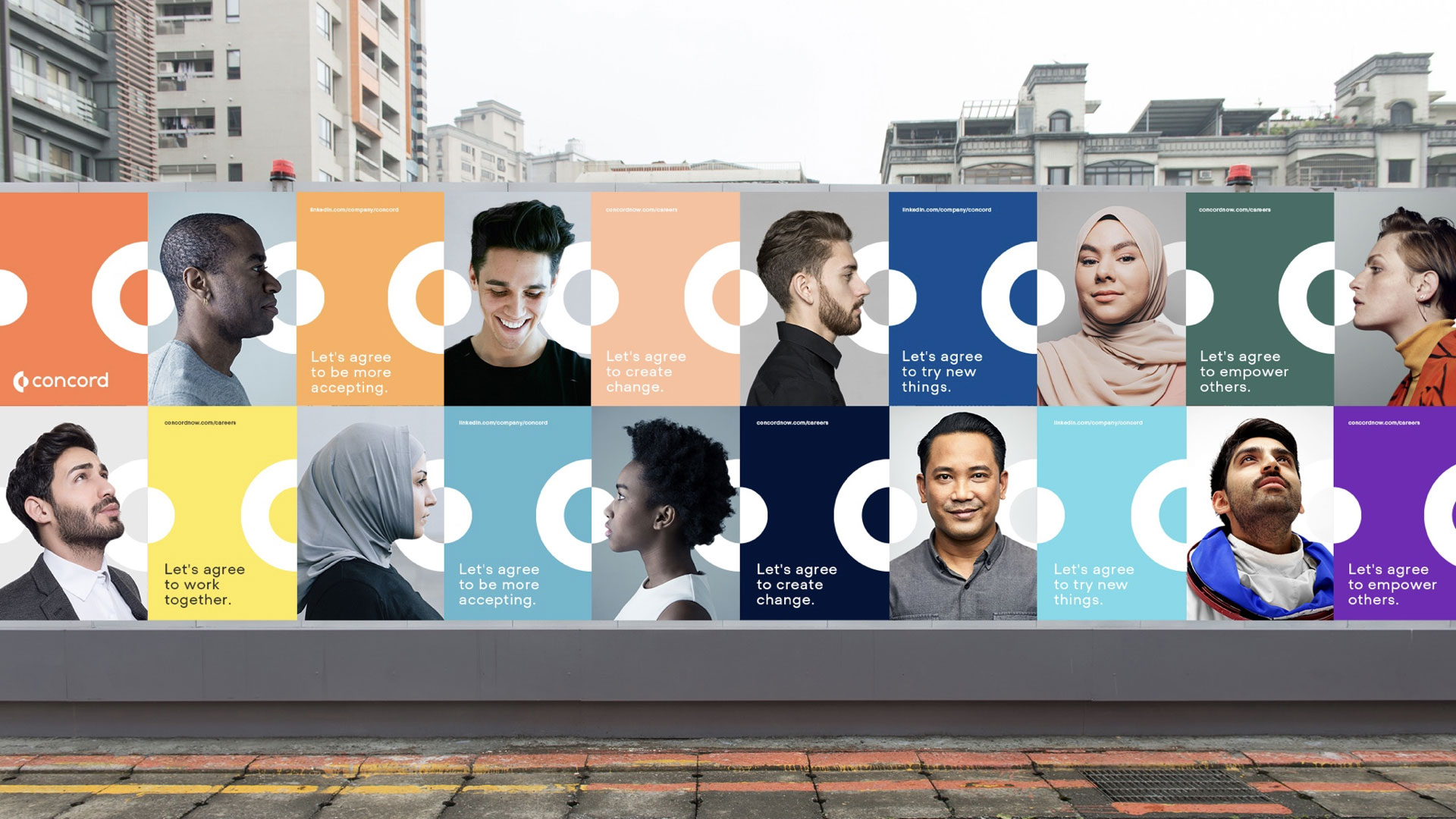
Elevating the identity of a legal documents tech startup to reframe the category conversation from the idea of “contracts” to “agreements”; celebrating the collaborative element of humanity and the amazing possibilities we unlock together.

Our imagery set features a mix of portraits, moments created by agreements, and a rotating “artist in residence” – someone who has created compelling work through the combination of their human ingenuity and technology.

3-Creative

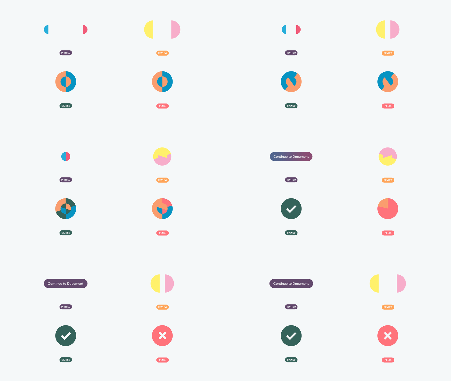
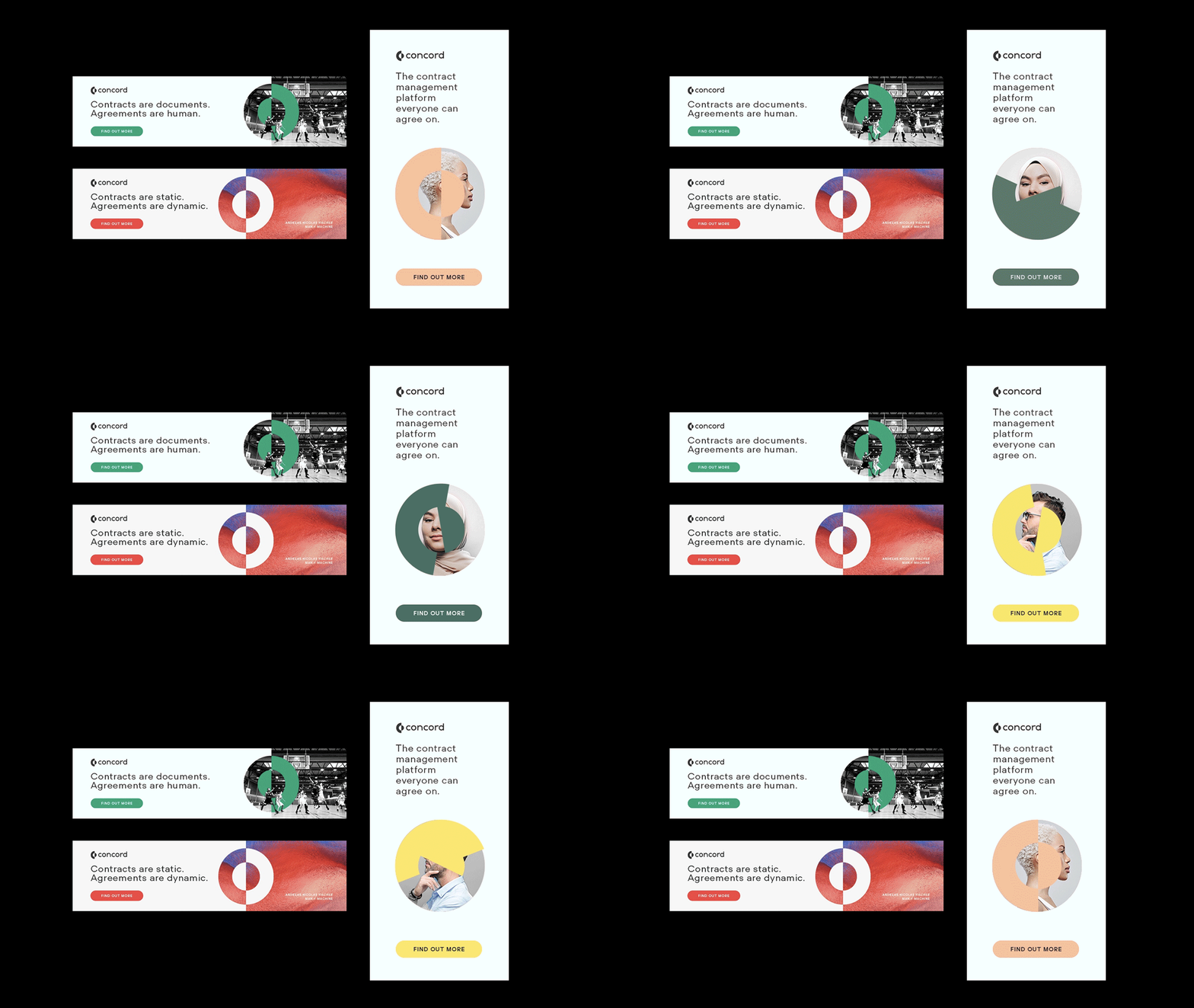
We built a set of motion design components for use on the actual Concord platform/product.

6-product1

CAPABILITIES

Creative Direction

Branding

Type Design

Animation

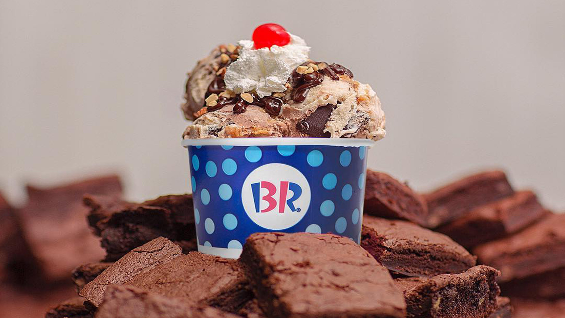
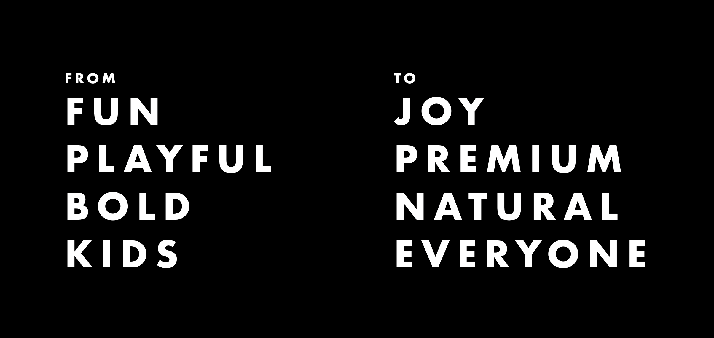
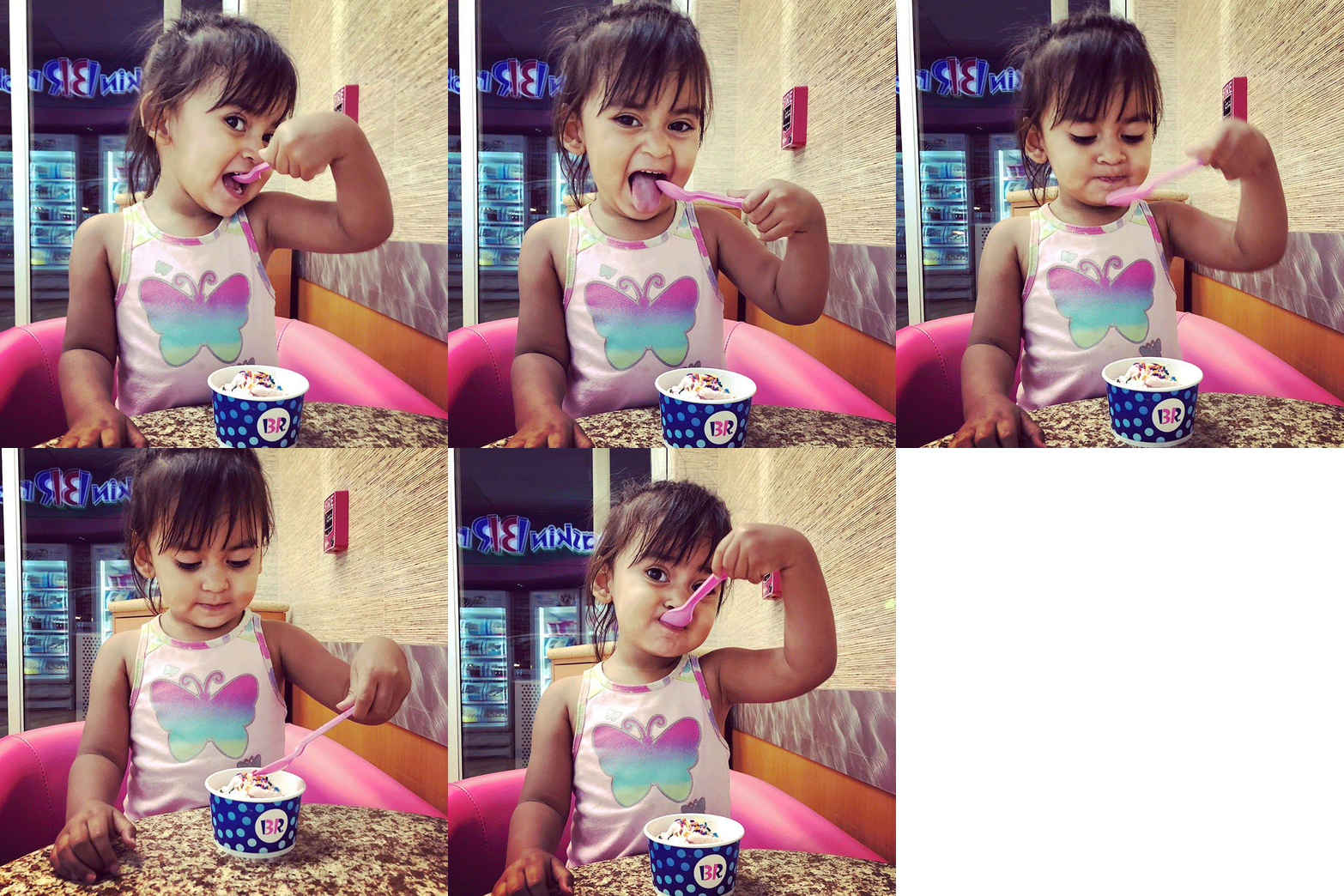
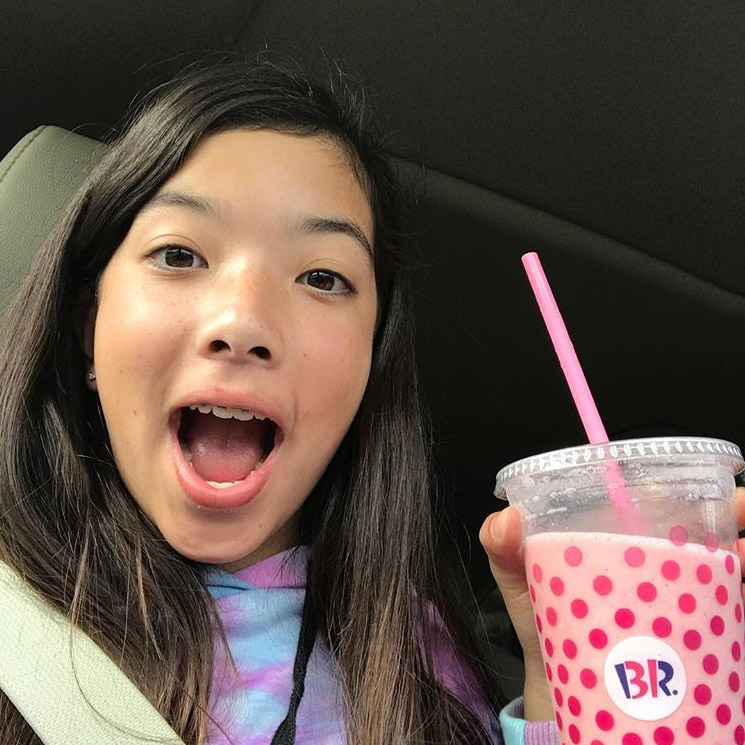
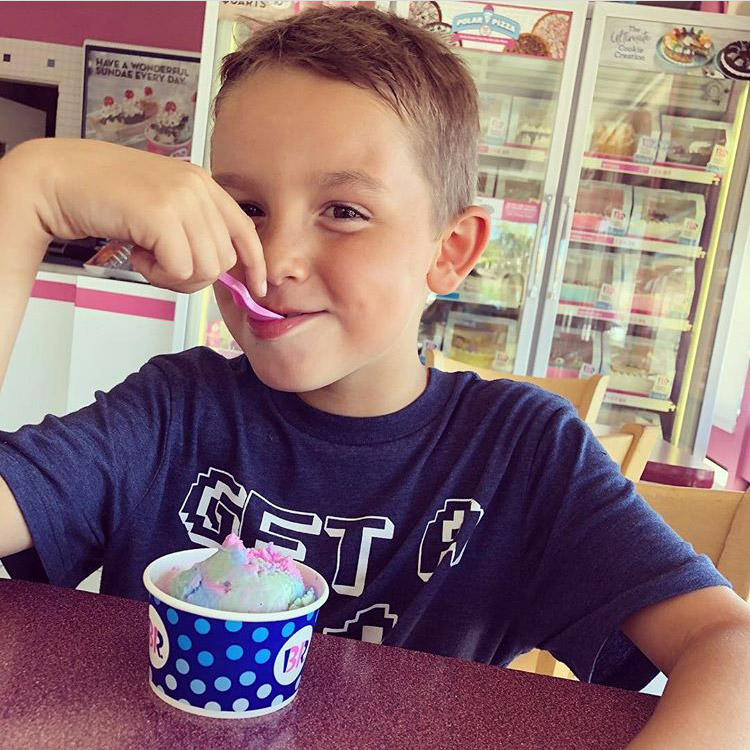
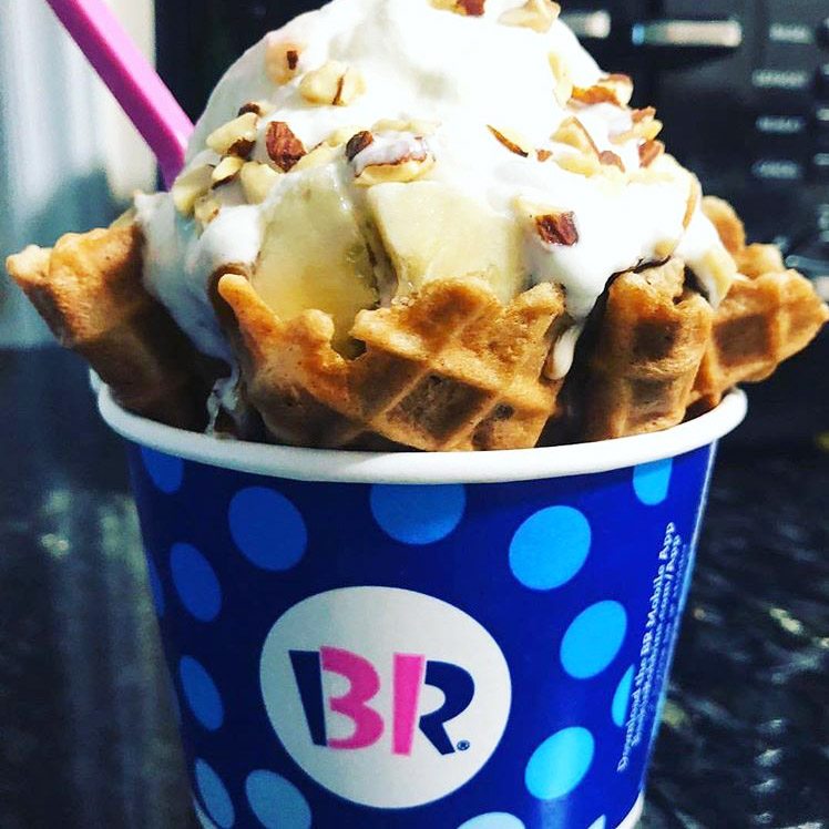
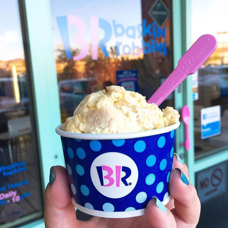
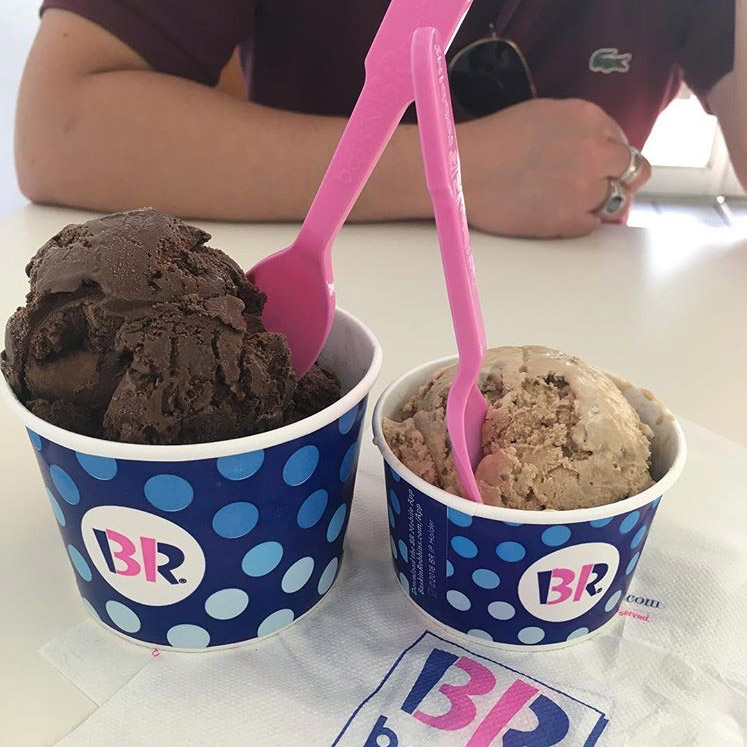
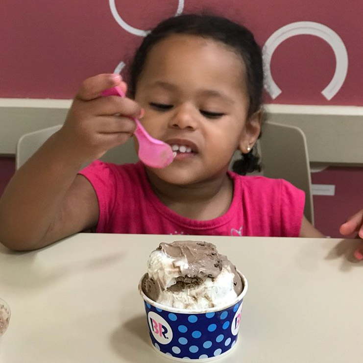
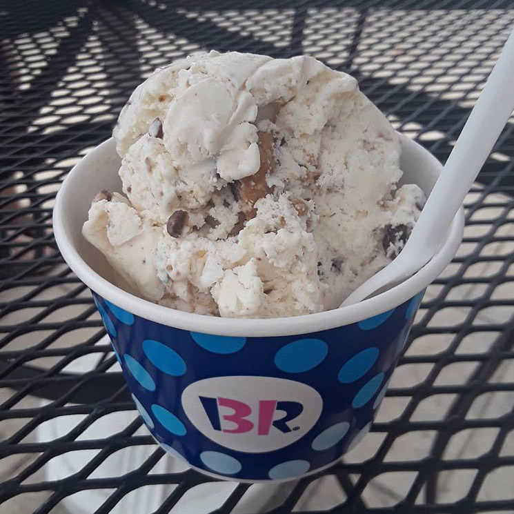
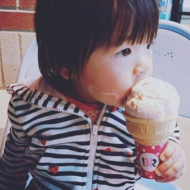
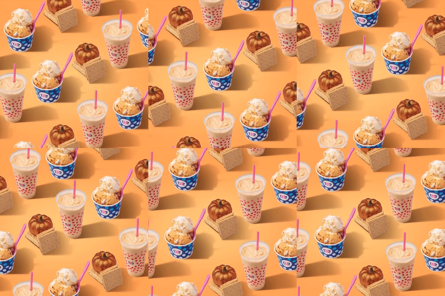
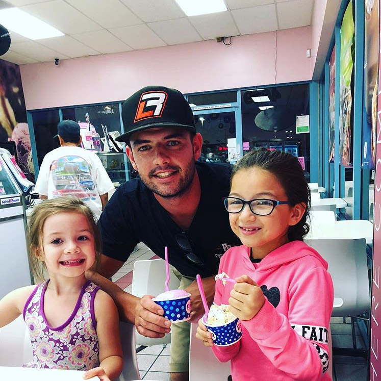
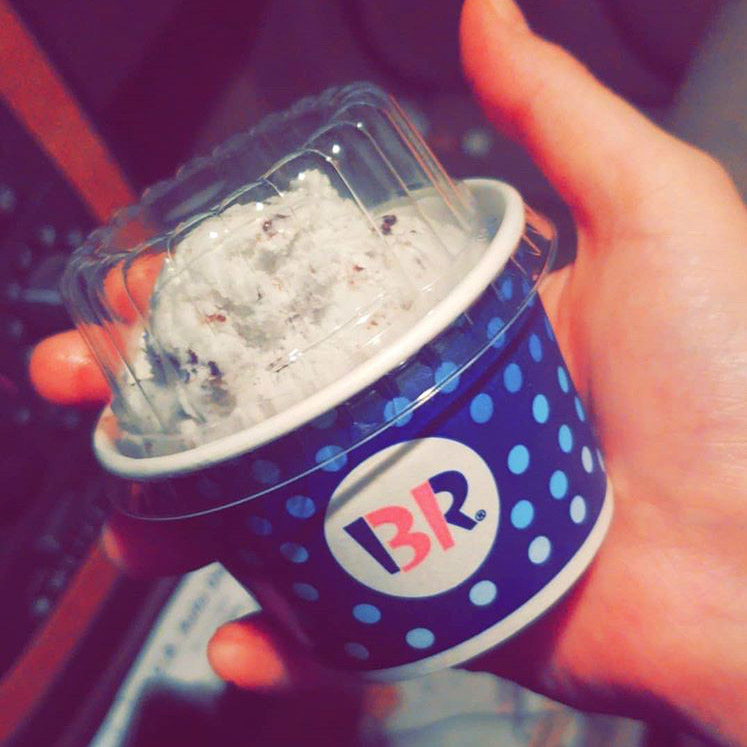
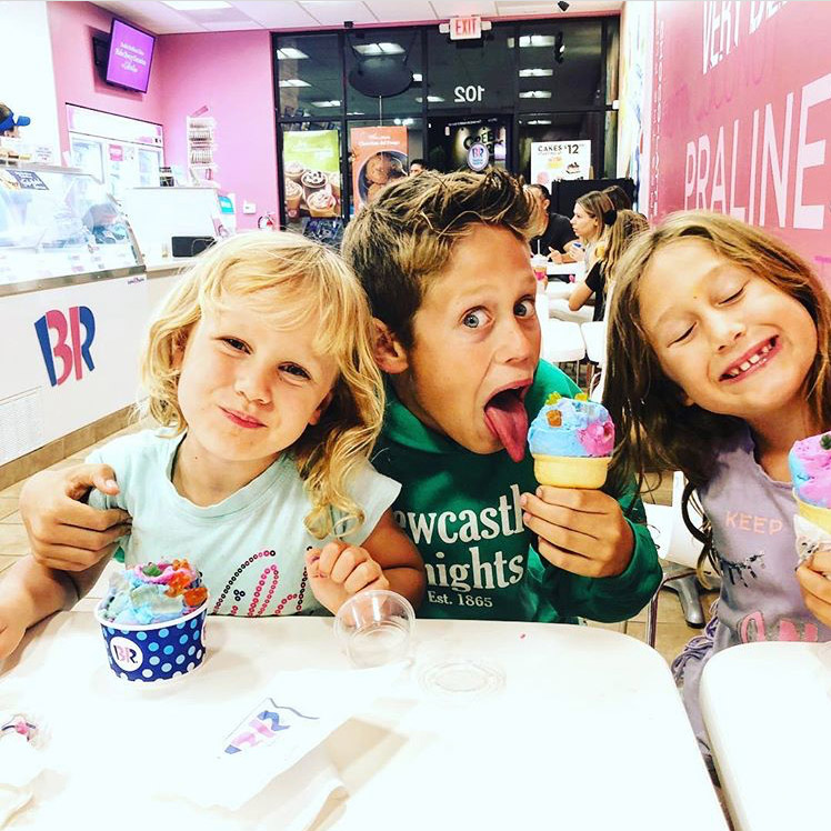
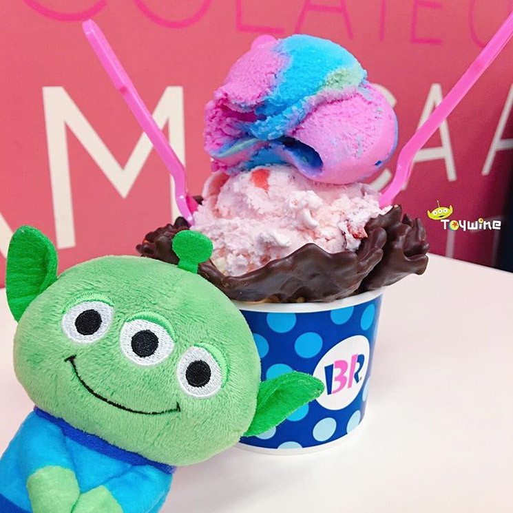
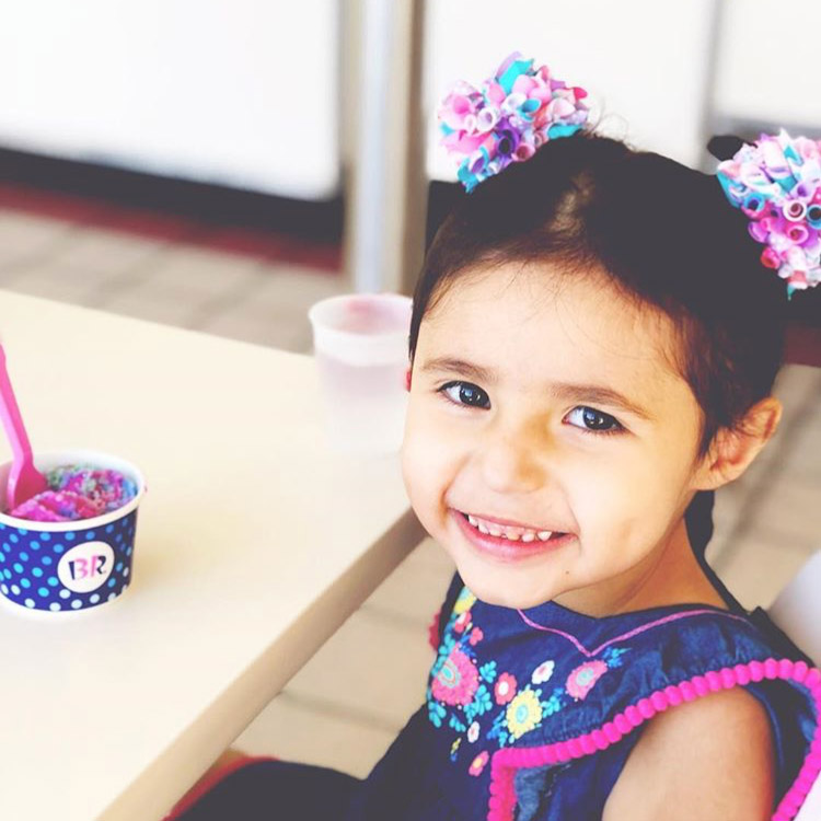
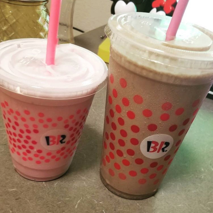
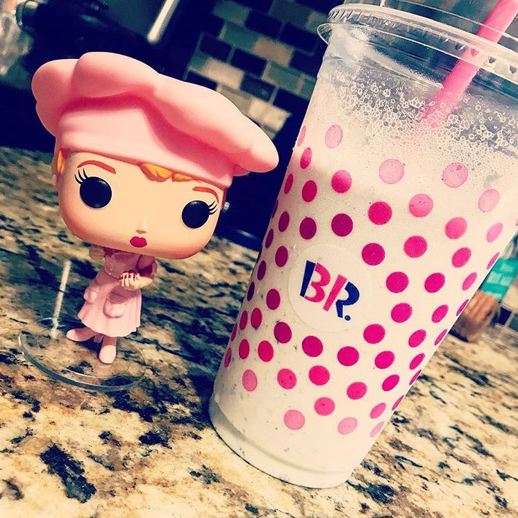
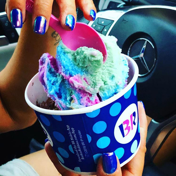
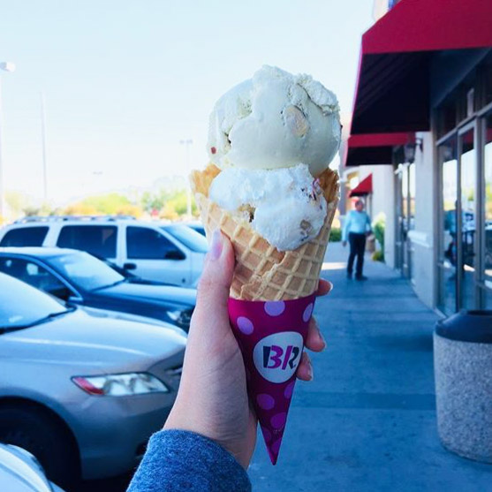
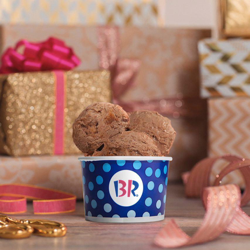
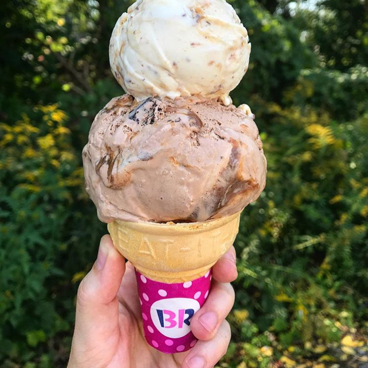
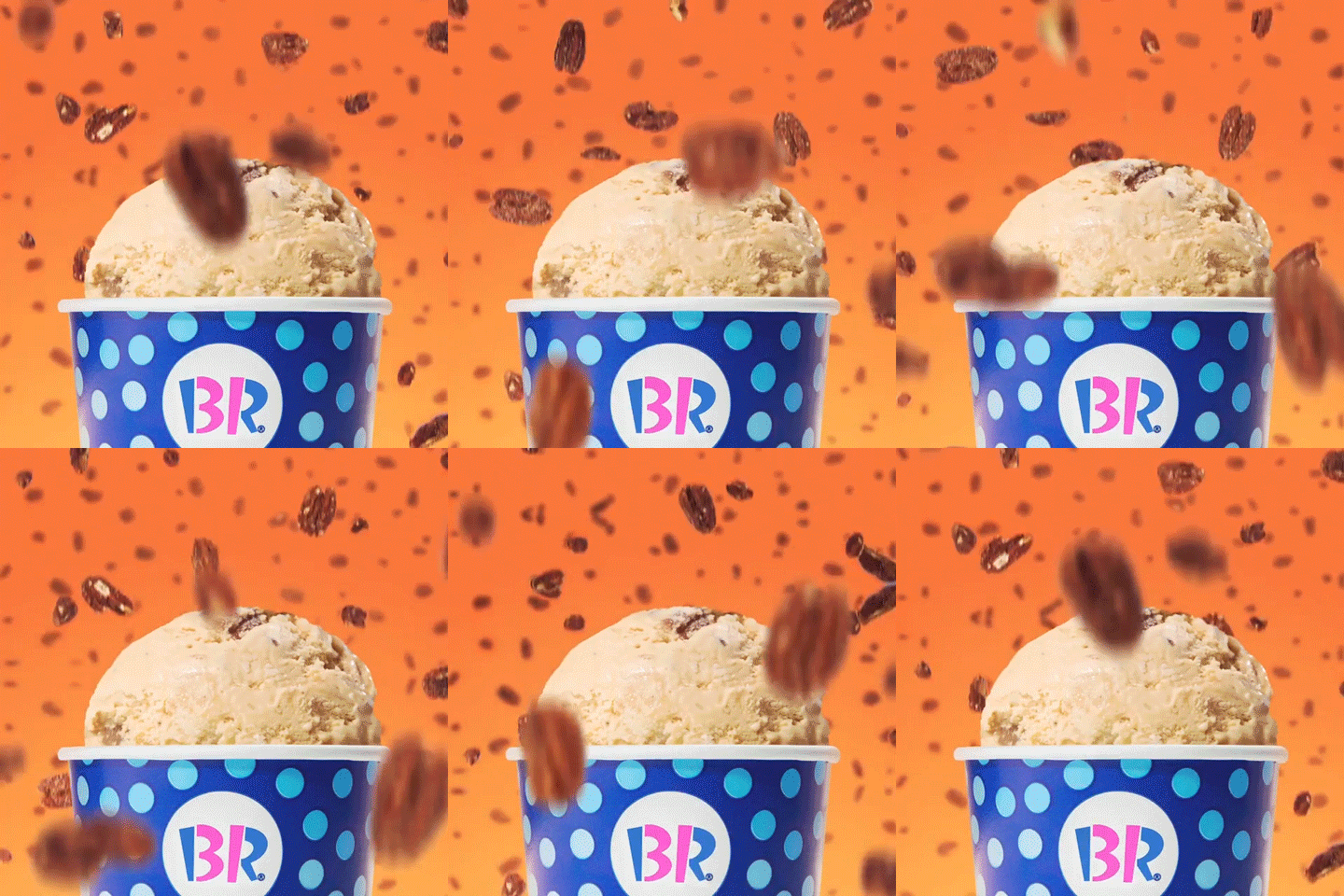
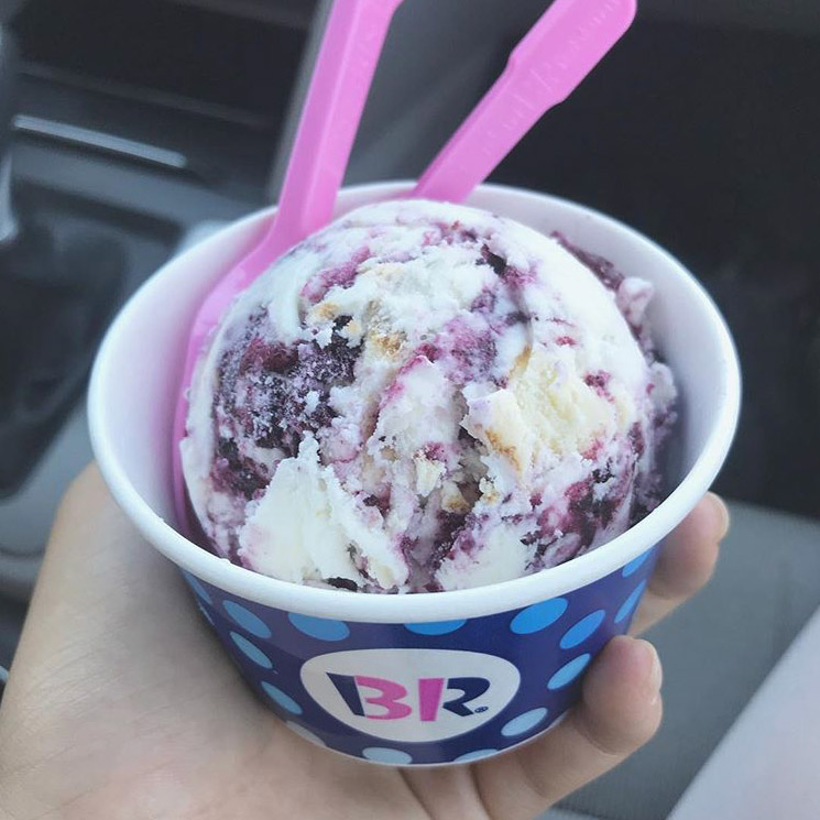
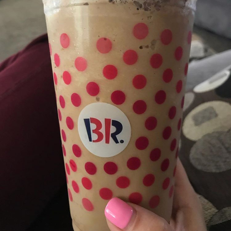
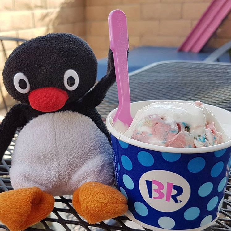
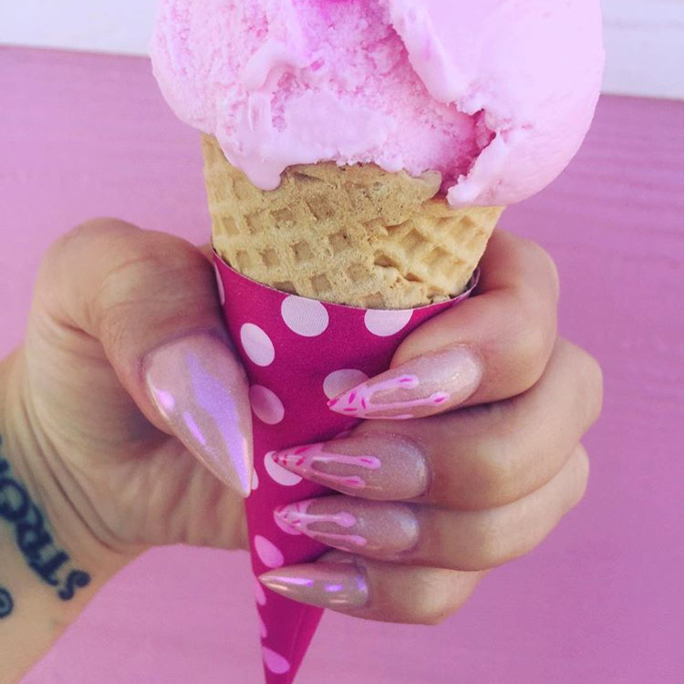
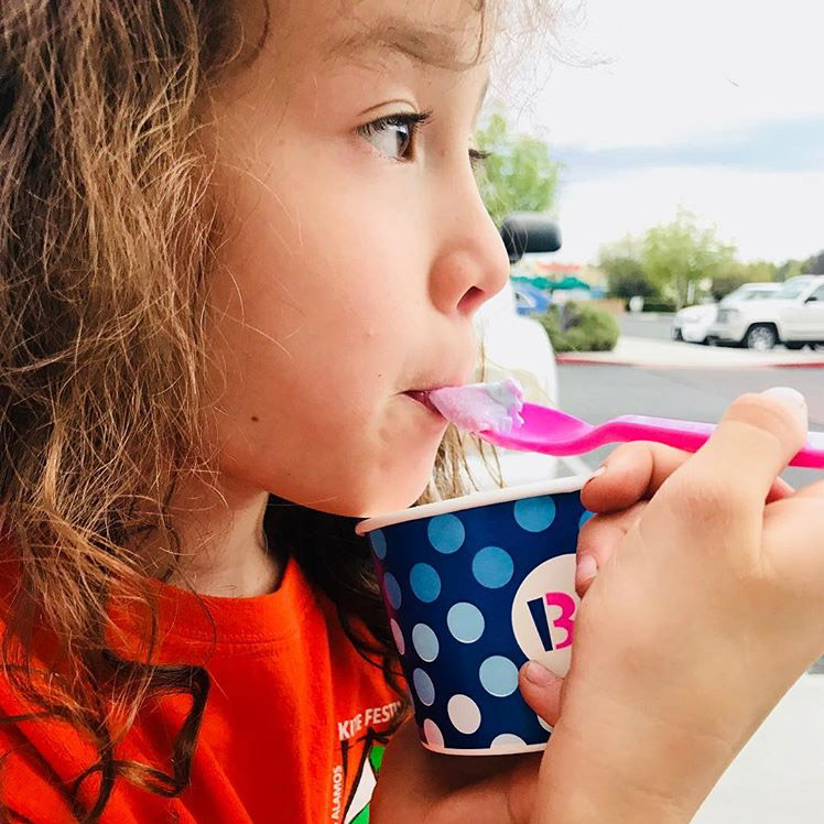
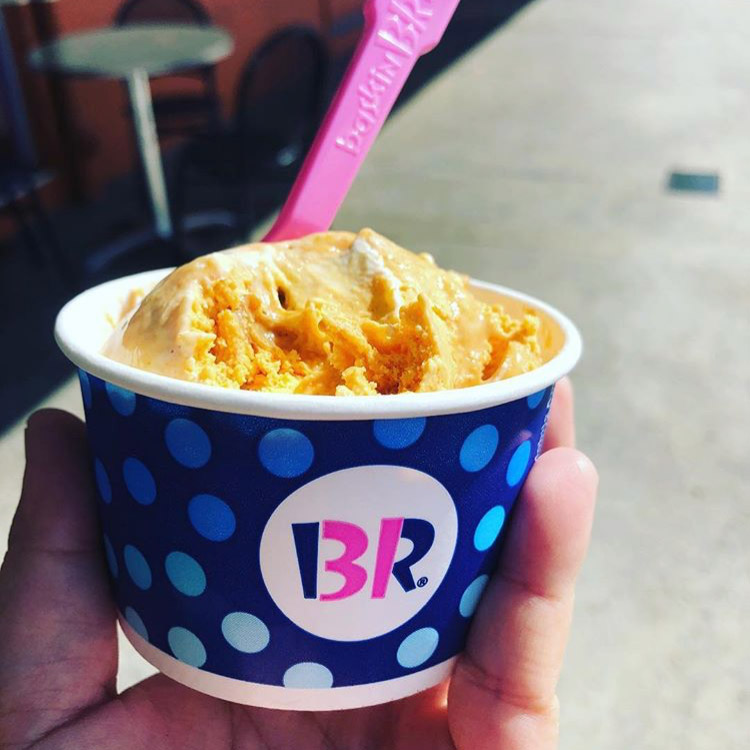
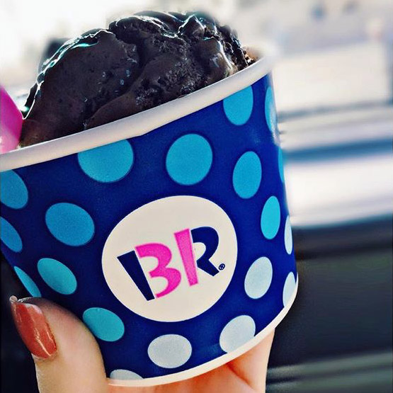
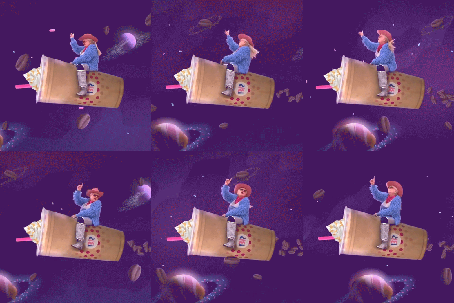
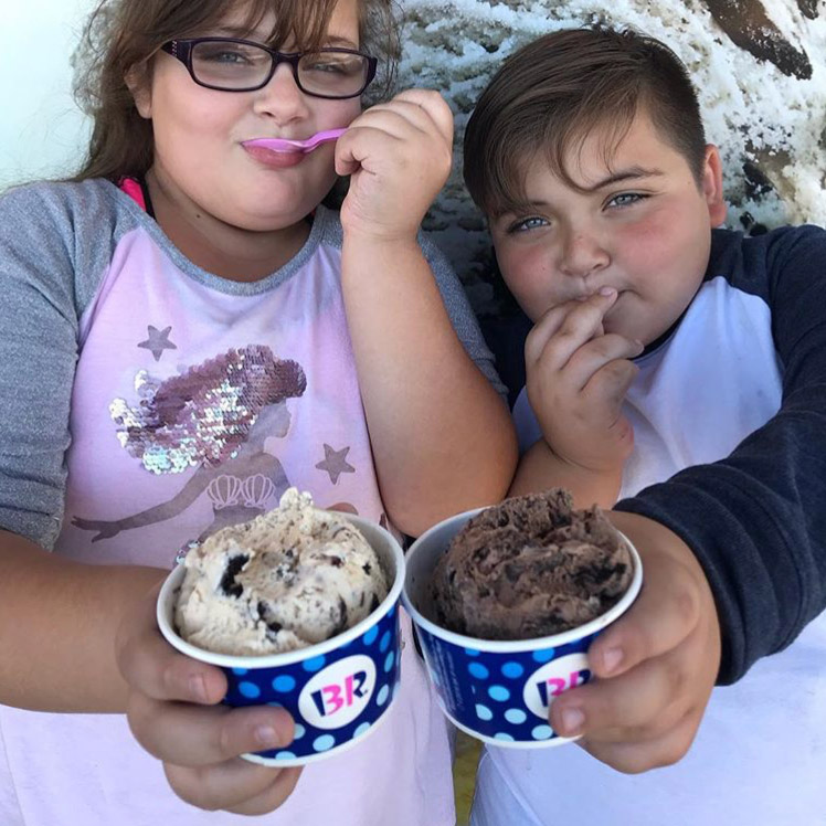
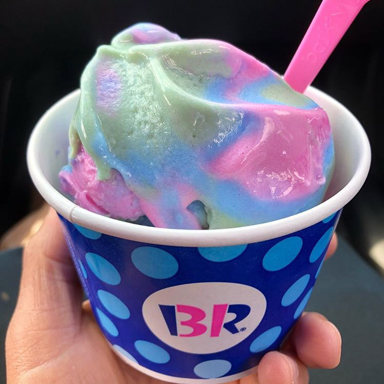
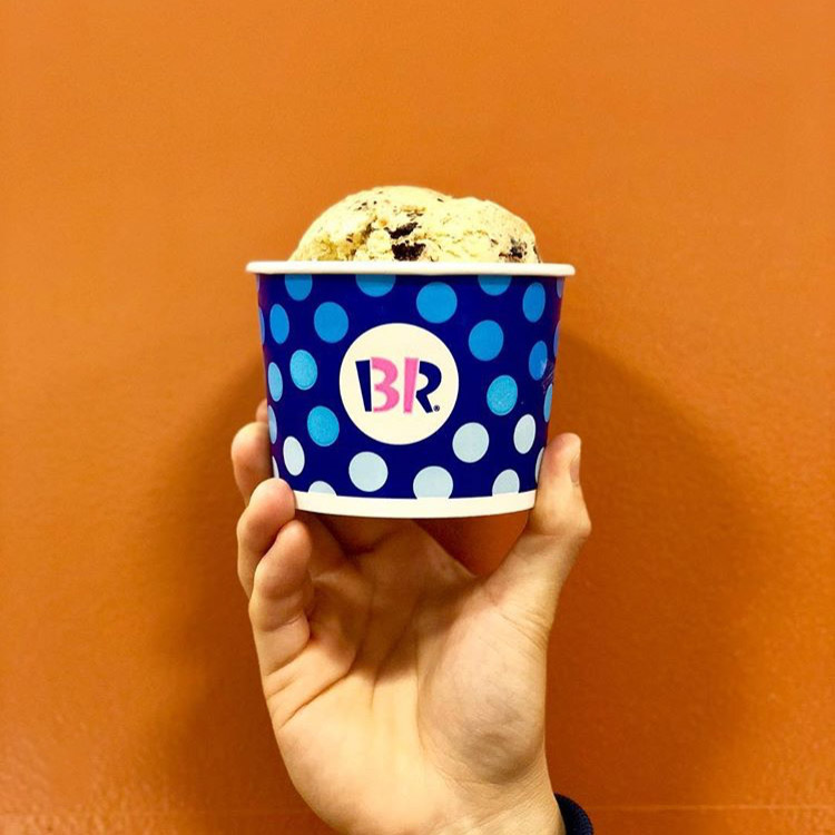
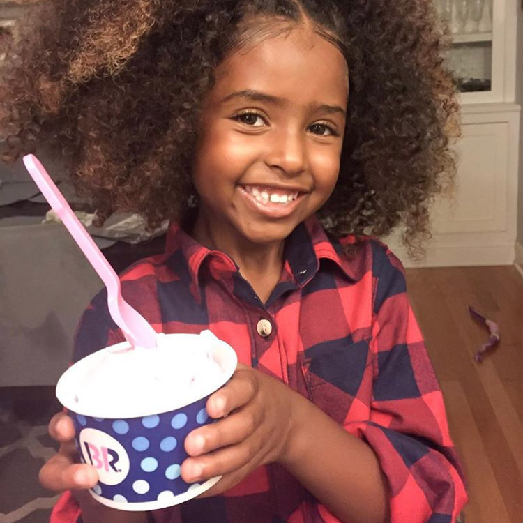
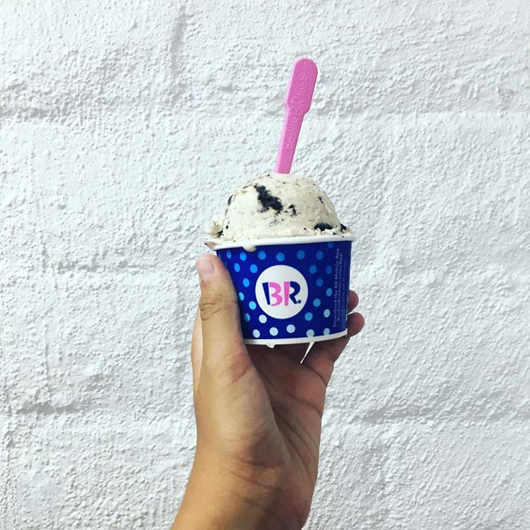
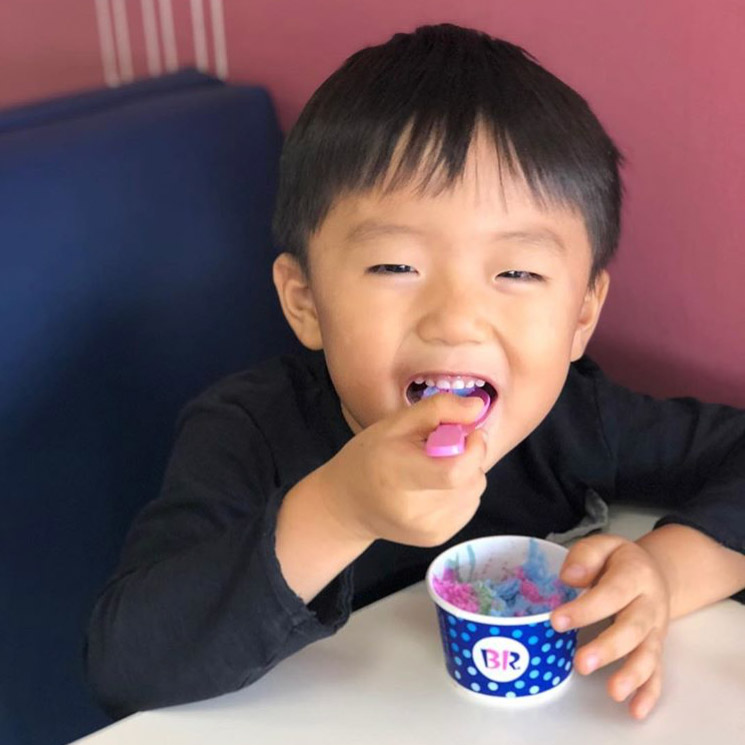
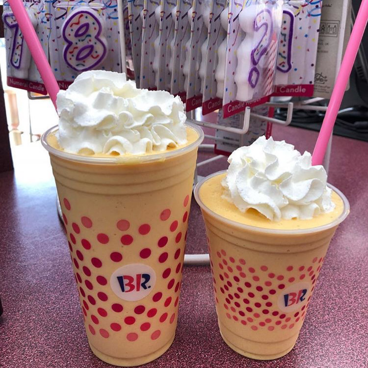
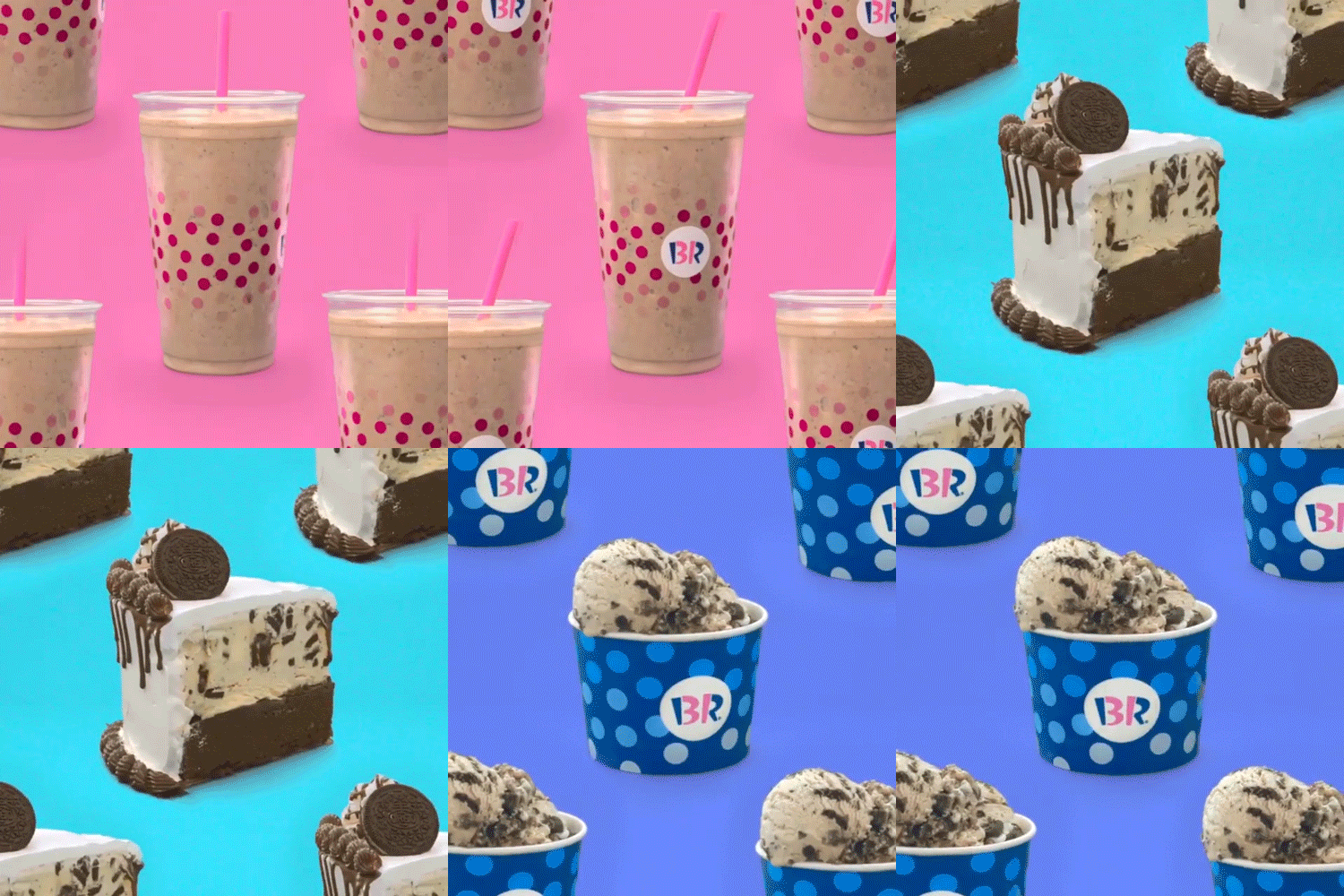
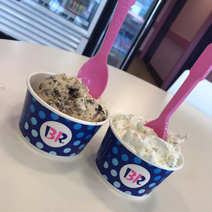
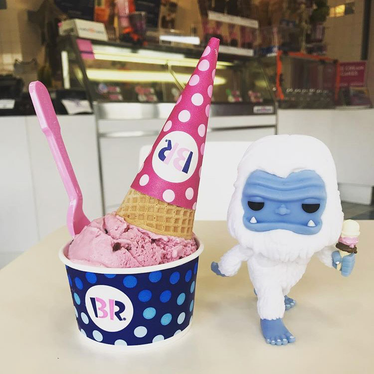
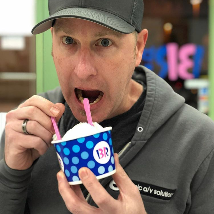
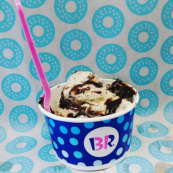
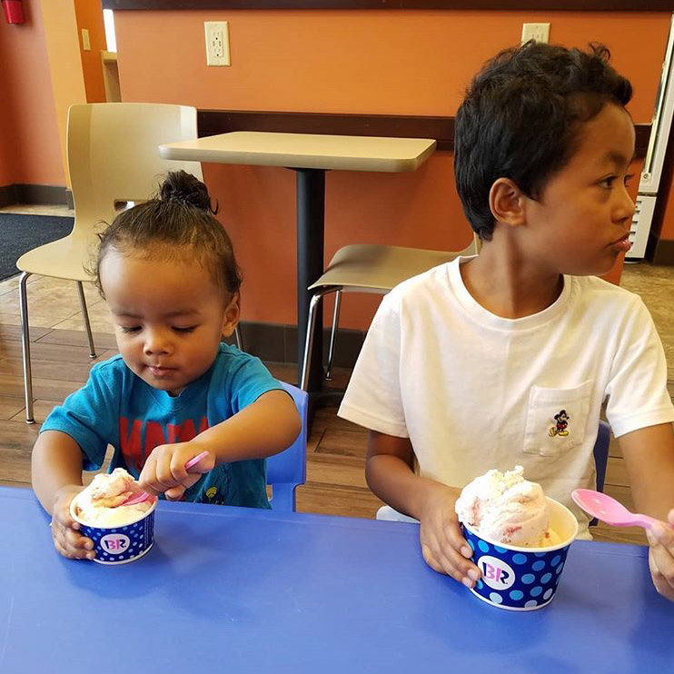
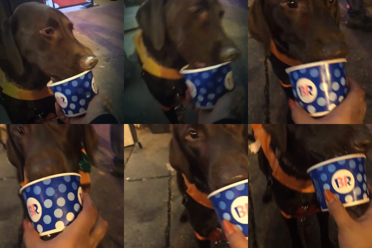
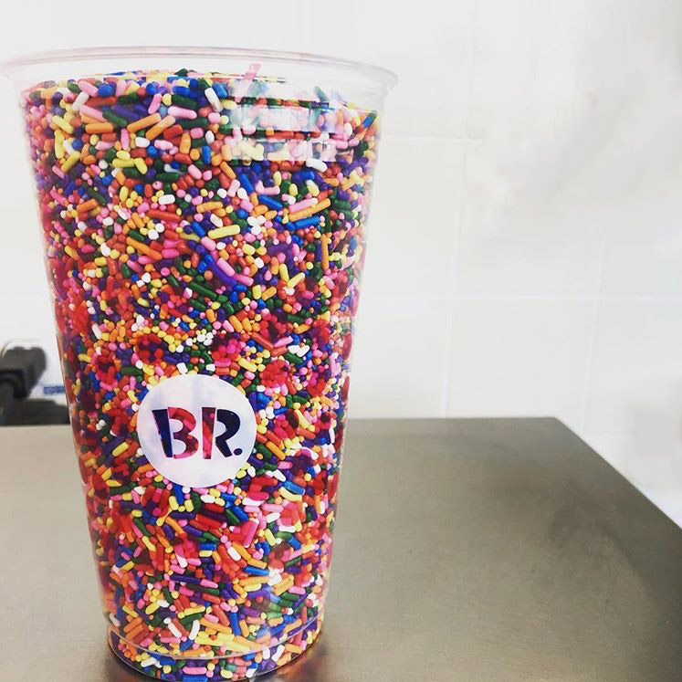
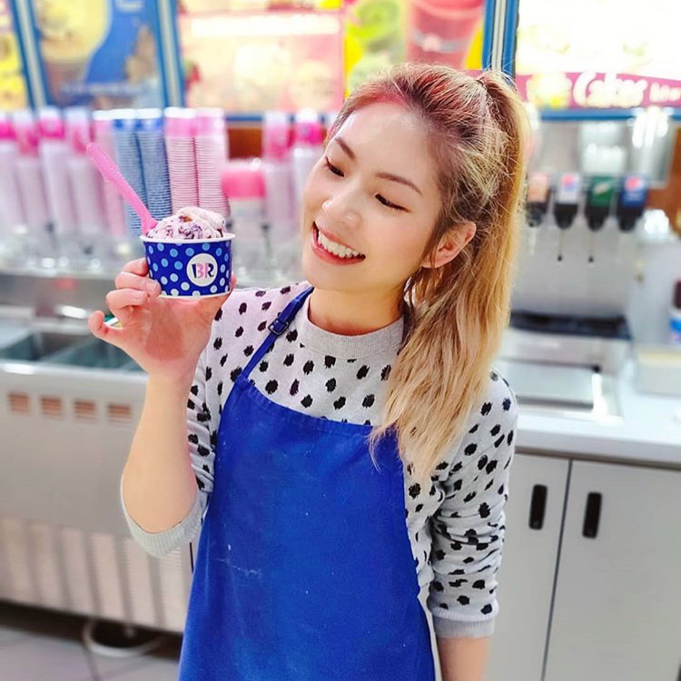
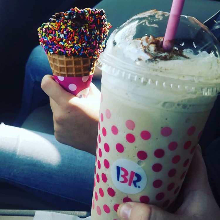
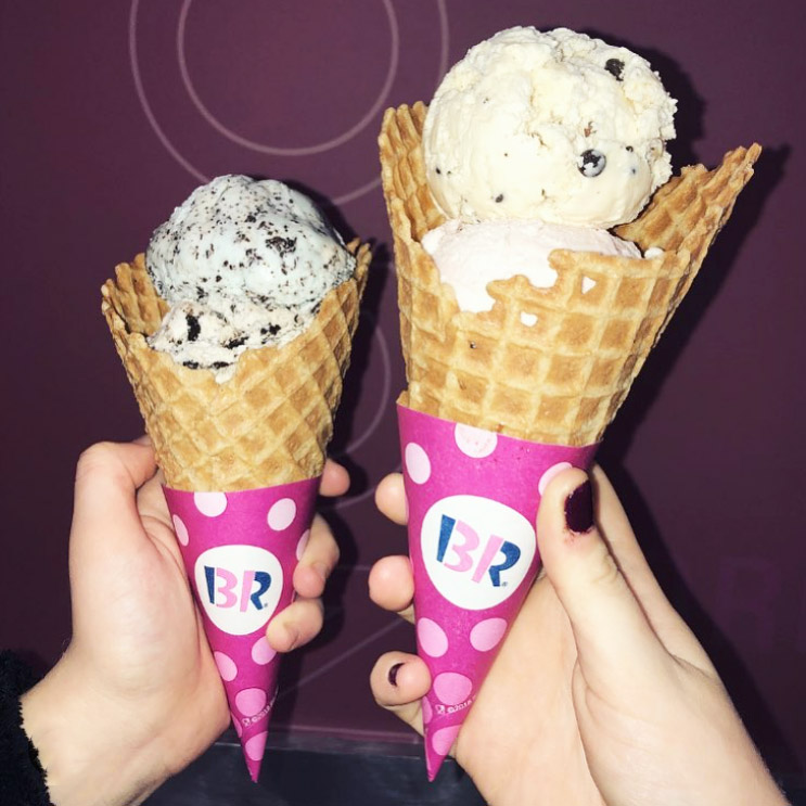
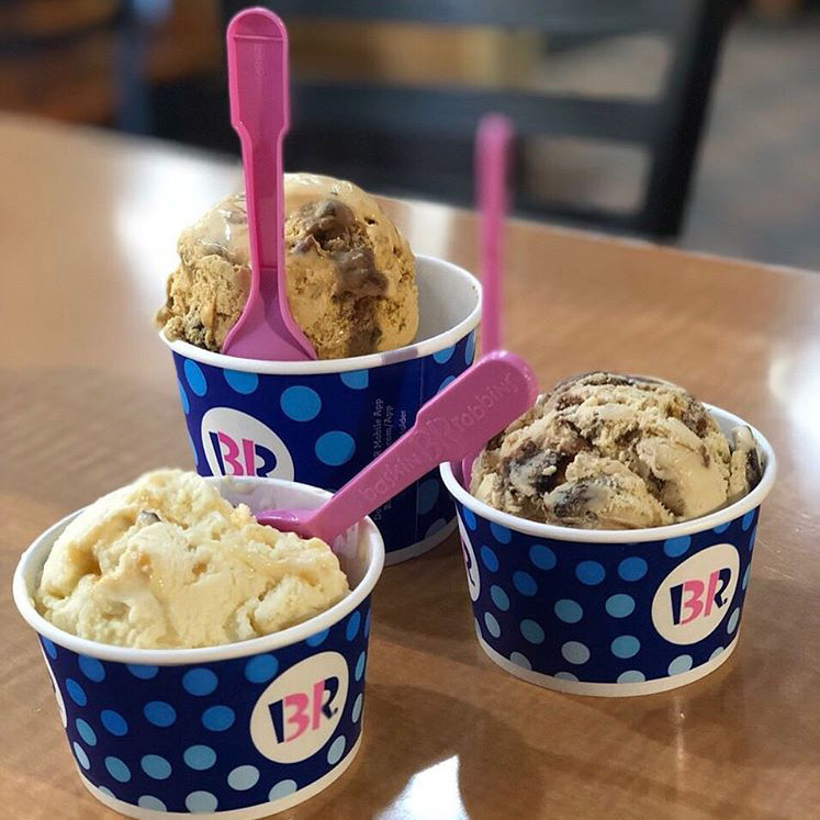
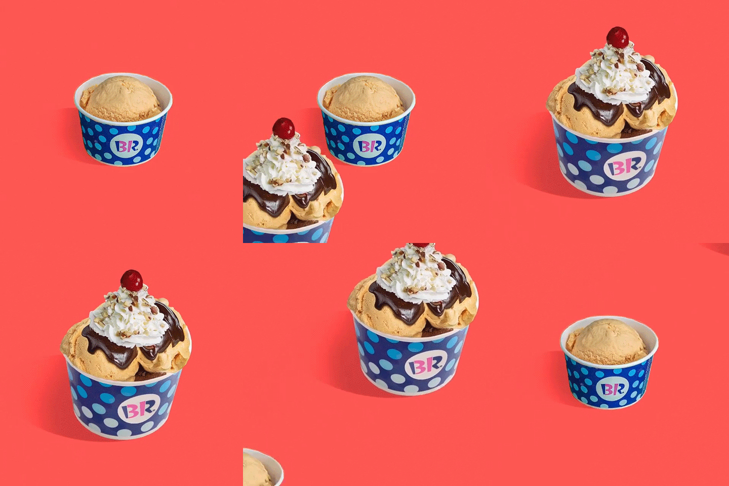
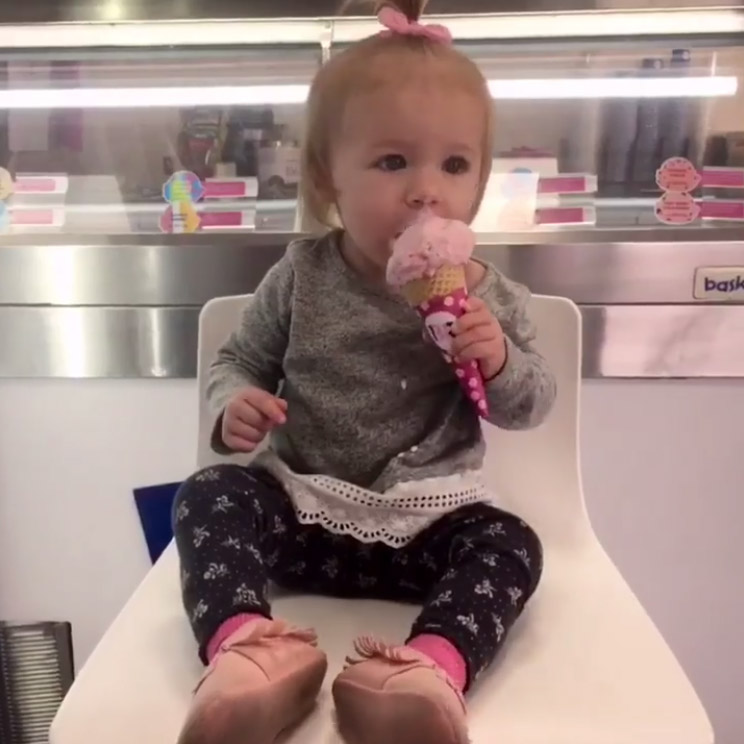
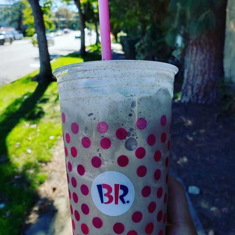
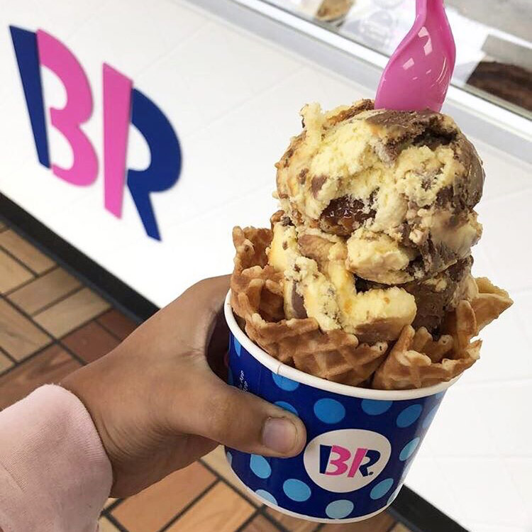
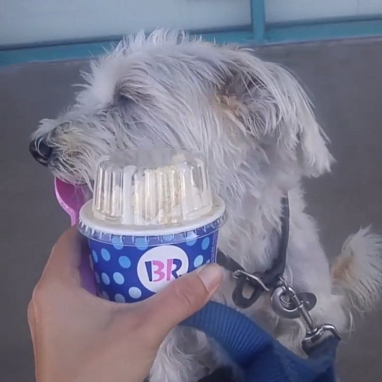
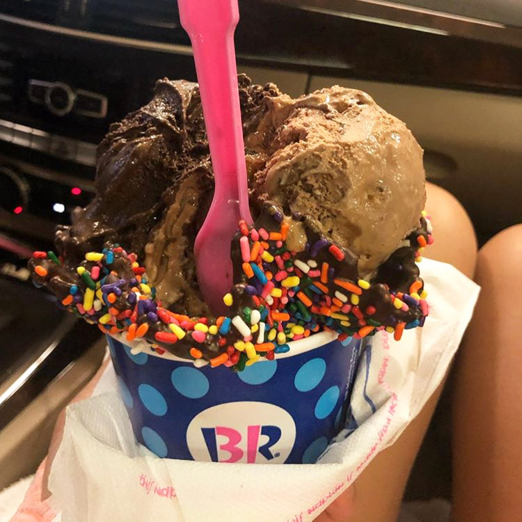
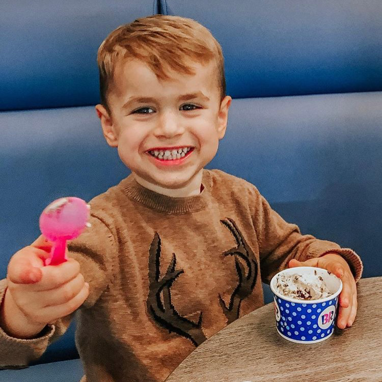
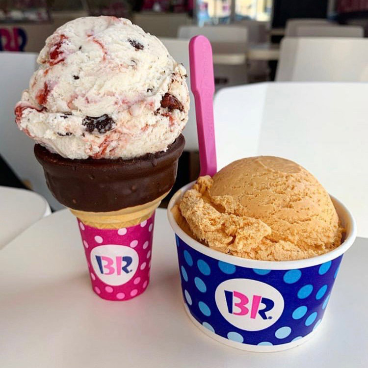
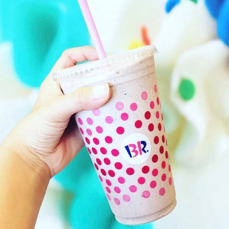
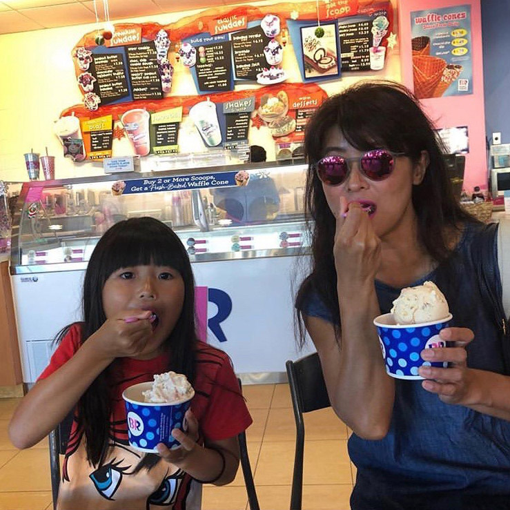
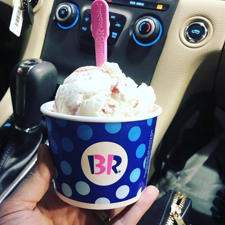
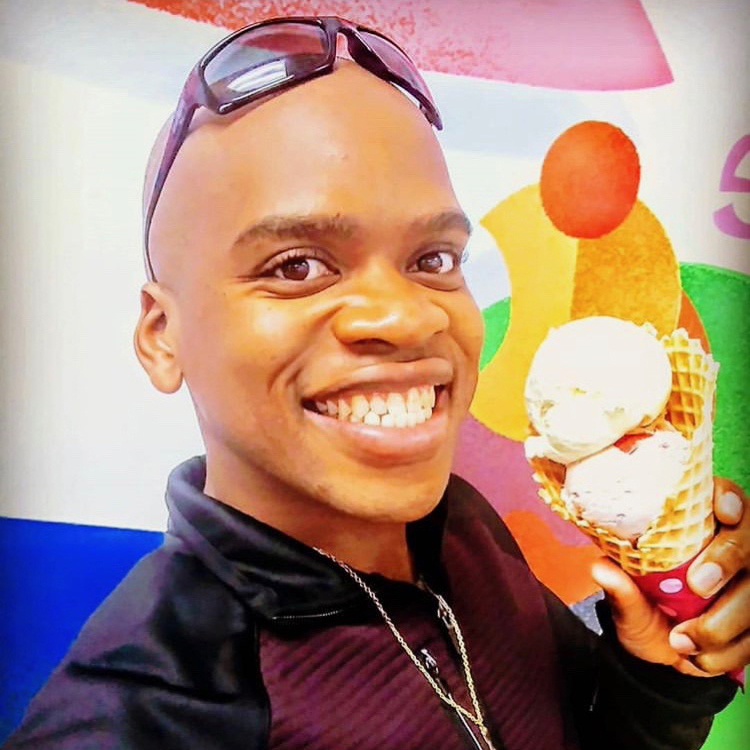
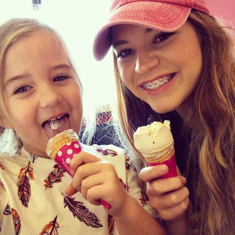
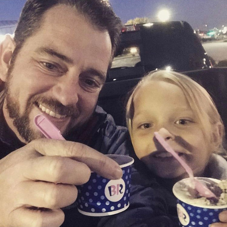
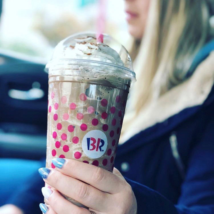
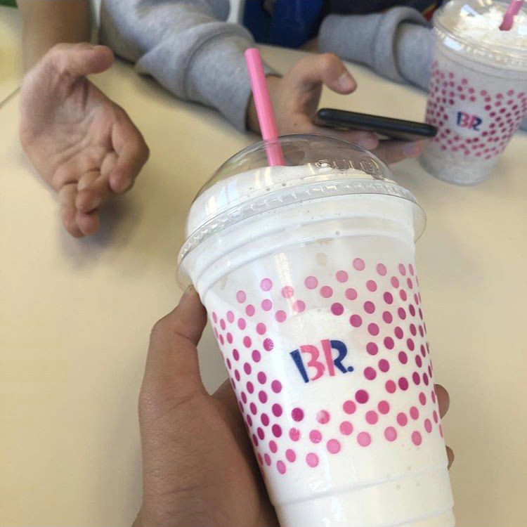
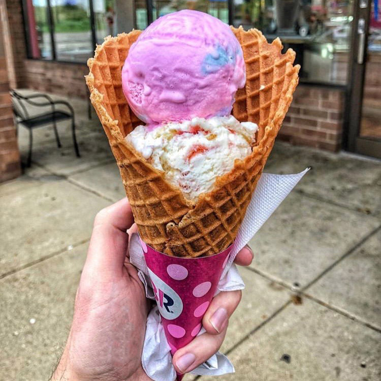
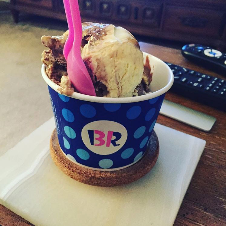
Baskin-Robbins challenged us to elevate their packaging to match the quality of their product, the expectations of their audience and the shared experiences they create.

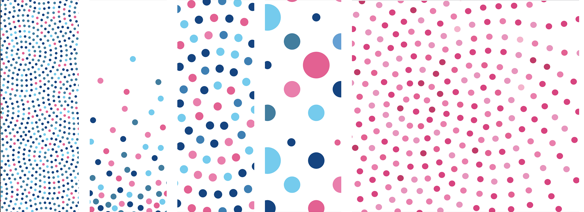
We built a series of dot patterns as a sophisticated (but still joyful!) nod to the dots found on B-R’s original packaging.

PROJECT LINKS

Packaging in the Wild

CAPABILITIES

Creative Direction

Package Design