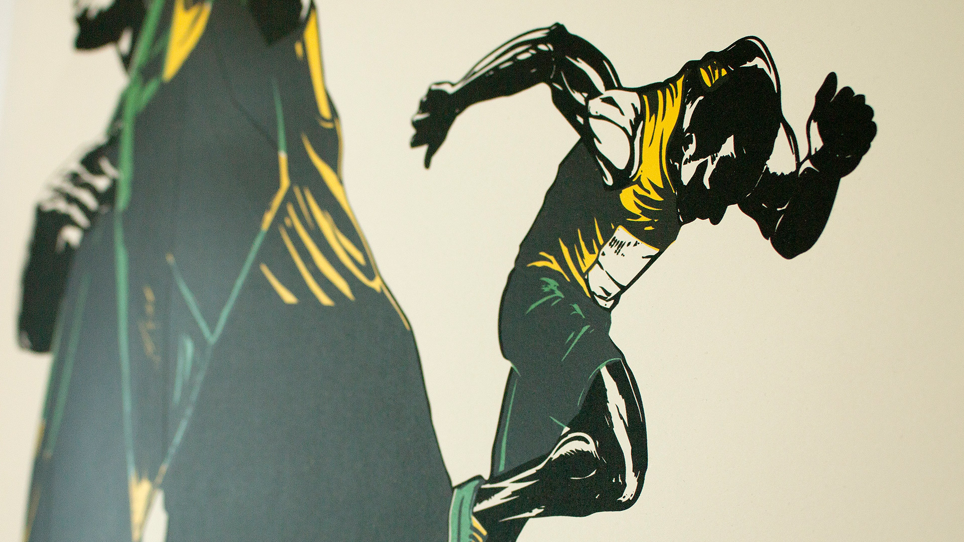
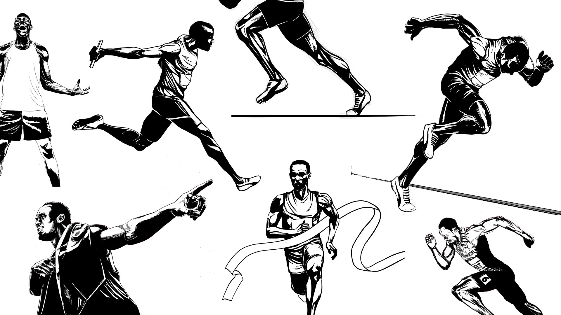
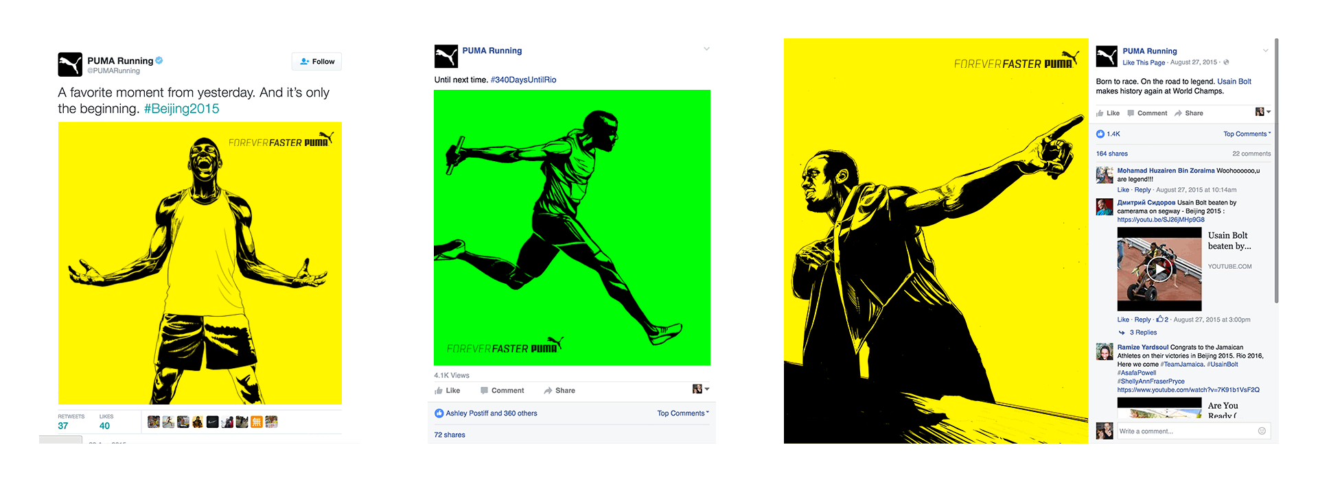
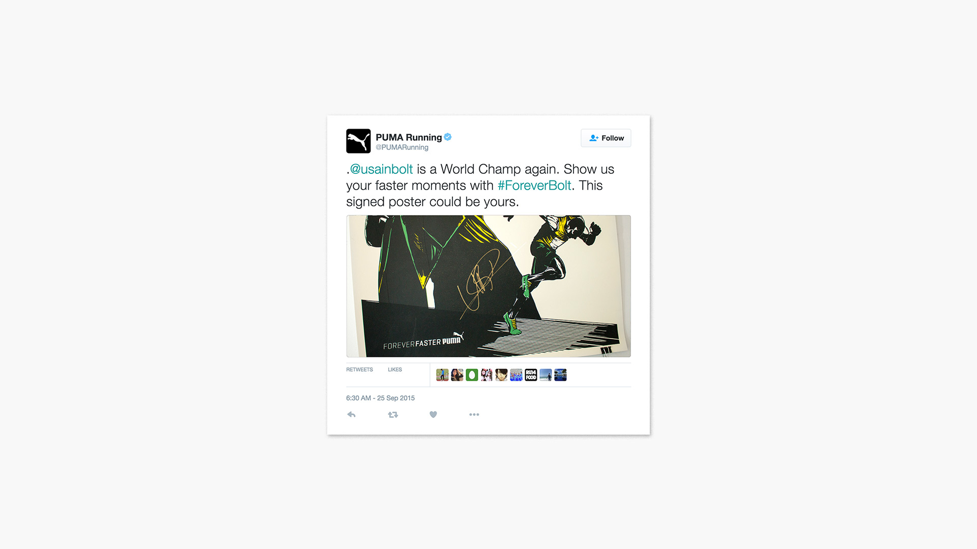
We helped PUMA capture social share during the brand-crowded World Track & Field Championships in Beijing through a series of speed drawings. As soon as the gun went off for a race featuring a PUMA athlete, we started drawing, capturing key moments from the race within moments of the finish and posting them as mini posters throughout the day. Our realtime content earned 65% share of voice, more than any competitor—including event sponsor Adidas.
We immortalized our speed drawings of Usain Bolt winning the 100M and 200M sprints as a limited run of actual posters, and gave away signed copies to a few lucky fans.
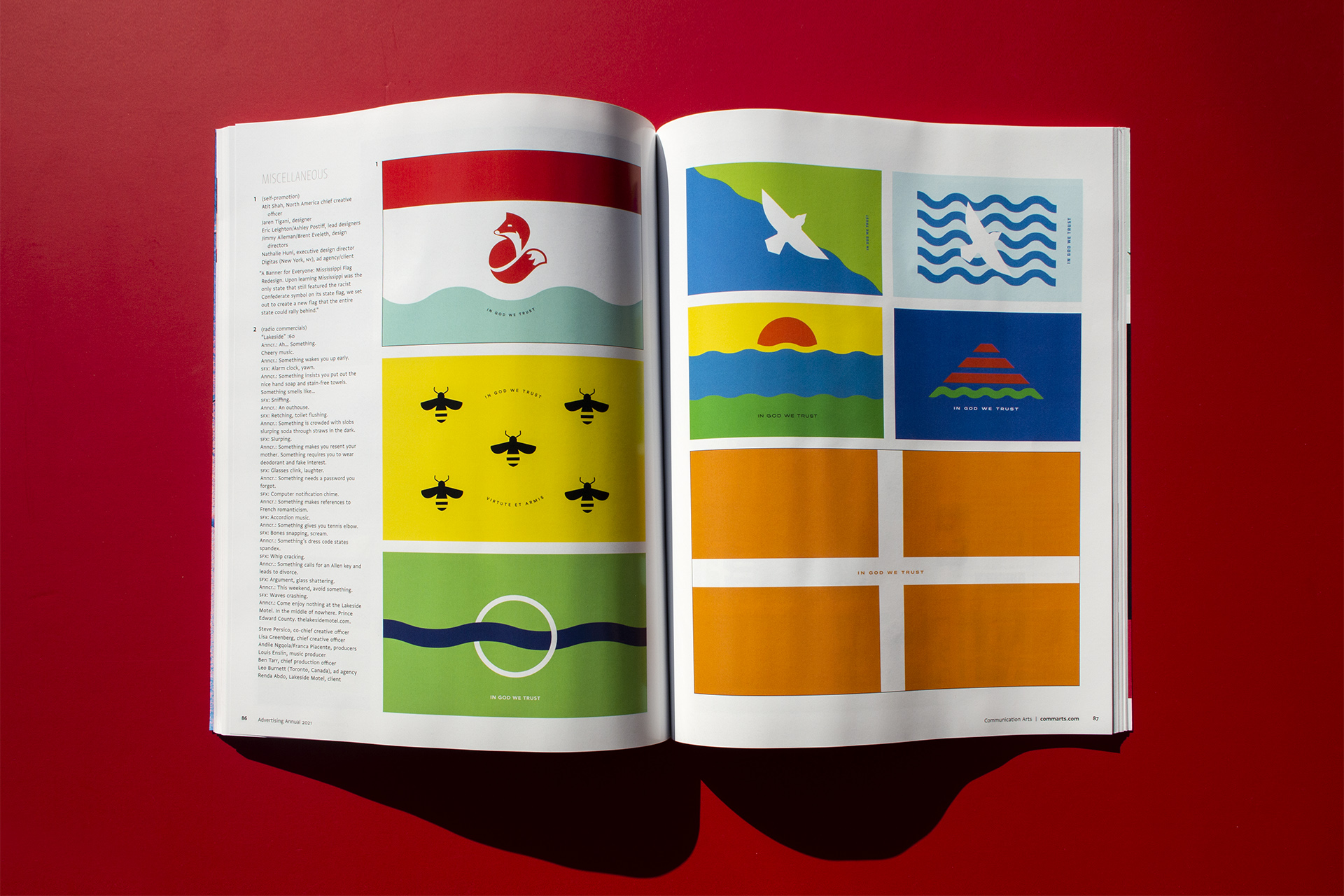
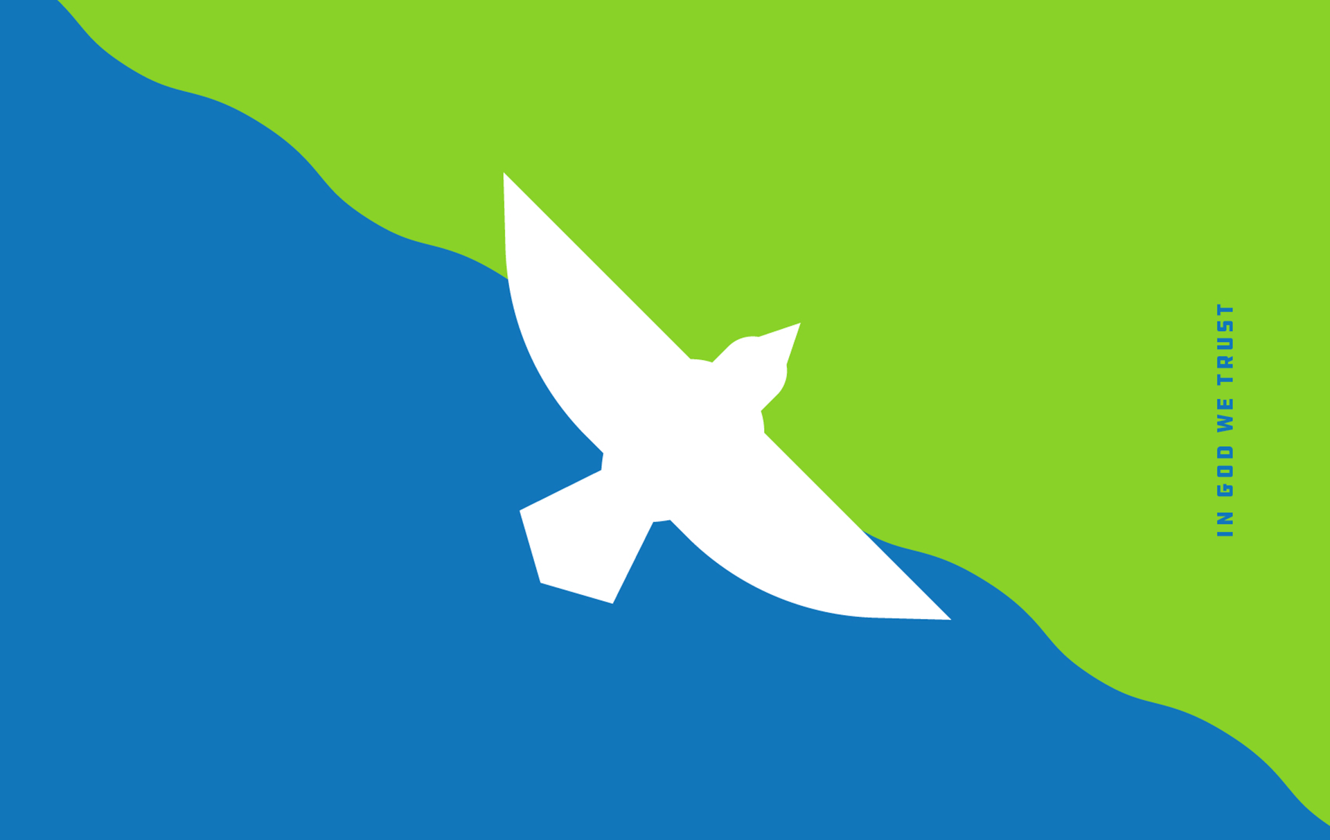
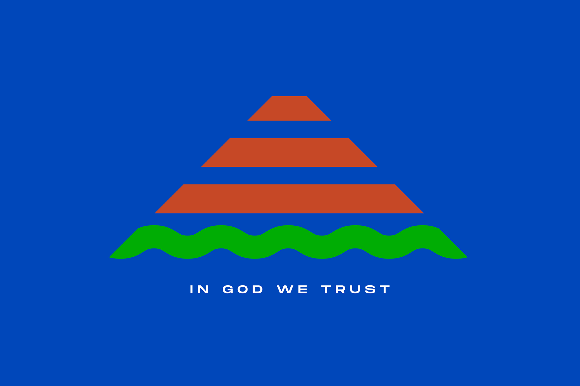
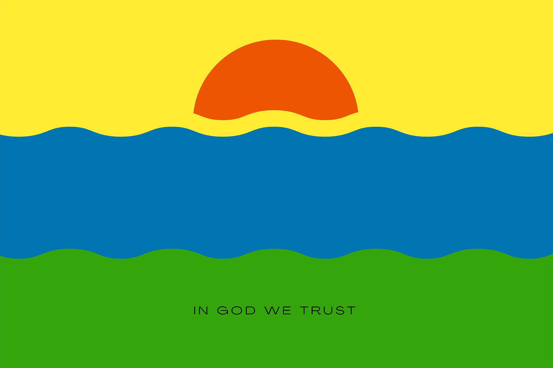
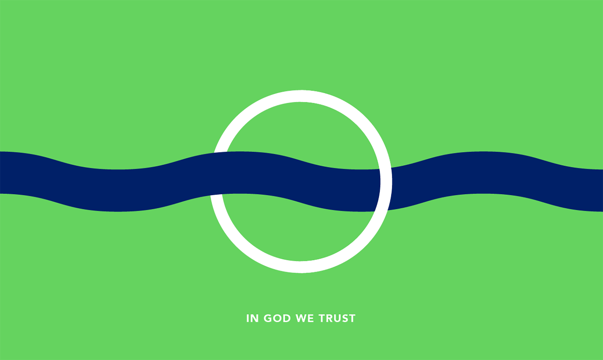
We believe in the power of design to solve universal challenges, build (and shift) culture, and ultimately move people to action. When we heard the state of Mississippi was the last state flag to feature a (racist) confederate flag element, we responded by quickly assembling a diverse and talented design collective to contribute to the conversation with several alternate flag designs that the whole state could rally behind.
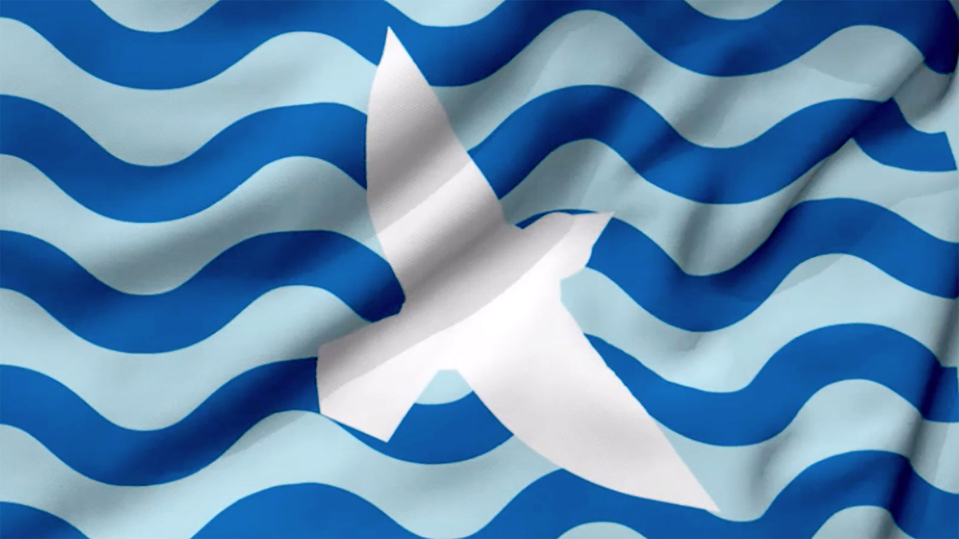
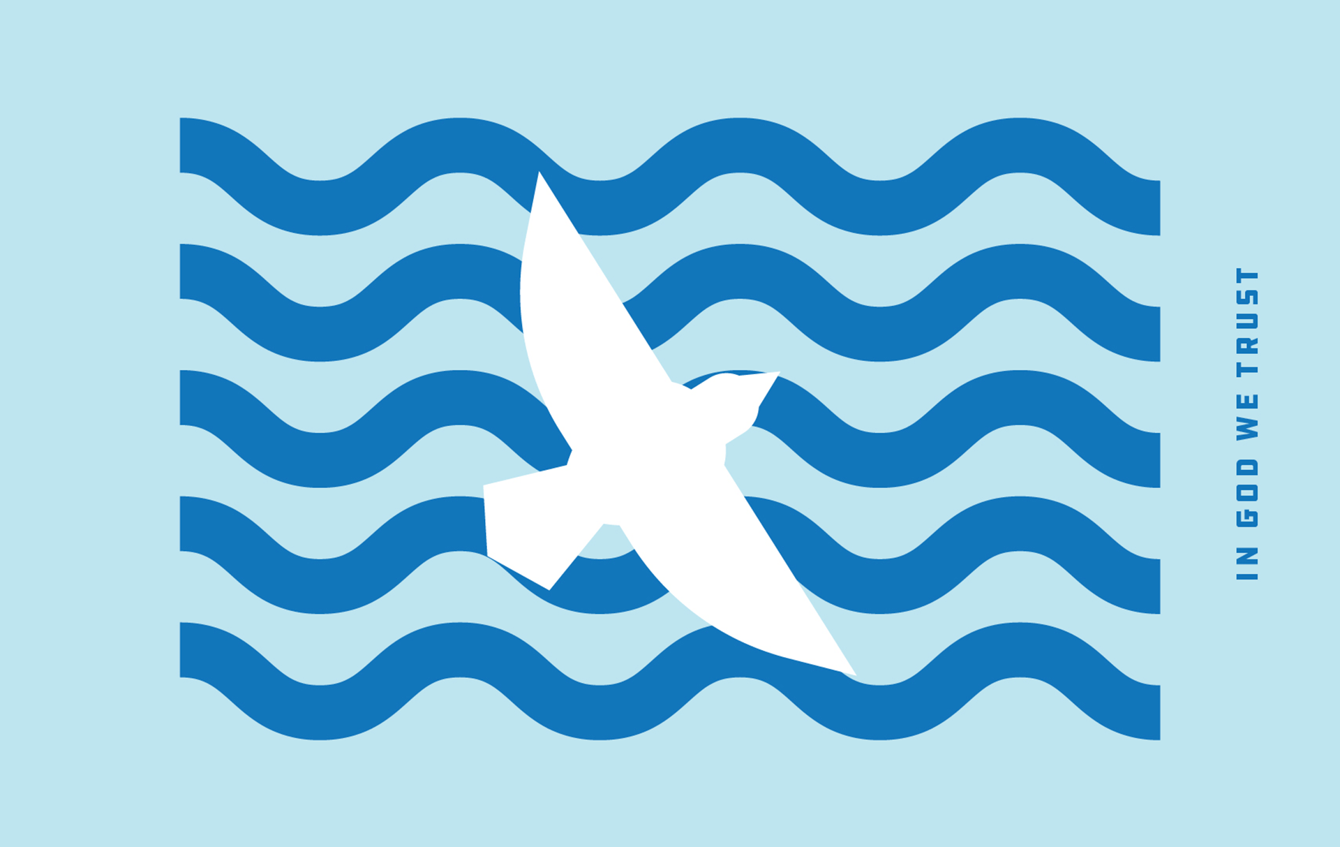
In the past, the Mississippi River was used as a way to flee from the state. This design shows the Mockingbird soaring over the Mississippi River, into Mississippi, as a reminder of new beginnings. A symbol of overcoming fear and finding the inner song and voice of a people that stand united together.
This design pays homage to the mound-building Mississippian culture, whose settlements would have dotted the banks of the river along what would become the state’s western border. Not identified with a single tribe, the architectural and agricultural traditions were the result of dozens of unique peoples including the Chickasaw, Choctaw, and Yazoo.
A play on a traditional three-bar design, the rolling waves of the Mississippi River acts as the gateway to the West. Our viewpoint is the green of the riverbank on the Mississippi side with a view towards the setting sun as it illuminates the state’s—and our country’s—progress towards inclusion.
A design that highlights the Mississippi River. The ring represents the community’s connection to Nature.
This design pays homage to the Mockingbird, Mississippi’s state bird. The Mockingbird can often represent overcoming fear and finding your inner song and voice. In the center of the flag, the bird soars over the Mississippi River as a reminder of new beginnings.
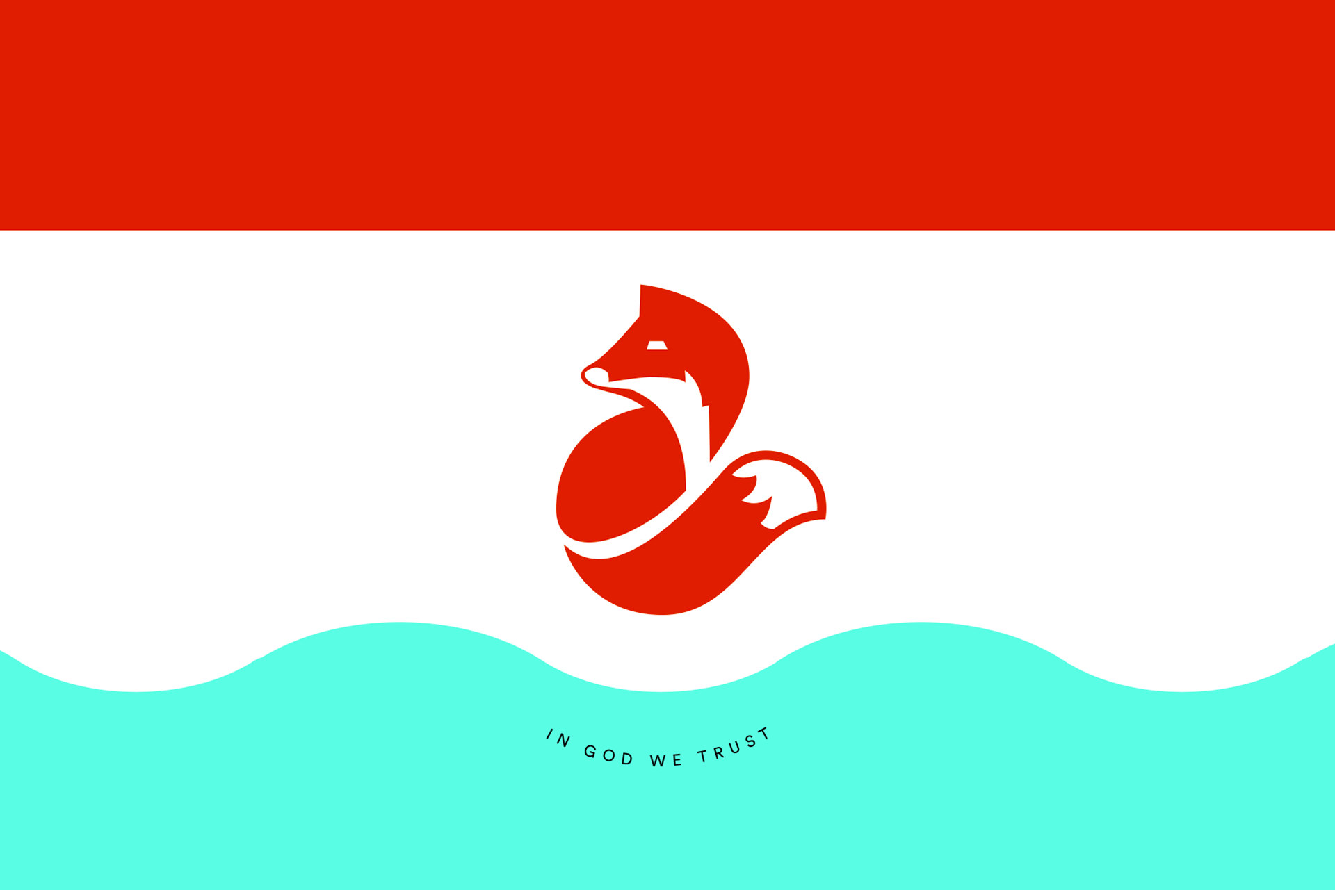
The Red Fox is the Mississippi state mammal; wise and cunning. In many cultures, particularly that of the Native Americans, the fox reveals itself during times of great and unpredictable change. With its heightened sense of awareness, the fox implores you to break free from your comfort zone and remain flexible with whatever comes next. Shown here with a red stripe signifying the Mississippi land, and a blue stripe representing the Mississippi River.
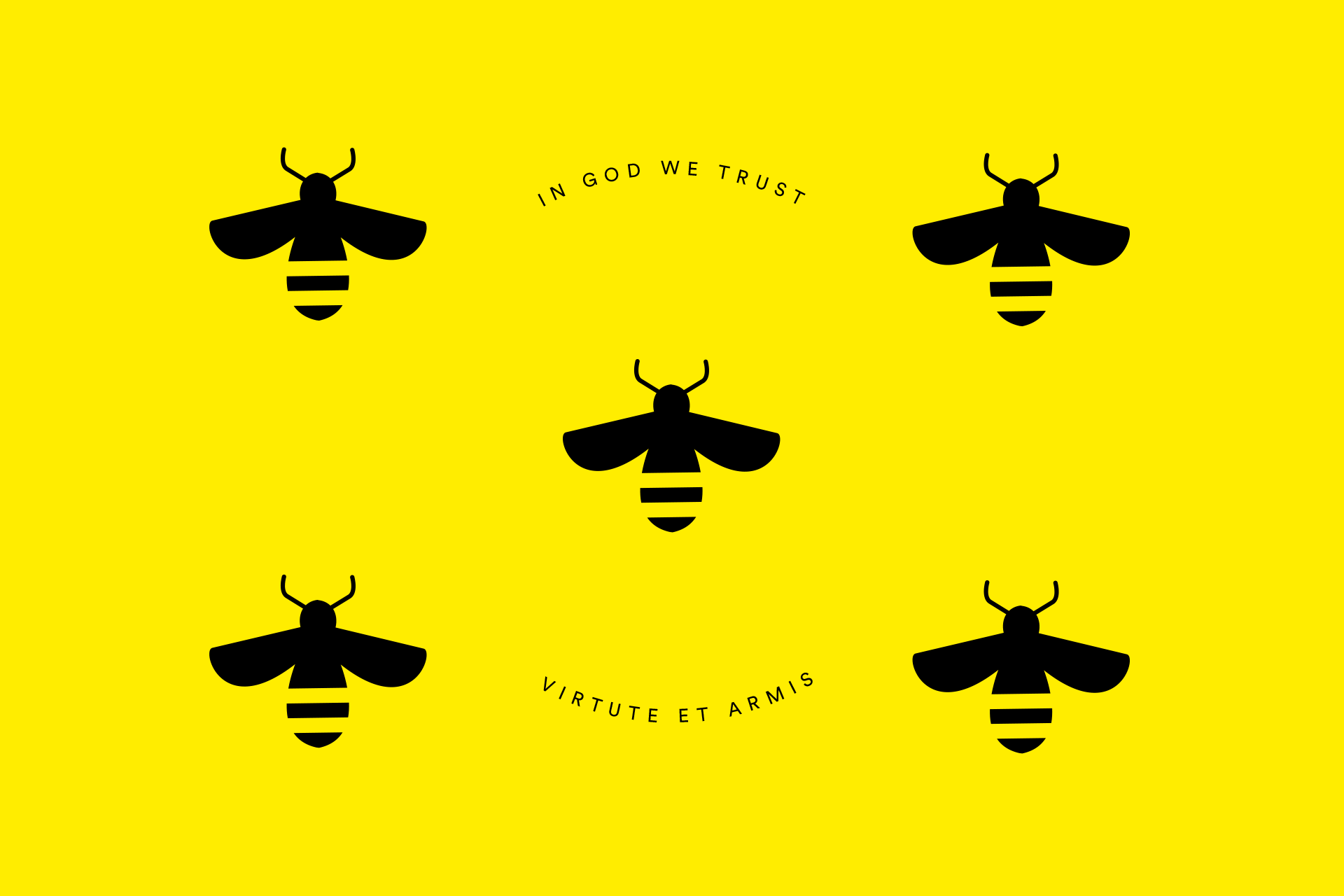
The honeybee is Mississippi’s state insect, and represents community, hope and personal power. This design features one bee from each region (Delta, Hills, Pines, Capital and Coastal) working together to build a brighter future on a foundation of Mississippi’s famous hospitality – signified by the color yellow which represents freshness, positivity, clarity, optimism, and enlightenment.
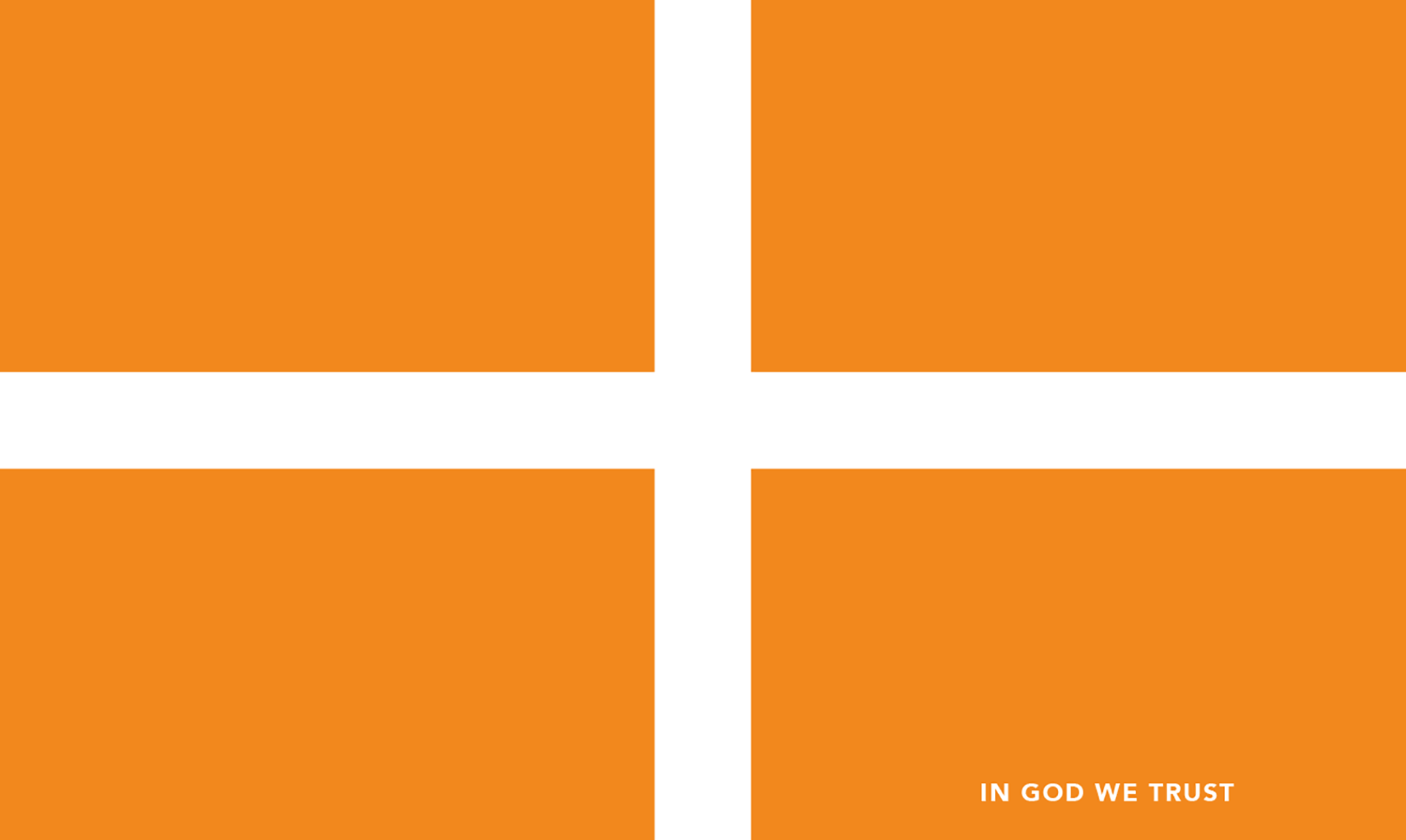
A daringly simple design that takes the outdated confederate X and turns it into a cross to represent healing. The orange represents courage and sacrifice but also optimism for the future.
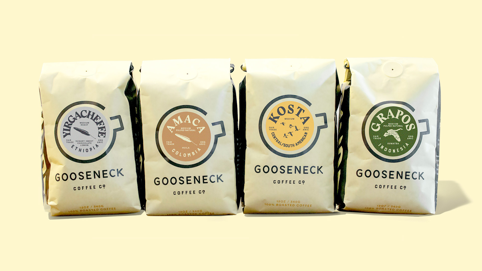
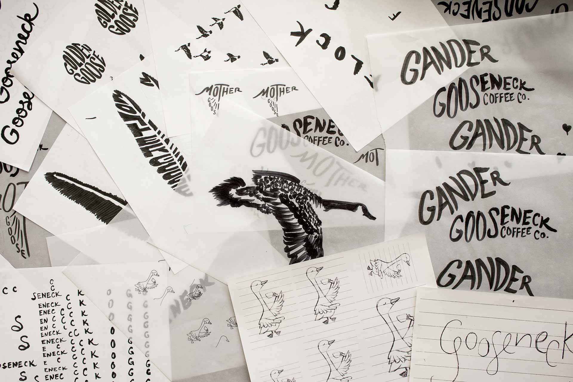
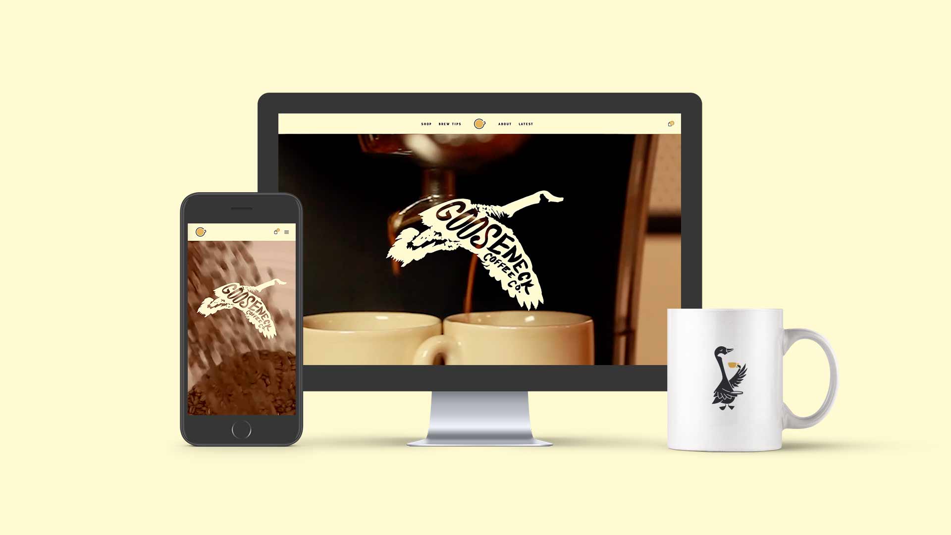
Gooseneck Coffee Co. is a coffee roaster in Detroit looking to expand from a single location to regional/national distribution. We crafted a look and feel for them (including packaging, collateral, merchandise and a website) that would signal their brand values to distributors and a new population of prospective fans.
0-1-lockup-01
0-1-lockup-01dark-01
0-4-brandLine-01
0-4b-rallyingCry-01
Each of their four categories of coffee got its own illustrated logo.
0-5-WildGoose-01
0-5-ProperGoose-01
0-6-category1-01
0-6-category2-01
0-6-category3-01
To reinforce how roasting pulls out different flavors in the coffee bean, we created a “tasting notes” color palette by sampling a photograph of coffee and curating the most expressive color pixels.
0-7-color1
0-7-color2
0-7-color3
Packaging is printed on a biodegradable bag and uses a sticker system to make for efficient flavor swaps.
2-packaging1
2-packaging2
2-packaging3edit
2-packaging4
2-packaging5
3-cups1
3-cups2
4-mug1
For their new brand launch, we designed lots of merchandise, a website, stationery, packing materials, and a mobile brew bar.
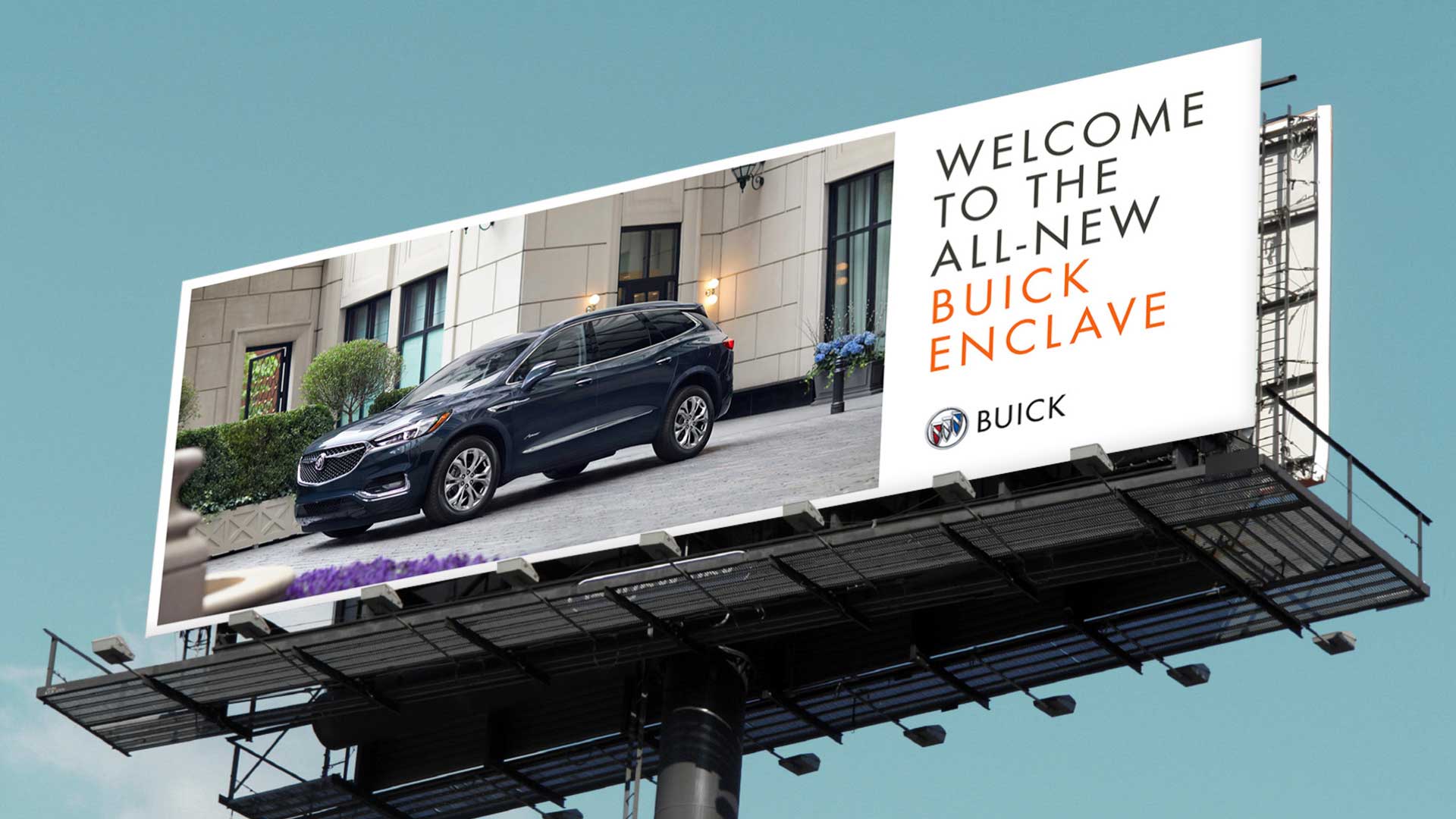
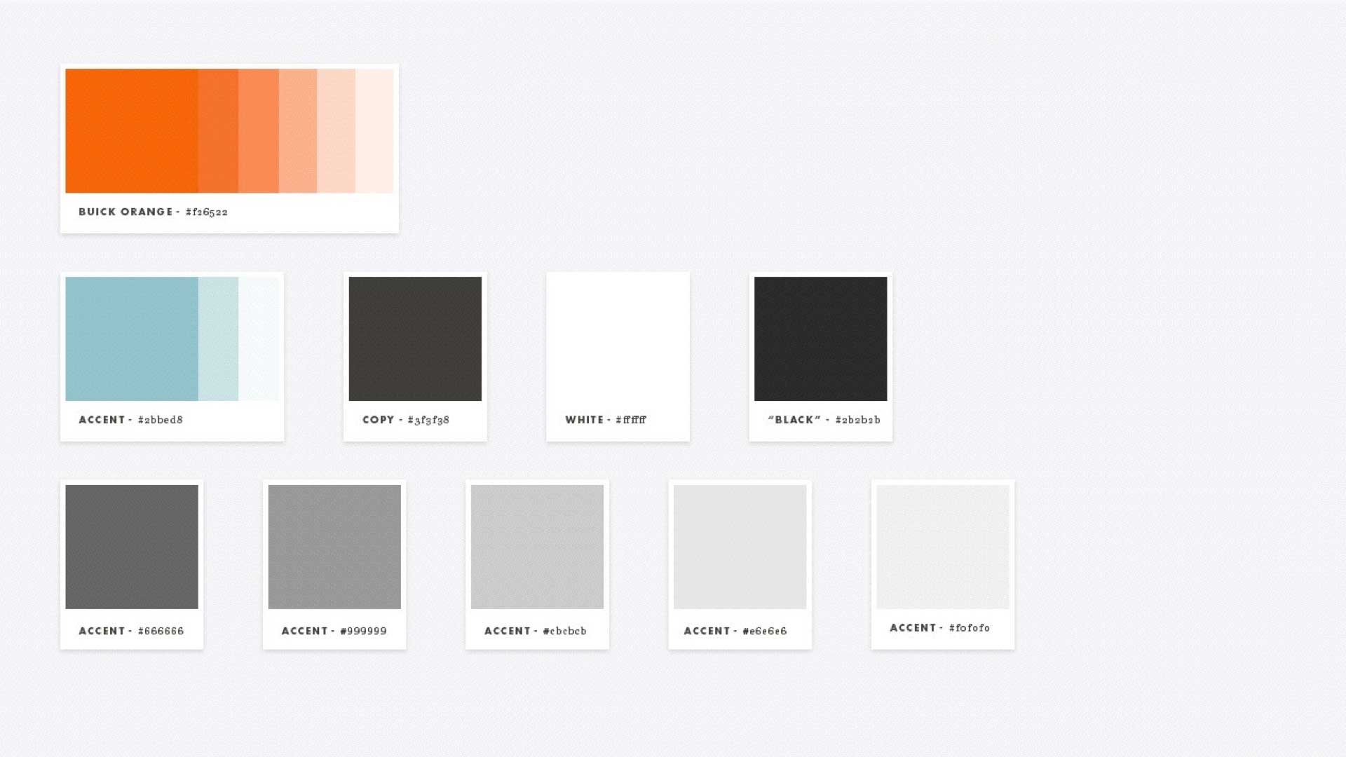
Buick’s target audience didn’t know what they stood for due to lack of visual direction and consistent execution. Using a combination of focus groups and competitive research, we developed a distinct visual persona for them around the idea of highly crafted experiences.
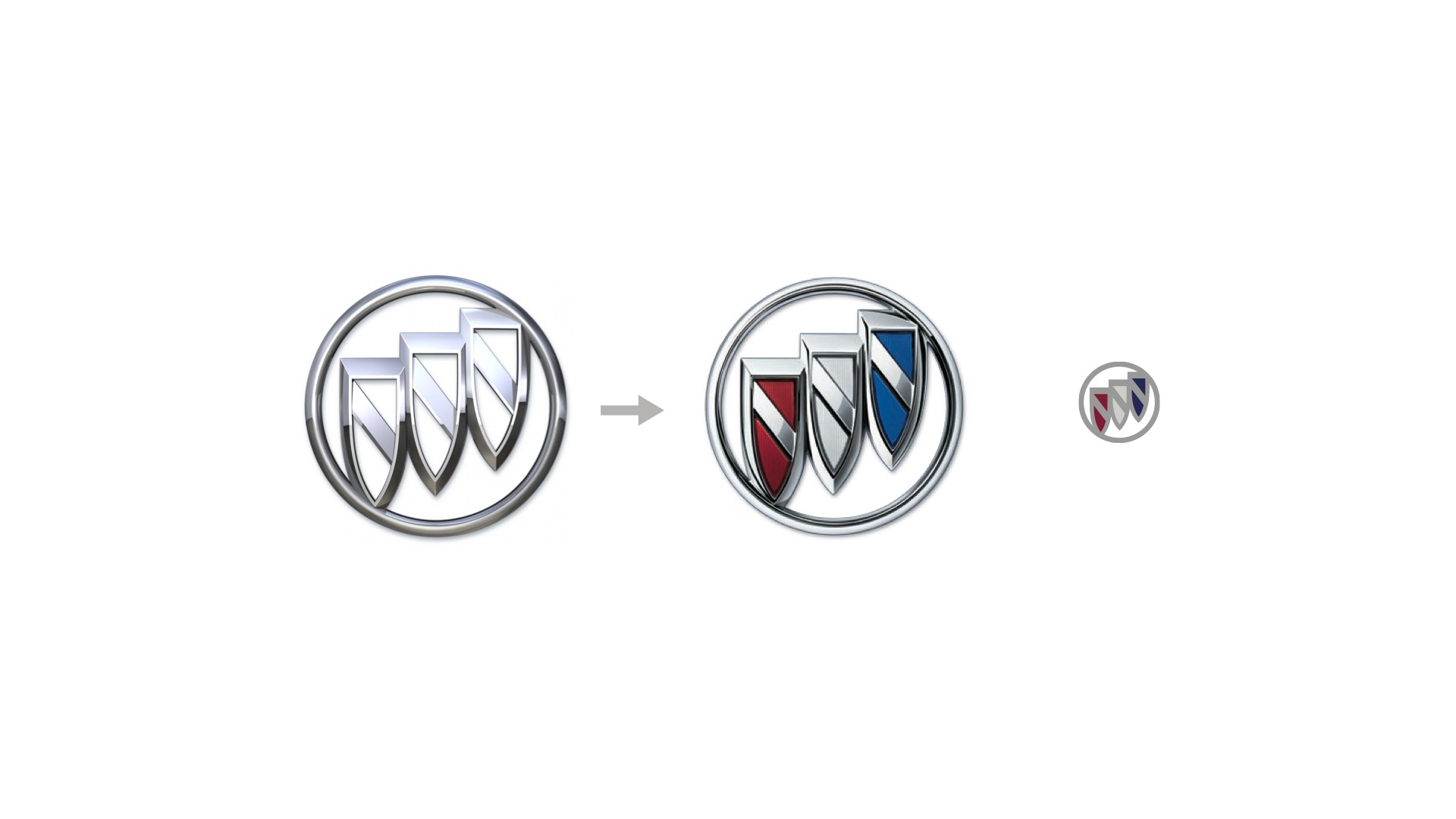
Buick is interesting in that they are an American brand with more appeal in China than the States. Our recommendation was to update the global Buick logo to match the red white and blue color way prevalent in China. We also proposed a responsive version for small sizes and digital channels.
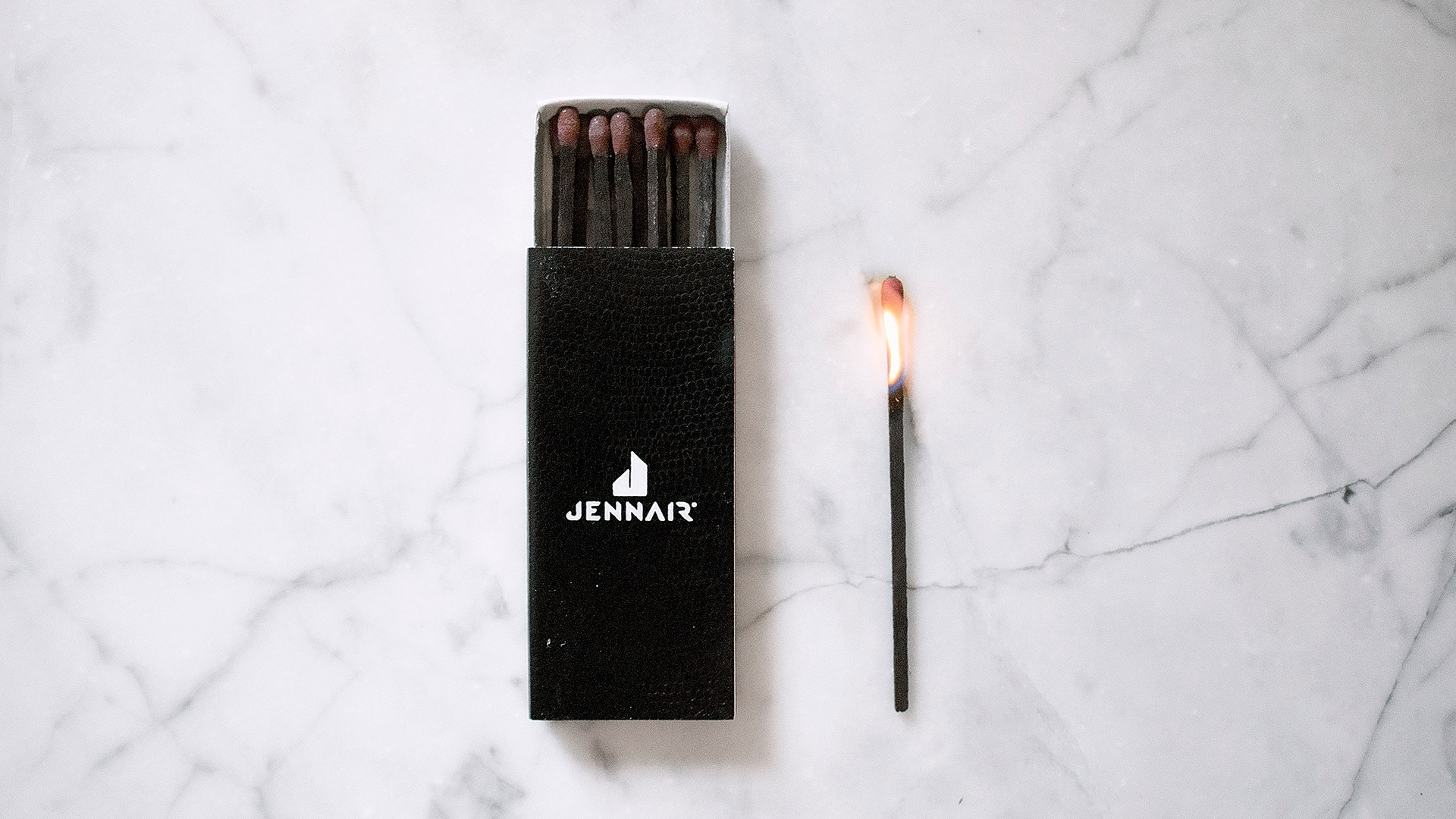
We helped JennAir reclaim the defiant spirit of founder Lou Jenn (who invented the downdraft range and paved the way for open concept home design) and turn the increasingly complacent luxury appliance industry on its head. The new brand launch led to an 11% increase in sales, 86% increase in retail partner floor commitments, and an 18% increase in brand consideration.
1-J1
1-J2
1-J3
1-J4
1-J5
1-J6
1-J7
1-J8
1-J9
2-productImagery0
2-productImagery2
2-productImagery3
2-productImagery4
2-productImagery5
2-productImagery7
2-productImagery6
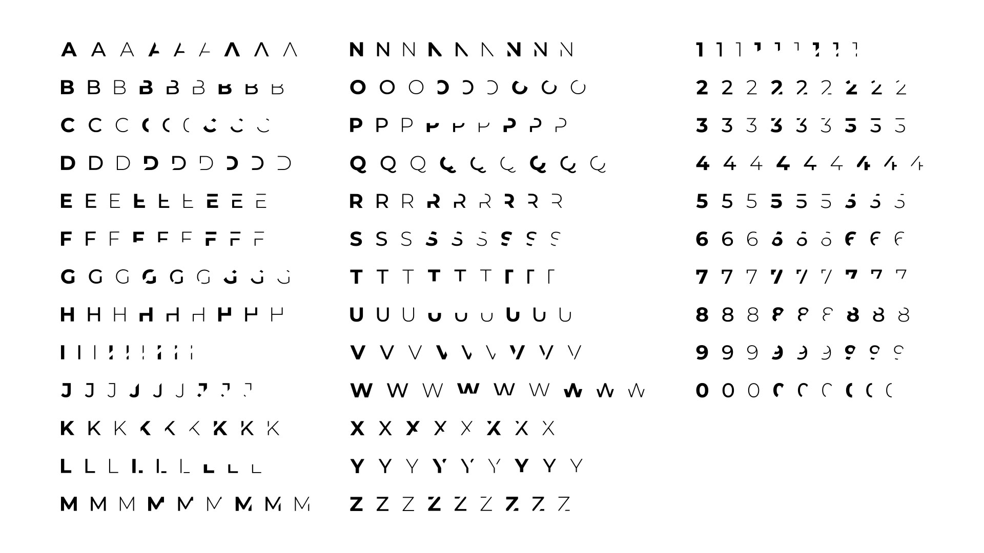
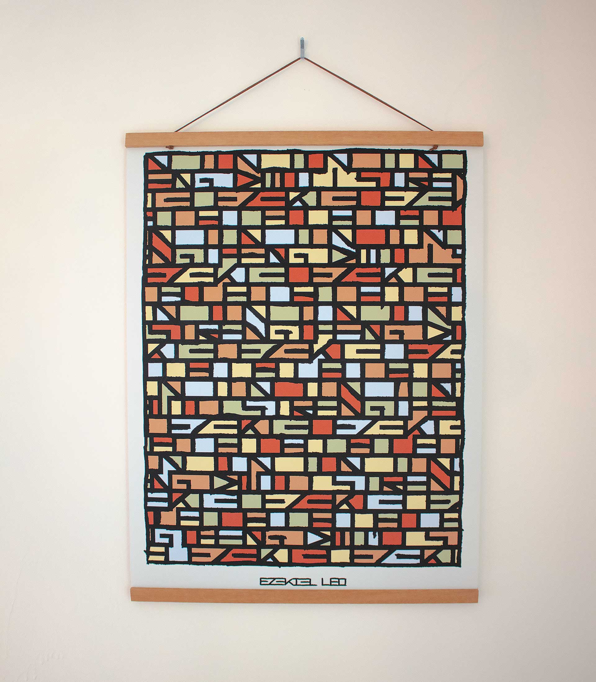
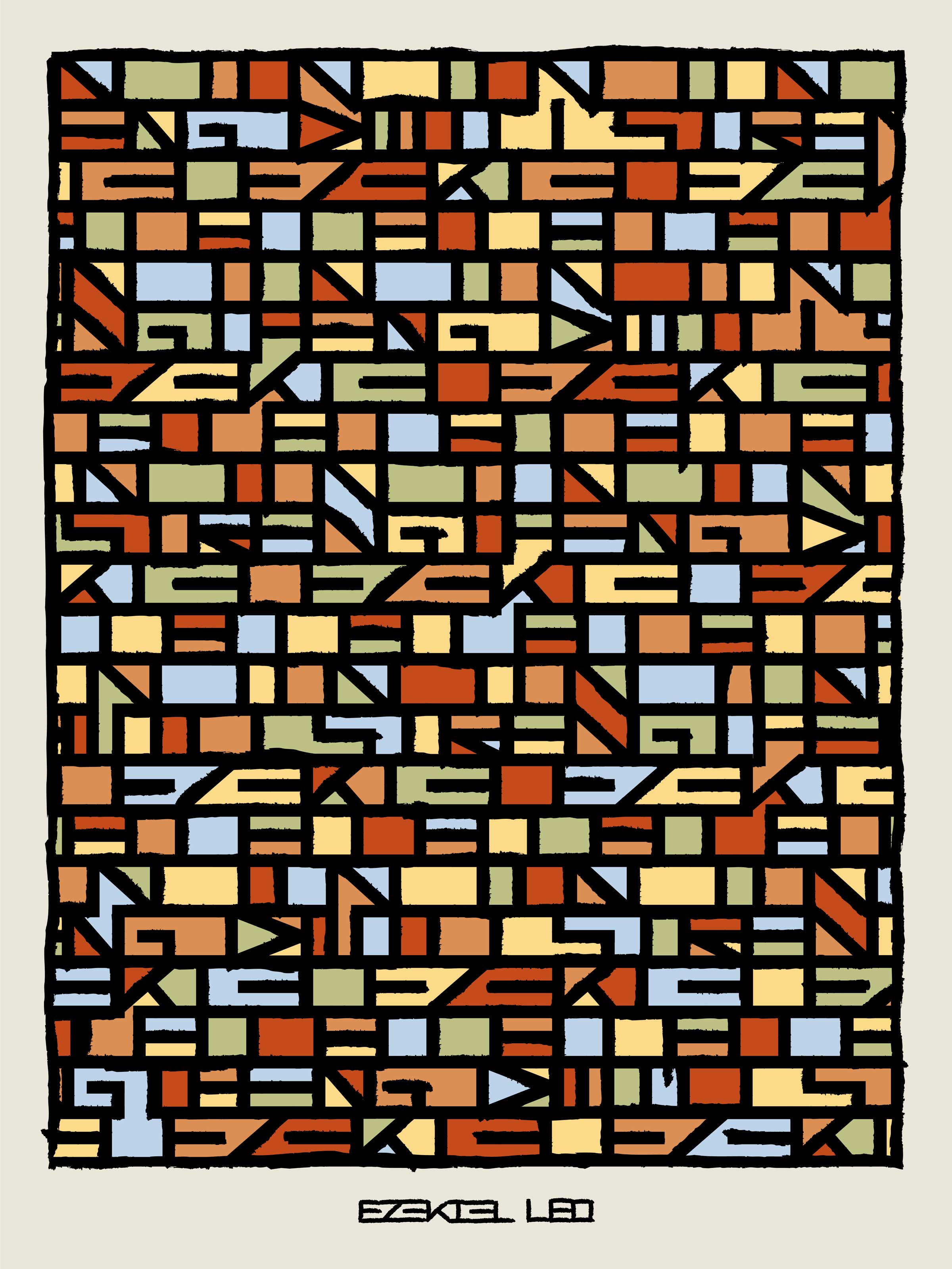
We created (and coded) a randomized glyph set for use in headlines and other accent type.
We launched the brand with a new social, broadcast and online presence, and an exhibit at the Architectural Digest Design Show (where we won Best in Show), with an after-hours launch event featuring performances from Nas and Deerhunter.
5-WildPostings
11-collateral3
11-collateral4
11-poster
11
14-booth1
14-booth3
cube
privatejet_NOIR-6
One of my favorite artifacts was the JennAir “bible”—a 12×12, hard-bound, laser cut coffee table book that outlines the strategic foundation of the reclaimed brand.
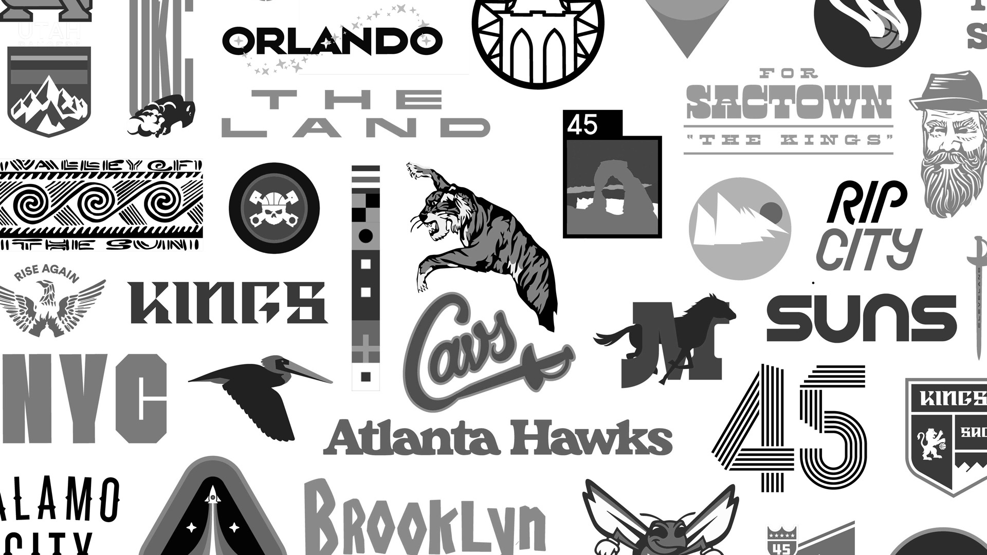
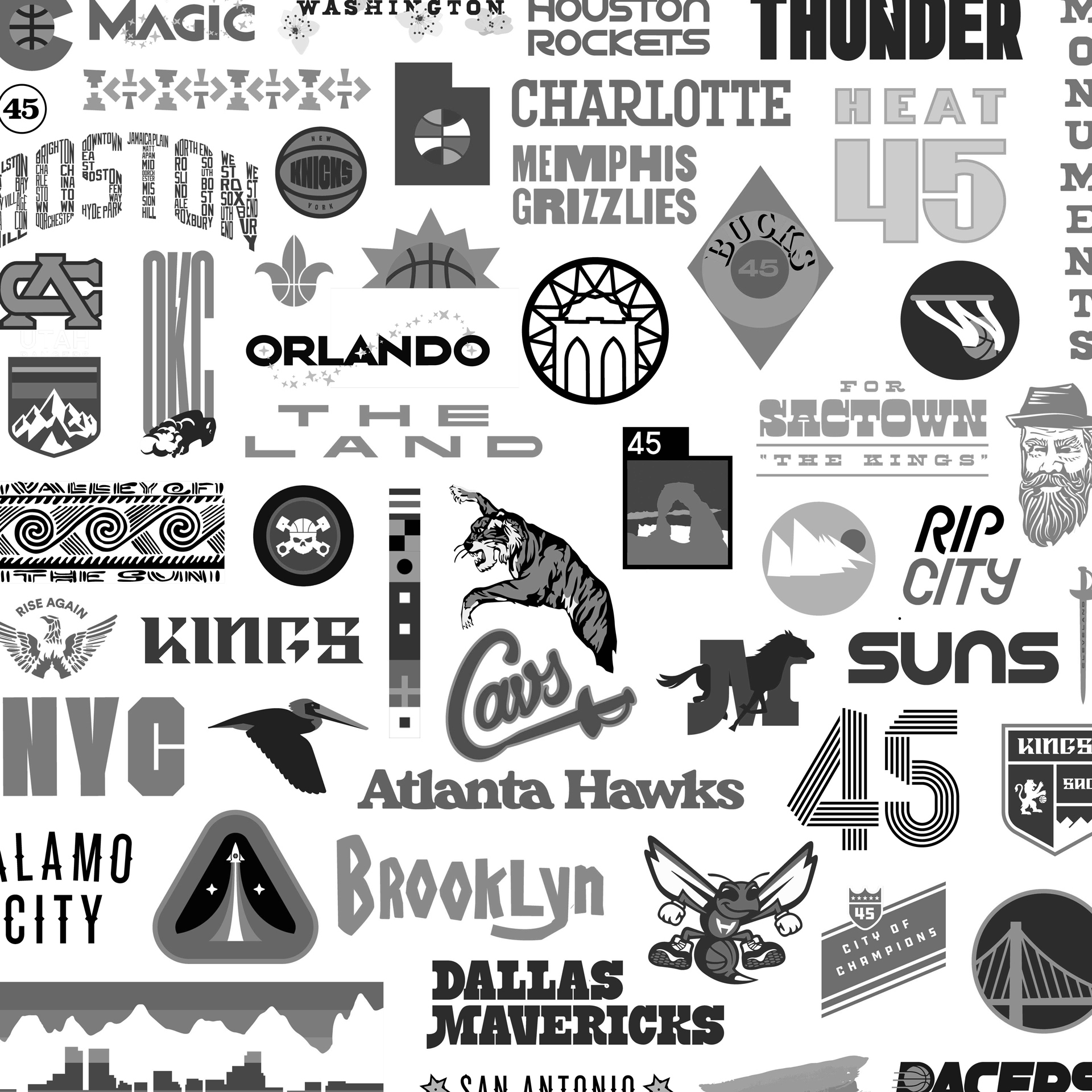
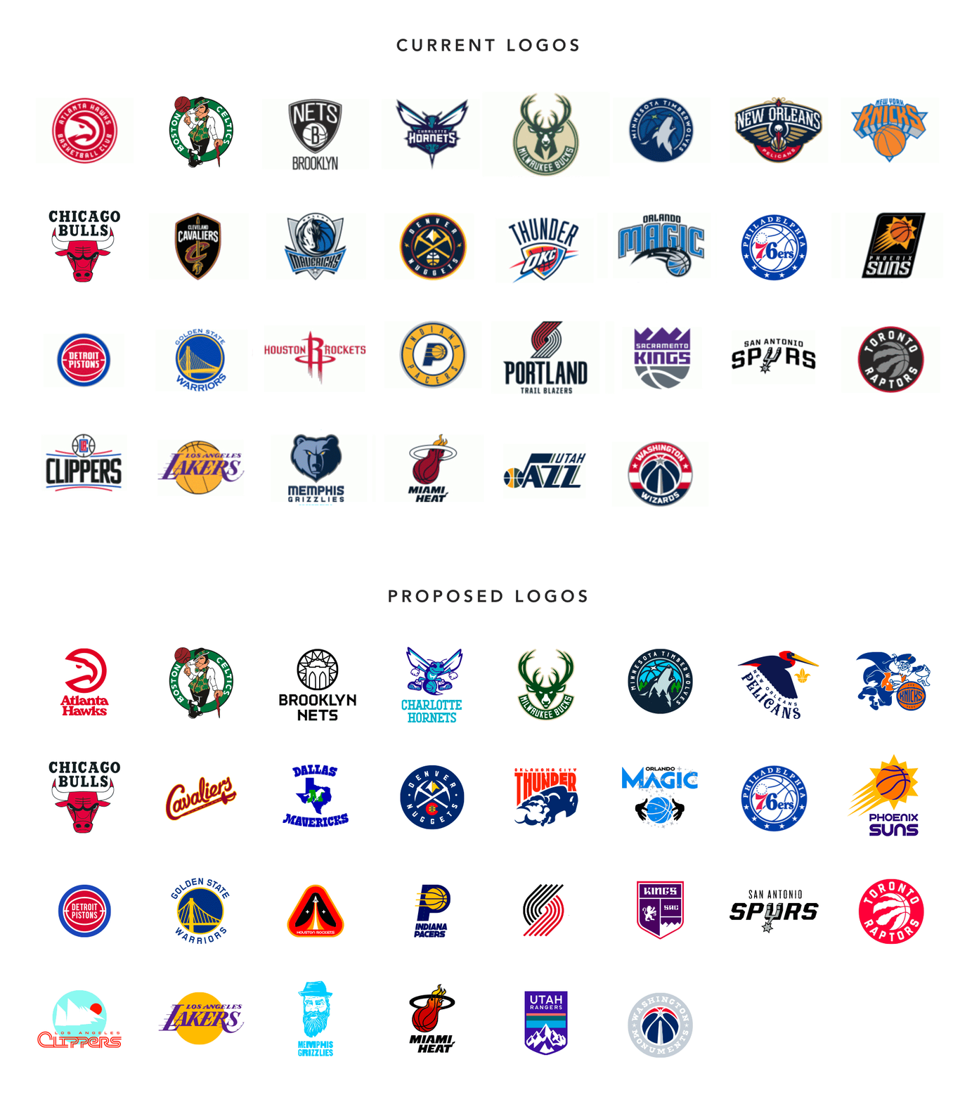
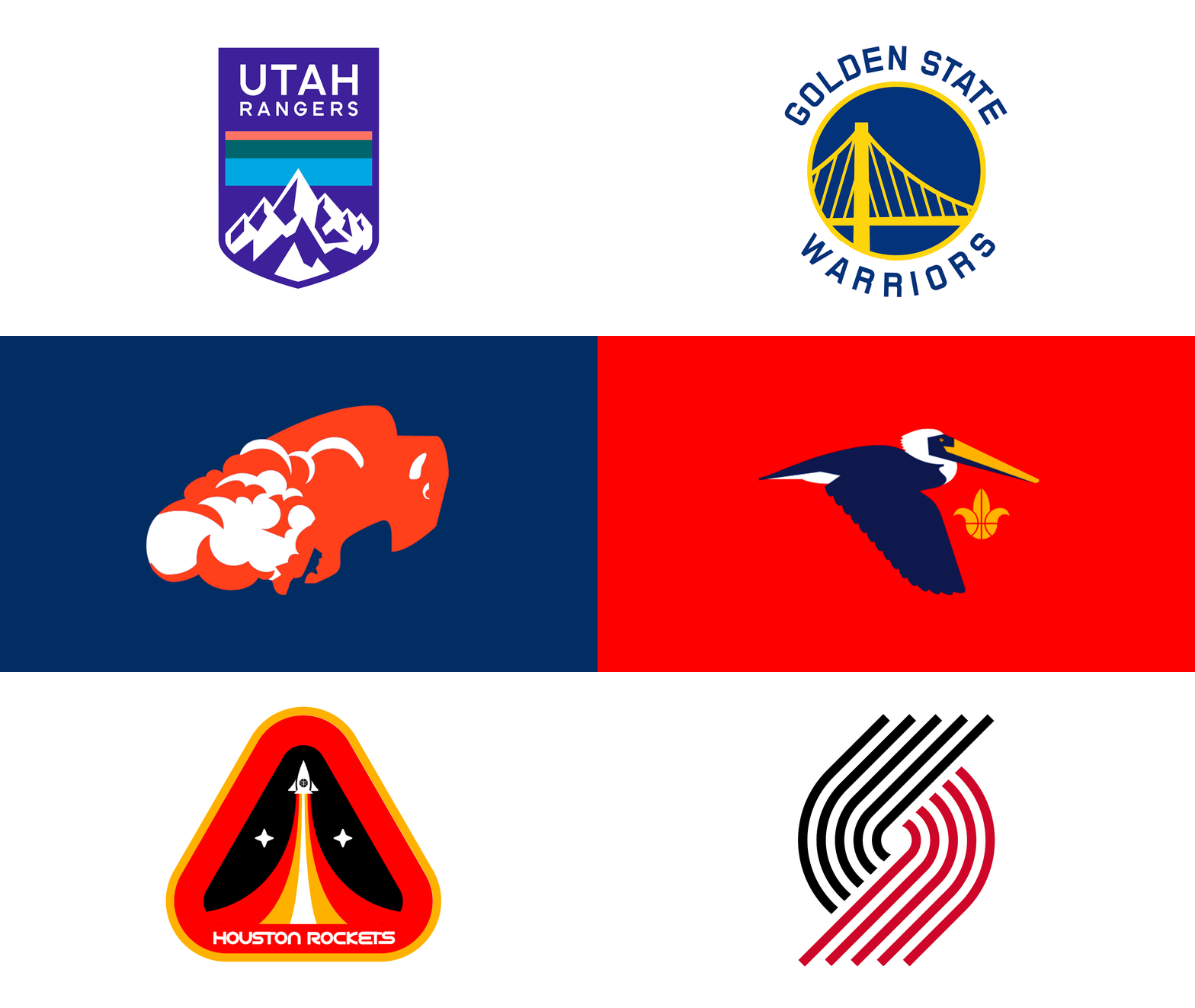
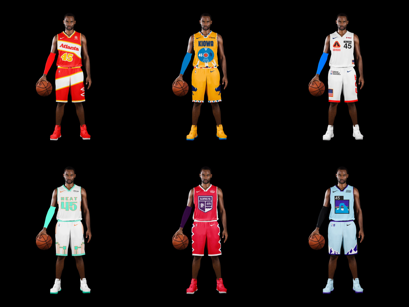
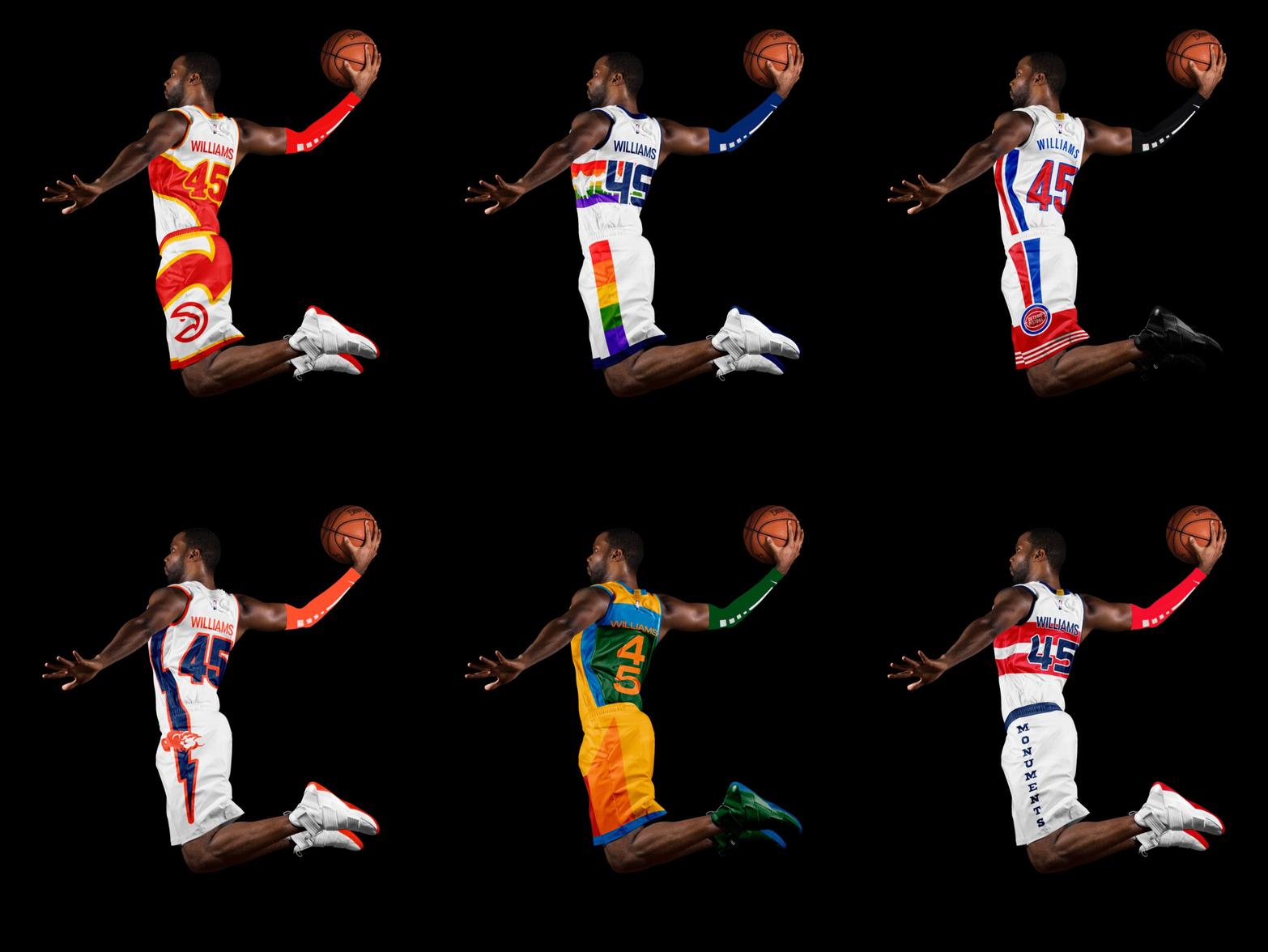
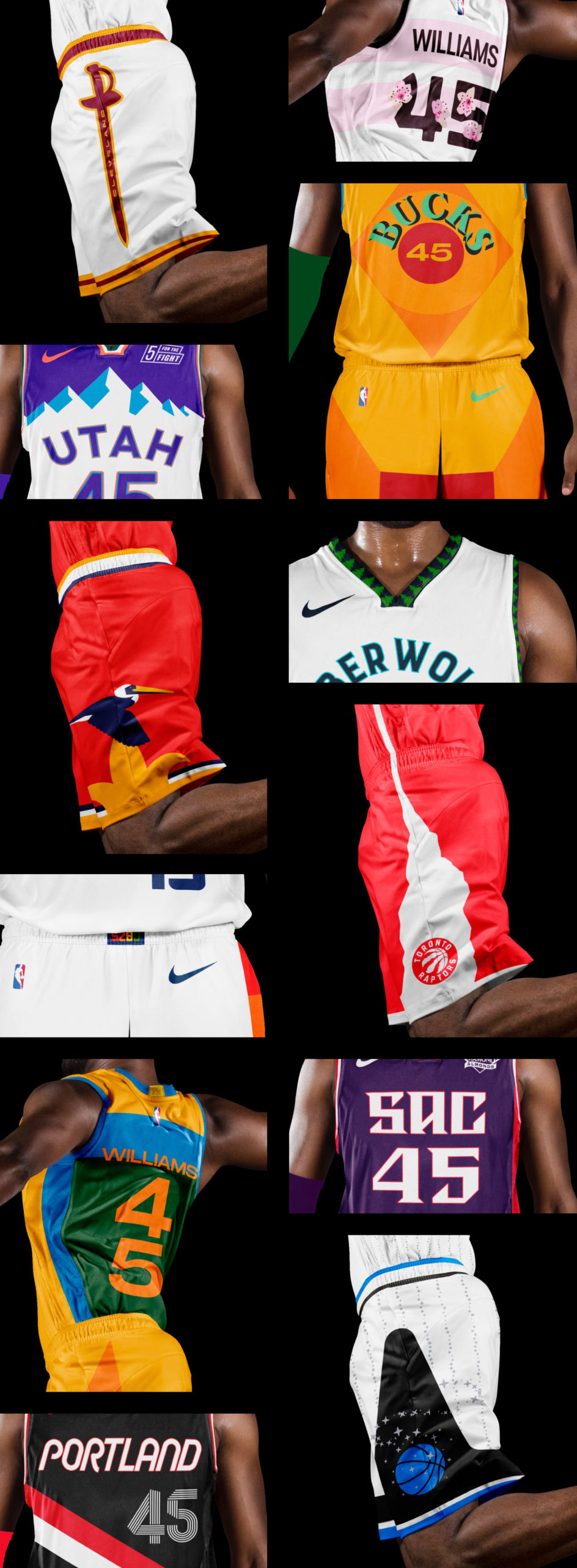
To promote Digitas’ visual design and branding capability, we kicked off the NBA season with a vision for every NBA team’s branding and uniforms designed to rally their fans, express their city and spike merch sales. We dove deep into Reddit threads, blog articles, and jersey rankings, letting fan voices be the design brief. We launched our project via a custom-coded website and social outreach during the 2021 opening tip-off. The project garnered over 60K unique visits and 170K page views to open the season.
We challenged ourselves to create custom lettering, numerals and logos whenever possible.
In addition to a branding kit, we designed four uniforms for each team – “Association” and “Icon” which are what used to be called home and away, and a more adventurous “City” and “Statement” edition.
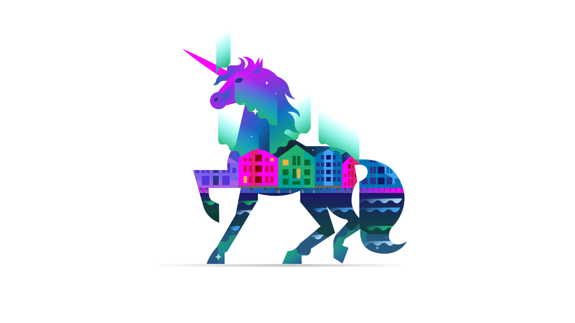
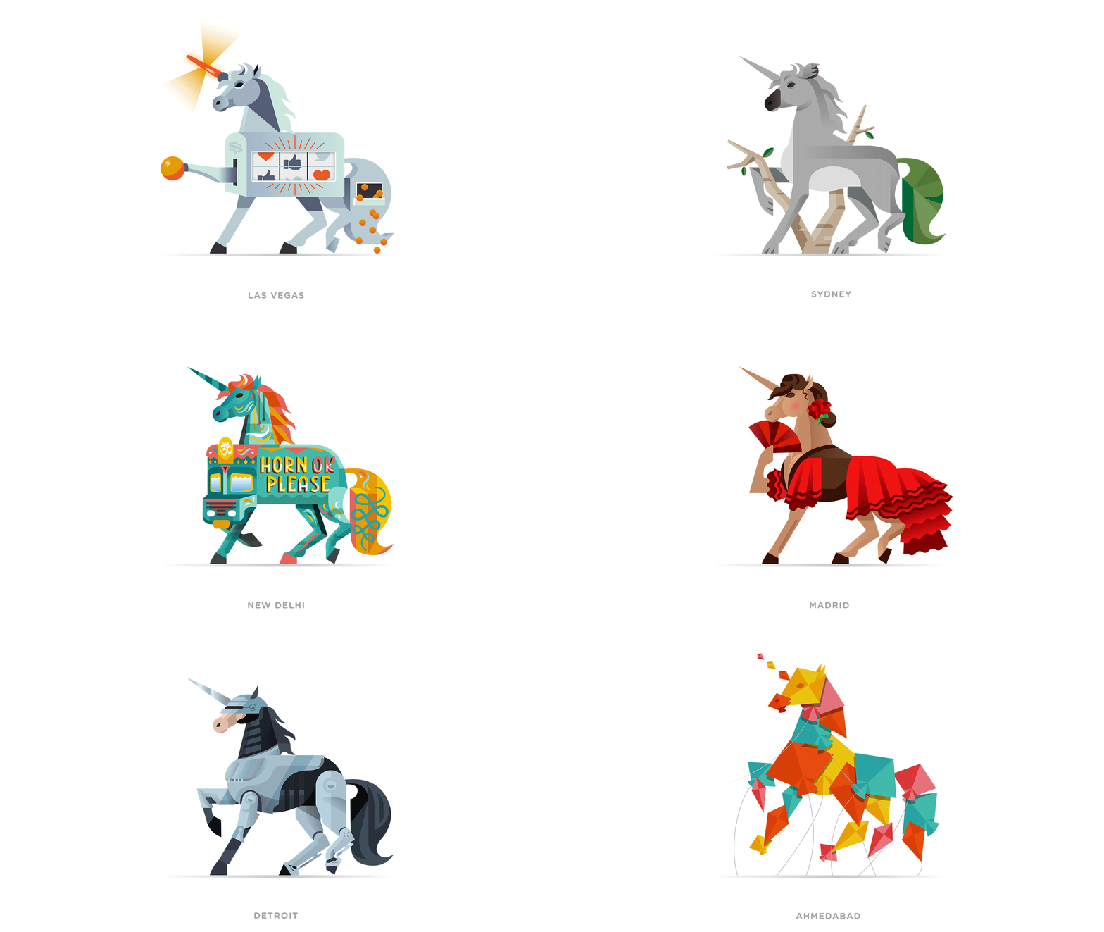
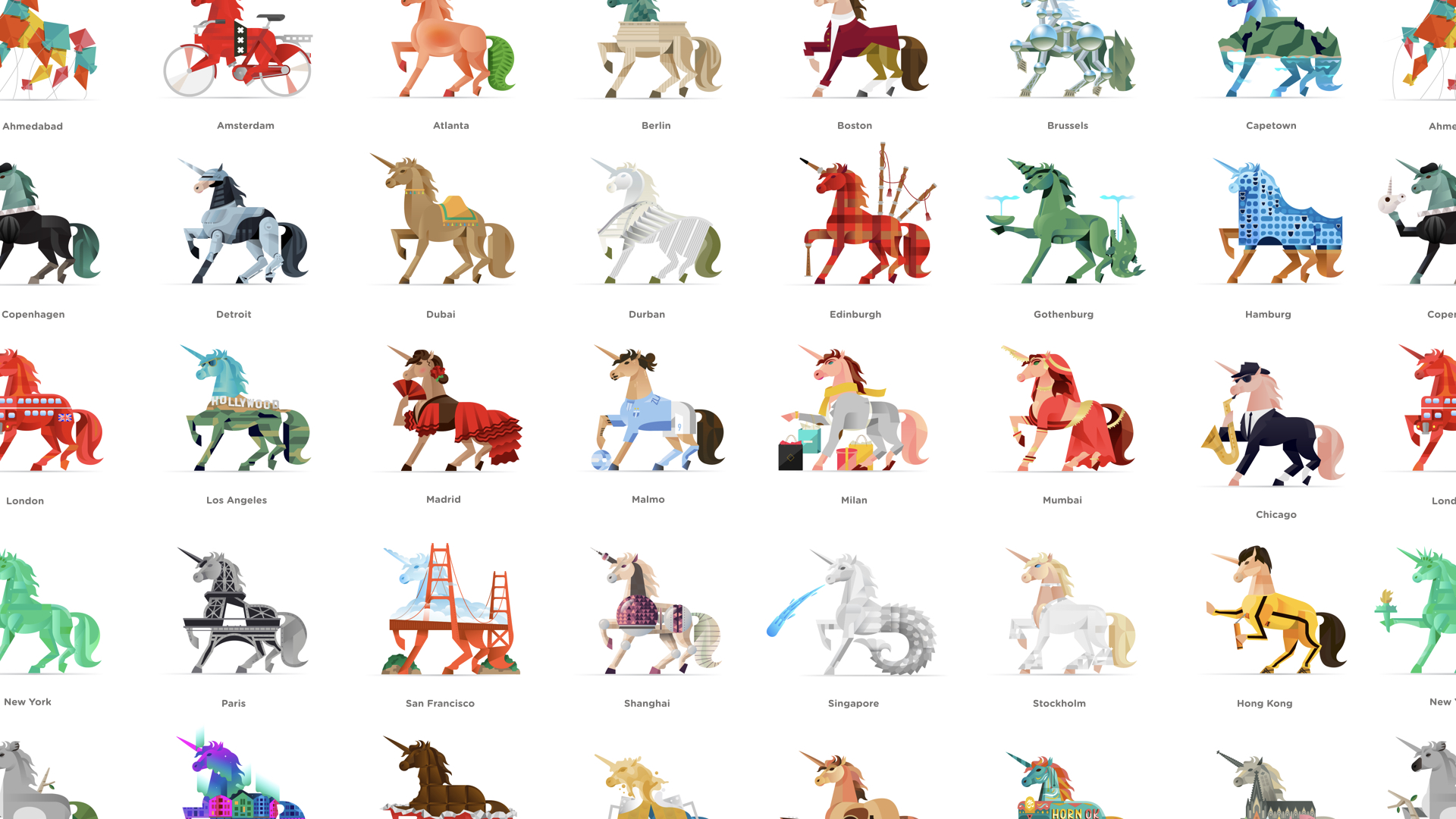
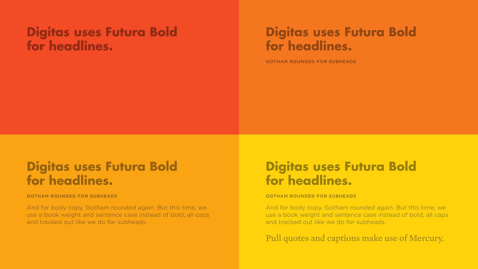
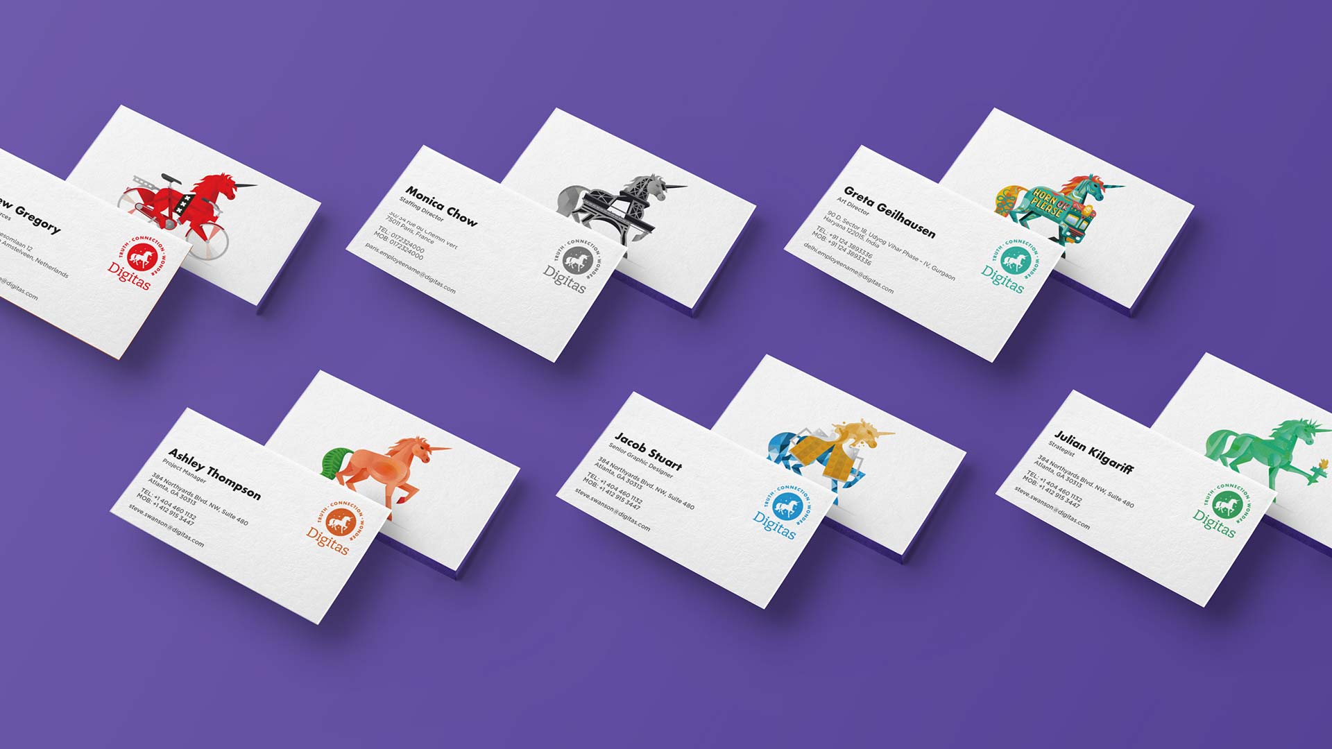
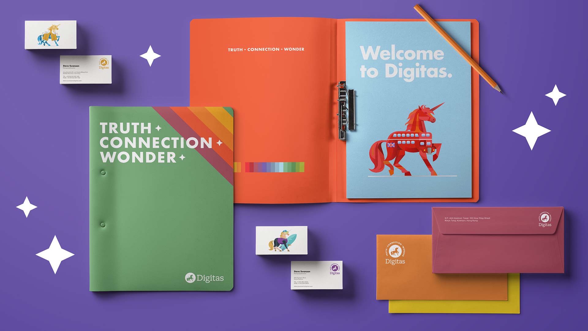
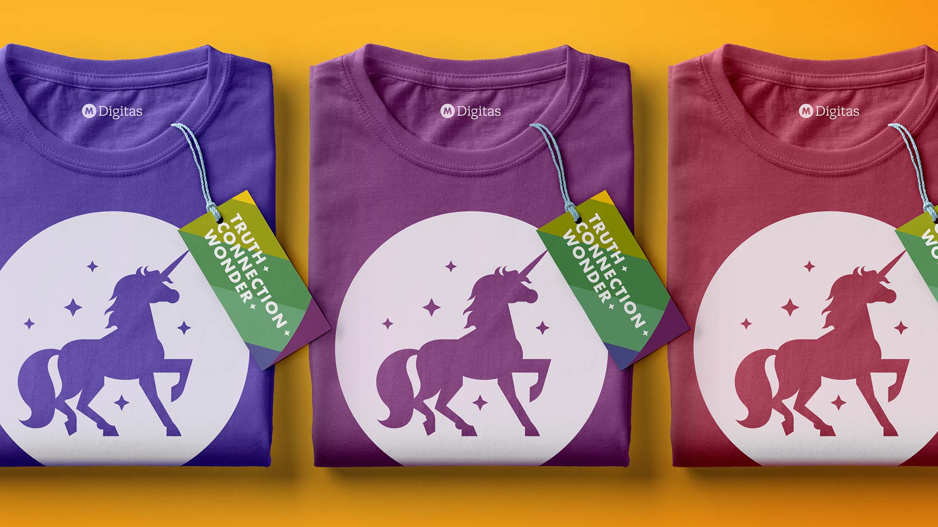
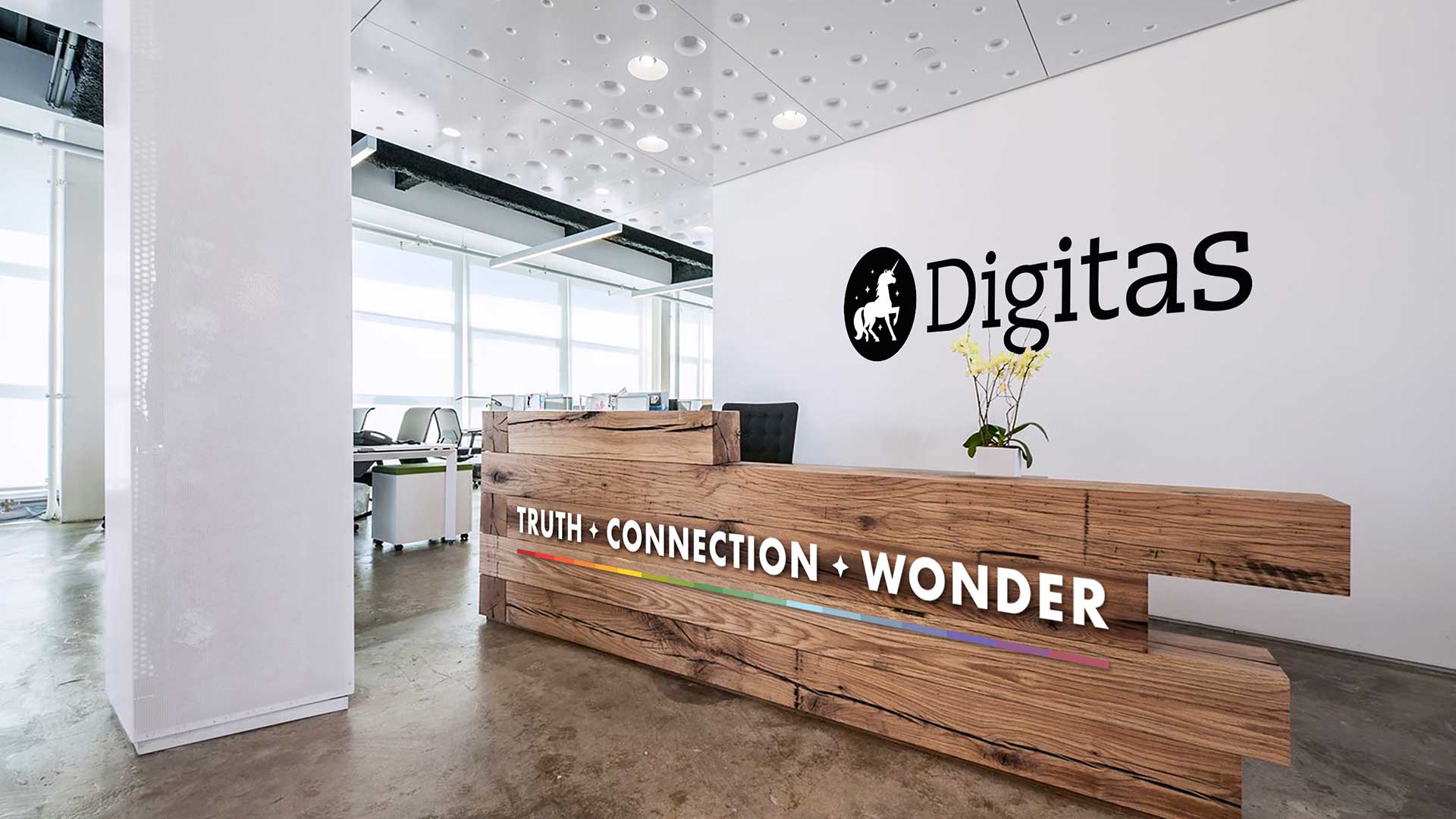
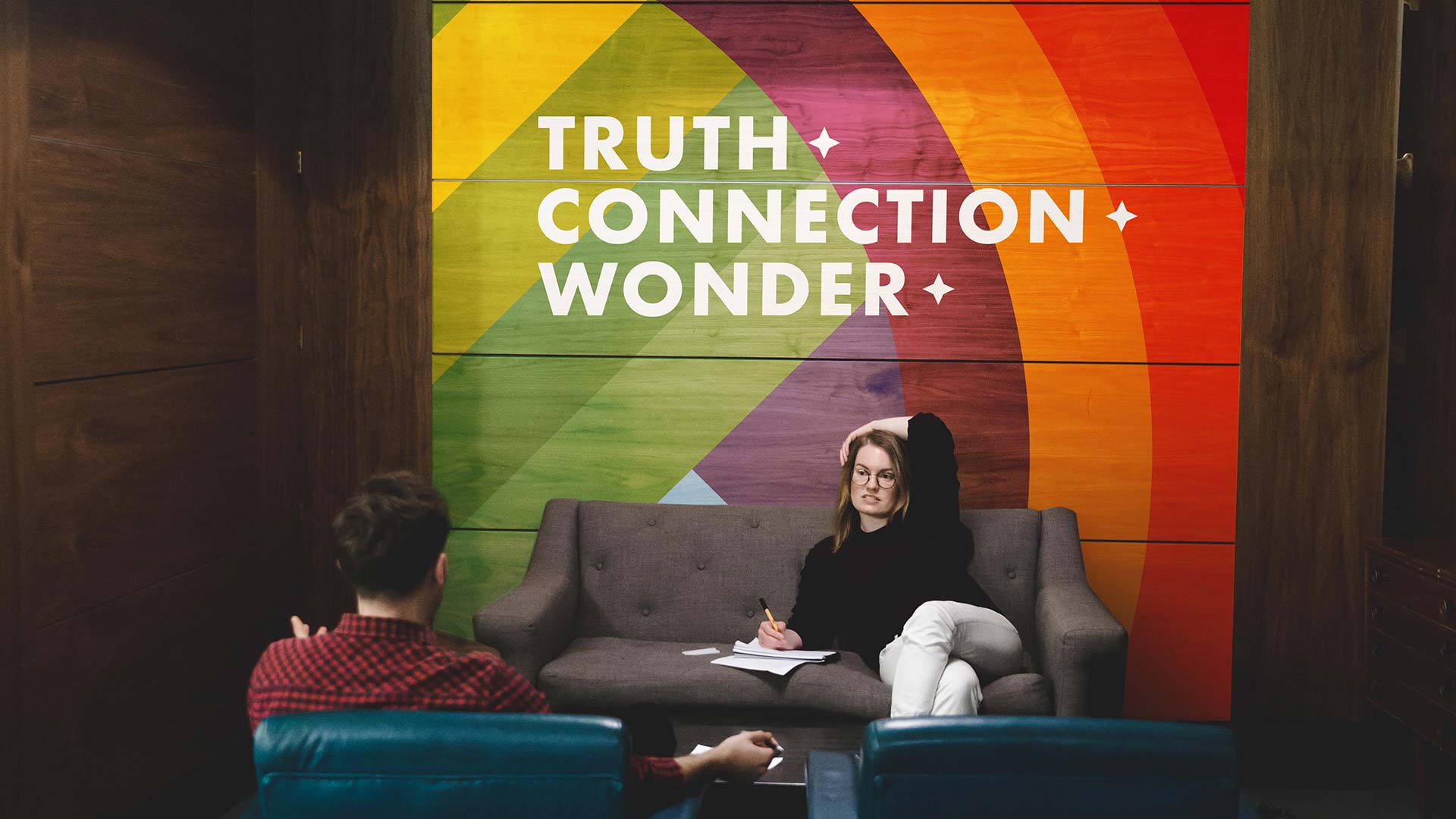
Updating the Digitas branding with a refined unicorn drawing, more color and sets of city- and capability-inspired unicorns to boot. We also created a video series called “Unicorns in the Wild” to show off the out-of-office talents that make our people, well, unicorns.
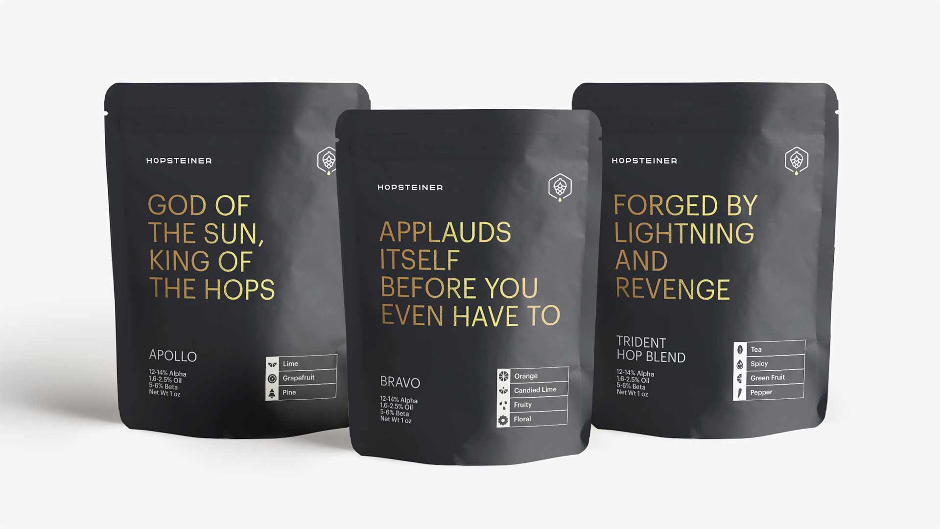
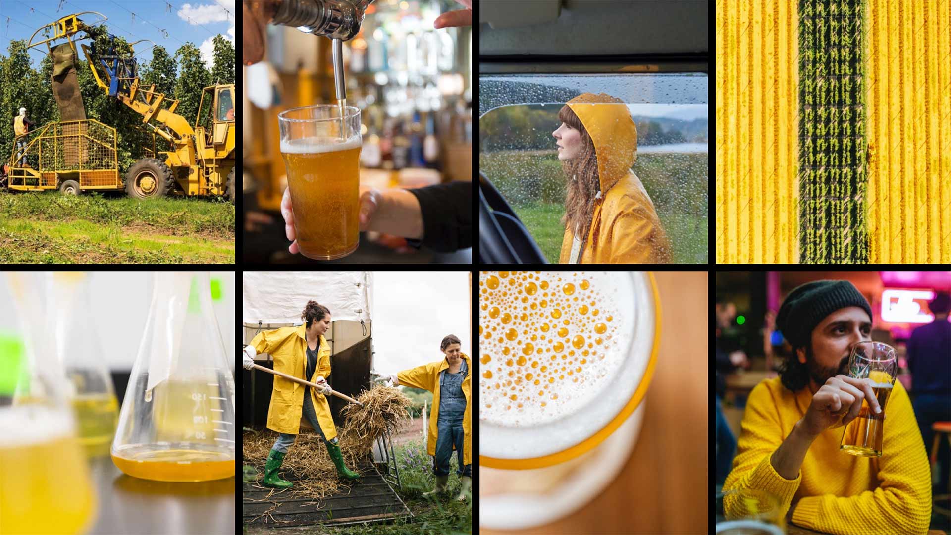
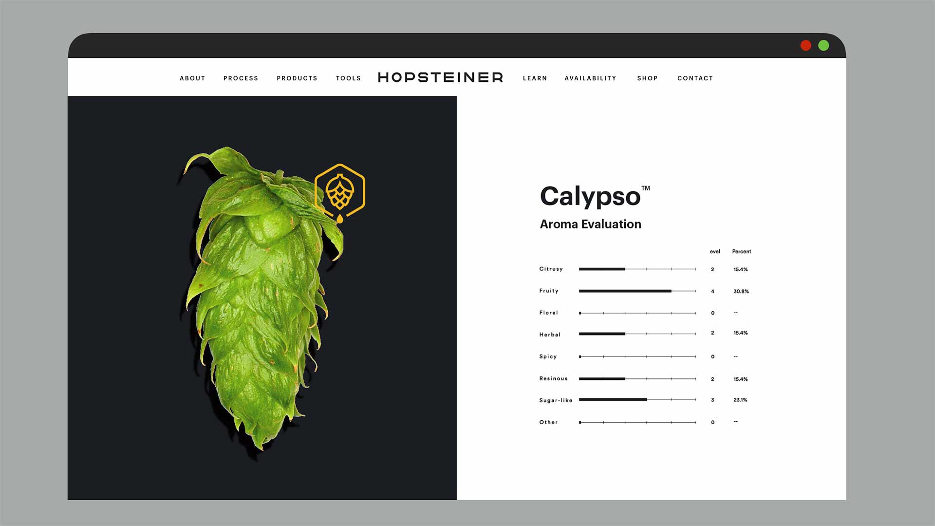
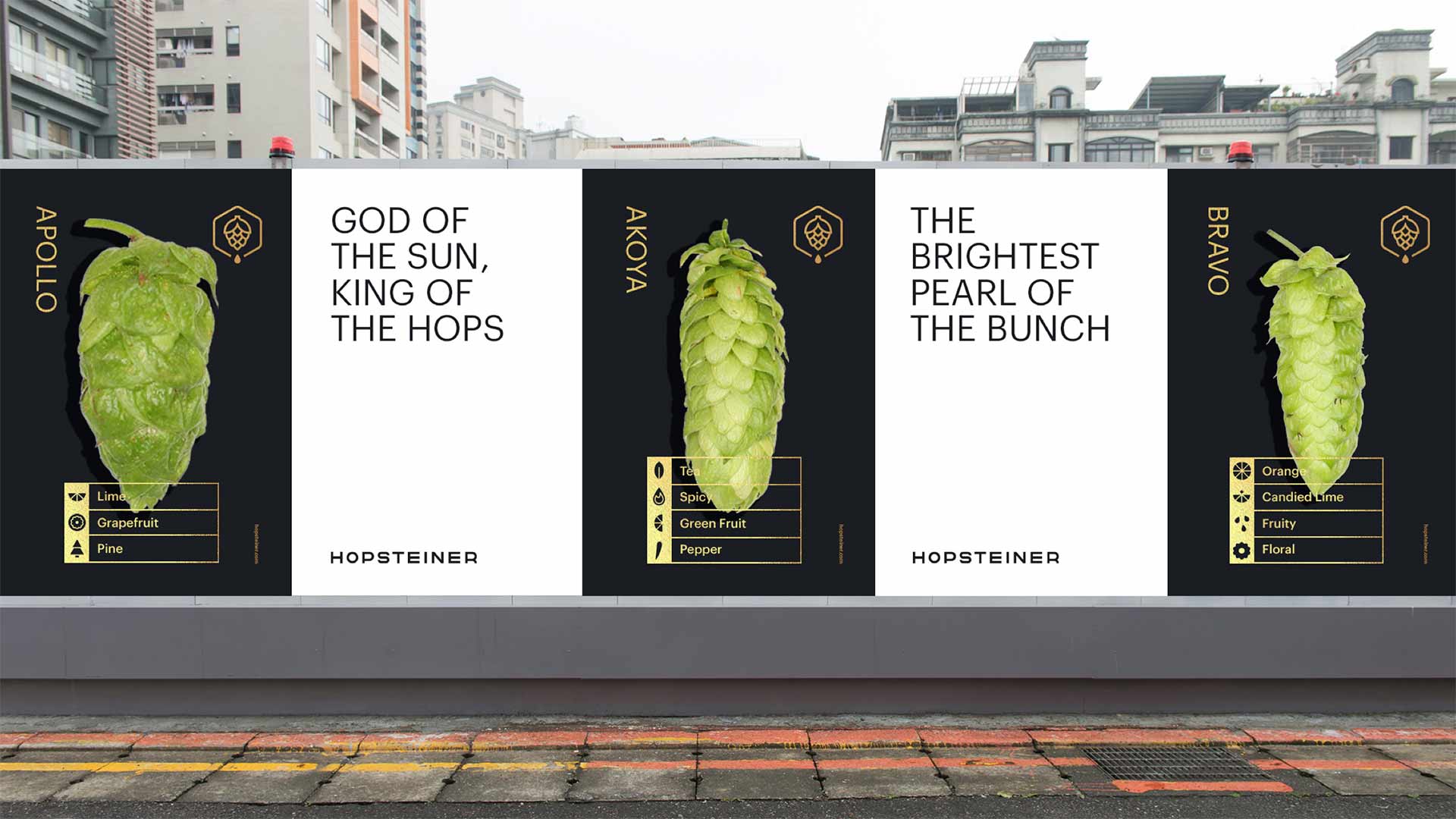
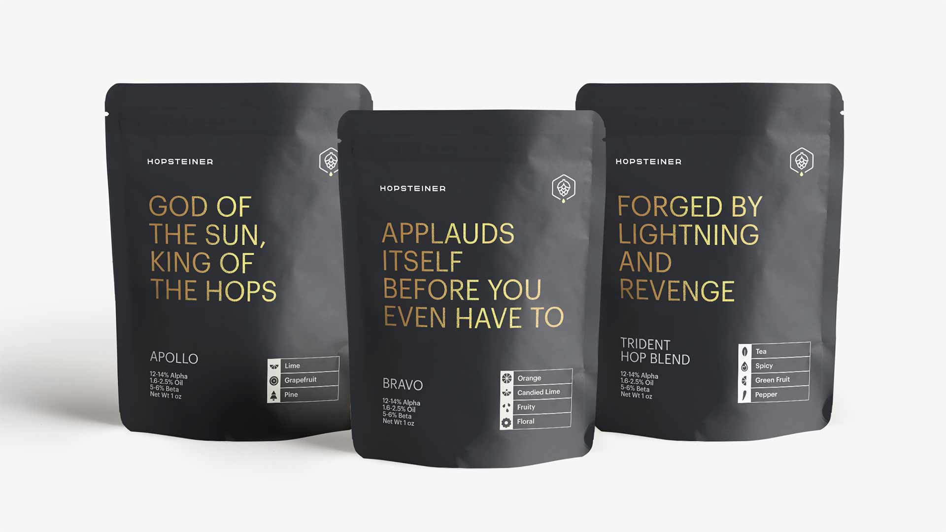
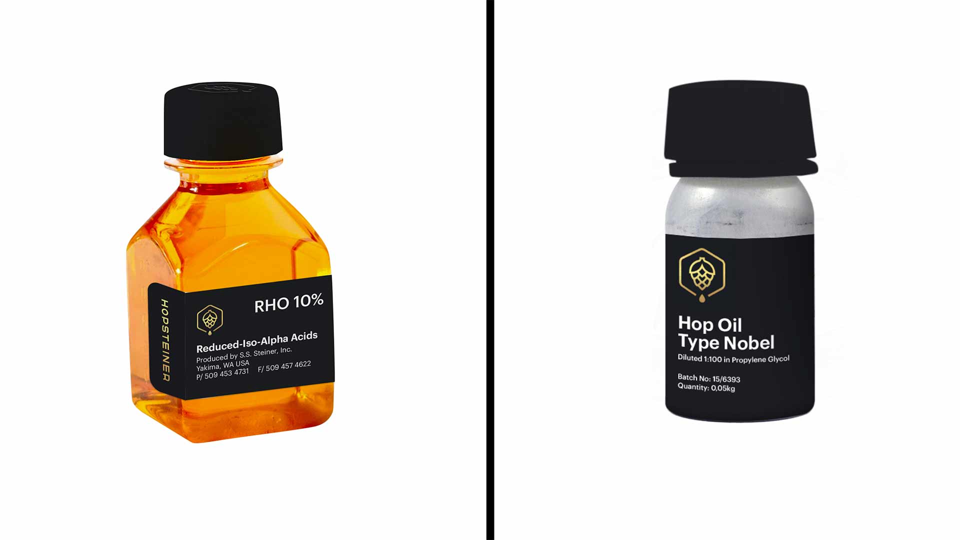
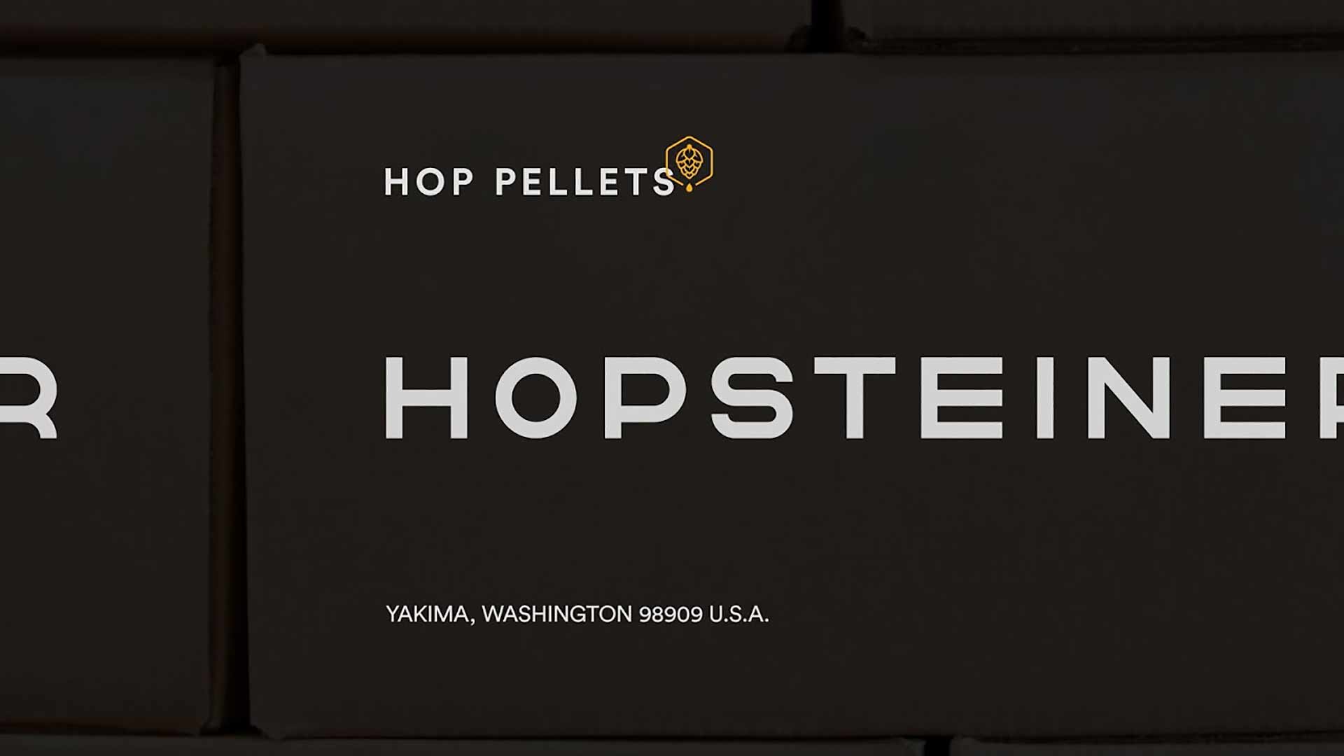
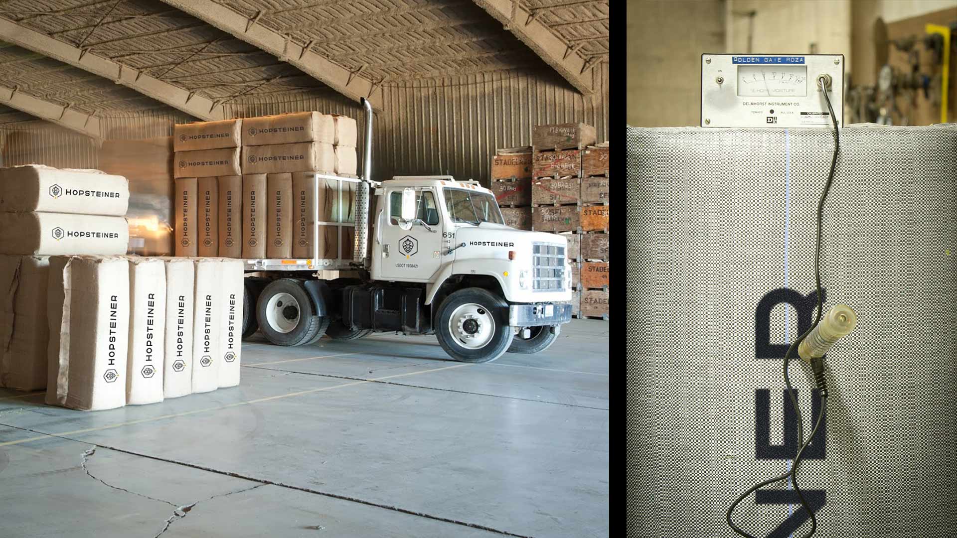
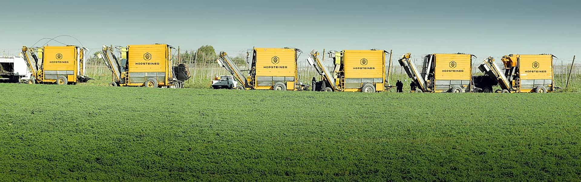
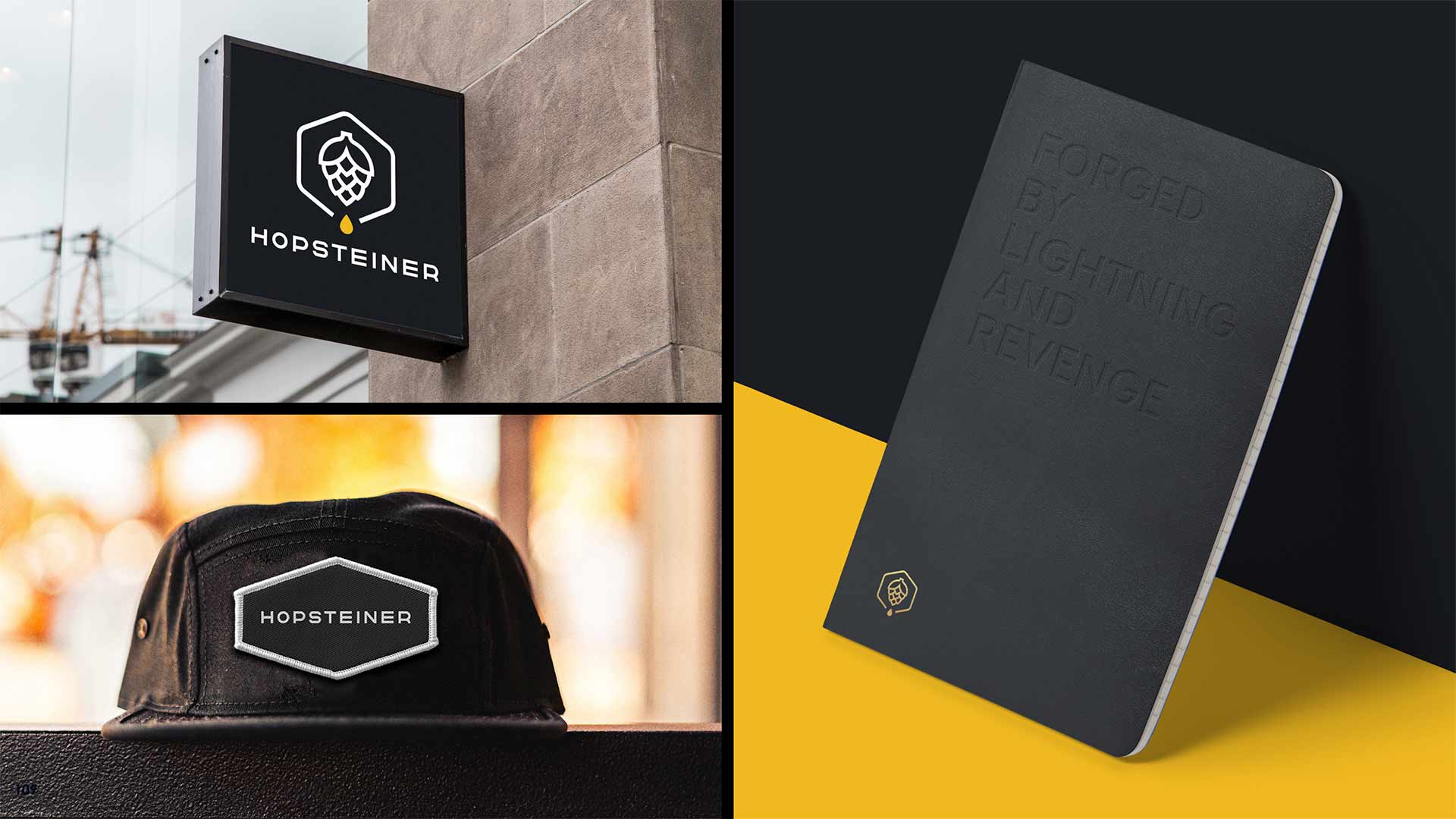
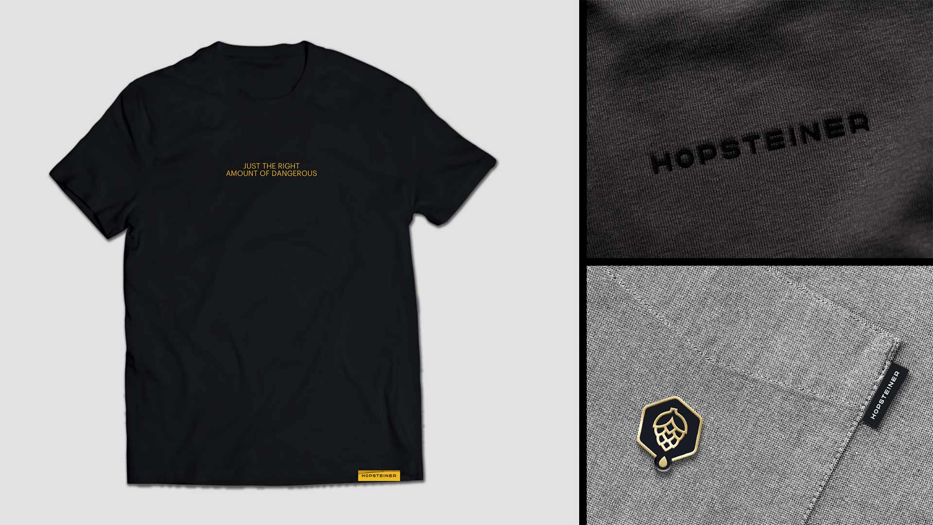
In a space where most brands are appealing to faux heritage and nostalgia, we positioned one of the oldest, biggest and most innovative hops growers in the world as the perennial pioneer in the hops industry – for brewers of all sizes who dare to brew different.